
时间序列深度学习:状态 LSTM 模型预测太阳黑子
时间序列深度学习:状态 LSTM 模型预测太阳黑子
本文翻译自《Time Series Deep Learning: Forecasting Sunspots With Keras Stateful Lstm In R》
2020-02-05 更新:添加函数
my_calc_rmse修正 R 包版本更新带来的错误。
由于数据科学机器学习和深度学习的发展,时间序列预测在预测准确性方面取得了显着进展。随着这些 ML/DL 工具的发展,企业和金融机构现在可以通过应用这些新技术来解决旧问题,从而更好地进行预测。在本文中,我们展示了使用称为 LSTM(长短期记忆)的特殊类型深度学习模型,该模型对涉及自相关性的序列预测问题很有用。我们分析了一个名为“太阳黑子”的著名历史数据集(太阳黑子是指太阳表面形成黑点的太阳现象)。我们将展示如何使用 LSTM 模型预测未来 10 年的太阳黑子数量。
教程概览
此代码教程对应于 2018 年 4 月 19 日星期四向 SP Global 提供的 Time Series Deep Learning 演示文稿。可以下载补充本文的幻灯片。
这是一个涉及时间序列深度学习和其他复杂机器学习主题(如回测交叉验证)的高级教程。如果想要了解 R 中的 Keras,请查看:Customer Analytics: Using Deep Learning With Keras To Predict Customer Churn。
本教程中,你将会学到:
- 用
keras包开发一个状态 LSTM 模型,该 R 包将 R TensorFlow 作为后端。 - 将状态 LSTM 模型应用到著名的太阳黑子数据集上。
- 借助
rsample包在初始抽样上滚动预测,实现时间序列的交叉检验。 - 借助
ggplot2和cowplot可视化回测和预测结果。 - 通过自相关函数(Autocorrelation Function,ACF)图评估时间序列数据是否适合应用 LSTM 模型。
本文的最终结果是一个高性能的深度学习算法,在预测未来 10 年太阳黑子数量方面表现非常出色!这是回测后状态 LSTM 模型的结果。

商业应用
时间序列预测对营收和利润有显着影响。在商业方面,我们可能有兴趣预测每月、每季度或每年的哪一天会发生大额支出,或者我们可能有兴趣了解消费者物价指数(CPI)在未来六年个月如何变化。这些都是在微观经济和宏观经济层面影响商业组织的常见问题。虽然本教程中使用的数据集不是“商业”数据集,但它显示了工具-问题匹配的强大力量,意味着使用正确的工具进行工作可以大大提高准确性。最终的结果是预测准确性的提高将对营收和利润带来可量化的提升。
长短期记忆(LSTM)模型
长短期记忆(LSTM)模型是一种强大的递归神经网络(RNN)。博文《Understanding LSTM Networks》(翻译版)以简单易懂的方式解释了模型的复杂性机制。下面是描述 LSTM 内部单元架构的示意图,除短期状态之外,该架构使其能够保持长期状态,而这是传统的 RNN 处理起来有困难的:
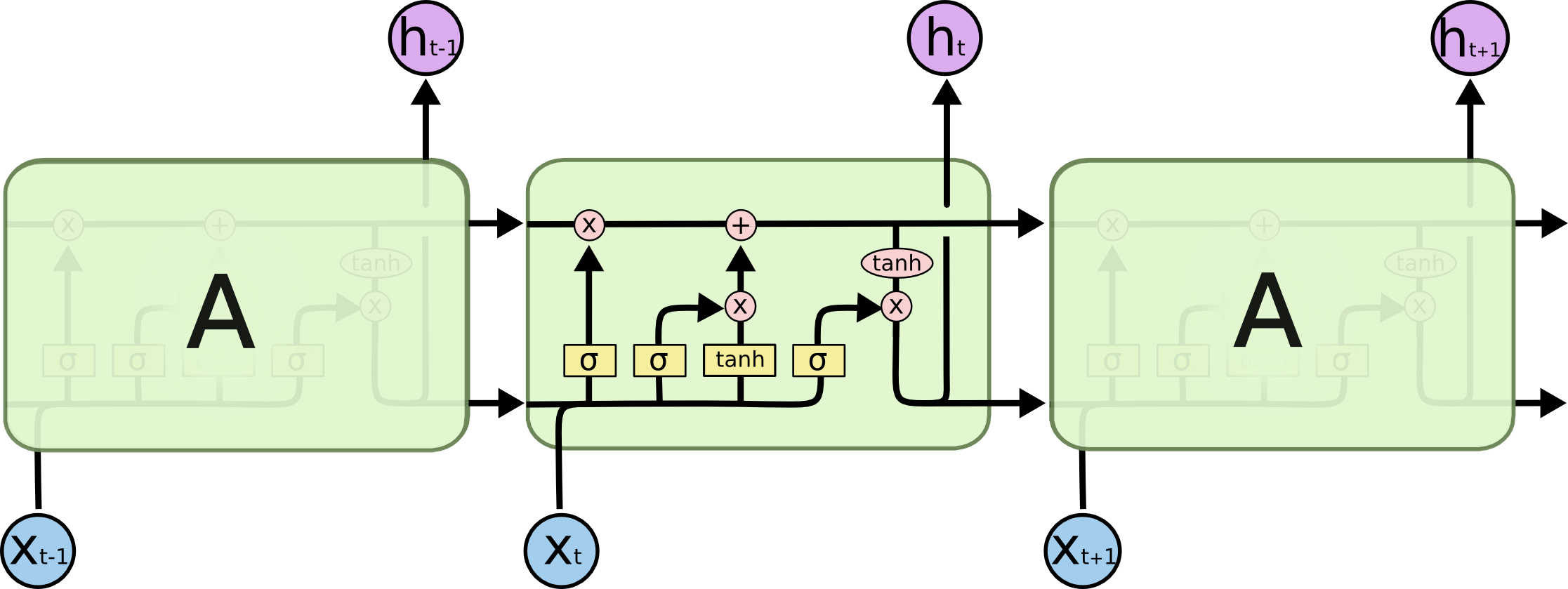
来源:Understanding LSTM Networks
LSTM 模型在预测具有自相关性(时间序列和滞后项之间存在相关性)的时间序列时非常有用,因为模型能够保持状态并识别时间序列上的模式。在每次处理过程中,递归架构能使状态在更新权重时保持或者传递下去。此外,LSTM 模型的单元架构在短期持久化的基础上实现了长期持久化,进而强化了 RNN,这一点非常吸引人!
在 Keras 中,LSTM 模型可以有“状态”模式,Keras 文档中这样解释:
索引 i 处每个样本的最后状态将被用作下一次批处理中索引 i 处样本的初始状态
在正常(或“无状态”)模式下,Keras 对样本重新洗牌,时间序列与其滞后项之间的依赖关系丢失。但是,在“状态”模式下运行时,我们通常可以通过利用时间序列中存在的自相关性来获得高质量的预测结果。
在完成本教程时,我们会进一步解释。就目前而言,可以认为 LSTM 模型对涉及自相关性的时间序列问题可能非常有用,而且 Keras 有能力创建完美的时间序列建模工具——状态 LSTM 模型。
太阳黑子数据集
太阳黑子是随 R 发布的著名数据集(参见 datasets 包)。数据集跟踪记录太阳黑子,即太阳表面出现黑点的事件。这是来自 NASA 的一张照片,显示了太阳黑子现象。相当酷!

来源:NASA
本教程所用的数据集称为 sunspots.month,包含了 265(1749 ~ 2013)年间每月太阳黑子数量的月度数据。
构建 LSTM 模型预测太阳黑子
让我们开动起来,预测太阳黑子。这是我们的目标:
目标:使用 LSTM 模型预测未来 10 年的太阳黑子数量。
1 若干相关包
以下是本教程所需的包,所有这些包都可以在 CRAN 上找到。如果你尚未安装这些包,可以使用 install.packages() 进行安装。注意:在继续使用此代码教程之前,请确保更新所有包,因为这些包的先前版本可能与所用代码不兼容。
# Core Tidyverse
library(tidyverse)
library(glue)
library(forcats)

# Time Series
library(timetk)
library(tidyquant)
library(tibbletime)

# Visualization
library(cowplot)

# Preprocessing
library(recipes)

# Sampling / Accuracy
library(rsample)
library(yardstick)

# Modeling
library(keras)
如果你之前没有在 R 中运行过 Keras,你需要用 install_keras() 函数安装 Keras。
# Install Keras if you have not installed before
install_keras()
2 数据
数据集 sunspot.month 随 R 一起发布,可以轻易获得。它是一个 ts 类对象(非 tidy 类),所以我们将使用 timetk 中的 tk_tbl() 函数转换为 tidy 数据集。我们使用这个函数而不是来自 tibble 的 as.tibble(),用来自动将时间序列索引保存为zoo yearmon 索引。最后,我们将使用 lubridate::as_date()(使用 tidyquant 时加载)将 zoo 索引转换为日期,然后转换为 tbl_time 对象以使时间序列操作起来更容易。
sun_spots <- datasets::sunspot.month %>%
    tk_tbl() %>%
    mutate(index = as_date(index)) %>%
    as_tbl_time(index = index)

sun_spots
## # A time tibble: 3,177 x 2
## # Index: index
##    index      value
##    <date>     <dbl>
##  1 1749-01-01  58.0
##  2 1749-02-01  62.6
##  3 1749-03-01  70.0
##  4 1749-04-01  55.7
##  5 1749-05-01  85.0
##  6 1749-06-01  83.5
##  7 1749-07-01  94.8
##  8 1749-08-01  66.3
##  9 1749-09-01  75.9
## 10 1749-10-01  75.5
## # ... with 3,167 more rows
3 探索性数据分析
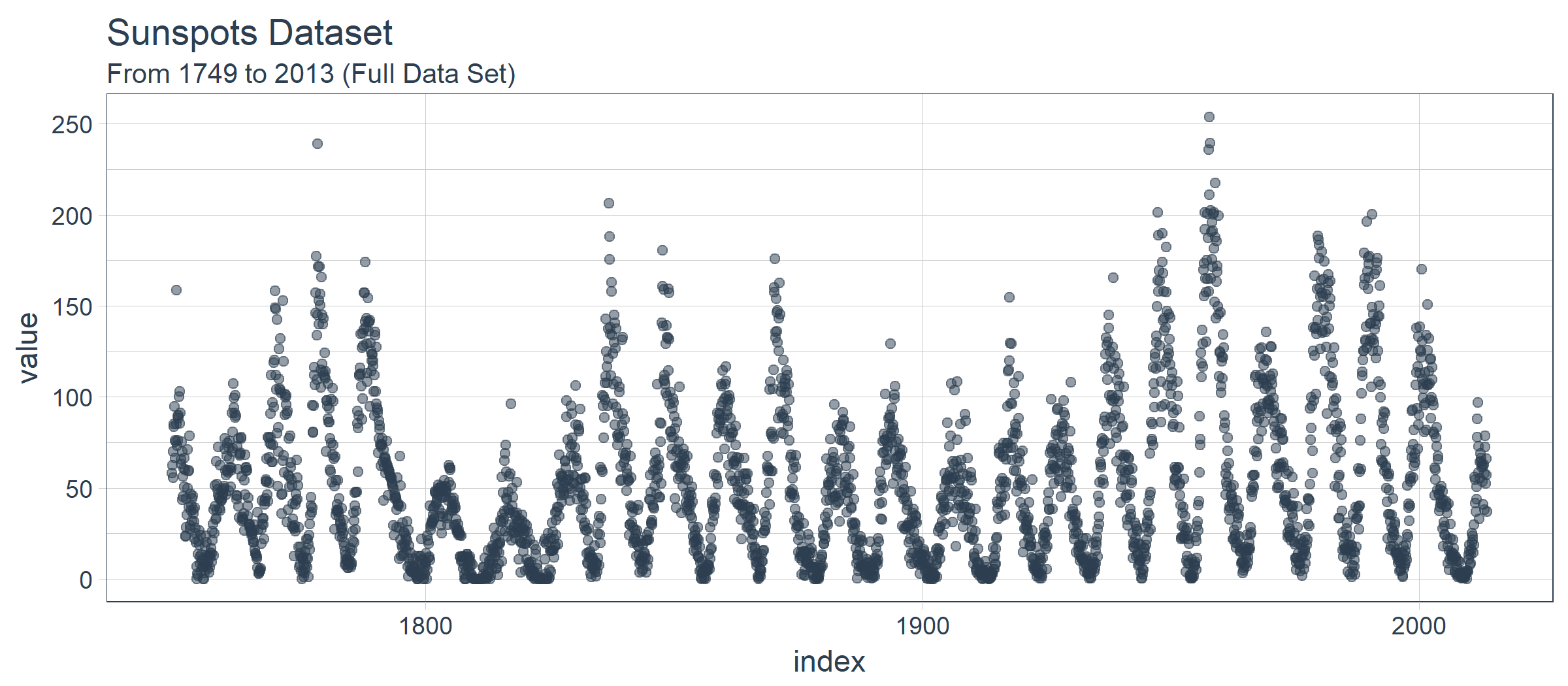
时间序列很长(有 265 年!)。我们可以将时间序列的全部(265 年)以及前 50 年的数据可视化,以获得该时间系列的直观感受。
3.1 使用 COWPLOT 可视化太阳黑子数据
我们将创建若干 ggplot 对象并借助 cowplot::plot_grid() 把这些对象组合起来。对于需要缩放的部分,我们使用 tibbletime::time_filter(),可以方便的实现基于时间的过滤。
p1 <- sun_spots %>%
    ggplot(aes(index, value)) +
    geom_point(
        color = palette_light()[[1]], alpha = 0.5) +
    theme_tq() +
    labs(title = "From 1749 to 2013 (Full Data Set)")

p2 <- sun_spots %>%
    filter_time("start" ~ "1800") %>%
    ggplot(aes(index, value)) +
    geom_line(color = palette_light()[[1]], alpha = 0.5) +
    geom_point(color = palette_light()[[1]]) +
    geom_smooth(method = "loess", span = 0.2, se = FALSE) +
    theme_tq() +
    labs(
        title = "1749 to 1800 (Zoomed In To Show Cycle)",
        caption = "datasets::sunspot.month")

p_title <- ggdraw() +
    draw_label(
        "Sunspots",
        size = 18,
        fontface = "bold",
        colour = palette_light()[[1]])

plot_grid(
    p_title, p1, p2,
    ncol = 1,
    rel_heights = c(0.1, 1, 1))
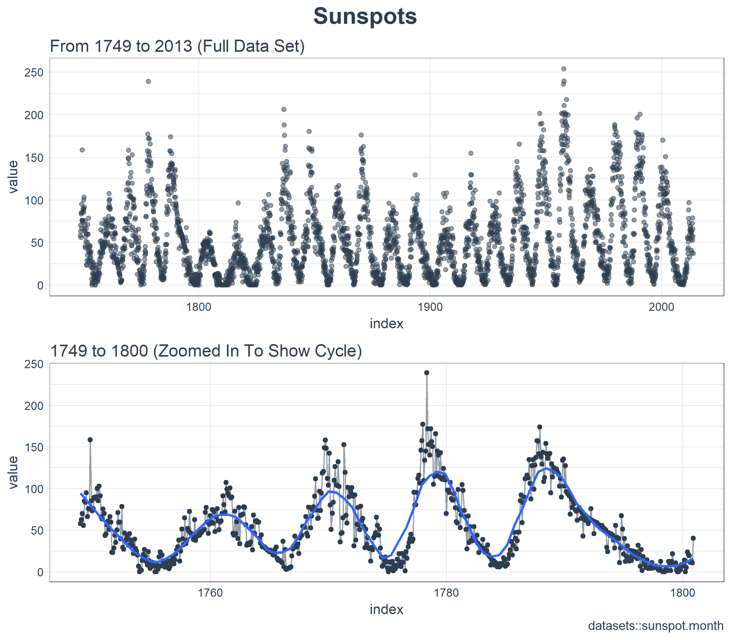
乍一看,这个时间序列应该很容易预测。但是,我们可以看到,周期(10 年)和振幅(太阳黑子的数量)似乎在 1780 年至 1800 年之间发生变化。这产生了一些挑战。
3.2 计算 ACF
接下来我们要做的是确定 LSTM 模型是否是一个适用的好方法。LSTM 模型利用自相关性产生序列预测。我们的目标是使用批量预测(一种在整个预测区域内创建单一预测批次的技术,不同于在未来一个或多个步骤中迭代执行的单一预测)产生未来 10 年的预测。批量预测只有在自相关性持续 10 年以上时才有效。下面,我们来检查一下。
首先,我们需要回顾自相关函数(Autocorrelation Function,ACF),它表示时间序列与自身滞后项之间的相关性。stats 包库中的 acf() 函数以曲线的形式返回每个滞后阶数的 ACF 值。但是,我们希望将 ACF 值提取出来以便研究。为此,我们将创建一个自定义函数 tidy_acf(),以 tidy tibble 的形式返回 ACF 值。
tidy_acf <- function(data,
                     value,
                     lags = 0:20) {

    value_expr <- enquo(value)

    acf_values <- data %>%
        pull(value) %>%
        acf(lag.max = tail(lags, 1), plot = FALSE) %>%
        .$acf %>%
        .[,,1]

    ret <- tibble(acf = acf_values) %>%
        rowid_to_column(var = "lag") %>%
        mutate(lag = lag - 1) %>%
        filter(lag %in% lags)

    return(ret)
}
接下来,让我们测试一下这个函数以确保它按预期工作。该函数使用我们的 tidy 时间序列,提取数值列,并以 tibble 的形式返回 ACF 值以及对应的滞后阶数。我们有 601 个自相关系数(一个对应时间序列自身,剩下的对应 600 个滞后阶数)。一切看起来不错。
max_lag <- 12 * 50

sun_spots %>%
    tidy_acf(value, lags = 0:max_lag)
## # A tibble: 601 x 2
##      lag   acf
##    <dbl> <dbl>
##  1    0. 1.00
##  2    1. 0.923
##  3    2. 0.893
##  4    3. 0.878
##  5    4. 0.867
##  6    5. 0.853
##  7    6. 0.840
##  8    7. 0.822
##  9    8. 0.809
## 10    9. 0.799
## # ... with 591 more rows
下面借助 ggplot2 包把 ACF 数据可视化,以便确定 10 年后是否存在高自相关滞后项。
sun_spots %>%
    tidy_acf(value, lags = 0:max_lag) %>%
    ggplot(aes(lag, acf)) +
    geom_segment(
        aes(xend = lag, yend = 0),
        color = palette_light()[[1]]) +
    geom_vline(
        xintercept = 120, size = 3,
        color = palette_light()[[2]]) +
    annotate(
        "text", label = "10 Year Mark",
        x = 130, y = 0.8,
        color = palette_light()[[2]],
        size = 6, hjust = 0) +
    theme_tq() +
    labs(title = "ACF: Sunspots")
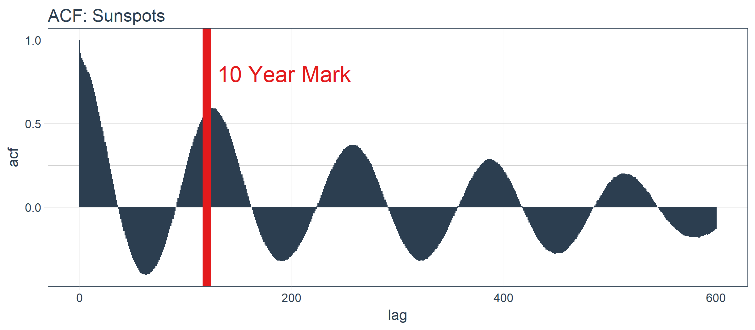
好消息。自相关系数在 120 阶(10年标志)之后依然超过 0.5。理论上,我们可以使用高自相关滞后项来开发 LSTM 模型。
sun_spots %>%
    tidy_acf(value, lags = 115:135) %>%
    ggplot(aes(lag, acf)) +
    geom_vline(
        xintercept = 120, size = 3,
        color = palette_light()[[2]]) +
    geom_segment(
        aes(xend = lag, yend = 0),
        color = palette_light()[[1]]) +
    geom_point(
        color = palette_light()[[1]],
        size = 2) +
    geom_label(
        aes(label = acf %>% round(2)),
        vjust = -1,
        color = palette_light()[[1]]) +
    annotate(
        "text", label = "10 Year Mark",
        x = 121, y = 0.8,
        color = palette_light()[[2]],
        size = 5, hjust = 0) +
    theme_tq() +
    labs(
        title = "ACF: Sunspots",
        subtitle = "Zoomed in on Lags 115 to 135")
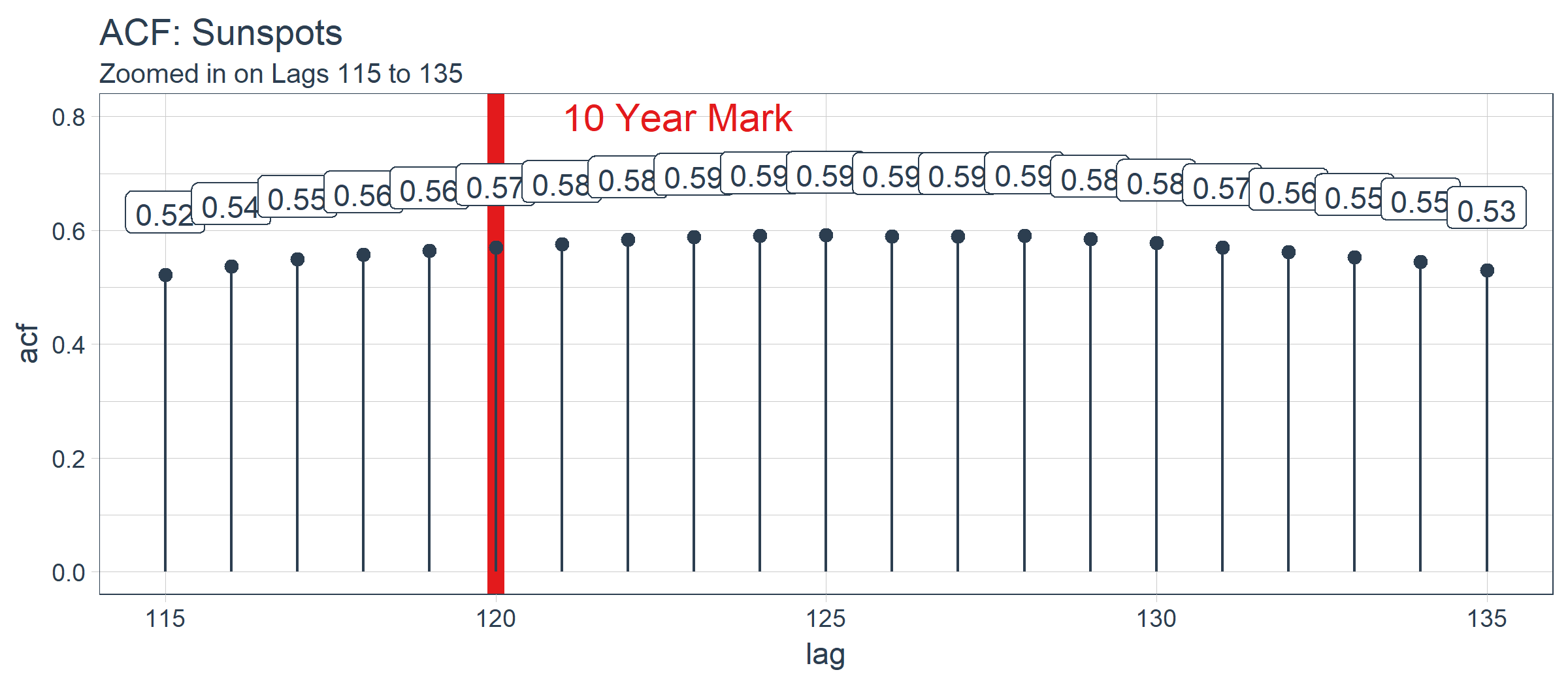
经过检查,最优滞后阶数位于在 125 阶。这不一定是我们将使用的,因为我们要更多地考虑使用 Keras 实现的 LSTM 模型进行批量预测。有了这个观点,以下是如何 filter() 获得最优滞后阶数。
optimal_lag_setting <- sun_spots %>%
    tidy_acf(value, lags = 115:135) %>%
    filter(acf == max(acf)) %>%
    pull(lag)

optimal_lag_setting
## [1] 125
4 回测:时间序列交叉验证
交叉验证是在子样本数据上针对验证集数据开发模型的过程,其目标是确定预期的准确度级别和误差范围。在交叉验证方面,时间序列与非序列数据有点不同。具体而言,在制定抽样计划时,必须保留对以前时间样本的时间依赖性。我们可以通过平移窗口的方式选择连续子样本,进而创建交叉验证抽样计划。在金融领域,这种类型的分析通常被称为“回测”,它需要在一个时间序列上平移若干窗口来分割成多个不间断的序列,以在当前和过去的观测上测试策略。
最近的一个发展是 rsample 包,它使交叉验证抽样计划非常易于实施。此外,rsample 包还包含回测功能。“Time Series Analysis Example”描述了一个使用 rolling_origin() 函数为时间序列交叉验证创建样本的过程。我们将使用这种方法。
4.1 开发一个回测策略
我们创建的抽样计划使用 50 年(initial = 12 x 50)的数据作为训练集,10 年(assess = 12 x 10)的数据用于测试(验证)集。我们选择 20 年的跳跃跨度(skip = 12 x 20),将样本均匀分布到 11 组中,跨越整个 265 年的太阳黑子历史。最后,我们选择 cumulative = FALSE 来允许平移起始点,这确保了较近期数据上的模型相较那些不太新近的数据没有不公平的优势(使用更多的观测数据)。rolling_origin_resamples 是一个 tibble 型的返回值。
periods_train <- 12 * 50
periods_test  <- 12 * 10
skip_span     <- 12 * 20

rolling_origin_resamples <- rolling_origin(
    sun_spots,
    initial    = periods_train,
    assess     = periods_test,
    cumulative = FALSE,
    skip       = skip_span)

rolling_origin_resamples
## # Rolling origin forecast resampling
## # A tibble: 11 x 2
##    splits       id
##    <list>       <chr>
##  1 <S3: rsplit> Slice01
##  2 <S3: rsplit> Slice02
##  3 <S3: rsplit> Slice03
##  4 <S3: rsplit> Slice04
##  5 <S3: rsplit> Slice05
##  6 <S3: rsplit> Slice06
##  7 <S3: rsplit> Slice07
##  8 <S3: rsplit> Slice08
##  9 <S3: rsplit> Slice09
## 10 <S3: rsplit> Slice10
## 11 <S3: rsplit> Slice11
4.2 可视化回测策略
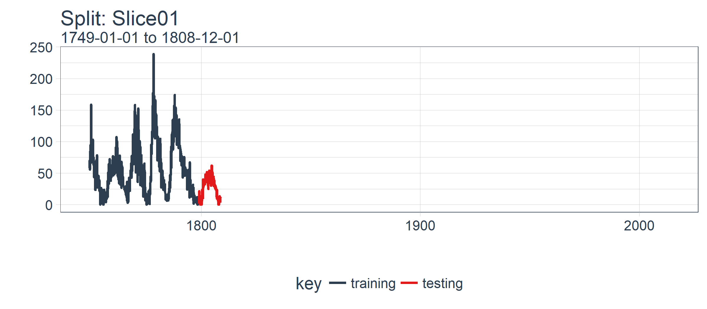
我们可以用两个自定义函数来可视化再抽样。首先是 plot_split(),使用 ggplot2 绘制一个再抽样分割图。请注意,expand_y_axis 参数默认将日期范围扩展成整个 sun_spots 数据集的日期范围。当我们将所有的图形同时可视化时,这将变得有用。
# Plotting function for a single split
plot_split <- function(split,
                       expand_y_axis = TRUE,
                       alpha = 1,
                       size = 1,
                       base_size = 14) {

    # Manipulate data
    train_tbl <- training(split) %>%
        add_column(key = "training")

    test_tbl  <- testing(split) %>%
        add_column(key = "testing")

    data_manipulated <- bind_rows(
        train_tbl, test_tbl) %>%
        as_tbl_time(index = index) %>%
        mutate(
            key = fct_relevel(
                key, "training", "testing"))

    # Collect attributes
    train_time_summary <- train_tbl %>%
        tk_index() %>%
        tk_get_timeseries_summary()

    test_time_summary <- test_tbl %>%
        tk_index() %>%
        tk_get_timeseries_summary()

    # Visualize
    g <- data_manipulated %>%
        ggplot(
            aes(x = index,
                y = value,
                color = key)) +
        geom_line(size = size, alpha = alpha) +
        theme_tq(base_size = base_size) +
        scale_color_tq() +
        labs(
            title    = glue("Split: {split$id}"),
            subtitle = glue(
                "{train_time_summary$start} to {test_time_summary$end}"),
            y = "", x = "") +
        theme(legend.position = "none")

    if (expand_y_axis) {

        sun_spots_time_summary <- sun_spots %>%
            tk_index() %>%
            tk_get_timeseries_summary()

        g <- g +
            scale_x_date(
                limits = c(
                    sun_spots_time_summary$start,
                    sun_spots_time_summary$end))
    }

    return(g)
}
plot_split() 函数接受一个分割(在本例中为 Slice01),并可视化抽样策略。我们使用 expand_y_axis = TRUE 将横坐标范围扩展到整个数据集的日期范围。
rolling_origin_resamples$splits[[1]] %>%
    plot_split(expand_y_axis = TRUE) +
    theme(legend.position = "bottom")
第二个函数是 plot_sampling_plan(),使用 purrr 和 cowplot 将 plot_split() 函数应用到所有样本上。
# Plotting function that scales to all splits
plot_sampling_plan <- function(sampling_tbl,
                               expand_y_axis = TRUE,
                               ncol = 3,
                               alpha = 1,
                               size = 1,
                               base_size = 14,
                               title = "Sampling Plan") {

    # Map plot_split() to sampling_tbl
    sampling_tbl_with_plots <- sampling_tbl %>%
        mutate(
            gg_plots = map(
                splits, plot_split,
                expand_y_axis = expand_y_axis,
                alpha = alpha,
                base_size = base_size))

    # Make plots with cowplot
    plot_list <- sampling_tbl_with_plots$gg_plots

    p_temp <- plot_list[[1]] + theme(legend.position = "bottom")
    legend <- get_legend(p_temp)

    p_body  <- plot_grid(
        plotlist = plot_list, ncol = ncol)

    p_title <- ggdraw() +
        draw_label(
            title,
            size = 18,
            fontface = "bold",
            colour = palette_light()[[1]])

    g <- plot_grid(
        p_title,
        p_body,
        legend,
        ncol = 1,
        rel_heights = c(0.05, 1, 0.05))

    return(g)
}
现在我们可以使用 plot_sampling_plan() 可视化整个回测策略!我们可以看到抽样计划如何平移抽样窗口逐渐切分出训练和测试子样本。
rolling_origin_resamples %>%
    plot_sampling_plan(
        expand_y_axis = T,
        ncol = 3, alpha = 1,
        size = 1, base_size = 10,
        title = "Backtesting Strategy: Rolling Origin Sampling Plan")

此外,我们可以让 expand_y_axis = FALSE,对每个样本进行缩放。
rolling_origin_resamples %>%
    plot_sampling_plan(
        expand_y_axis = F,
        ncol = 3, alpha = 1,
        size = 1, base_size = 10,
        title = "Backtesting Strategy: Zoomed In")
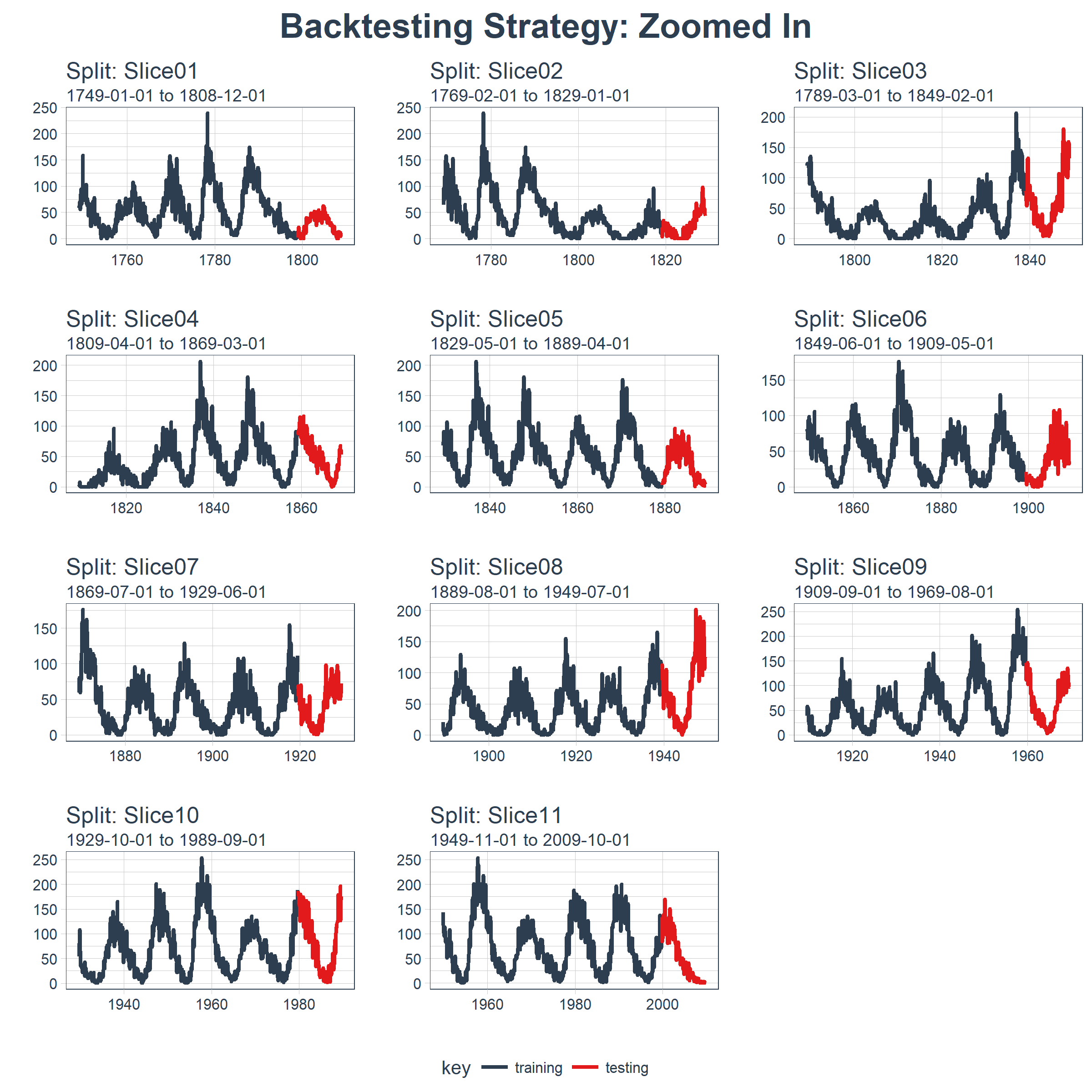
当在太阳黑子数据集上测试 LSTM 模型准确性时,我们将使用这种回测策略(来自一个时间序列的 11 个样本,每个时间序列分为 50/10 两部分,并且样本之间有 20 年的偏移)。
5 用 Keras 构建状态 LSTM 模型
首先,我们将在回测策略的某个样本上用 Keras 开发一个状态 LSTM 模型。然后,我们将模型套用到所有样本,以测试和验证模型性能。
5.1 单个 LSTM 模型
对单个 LSTM 模型,我们选择并可视化最近一期的分割样本(Slice11),这一样本包含了最新的数据。
split    <- rolling_origin_resamples$splits[[11]]
split_id <- rolling_origin_resamples$id[[11]]
5.1.1 可视化该分割样本
我么可以用 plot_split() 函数可视化该分割,设定 expand_y_axis = FALSE 以便将横坐标缩放到样本本身的范围。
plot_split(
    split,
    expand_y_axis = FALSE,
    size = 0.5) +
    theme(legend.position = "bottom") +
    ggtitle(glue("Split: {split_id}"))

5.1.2 数据准备
首先,我们将训练和测试数据集合成一个数据集,并使用列 key 来标记它们来自哪个集合(training 或 testing)。请注意,tbl_time 对象需要在调用 bind_rows() 时重新指定索引,但是这个问题应该很快在 dplyr 包中得到纠正。
df_trn <- training(split)
df_tst <- testing(split)

df <- bind_rows(
    df_trn %>% add_column(key = "training"),
    df_tst %>% add_column(key = "testing")) %>%
    as_tbl_time(index = index)

df
## # A time tibble: 720 x 3
## # Index: index
##    index      value key
##    <date>     <dbl> <chr>
##  1 1949-11-01 144.  training
##  2 1949-12-01 118.  training
##  3 1950-01-01 102.  training
##  4 1950-02-01  94.8 training
##  5 1950-03-01 110.  training
##  6 1950-04-01 113.  training
##  7 1950-05-01 106.  training
##  8 1950-06-01  83.6 training
##  9 1950-07-01  91.0 training
## 10 1950-08-01  85.2 training
## # ... with 710 more rows
5.1.3 用 recipe 做数据预处理
LSTM 算法要求输入数据经过中心化并标度化。我们可以使用 recipe 包预处理数据。我们用 step_sqrt 来转换数据以减少异常值的影响,再结合 step_center 和 step_scale 对数据进行中心化和标度化。最后,数据使用 bake() 函数实现处理转换。
rec_obj <- recipe(value ~ ., df) %>%
    step_sqrt(value) %>%
    step_center(value) %>%
    step_scale(value) %>%
    prep()

df_processed_tbl <- bake(rec_obj, df)

df_processed_tbl
## # A tibble: 720 x 3
##    index      value key
##    <date>     <dbl> <fct>
##  1 1949-11-01 1.25  training
##  2 1949-12-01 0.929 training
##  3 1950-01-01 0.714 training
##  4 1950-02-01 0.617 training
##  5 1950-03-01 0.825 training
##  6 1950-04-01 0.874 training
##  7 1950-05-01 0.777 training
##  8 1950-06-01 0.450 training
##  9 1950-07-01 0.561 training
## 10 1950-08-01 0.474 training
## # ... with 710 more rows
接着,记录中心化和标度化的信息,以便在建模完成之后可以将数据逆向转换回去。平方根转换可以通过乘方运算逆转回去,但要在逆转中心化和标度化之后。
center_history <- rec_obj$steps[[2]]$means["value"]
scale_history  <- rec_obj$steps[[3]]$sds["value"]

c("center" = center_history, "scale" = scale_history)
## center.value  scale.value
##     7.549526     3.545561
5.1.4 规划 LSTM 模型
我们需要规划下如何构建 LSTM 模型。首先,了解几个 LSTM 模型的专业术语:
张量格式(Tensor Format):
- 预测变量(X)必须是一个 3 维数组,维度分别是:
samples、timesteps和features。第一维代表变量的长度;第二维是时间步(滞后阶数);第三维是预测变量的个数(1 表示单变量,n 表示多变量) - 输出或目标变量(y)必须是一个 2 维数组,维度分别是:
samples和timesteps。第一维代表变量的长度;第二维是时间步(之后阶数)
训练与测试:
- 训练与测试的长度必须是可分的(训练集长度除以测试集长度必须是一个整数)
批量大小(Batch Size):
- 批量大小是在 RNN 权重更新之前一次前向 / 后向传播过程中训练样本的数量
- 批量大小关于训练集和测试集长度必须是可分的(训练集长度除以批量大小,以及测试集长度除以批量大小必须是一个整数)
时间步(Time Steps):
- 时间步是训练集与测试集中的滞后阶数
- 我们的例子中滞后 1 阶
周期(Epochs):
- 周期是前向 / 后向传播迭代的总次数
- 通常情况下周期越多,模型表现越好,直到验证集上的精确度或损失不再增加,这时便出现过度拟合
考虑到这一点,我们可以提出一个计划。我们将预测窗口或测试集的长度定在 120 个月(10年)。最优相关性发生在 125 阶,但这并不能被预测范围整除。我们可以增加预测范围,但是这仅提供了自相关性的最小幅度增加。我们选择批量大小为 40,它可以整除测试集和训练集的观察个数。我们选择时间步等于 1,这是因为我们只使用 1 阶滞后(只向前预测一步)。最后,我们设置 epochs = 300,但这需要调整以平衡偏差与方差。
# Model inputs
lag_setting  <- 120 # = nrow(df_tst)
batch_size   <- 40
train_length <- 440
tsteps       <- 1
epochs       <- 300
5.1.5 2 维与 3 维的训练、测试数组
下面将训练集和测试集数据转换成合适的形式(数组)。记住,LSTM 模型要求预测变量(X)是 3 维的,输出或目标变量(y)是 2 维的。
# Training Set
lag_train_tbl <- df_processed_tbl %>%
    mutate(value_lag = lag(value, n = lag_setting)) %>%
    filter(!is.na(value_lag)) %>%
    filter(key == "training") %>%
    tail(train_length)

x_train_vec <- lag_train_tbl$value_lag
x_train_arr <- array(
    data = x_train_vec, dim = c(length(x_train_vec), 1, 1))

y_train_vec <- lag_train_tbl$value
y_train_arr <- array(
    data = y_train_vec, dim = c(length(y_train_vec), 1))

# Testing Set
lag_test_tbl <- df_processed_tbl %>%
    mutate(
        value_lag = lag(
            value, n = lag_setting)) %>%
    filter(!is.na(value_lag)) %>%
    filter(key == "testing")

x_test_vec <- lag_test_tbl$value_lag
x_test_arr <- array(
    data = x_test_vec,
    dim = c(length(x_test_vec), 1, 1))

y_test_vec <- lag_test_tbl$value
y_test_arr <- array(
    data = y_test_vec,
    dim = c(length(y_test_vec), 1))
5.1.6 构建 LSTM 模型
我们可以使用 keras_model_sequential() 构建 LSTM 模型,并像堆砖块一样堆叠神经网络层。我们将使用两个 LSTM 层,每层都设定 units = 50。第一个 LSTM 层接收所需的输入形状,即[时间步,特征数量]。批量大小就是我们的批量大小。我们将第一层设置为 return_sequences = TRUE 和 stateful = TRUE。第二层和前面相同,除了 batch_size(batch_size 只需要在第一层中指定),另外 return_sequences = FALSE 不返回时间戳维度(从第一个 LSTM 层返回 2 维数组,而不是 3 维)。我们使用 layer_dense(units = 1),这是 Keras 序列模型的标准结尾。最后,我们在 compile() 中使用 loss ="mae" 以及流行的 optimizer = "adam"。
model <- keras_model_sequential()

model %>%
    layer_lstm(
        units            = 50,
        input_shape      = c(tsteps, 1),
        batch_size       = batch_size,
        return_sequences = TRUE,
        stateful         = TRUE) %>%
    layer_lstm(
        units            = 50,
        return_sequences = FALSE,
        stateful         = TRUE) %>%
    layer_dense(units = 1)

model %>%
    compile(loss = 'mae', optimizer = 'adam')

model
## Model
## ______________________________________________________________________
## Layer (type)                   Output Shape                Param #
## ======================================================================
## lstm_1 (LSTM)                  (40, 1, 50)                 10400
## ______________________________________________________________________
## lstm_2 (LSTM)                  (40, 50)                    20200
## ______________________________________________________________________
## dense_1 (Dense)                (40, 1)                     51
## ======================================================================
## Total params: 30,651
## Trainable params: 30,651
## Non-trainable params: 0
## ______________________________________________________________________
5.1.7 拟合 LSTM 模型
下一步,我们使用一个 for 循环拟合状态 LSTM 模型(需要手动重置状态)。有 300 个周期要循环,运行需要一点时间。我们设置 shuffle = FALSE 来保存序列,并且我们使用 reset_states() 在每个循环后手动重置状态。
for (i in 1:epochs) {
    model %>%
    	fit(x          = x_train_arr,
            y          = y_train_arr,
            batch_size = batch_size,
            epochs     = 1,
            verbose    = 1,
            shuffle    = FALSE)

    model %>% reset_states()
    cat("Epoch: ", i)
}
5.1.8 使用 LSTM 模型预测
然后,我们可以使用 predict() 函数对测试集 x_test_arr 进行预测。我们可以使用之前保存的 scale_history 和 center_history 转换得到的预测,然后对结果进行平方。最后,我们使用 reduce() 和自定义的 time_bind_rows() 函数将预测与一列原始数据结合起来。
# Make Predictions
pred_out <- model %>%
    predict(x_test_arr, batch_size = batch_size) %>%
    .[,1]

# Retransform values
pred_tbl <- tibble(
    index   = lag_test_tbl$index,
    value   = (pred_out * scale_history + center_history)^2)

# Combine actual data with predictions
tbl_1 <- df_trn %>%
    add_column(key = "actual")

tbl_2 <- df_tst %>%
    add_column(key = "actual")

tbl_3 <- pred_tbl %>%
    add_column(key = "predict")

# Create time_bind_rows() to solve dplyr issue
time_bind_rows <- function(data_1,
                           data_2, index) {
    index_expr <- enquo(index)
    bind_rows(data_1, data_2) %>%
        as_tbl_time(index = !! index_expr)
}

ret <- list(tbl_1, tbl_2, tbl_3) %>%
    reduce(time_bind_rows, index = index) %>%
    arrange(key, index) %>%
    mutate(key = as_factor(key))

ret
## # A time tibble: 840 x 3
## # Index: index
##    index      value key
##    <date>     <dbl> <fct>
##  1 1949-11-01 144.  actual
##  2 1949-12-01 118.  actual
##  3 1950-01-01 102.  actual
##  4 1950-02-01  94.8 actual
##  5 1950-03-01 110.  actual
##  6 1950-04-01 113.  actual
##  7 1950-05-01 106.  actual
##  8 1950-06-01  83.6 actual
##  9 1950-07-01  91.0 actual
## 10 1950-08-01  85.2 actual
## # ... with 830 more rows
5.1.9 评估单个分割样本上 LSTM 模型的表现
我们使用 yardstick 包里的 rmse() 函数评估表现,rmse() 返回均方误差平方根(RMSE)。我们的数据以“长”格式的形式存在(使用 ggplot2 可视化的最佳格式),所以需要创建一个包装器函数 my_calc_rmse() 对数据做预处理,以适应 yardstick::rmse() 的要求。
calc_rmse <- function(prediction_tbl) {

    rmse_calculation <- function(data) {
        data %>%
            spread(key = key, value = value) %>%
            select(-index) %>%
            filter(!is.na(predict)) %>%
            rename(
                truth    = actual,
                estimate = predict) %>%
            rmse(truth, estimate)
    }

    safe_rmse <- possibly(
        rmse_calculation, otherwise = NA)

    safe_rmse(prediction_tbl)
}

my_calc_rmse <- function(x)
{
  t <- calc_rmse(x)

  return(t$.estimate)
}
我们计算模型的 RMSE。
# calc_rmse(ret)
my_calc_rmse(ret)
## [1] 31.81798
RMSE 提供的信息有限,我们需要可视化。注意:当我们扩展到回测策略中的所有样本时,RMSE 将在确定预期误差时派上用场。
5.1.10 可视化一步预测
下一步,我们创建一个绘图函数——plot_prediction(),借助 ggplot2 可视化单一样本上的结果。
# Setup single plot function
plot_prediction <- function(data,
                            id,
                            alpha = 1,
                            size = 2,
                            base_size = 14) {

    # rmse_val <- calc_rmse(data)
    rmse_val <- my_calc_rmse(data)

    g <- data %>%
        ggplot(aes(index, value, color = key)) +
        geom_point(alpha = alpha, size = size) +
        theme_tq(base_size = base_size) +
        scale_color_tq() +
        theme(legend.position = "none") +
        labs(
            title = glue(
                "{id}, RMSE: {round(rmse_val, digits = 1)}"),
            x = "", y = "")

    return(g)
}
我们设置 id = split_id,在 Slice11 上测试函数。
ret %>%
    plot_prediction(id = split_id, alpha = 0.65) +
    theme(legend.position = "bottom")
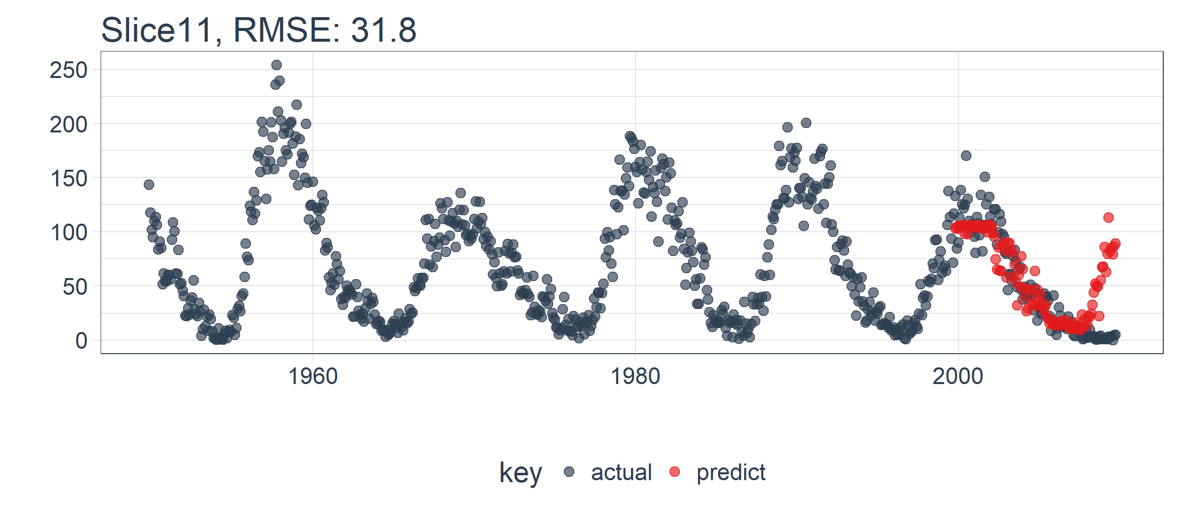
LSTM 模型表现相对较好! 我们选择的设置似乎产生了一个不错的模型,可以捕捉到数据中的趋势。预测在下一个上升趋势前抢跑了,但总体上好过了我的预期。现在,我们需要通过回测来查看随着时间推移的真实表现!
5.2 在 11 个样本上回测 LSTM 模型
一旦我们有了能在一个样本上工作的 LSTM 模型,扩展到全部 11 个样本上就相对简单。我们只需创建一个预测函数,再套用到 rolling_origin_resamples 中抽样计划包含的数据上。
5.2.1 构建一个 LSTM 预测函数
这一步看起来很吓人,但实际上很简单。我们将 5.1 节的代码复制到一个函数中。我们将它作为一个安全函数,对于任何长时间运行的函数来说,这是一个很好的做法,可以防止单个故障停止整个过程。
predict_keras_lstm <- function(split,
                               epochs = 300,
                               ...) {

    lstm_prediction <- function(split,
                                epochs,
                                ...) {

        # 5.1.2 Data Setup
        df_trn <- training(split)
        df_tst <- testing(split)

        df <- bind_rows(
            df_trn %>% add_column(key = "training"),
            df_tst %>% add_column(key = "testing")) %>%
            as_tbl_time(index = index)

        # 5.1.3 Preprocessing
        rec_obj <- recipe(value ~ ., df) %>%
            step_sqrt(value) %>%
            step_center(value) %>%
            step_scale(value) %>%
            prep()

        df_processed_tbl <- bake(rec_obj, df)

        center_history <- rec_obj$steps[[2]]$means["value"]
        scale_history  <- rec_obj$steps[[3]]$sds["value"]

        # 5.1.4 LSTM Plan
        lag_setting  <- 120 # = nrow(df_tst)
        batch_size   <- 40
        train_length <- 440
        tsteps       <- 1
        epochs       <- epochs

        # 5.1.5 Train/Test Setup
        lag_train_tbl <- df_processed_tbl %>%
            mutate(
                value_lag = lag(value, n = lag_setting)) %>%
            filter(!is.na(value_lag)) %>%
            filter(key == "training") %>%
            tail(train_length)

        x_train_vec <- lag_train_tbl$value_lag
        x_train_arr <- array(
            data = x_train_vec, dim = c(length(x_train_vec), 1, 1))

        y_train_vec <- lag_train_tbl$value
        y_train_arr <- array(
            data = y_train_vec, dim = c(length(y_train_vec), 1))

        lag_test_tbl <- df_processed_tbl %>%
            mutate(
                value_lag = lag(value, n = lag_setting)) %>%
            filter(!is.na(value_lag)) %>%
            filter(key == "testing")

        x_test_vec <- lag_test_tbl$value_lag
        x_test_arr <- array(
            data = x_test_vec, dim = c(length(x_test_vec), 1, 1))

        y_test_vec <- lag_test_tbl$value
        y_test_arr <- array(
            data = y_test_vec, dim = c(length(y_test_vec), 1))

        # 5.1.6 LSTM Model
        model <- keras_model_sequential()

        model %>%
            layer_lstm(
                units            = 50,
                input_shape      = c(tsteps, 1),
                batch_size       = batch_size,
                return_sequences = TRUE,
                stateful         = TRUE) %>%
            layer_lstm(
                units            = 50,
                return_sequences = FALSE,
                stateful         = TRUE) %>%
            layer_dense(units = 1)

        model %>%
            compile(loss = 'mae', optimizer = 'adam')

        # 5.1.7 Fitting LSTM
        for (i in 1:epochs) {
            model %>%
            	fit(x          = x_train_arr,
                    y          = y_train_arr,
                    batch_size = batch_size,
                    epochs     = 1,
                    verbose    = 1,
                    shuffle    = FALSE)

            model %>% reset_states()
            cat("Epoch: ", i)
        }

        # 5.1.8 Predict and Return Tidy Data
        # Make Predictions
        pred_out <- model %>%
            predict(x_test_arr, batch_size = batch_size) %>%
            .[,1]

        # Retransform values
        pred_tbl <- tibble(
            index = lag_test_tbl$index,
            value = (pred_out * scale_history + center_history)^2)

        # Combine actual data with predictions
        tbl_1 <- df_trn %>%
            add_column(key = "actual")

        tbl_2 <- df_tst %>%
            add_column(key = "actual")

        tbl_3 <- pred_tbl %>%
            add_column(key = "predict")

        # Create time_bind_rows() to solve dplyr issue
        time_bind_rows <- function(data_1, data_2, index) {
            index_expr <- enquo(index)
            bind_rows(data_1, data_2) %>%
                as_tbl_time(index = !! index_expr)
        }

        ret <- list(tbl_1, tbl_2, tbl_3) %>%
            reduce(time_bind_rows, index = index) %>%
            arrange(key, index) %>%
            mutate(key = as_factor(key))

        return(ret)
    }

    safe_lstm <- possibly(lstm_prediction, otherwise = NA)

    safe_lstm(split, epochs, ...)

}
我们测试下 predict_keras_lstm() 函数,设置 epochs = 10。返回的数据为长格式,在 key 列中标记有 actual 和 predict。
predict_keras_lstm(split, epochs = 10)
## # A time tibble: 840 x 3
## # Index: index
##    index      value key
##    <date>     <dbl> <fct>
##  1 1949-11-01 144.  actual
##  2 1949-12-01 118.  actual
##  3 1950-01-01 102.  actual
##  4 1950-02-01  94.8 actual
##  5 1950-03-01 110.  actual
##  6 1950-04-01 113.  actual
##  7 1950-05-01 106.  actual
##  8 1950-06-01  83.6 actual
##  9 1950-07-01  91.0 actual
## 10 1950-08-01  85.2 actual
## # ... with 830 more rows
5.2.2 将 LSTM 预测函数应用到 11 个样本上
既然 predict_keras_lstm() 函数可以在一个样本上运行,我们现在可以借助使用 mutate() 和 map() 将函数应用到所有样本上。预测将存储在名为 predict 的列中。注意,这可能需要 5-10 分钟左右才能完成。
sample_predictions_lstm_tbl <- rolling_origin_resamples %>%
     mutate(predict = map(splits, predict_keras_lstm, epochs = 300))
现在,我们得到了 11 个样本的预测,数据存储在列 predict 中。
sample_predictions_lstm_tbl
## # Rolling origin forecast resampling
## # A tibble: 11 x 3
##    splits       id      predict
##  * <list>       <chr>   <list>
##  1 <S3: rsplit> Slice01 <tibble [840 x 3]>
##  2 <S3: rsplit> Slice02 <tibble [840 x 3]>
##  3 <S3: rsplit> Slice03 <tibble [840 x 3]>
##  4 <S3: rsplit> Slice04 <tibble [840 x 3]>
##  5 <S3: rsplit> Slice05 <tibble [840 x 3]>
##  6 <S3: rsplit> Slice06 <tibble [840 x 3]>
##  7 <S3: rsplit> Slice07 <tibble [840 x 3]>
##  8 <S3: rsplit> Slice08 <tibble [840 x 3]>
##  9 <S3: rsplit> Slice09 <tibble [840 x 3]>
## 10 <S3: rsplit> Slice10 <tibble [840 x 3]>
## 11 <S3: rsplit> Slice11 <tibble [840 x 3]>
5.2.3 评估回测表现
通过将 my_calc_rmse() 函数应用到 predict 列上,我们可以得到所有样本的 RMSE。
# sample_rmse_tbl <- sample_predictions_lstm_tbl %>%
# mutate(rmse = map_dbl(predict, calc_rmse)) %>%
# select(id, rmse)
sample_rmse_tbl <- sample_predictions_lstm_tbl %>%
mutate(rmse = map_dbl(predict, my_calc_rmse)) %>%
select(id, rmse)
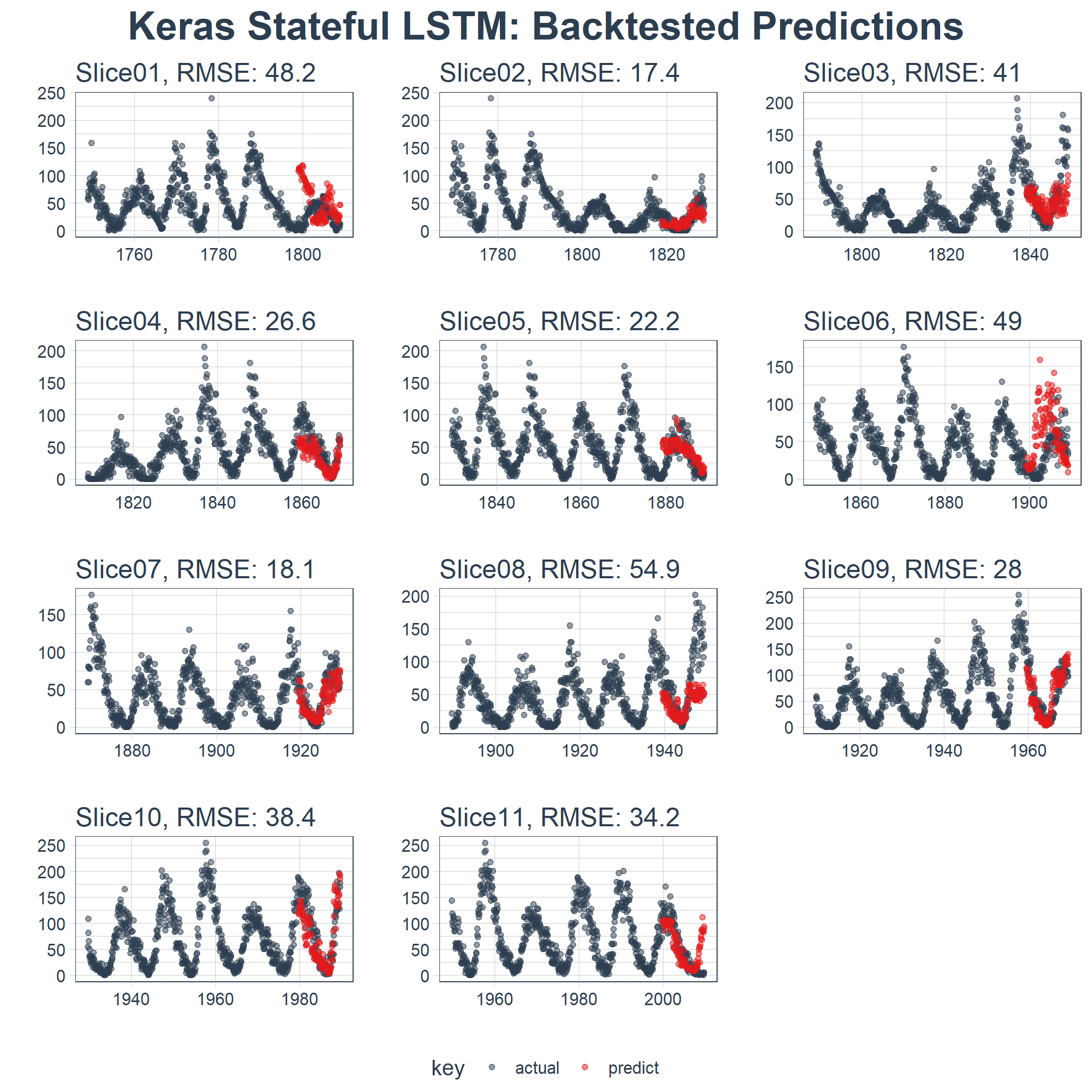
sample_rmse_tbl
## # Rolling origin forecast resampling
## # A tibble: 11 x 2
##    id       rmse
##  * <chr>   <dbl>
##  1 Slice01  48.2
##  2 Slice02  17.4
##  3 Slice03  41.0
##  4 Slice04  26.6
##  5 Slice05  22.2
##  6 Slice06  49.0
##  7 Slice07  18.1
##  8 Slice08  54.9
##  9 Slice09  28.0
## 10 Slice10  38.4
## 11 Slice11  34.2
sample_rmse_tbl %>%
    ggplot(aes(rmse)) +
    geom_histogram(
        aes(y = ..density..),
        fill = palette_light()[[1]], bins = 16) +
    geom_density(
        fill = palette_light()[[1]], alpha = 0.5) +
    theme_tq() +
    ggtitle("Histogram of RMSE")
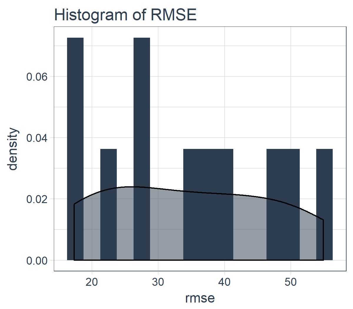
而且,我们可以总结 11 个样本的 RMSE。专业提示:使用 RMSE(或其他类似指标)的平均值和标准差是比较各种模型表现的好方法。
sample_rmse_tbl %>%
    summarize(
        mean_rmse = mean(rmse),
        sd_rmse   = sd(rmse))
## # Rolling origin forecast resampling
## # A tibble: 1 x 2
##   mean_rmse sd_rmse
##       <dbl>   <dbl>
## 1      34.4    13.0
5.2.4 可视化回测的结果
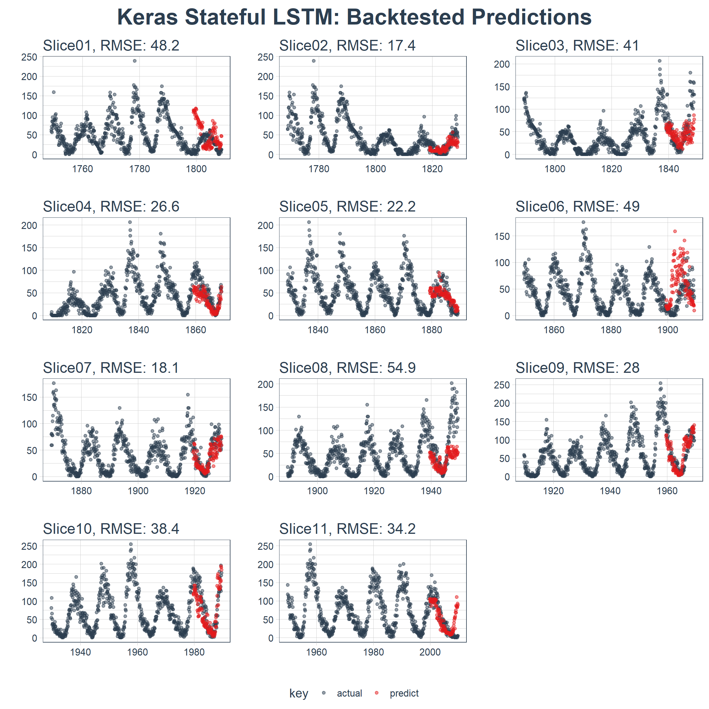
我们可以创建一个 plot_predictions() 函数,把 11 个回测样本的预测结果绘制在一副图上!!!
plot_predictions <- function(sampling_tbl,
                             predictions_col,
                             ncol = 3,
                             alpha = 1,
                             size = 2,
                             base_size = 14,
                             title = "Backtested Predictions") {

    predictions_col_expr <- enquo(predictions_col)

    # Map plot_split() to sampling_tbl
    sampling_tbl_with_plots <- sampling_tbl %>%
        mutate(
            gg_plots = map2(
                !! predictions_col_expr, id,
                .f        = plot_prediction,
                alpha     = alpha,
                size      = size,
                base_size = base_size))

    # Make plots with cowplot
    plot_list <- sampling_tbl_with_plots$gg_plots

    p_temp <- plot_list[[1]] + theme(legend.position = "bottom")
    legend <- get_legend(p_temp)

    p_body  <- plot_grid(plotlist = plot_list, ncol = ncol)


    p_title <- ggdraw() +
        draw_label(
            title,
            size = 18,
            fontface = "bold",
            colour = palette_light()[[1]])

    g <- plot_grid(
        p_title,
        p_body,
        legend,
        ncol = 1,
        rel_heights = c(0.05, 1, 0.05))

    return(g)
}
结果在这里。在一个不容易预测的数据集上,这是相当令人印象深刻的!
sample_predictions_lstm_tbl %>%
    plot_predictions(
        predictions_col = predict,
        alpha = 0.5,
        size = 1,
        base_size = 10,
        title = "Keras Stateful LSTM: Backtested Predictions")
5.3 预测未来 10 年的数据
我们可以通过调整预测函数来使用完整的数据集预测未来 10 年的数据。新函数 predict_keras_lstm_future() 用来预测未来 120 步(或 10 年)的数据。
predict_keras_lstm_future <- function(data,
                                      epochs = 300,
                                      ...) {

    lstm_prediction <- function(data,
                                epochs,
                                ...) {

        # 5.1.2 Data Setup (MODIFIED)
        df <- data

        # 5.1.3 Preprocessing
        rec_obj <- recipe(value ~ ., df) %>%
            step_sqrt(value) %>%
            step_center(value) %>%
            step_scale(value) %>%
            prep()

        df_processed_tbl <- bake(rec_obj, df)

        center_history <- rec_obj$steps[[2]]$means["value"]
        scale_history  <- rec_obj$steps[[3]]$sds["value"]

        # 5.1.4 LSTM Plan
        lag_setting  <- 120 # = nrow(df_tst)
        batch_size   <- 40
        train_length <- 440
        tsteps       <- 1
        epochs       <- epochs

        # 5.1.5 Train Setup (MODIFIED)
        lag_train_tbl <- df_processed_tbl %>%
            mutate(
                value_lag = lag(value, n = lag_setting)) %>%
            filter(!is.na(value_lag)) %>%
            tail(train_length)

        x_train_vec <- lag_train_tbl$value_lag
        x_train_arr <- array(
            data = x_train_vec, dim = c(length(x_train_vec), 1, 1))

        y_train_vec <- lag_train_tbl$value
        y_train_arr <- array(
            data = y_train_vec, dim = c(length(y_train_vec), 1))

        x_test_vec <- y_train_vec %>% tail(lag_setting)
        x_test_arr <- array(
            data = x_test_vec, dim = c(length(x_test_vec), 1, 1))

        # 5.1.6 LSTM Model
        model <- keras_model_sequential()

        model %>%
            layer_lstm(
                units            = 50,
                input_shape      = c(tsteps, 1),
                batch_size       = batch_size,
                return_sequences = TRUE,
                stateful         = TRUE) %>%
            layer_lstm(
                units            = 50,
                return_sequences = FALSE,
                stateful         = TRUE) %>%
            layer_dense(units = 1)

        model %>%
            compile(loss = 'mae', optimizer = 'adam')

        # 5.1.7 Fitting LSTM
        for (i in 1:epochs) {
            model %>%
            	fit(x          = x_train_arr,
                    y          = y_train_arr,
                    batch_size = batch_size,
                    epochs     = 1,
                    verbose    = 1,
                    shuffle    = FALSE)

            model %>% reset_states()
            cat("Epoch: ", i)
        }

        # 5.1.8 Predict and Return Tidy Data (MODIFIED)
        # Make Predictions
        pred_out <- model %>%
            predict(x_test_arr, batch_size = batch_size) %>%
            .[,1]

        # Make future index using tk_make_future_timeseries()
        idx <- data %>%
            tk_index() %>%
            tk_make_future_timeseries(n_future = lag_setting)

        # Retransform values
        pred_tbl <- tibble(
            index   = idx,
            value   = (pred_out * scale_history + center_history)^2)

        # Combine actual data with predictions
        tbl_1 <- df %>%
            add_column(key = "actual")

        tbl_3 <- pred_tbl %>%
            add_column(key = "predict")

        # Create time_bind_rows() to solve dplyr issue
        time_bind_rows <- function(data_1,
                                   data_2,
                                   index) {
            index_expr <- enquo(index)
            bind_rows(data_1, data_2) %>%
                as_tbl_time(index = !! index_expr)
        }

        ret <- list(tbl_1, tbl_3) %>%
            reduce(time_bind_rows, index = index) %>%
            arrange(key, index) %>%
            mutate(key = as_factor(key))

        return(ret)
    }

    safe_lstm <- possibly(lstm_prediction, otherwise = NA)

    safe_lstm(data, epochs, ...)
}
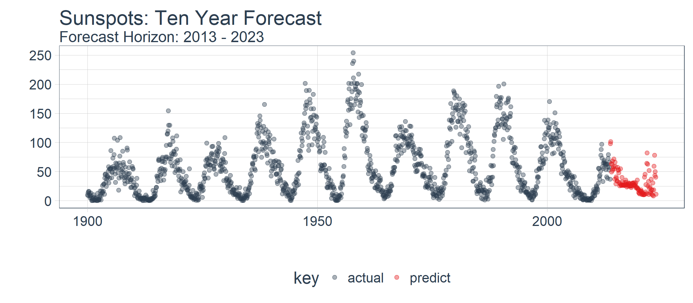
下一步,在 sun_spots 数据集上运行 predict_keras_lstm_future() 函数。
future_sun_spots_tbl <- predict_keras_lstm_future(sun_spots, epochs = 300)
最后,我们使用 plot_prediction() 可视化预测结果,需要设置 id = NULL。我们使用 filter_time() 函数将数据集缩放到 1900 年之后。
future_sun_spots_tbl %>%
    filter_time("1900" ~ "end") %>%
    plot_prediction(
        id = NULL, alpha = 0.4, size = 1.5) +
    theme(legend.position = "bottom") +
    ggtitle(
        "Sunspots: Ten Year Forecast",
        subtitle = "Forecast Horizon: 2013 - 2023")
结论
本文演示了使用 keras 包构建的状态 LSTM 模型的强大功能。令人惊讶的是,提供的唯一特征是滞后 120 阶的历史数据,深度学习方法依然识别出了数据中的趋势。回测模型的 RMSE 均值等于 34,RMSE 标准差等于 13。虽然本文未显示,但我们对比测试[1]了 ARIMA 模型和 prophet 模型(Facebook 开发的时间序列预测模型),LSTM 模型的表现优越:平均误差减少了 30% 以上,标准差减少了 40%。这显示了机器学习工具-应用适合性的好处。
除了使用的深度学习方法之外,文章还揭示了使用 ACF 图确定 LSTM 模型对于给定时间序列是否适用的方法。我们还揭示了时间序列模型的准确性应如何通过回测来进行基准测试,这种策略保持了时间序列的连续性,可用于时间序列数据的交叉验证。

 浙公网安备 33010602011771号