R绘制韦恩图 | Venn图 | UpSetR图
网页版venn图
- 维恩(Venn)图绘制工具大全 (在线+R包)
- 在线数据可视化系列一:维恩图 - 内含推荐指数
发表级venn图
如果对venn图颜值要求较高,强烈推荐venneuler
理由:
- 面积比例代表数量,信息含量更高
- 可以直接与ggplot对接,自定义修改
参考代码:human/singleCell/HSCR/2-HSCR_additional_analysis.ipynb
集群上不好装rJava,所以只能在本地Mac上使用venneuler
2024年04月23日
已经全部解决,rJava和venneuler都可以用conda安装成功!
# step 1: prepare data
length(ctrl.targets)
length(common.target)
length(chip.target)

# best venn by venneuler
# step 2: prepare df
tmp.genes <- unique(c(chip.target, common.target, ctrl.targets))
tmp.df <- data.frame(`Predicted targets`=as.integer(tmp.genes %in% c(ctrl.targets, common.target)),
                     `ChIP-seq_target`=as.integer(tmp.genes %in% c(chip.target, common.target)), row.names = tmp.genes)

y <- venneuler::venneuler(tmp.df)
d <- data.frame(y$centers, diameters = y$diameters, labels = y$labels,
    stringsAsFactors = FALSE)

d$labels <- plyr::mapvalues(d$labels, from = c('ChIP.seq_target','Predicted.targets'),
                                      to = c('ChIP-seq targets','Predicted targets'))
d$labels <- factor(d$labels, levels = c('Predicted targets', 'ChIP-seq targets'))

geom_circle <- rvcheck::get_fun_from_pkg("ggforce", "geom_circle")

options(repr.plot.width=6, repr.plot.height=4)
g2 <- ggplot(d) +
        geom_circle(aes_(x0 = ~x, y0 = ~y, r = ~diameters/2, fill = ~labels, color = ~labels), size=1.5) +
        coord_fixed() +
        theme_void() +
        scale_color_manual(values = c("#E41A1C", "#984EA3")) +
        scale_fill_manual(values = alpha(c("#E41A1C", "#984EA3"), .2)) +
        theme(legend.position = c(0.58, 0.38), legend.title = element_blank(), legend.text = element_text(size = 15))+
        geom_text(x=0.16, y=0.5, label="1493", size=6) +
        geom_text(x=0.54, y=0.5, label="722", size=8, fontface="bold") +
        geom_text(x=0.82, y=0.5, label="543", size=6)
g2

ggsave(filename = "PHOX2B.targets.venn.pdf", width = 6, height = 4)

write.csv(tmp.df, file="PHOX2B.targets.venn.csv")
Venn
解决方案有好几种:
- 网页版,无脑绘图,就是麻烦,没有写代码方便
- 极简版,gplots::venn
- 文艺版,venneuler,不好安装rJava,参见Y叔
- 酷炫版,VennDiagram
特别注意:
目前主流的韦恩图最多只支持5个类别,多了不能使用韦恩图,也不好看。
UpSet某种程度上可以显示多于5个类别,但是结果不是很直观,不推荐,图也很难解读。
library(ComplexHeatmap)
m = make_comb_mat(venn.list)
UpSet(m)
1. 网页版
就不说了,非常简单,直接输入数据就行;
- 2-30 Venn Diagrams (non-proportional) - 常用的web版
- 2-6 Venn Diagrams (non-proportional)
- http://bioinfogp.cnb.csic.es/tools/venny/index.html
- http://genevenn.sourceforge.net/
local
- https://github.com/linguoliang/VennPainter
- https://sysbio.uni-ulm.de/?Software:VennMaster
- http://omics.pnl.gov/software/venn-diagram-plotter
R版的输入都是一种数据结构list,可以单独出来。
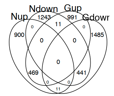
2. 极简版
options(repr.plot.width=4, repr.plot.height=5)
vp <- gplots::venn(list(Nup=names(moduleListN_DEG[["up"]]), Ndown=names(moduleListN_DEG[["down"]]),
                 Gup=names(moduleListG_DEG[["up"]]), Gdown=names(moduleListG_DEG[["down"]])))
获取任意区域的元素
attributes(g)$intersections
3. 还没成功过,需安装rJava,代码如下:
set.seed(2017-11-08)
x <- matrix(sample(0:4, 40, TRUE, c(.5, .1, .1, .1, .1)), ncol=4)
colnames(x) <- LETTERS[1:4]
yyplot::ggvenn(x)
4. VennDiagram
只能保存图为文件(三种可选:tiff, png or svg),非常实用和美观,但是不能做下游美化。
library(VennDiagram)
venn.diagram(list(Nup=names(moduleListN_DEG[["up"]]), Ndown=names(moduleListN_DEG[["down"]]),
                 Gup=names(moduleListG_DEG[["up"]]), Gdown=names(moduleListG_DEG[["down"]])),
             fill=c("red","green","blue","yellow"), alpha=c(0.5,0.5,0.5,0.5),
             imagetype = "tiff", category.names = rep("", 4),
             height = 600, width = 600, resolution = 100,
             cex=2, cat.fontface=4, filename="VennDiagram.tiff")
参考:
R作图 在R中绘制韦恩图的几种方法 和 一些漂亮的venn图
ggplot2版本的维恩图 - Y叔公众号
UpSetR
超过4个类别以上就不推荐使用韦恩图了,非常不直观,此时可以用UpSetR图替代。
https://github.com/hms-dbmi/UpSetR
UpSet: Visualizing Intersecting Sets
教程:
UpSetR的输入数据比较奇特,不是list格式的数据,而是0、1格式的data.frame
第一列是Name(全集);后面每一列都是一个set,如果set里的数据在全集里,那么就是1,不在则是0;
以下是准备输入输入数据的代码:
all.genes <- unique(c(HSCR_5c3.DEG, HSCR_10c2.DEG, HSCR_20c7.DEG, HSCR_23c9.DEG, HSCR_1c11.DEG, HSCR_17c8.DEG))
length(all.genes)

DEG.UpSetR.df <- data.frame(Name=all.genes, `HSCR#5`=as.integer(all.genes %in% HSCR_5c3.DEG),
                                           `HSCR#10`=as.integer(all.genes %in% HSCR_10c2.DEG),
                                           `HSCR#20`=as.integer(all.genes %in% HSCR_20c7.DEG),
                                           `HSCR#23`=as.integer(all.genes %in% HSCR_23c9.DEG),
                                           `HSCR#1`=as.integer(all.genes %in% HSCR_1c11.DEG),
                                           `HSCR#17`=as.integer(all.genes %in% HSCR_17c8.DEG)
                           )
Y叔的经典代码:
require(UpSetR)
movies <- read.csv( system.file("extdata", "movies.csv", package = "UpSetR"), header=T, sep=";" )
p1 <- upset(movies)

# head(movies)

# p1

require(ggplotify)
g1 <- as.ggplot(p1)

library(yyplot)

require(yyplot)
g2 <- ggvenn(movies[, c(3,6,9,15,17)])

require(ggimage)
g3 <- g1 + geom_subview(subview = g2 + theme_void(), x=.7, y=.7, w=.6, h=.6)

# g3
我的代码
问题:
1. 无法精准控制set的order;
2. 无法在列名里保留#号;
require(UpSetR)
p1 <- upset(DEG.UpSetR.df, nsets = 6, text.scale = 2, keep.order = T,
            sets = rev(c("HSCR.5", "HSCR.10", "HSCR.20", "HSCR.1", "HSCR.17", "HSCR.23")),
            intersections = list(list("HSCR.5", "HSCR.10", "HSCR.20"),
                                 list("HSCR.5", "HSCR.10", "HSCR.20", "HSCR.1"),
                                 list("HSCR.23", "HSCR.17"),
                                 list("HSCR.23", "HSCR.1", "HSCR.17"),
                                 list("HSCR.5", "HSCR.10", "HSCR.20", "HSCR.23", "HSCR.1", "HSCR.17")
                                 ))
require(ggplotify)
g1 <- as.ggplot(p1)
拆解ggvenn函数,精准控制order和color
y <- venneuler(DEG.UpSetR.df[, 2:7])
d <- data.frame(y$centers, diameters = y$diameters, labels = y$labels,
    stringsAsFactors = FALSE)

d$labels <- plyr::mapvalues(d$labels, from = c("HSCR.5", "HSCR.10", "HSCR.20", "HSCR.23", "HSCR.1", "HSCR.17"),
                          to = c("HSCR#5", "HSCR#10", "HSCR#20", "HSCR#23", "HSCR#1", "HSCR#17"))

d$labels <- factor(d$labels, levels = c("HSCR#5", "HSCR#10", "HSCR#20", "HSCR#1", "HSCR#17", "HSCR#23"))

geom_circle <- rvcheck::get_fun_from_pkg("yyplot", "geom_circle")

require(yyplot)
require(ggplot2)
# require(ggforce)
g2 <- ggplot(d) + geom_circle(aes_(x0 = ~x, y0 = ~y, r = ~diameters/2, fill = ~labels, color = ~labels), size=1.5) +
        # geom_text(aes_(x = ~x, y = ~y, label = ~labels)) +
        coord_fixed() +
        theme_void() +
        scale_color_manual(values = sample.colors) +
        scale_fill_manual(values = alpha(sample.colors, .2))
g2
参考:http://localhost:17435/notebooks/projects/BAF_SOX9/diffbind/6.DMSO_only.ipynb
组合
options(repr.plot.width=10, repr.plot.height=7)
cowplot::plot_grid(g1,g2,ncol = 2)
取出交集函数,https://github.com/hms-dbmi/UpSetR/issues/85
get_intersect_members <- function (x, ...){
  require(dplyr)
  require(tibble)
  x <- x[,sapply(x, is.numeric)][,0<=colMeans(x[,sapply(x, is.numeric)],na.rm=T) & colMeans(x[,sapply(x, is.numeric)],na.rm=T)<=1]
  n <- names(x)
  x %>% rownames_to_column() -> x
  l <- c(...)
  a <- intersect(names(x), l)
  ar <- vector('list',length(n)+1)
  ar[[1]] <- x
  i=2
  for (item in n) {
    if (item %in% a){
      if (class(x[[item]])=='integer'){
        ar[[i]] <- paste(item, '>= 1')
        i <- i + 1
      }
    } else {
      if (class(x[[item]])=='integer'){
        ar[[i]] <- paste(item, '== 0')
        i <- i + 1
      }
    }
  }
  do.call(filter_, ar) %>% column_to_rownames() -> x
  return(rownames(x))
}

 浙公网安备 33010602011771号