

CSS & JS Effect – 画直角三角形与边框
前言
续上一篇《画箭头 arrow》后,我们继续来画一点有趣的东西 -- 带边框的直角三角形(right triangle + border)。
需求 & 难点
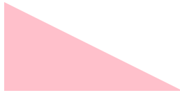
最终要实现的设计长这样

难点就是 message box 的 caret,那一个带边框的 right triangle。
三角形的基本画法
画三角形,很多年前我写过一篇《画三角形 Triangle》
可以用 border 来实现,也可以用 clip-path 来实现。
HTML
<div class="triangle"></div>Styles
/* 用 border 实现 right triangle */
.triangle {
  border-left: 150px solid red;
  border-top: 100px solid transparent;
  width: 0;
}

/* 用 clip-path 实现 right triangle */
.triangle {
  width: 150px;
  height: 100px;
  background-color: red;
  clip-path: polygon(0 0, 100% 100%, 0 100%);
}
效果都是一样的(clip-path 比较直观,推荐使用)

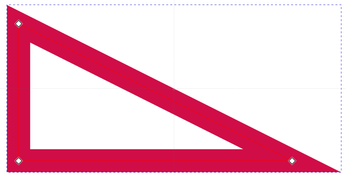
三角形 + 边框?
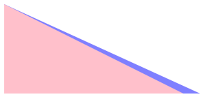
上面提到的需求

白色是三角形,绿色是它的边框。
如果我们用 border 来画三角形,那 border 已经用掉了,不可能再多一层 border,所以 border 方案肯定实现不了这个。
clip-path 方案的话,我们直接天真的加上 border 看看效果
.triangle {
  border-left: 16px solid blue; /* 直接添加 border */
  border-top: 16px solid blue;  /* 直接添加 border */
  width: 150px;
  height: 100px;
  background-color: red;
  clip-path: polygon(0 0, 100% 100%, 0 100%);
}
效果

border-left 没问题,但三角形的斜线(hypotenuse)border 没画出来。
这是因为 CSS border 本来就不支持斜线。
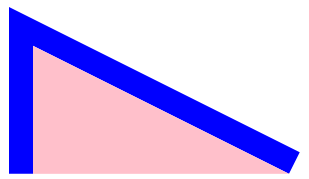
双层 div 重叠实现三角形 + 边框?
两个传统方案都不行,立马能想到的偏方是用两个 div,一个负责画三角形,一个负责画边框。
所谓的画边框,其实是画一个更大的三角形,然后大小三角形重叠,这样背后(大三角)被前面(小三角)遮挡了中心,露出来的地方就成了小三角的边框。
我们直接画一个来看看效果:
HTML
<div class="frame">
  <div class="border"></div>
  <div class="triangle"></div>
</div>
需要定位,所以搞了一个 frame,里面有两个 div,一个负责画三角形,一个负责画边框。
Styles
.frame {
  --border-width: 24px;
  --width: 256px;
  --height: 128px;

  .triangle {
    width: var(--width);
    height: var(--height);
    background-color: pink;
    clip-path: polygon(0 0, 100% 100%, 0 100%);
  }
}
先画一个三角形
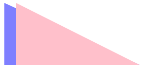
效果
接着我们画 border(大三角形)
.frame {
  position: relative;

  .border {
    position: absolute;
    left: 0;
    bottom: 0;
    width: calc(var(--border-width) + var(--width));
    height: var(--height);
    background-color: blue;
    clip-path: polygon(0 0, 100% 100%, 0 100%);
    opacity: 0.5;
  }
}
首先是定位 postion absolute,因为要重叠两个 div。
再来是 width 比较大,增加了一个 border-width 宽度。
效果
粉色是小三角形,蓝色是大三角形。
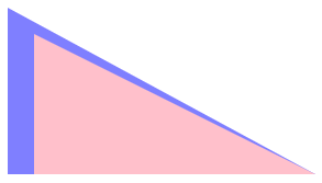
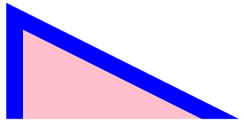
位置不正确,我们需要把小三角往右移,让它形成 border-left。
.frame .triangle {
  transform: translateX(var(--border-width));
}
效果
现在,难点来了!
这个大三角的 width height 要放多少呢?
我们试试看
.frame .border {
  width: calc(var(--border-width) + var(--width));
  height: calc(var(--border-width) + var(--height));
}
width height 都增加一个 border-width。
不对,继续试试
width: calc((var(--border-width) * 2) + var(--width));两个 border-width 呢?

有点像了,但还是偏薄,继续增加看看。
width: calc((var(--border-width) * 3) + var(--width));
height: calc((var(--border-width) * 2) + var(--height));
接近了,但上半段偏大,下半段偏小,有一点点微差。
没错,你看出来了!这样乱试,只能做出一个不太精准的边框。
大三角的 width height 和 clip-path 的点,都需要精心计算,不可以单纯的用 width + 几个 border-width。
😨...难道是要搞 tan sin cos hypot radius radian degree pi xy 那一套来计算?不会吧...
双层 div 重叠实现三角形 + 边框
要算就来算呗!
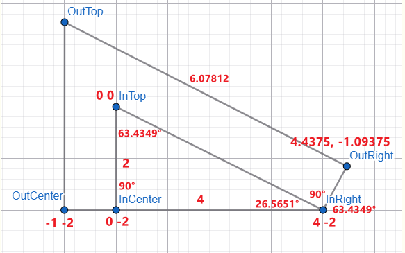
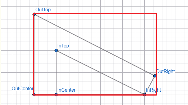
几何图
使用在线工具 geometry
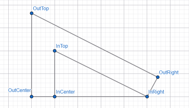
里面是小三角形,由三个点构成(InCenter、InTop、InRight)
外面是 border,由三个点构成(OutCenter、OutTop、OutRight)
看懂它 border 画法吗?

红线是 border width,从小三角往外。
那我们要算什么呢?
想象一下...

整个红框代表一个 div,里面的六个点就是 clip-path polygon 的六个点,OutRight 的 x 坐标就是整个 div 的 width,OutTop 的 y 坐标就是整个 div 的 height。
clip-path 出来的是小三角的 border。
有了这个 border,我们就可以实现两个 div 重叠,一个负责小三角形,一个负责 border。
计算几何
我们最终需要 width height 和 polygon 六个点的坐标。
开始算 🚀
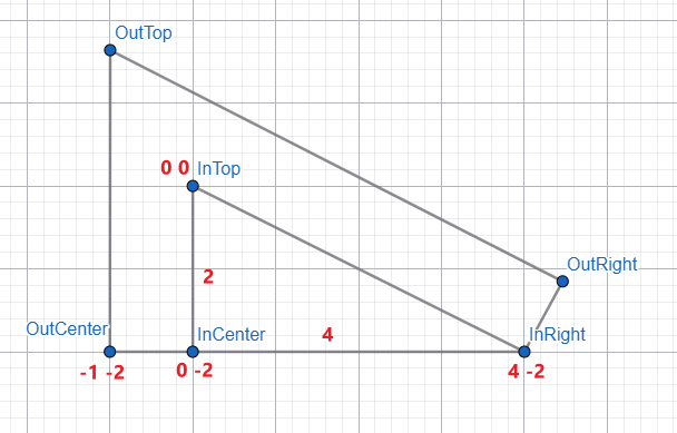
我们先把一眼就看出来的东西给填上。
InTop 暂时作为整个几何图的中心点 x: 0, y: 0。
小三角形的高度是 2(代表两个格子),长度是 4 个格子,border width 是一个格子。
立马可以看出来的坐标有 OutCenter、InCenter、InRight,其它的都需要一些计算。
好,一个一个算

小三角里 InTop 是多少度呢?
算 degree 的 formula 是啥?不熟悉的读者可以看这篇《前端基础几何计算》。
使用 right triangle 公式:tan(θ) = opposite / adjacent
opposite 对边指的是 InCenter → InRight 的长度,也就是 4。
adjacent 邻边指的是 InTop → InCenter 的长度,也就是 2。
算式:
tan(θ) = 4 / 2
θ = atan(4 / 2)
θ = 63.434948822922010648427806279547...°(是个无理数,我们拿前面 4 位小数就好)
CSS 写法
--in-top-degree: atan(4 / 2) = 63.4349°
好,目前已知的几个角度有:
InCenter 90°,InTop 63.4349°,∠ InTop → InRight → OutRight 也是 90°。
right triangle 的规定:
-
内有三个角度 InCenter、InTop、InRight
-
中间 InCenter 一定是
90° -
三个总和一定是
180°
依照这些规定,我们有 InCenter、InTop 就可以计算出 InRight 了。
--in-right-degree: calc(180deg - 90deg - var(--in-top-degree)) 也就是 180° - 90° - 63.4349° = 26.5651°。
好,又多了几个算好的角度:
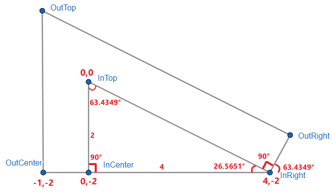
接下来,关键的来了 -- 算 OutRight 的坐标。

InRight → OutRight 这条线的长度就是 border width,也就是一个格子。
图中下方的三个角度(左到右):
第一个是上面我们已算出的 InRight 26.5651°。
第二个是 InTop → InRight → OutRight,它一定是 90°。
第三个则是 180° - 26.5651° - 90° = 63.4349°,它刚巧和 InTop 是相同的角度。

也不是巧合啦,因为 InTop → InRight → OutRight 是 90° 嘛。
有了这些就可以计算出 OutRight 的坐标了,公式是:
x = cos(θ) * radius
y = sin(θ) * radius
θ 指的是 InRight 外围角度,也就是刚巧和 InTop 一样的 63.4349°。
radius 是 InRight → OutRight 长度,也就是 border width 一个格子。
--out-right-x: calc(cos(63.4349deg) * 1px) 结果是 0.4375px
--out-right-y: calc(sin(63.4349deg) * 1px) 结果是 0.890625px
注意哦,我们这个算法是以 InRight 作为中心点

把它换成以 InTop 为中心,公式是
fromPoint + (fromBasePoint - toBasePoint)
fromPoint 就是当下的 OutRight 0.4375, 0.890625
fromBasePoint 是 InRight 原本的坐标 4, -2(以 InTop 为中心)
toBasePoint 就是 InTop 0, 0
OutRight x = 0.4375 + (4 - 0) = 4.4375
OutRight y = 0.890625 + (-2 - 0) = -1.109375

好,剩下最后一个 OutTop 坐标,算完就能收工了!
要算出 OutTop 坐标,首先要算出 OutTop → OutRight 这条斜线的长度。

用这个公式
radius = x / cos(θ)
以 OutRight 为中心点,θ 是 63.4349° + 90° = 153.4349°
x 则是图中的红线长度,原本 OutCenter x 的坐标是 -1,以 InTop 为中心,我们把它换成以 OutRight 为中心。
x = -1 + (0 - 4.4375) = -5.4375
所以是 --out-top-to-out-right-length : calc(-5.4375px / cos(153.4349deg)),得出 6.07812px。
最后计算 OutTop y 的公式是
y = sin(θ) * radius
同样以 OutRight 为中心点,θ 是 63.4349° + 90° = 153.4349°
radius 就是刚刚算出来的 OutTop → OutRight 6.07812
所以是 --out-top-y : calc(sin(153.4349deg) * 6.0781),得出 2.70312。
目前 OutTop 的坐标 -5.4375, 2.70312 是以 OutRight 为中心点。
我们改成以 InTop 为中心点:
公式是
fromPoint + (fromBasePoint - toBasePoint)
OutTop x = -5.4375 + (4.4375 - 0) = -1
OutTop y = 2.70312 + (-1.09375 - 0) = 1.60937
至此,6 个坐标全部算出来了。

OutTop -1, 1.60937、OutRight 4.4375, -1.09375、InRight 4, -2、InTop 0, 0、InCenter 0, -2、OutCenter -1, -2。
这些坐标并不能直接用于 clip-path 的 polygon,因为它们的中心点是 InTop,而 polygon 是以 OutTop 为中心点。
还有 polygon 坐标 y 往下是 position(和 translateY 一样),可几何图 y 往下是 negative。
首先换中心点,公式:
fromPoint + (fromBasePoint - toBasePoint)
换完后再把所有的坐标 y 拿来乘于 -1 做反向就是 polygon 坐标 y 了。
转换后的结果:
OutTop 0, 0、OutRight 5.4375, 2.70312、InRight 5, 3.60937、InTop 1, 1.160937、InCenter 1, 3.60937、OutCenter 0, 3.60937。
代码测试
HTML
<div class="frame">
  <div class="border"></div>
  <div class="triangle"></div>
</div>
Styles
.frame {
  --border-width: 24px;
  --triangle-width: 256px;
  --triangle-height: 128px;

  .border {
    @function change-base-point($currPoint, $currBasePoint, $nextBasePoint) {
      @return calc(#{$currPoint} + (#{$currBasePoint} - #{$nextBasePoint}));
    }

    --in-top-x: 0px;
    --in-top-y: 0px;
    --in-center-x: 0px;
    --in-center-y: calc(-1 * var(--triangle-height));
    --out-center-x: calc(-1 * var(--border-width));
    --out-center-y: calc(-1 * var(--triangle-height));
    --in-right-x: var(--triangle-width);
    --in-right-y: calc(-1 * var(--triangle-height));
    --in-top-degree: atan2(var(--triangle-width), var(--triangle-height));
    --out-right-x-based-on-in-right: calc(cos(var(--in-top-degree)) * var(--border-width));
    --out-right-y-based-on-in-right: calc(sin(var(--in-top-degree)) * var(--border-width));
    --out-right-x: #{change-base-point(var(--out-right-x-based-on-in-right), var(--in-right-x), var(--in-top-x))};
    --out-right-y: #{change-base-point(var(--out-right-y-based-on-in-right), var(--in-right-y), var(--in-top-y))};
    --out-top-x-based-on-out-right: #{change-base-point(var(--out-center-x), var(--in-top-x), var(--out-right-x))};
    --out-top-to-out-right-length: calc(var(--out-top-x-based-on-out-right) / cos(var(--in-top-degree) + 90deg));
    --out-top-y-based-on-out-right: calc(sin(var(--in-top-degree) + 90deg) * var(--out-top-to-out-right-length));
    --out-top-x: #{change-base-point(var(--out-top-x-based-on-out-right), var(--out-right-x), var(--in-top-x))};
    --out-top-y: #{change-base-point(var(--out-top-y-based-on-out-right), var(--out-right-y), var(--in-top-y))};
    --polygon-out-top-x: 0px;
    --polygon-out-top-y: 0px;
    --polygon-out-center-x: #{change-base-point(var(--out-center-x), var(--in-top-x), var(--out-top-x))};
    --polygon-out-center-y: calc(#{change-base-point(var(--out-center-y), var(--in-top-y), var(--out-top-y))} * -1);
    --polygon-in-center-x: #{change-base-point(var(--in-center-x), var(--in-top-x), var(--out-top-x))};
    --polygon-in-center-y: calc(#{change-base-point(var(--in-center-y), var(--in-top-y), var(--out-top-y))} * -1);
    --polygon-in-top-x: #{change-base-point(var(--in-top-x), var(--in-top-x), var(--out-top-x))};
    --polygon-in-top-y: calc(#{change-base-point(var(--in-top-y), var(--in-top-y), var(--out-top-y))} * -1);
    --polygon-in-right-x: #{change-base-point(var(--in-right-x), var(--in-top-x), var(--out-top-x))};
    --polygon-in-right-y: calc(#{change-base-point(var(--in-right-y), var(--in-top-y), var(--out-top-y))} * -1);
    --polygon-out-right-x: #{change-base-point(var(--out-right-x), var(--in-top-x), var(--out-top-x))};
    --polygon-out-right-y: calc(#{change-base-point(var(--out-right-y), var(--in-top-y), var(--out-top-y))} * -1);

    width: var(--polygon-out-right-x);
    height: var(--polygon-out-center-y);
    background-color: blue;

    clip-path: polygon(
      var(--polygon-out-top-x) var(--polygon-out-top-y),
      var(--polygon-out-right-x) var(--polygon-out-right-y),
      var(--polygon-in-right-x) var(--polygon-in-right-y),
      var(--polygon-in-top-x) var(--polygon-in-top-y),
      var(--polygon-in-center-x) var(--polygon-in-center-y),
      var(--polygon-out-center-x) var(--polygon-out-center-y)
    );
  }

  position: relative;

  .triangle {
    position: absolute;
    bottom: 0;
    left: var(--border-width);
    width: var(--triangle-width);
    height: var(--triangle-height);
    background-color: pink;
    clip-path: polygon(0 0, 100% 100%, 0 100%);
  }
}
效果
右下角如果想画完整的尖角也不难,用算 OutTop 的方式就可以算出来了。
补上最后一个缺角几何计算
我们这里快速算一下就好,毕竟本篇的题目没有这个需求。

我们要计算出 OutRight2 的 x 坐标。
图中有三个角度依规则它们是一样的,我们可以加以利用。
先算 OutRight → OutRight2 这条线的长度。
采用公式:
radius = y / sin(θ)
y 指的是 OutRight2 的 y 但中心点要换成 OutRight,θ 则是图中最右边的角度 -26.5651°(因为它是往下,所以用 negative)。
--out-right-to-out-right-2-length: calc(-0.90625 / sin(-26.5651deg)) 结果是 2.0264331510784896。
接下来采用公式
x = cos(θ) x radius
--out-right-2-x: calc(cos(-26.5651deg) * 2.0264331510784896) 结果是 1.8124961388344796。
最后把中心点换成 InTop,OutRight2 的坐标 y 是 4.4375 + 1.8124961388344796 = 6.249996138834479。
补上相关代码
--out-right-2-y: calc(-1 * var(--triangle-height));
--out-right-to-out-right-2-length: calc(
  #{change-base-point(var(--out-right-2-y), var(--in-top-y), var(--out-right-y))} /
    sin((90deg - var(--in-top-degree)) * -1)
);
--out-right-2-x-based-on-out-right: calc(
  cos((90deg - var(--in-top-degree)) * -1) * var(--out-right-to-out-right-2-length)
);
--out-right-2-x: #{change-base-point(var(--out-right-2-x-based-on-out-right), var(--out-right-x), var(--in-top-x))};

--polygon-out-right-2-x: #{change-base-point(var(--out-right-2-x), var(--in-top-x), var(--out-top-x))};
--polygon-out-right-2-y: calc(#{change-base-point(var(--out-right-2-y), var(--in-top-y), var(--out-top-y))} * -1);

width: var(--polygon-out-right-2-x); /* 改成 out-right-2 */

clip-path: polygon(
  var(--polygon-out-top-x) var(--polygon-out-top-y),
  var(--polygon-out-right-2-x) var(--polygon-out-right-2-y), /* 改成 out-right-2 */
  var(--polygon-in-right-x) var(--polygon-in-right-y),
  var(--polygon-in-top-x) var(--polygon-in-top-y),
  var(--polygon-in-center-x) var(--polygon-in-center-y),
  var(--polygon-out-center-x) var(--polygon-out-center-y)
);
效果
打完收工!
clip-path 偏差问题!
本来以为做好了

仔细一看,咦...

怎么会有一条线?
debug 一圈后发现,原来是 clip-path 遇到小数点造成的。
单元测试一下
<body style="padding-top: 100px; padding-left: 100px">
  <div style="width: 100px; height: 100px; clip-path: polygon(0 0, 100% 100%, 20px 100%, 20px 80%, 10px 80%, 10px 100%, 0 100%); background-color: red;"></div>
</body>
这是一个三角形,左下角开了一个孔。

一切正常。
<body style="padding-top: 100px; padding-left: 100px">把 body padding 改成有小数点
效果

看到吗?边边的 1px 颜色变了。

这条线就是这样来的。
只要被 clip 的 div 它的位置是在小数上(因为各种排版关系),就有可能中招。
怎么破?
如果 clip-path 的形状比较简单,那可以尝试 clip 多 1px。
如果无法靠 1px 去调整,那还真的就没招了😔。
要解决 clip-path 的问题,最直接的方式就是不要用 clip-path!
只要你不用它,就不会遇到它的问题了丫!
可,不用它如何实现 clip 效果呢?
答案是 svg
<svg width="100" height="100" viewBox="0 0 100 100">
  <polygon
    points="0 0 100 100 20 100 20 80 10 80 10 100 0 100"
    fill="red"
  />
</svg>
效果

完美,没有 1px 变色问题。
用 SVG 实现三角形 + 边框?
对 svg 一窍不通的可以先看这篇《用 SVG 画曲线和箭头》。
想用 svg 取代 clip-path 并不容易,除非搭配 JS。
因为,像本篇的需求,clip-path polygon 的各个坐标是透过 CSS variables + calc + tan sin cos 这一堆 function 计算出来的。
而 svg polygon points 属性,不支持写 CSS variables、calc、tan sin cos 等等。
因此,只有两条路:
-
用 JS 计算出 polygon 坐标,然后 set 进 svg。
-
提前计算好 polygon 坐标,hardcode 写入 svg,只透过 svg viewBox 等比例缩放去兼容 responsive(未必可以兼容所有场景需求)。
我们粗略试一下就好
<svg
  width="500"
  viewBox="0 0 290.72 166.83"
  xmlns="http://www.w3.org/2000/svg"
>
  <!-- border -->
  <polygon
    points="0,0 290.733,145.367 280,166.833 24,38.8328 24,166.833 0,166.833"
    fill="blue"
  />

  <!-- triangle -->
  <polygon
    points="24,166.833 24,38.8328 280,166.833"
    fill="pink"
  />
</svg>
关键是那些数字,哪来的?
它们来自计算好的 CSS。
我们设定好 CSS 变量
--border-width: 24px;
--triangle-width: 256px;
--triangle-height: 128px;
然后查看计算后的各个 polygon 坐标

接着把它们 copy paste 到 svg 就可以了。
svg 方案有两个重大缺陷:
第一个是它不灵活。
svg + viewBox 可以等比例缩放,但不像 clip-path 方案那样灵活到可以分开调 width height border-width。
svg 搭配 CSS variables 和 calc 有非常多的限制(要灵活,只能靠 JS)。
第二个是它的计算方式没有那么符合直觉。
上面我们算几何,是从小三角往外添加 border(因为小三角的角度是确定了的,因此它很容易算)。
svg 的直觉应该是先定一个 width height,然后往内算出其它的 polygon。
比如说
先有红框的 width height 和 border-width。
接着推算出 InTop、InRight、OutRight 的坐标。
我尝试了一下,非常困难,困难到要解一元四次方,要用牛顿法...我看还是算了吧,别用 svg 了。
todo
草稿,之后可以洗掉了
用 SVG 实现三角形 + 边框?
要自己计算几何也太费劲了。
既然 CSS 不给力,那就试试 svg 吧,不是有一句说:Why not just use SVG?
注:我 SVG 的功力连入门教程都没有学过...
使用工具 Inkscape

一个 path element
属性 d 是绘画 command,有点像 canvas
第一条 command 是 m 100,100
意思是 move to 坐标 100, 100
第二条 command v -25
意思是画 vertical 线条,从当前位置 -25,也就是从 y 100 画线到 y 75。(这条线就是三角形高度那一条线)
第三条 command l 50, 25
意思是画 line,从当前 100, 75 画到 100+50, 75+25 也就是 150, 100。(这条线就是三角形的斜线)
最后一个 command z
意思是画闭环,连回去 100, 100。(这条线就是三角形的长度那条线)
有了三角形形状,直接添加 stroke style 就可以了。
效果
SVG 的强项就是不管你画什么形状,它都可以直接加上 stroke(a.k.a border),CSS 完全办不到!
BUT !
它有一个大问题 -- 它的边框是左右两侧平均分配的。
这跟我们习惯的 CSS 不同。
CSS border 是里面,outline 是外面,没有两侧平均的(需要用黑科技弄)。
除此之外,还有一些问题

想象一下... 我画了两条红线,然后添加 stroke 绿色边框。
先不说它平均分配的问题,即便它像 outline 往外画边框,可整个 SVG 的 width height 是多少?
我要如何操控变量,比如调整小三角的 width height 或者 border-width。
SVG 的玩法视乎是先画好一个固定的图,width height 全部算好好,然后你只能 scale 去调动它。
嗯... 我思来想去(可能我 svg 功力太新手),SVG 好像不太合适这个场景。

 浙公网安备 33010602011771号