


CSS & JS Effect – 画三角形 Triangle
前言
画三角形有什么用?
可以做这样的 Design

参考
5 Ways To Create A Triangle With CSS
Border Triangle
用 border 做三角形应该是最远古的招数了。
我们看一下基本的 border 规则
HTML
<div class="box"></div>
Styles
.box {
  width: 100px;
  height: 100px;
  border-top: 20px solid red;
  background-color: blue;
}
效果
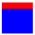
这是一般我们使用 border 的场景。
现在把 width height 拿掉,只留下 border
.box {
  width: 0;
  height: 0;
  border-top: 20px solid red;
  background-color: blue;
}
整个 div 都消失了
现在我们添加一个 border-left
.box {
  width: 0;
  height: 0;
  border-top: 100px solid red;
  border-left: 200px solid blue;
}
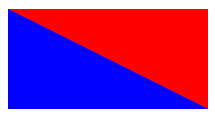
再只有 border top left 没有 width height 的情况下,border 变成了两个直角三角形。
如果我们把其它一个颜色换成 transparent,视觉上就变成一个直角三角形。
border-top: 100px solid transparent;
它的高度来自 border-top
它的长度来自 border-left
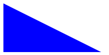
好,这是直角三角形的画法,如果想画一个完整的三角形,可以再加一边的 border
.box {
  width: 0;
  height: 0;
  border-bottom: 100px solid red;
  border-left: 150px solid yellow;
  border-right: 250px solid blue;
}
我放了不同颜色,方便大家看
红色是我们要的三角形
它的高度来自 border-bottom
角度则是靠 border-left right 不同的 width 来调
最后把 border-left right 颜色设成 transparent 就可以了。
用 border 做三角形并不是一个很好的方案。它不仅不直观,更糟糕的是 border width 很难控制,比如我想要 height 100% 它就做不了。
Linear Gradient Triangle
linear gradient 可以调角度. 所以也可以搞出三角形.
.box {
  width: 200px;
  height: 300px;
  background: linear-gradient(to bottom right, green 50%, transparent 50%);
}
效果

to bottom right 是渐变的方向. green 50% 表示 50% 以前都是纯绿色, 不要渐变. transparent 50% 表示从 50% 以后是纯 transparent.
所以看上去完全没有渐变的效果. 只是利用了它的角度而已.
这招挺巧妙的,但手法比 border 还要间接,不太理想。
Clip-path Triangle
clip-path 才是真确的方式,直角三角形不就是四角形的一半吗? 那就 clip 丫
.box {
  width: 150px;
  height: 200px;
  background: green;
  clip-path: polygon(0% 0%, 0% 100%, 100% 0%);
}
polygon 是一个 point collection。
一共有 3 个 point
0% 0% 是坐标 X, Y

三个点连起来的地方要保留,其余的 clip 掉,这样直角三角形就出来了。
Image with Triangle
<img src="../images/tifa1.jpg" />
CSS
img {
  width: 500px;
  height: auto;
  aspect-ratio: 4 / 3;
  object-fit: cover;
  clip-path: polygon(10% 0%, 100% 0%, 90% 100%, 0% 100%);
}
效果


 浙公网安备 33010602011771号