

CSS & JS Effect – 画箭头
前言
好一阵子没有写 HTML、CSS 了,都生疏了。
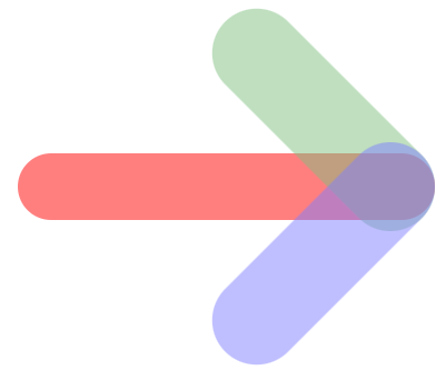
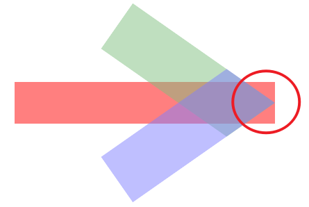
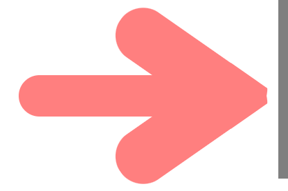
今天要分享的是用 HTML + CSS 画箭头,最终效果长这样:
为什么要自己画箭头呢?
干嘛不使用 icon?
因为...我误以为箭头很容易画🙄
Step by Step 画箭头
我的画法很直接,但未必是聪明的画法哦。
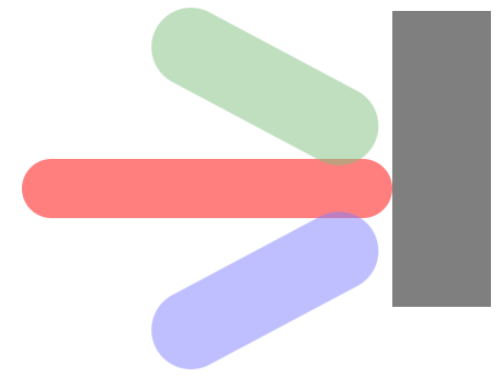
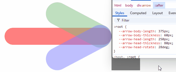
第一步:elements
首先要 3 个 elements。
那就一个 div 加上 ::before ::after 吧。
HTML
<div class="arrow"></div>Styles
:root {
--arrow-body-length: 375px;
--arrow-body-thickness: 60px;
--arrow-head-length: 250px;
--arrow-head-thickness: 80px;
}
.arrow {
width: var(--arrow-body-length);
height: var(--arrow-body-thickness);
opacity: 0.5;
background-color: red;
&::before,
&::after {
content: '';
display: block;
width: var(--arrow-head-length);
height: var(--arrow-head-thickness);
opacity: 0.5;
}
&::before {
background-color: green;
}
&::after {
background-color: blue;
}
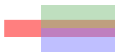
}只是给了一些颜色和尺寸,看得见 elements 先,目前长这样
第二步:基本布局
.arrow {
  display: flex;
  flex-direction: column;
  justify-content: center;
  align-items: flex-end;

  &::before,
  &::after {
    flex-shrink: 0;
  }
}
效果
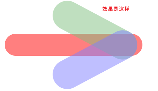
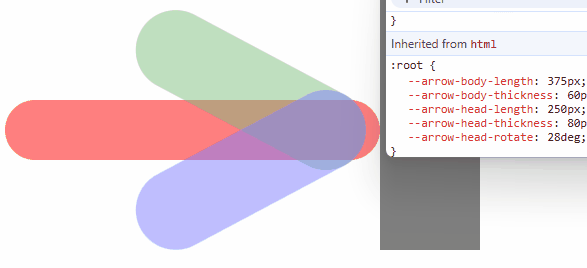
第三步:rotate
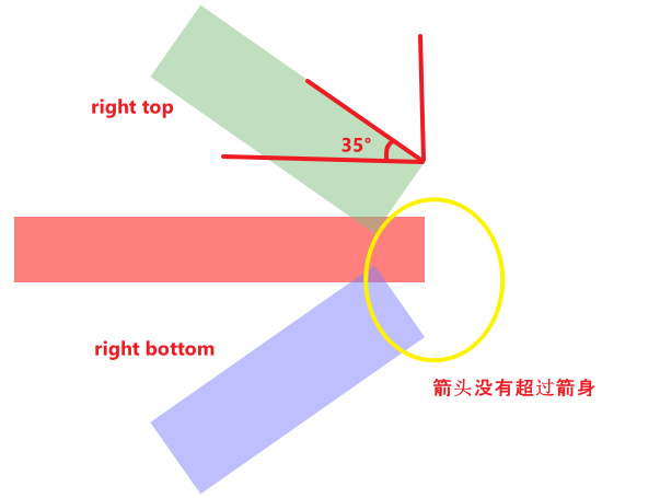
接着把 ::before 和 ::after 做一个 rotate 35° 整体形状就出来了。
:root {
  --arrow-head-rotate: 35deg;
}

.arrow {
  &::before {
    transform: rotate(var(--arrow-head-rotate));
  }

  &::after {
    transform: rotate(calc(-1 * var(--arrow-head-rotate)));
  }
}
注:我刻意用了 35° 是因为 45° 太容易算,而真实场景不一定那么刚好会是 45°。
效果

哎哟,这里细节就来了哦!
默认的 transform-origin 是 center,因此 rotate 35° 是这样发生的

显然这不是我们期望的,我们调整 transform-origin 看看
.arrow {
  &::before {
    transform-origin: right bottom;
  }

  &::after {
    transform-origin: right top;
  }
}
注意看它的 rotate 的方式

再来试试这样
.arrow {
  &::before {
    transform-origin: right top;
  }

  &::after {
    transform-origin: right bottom;
  }
}
效果
可以看到,不同的 transform-origin 效果是不同的。
那要用哪一个呢?
不急,我们先往下一步走走看
第四步:translateY
不管 transform-origin 是 top bottom 还是 bottom top

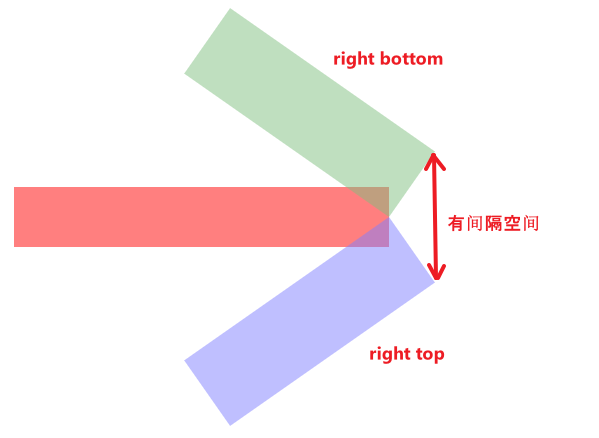
中间都有一段间隔。
我们需要把间隔合起来,这样才能形成箭头的尖角。
用 translateY 将它们重合起来(先看 origin top bottom):

上面的往下移,下面的往上移。
为什么是 80px 呢?
80px 指的是箭头的厚度(--arrow-head-thickness)
因为它是一个圈
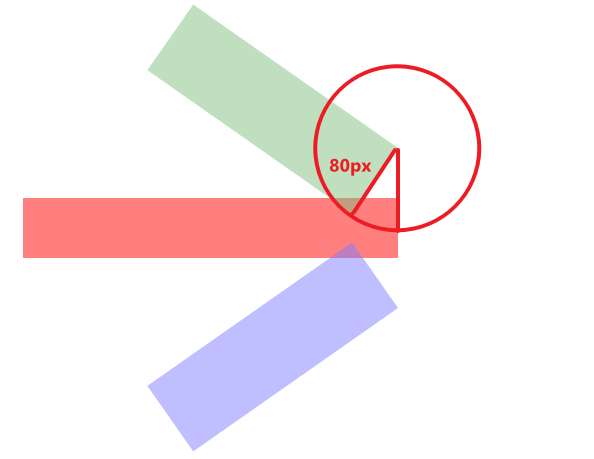
箭头的厚度就是圈的半径(radius)80px
.arrow {
  --translate-y: var(--arrow-head-thickness);

  &::before {
    transform-origin: right top;
    transform: translateY(var(--translate-y)) rotate(var(--arrow-head-rotate));
  }

  &::after {
    transform-origin: right bottom;
    transform: translateY(calc(-1 * var(--translate-y))) rotate(calc(-1 * var(--arrow-head-rotate)));
  }
}
效果

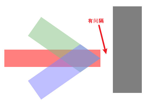
整体箭头形状出来了,但有好几处明显是过头了,需要一些裁剪 / 移位。
我们换另一个 origin bottom top 看看是否有相同问题,或是其它问题。

不同 origin 出来的位置不同,因此 translateY 的移动也需要不同计算方式。
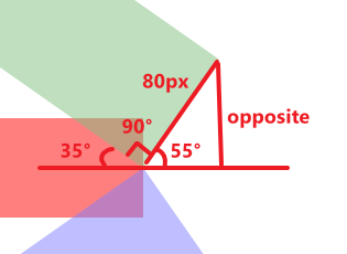
把它看作一个 right triangle
hypot 长度是 80px(--arrow-head-thickness)
角度是 55°(因为箭头 rotate 是 35°)
求,opposite 的长度。
算式 opposite = sin(θ) * hypot → sin(55°) * 80 = 65.532...
注:对 right triangle 几何公式不熟悉的读者,可以看这篇。
.arrow {
  --translate-y: calc(sin(90deg - var(--arrow-head-rotate)) * var(--arrow-head-thickness));

  &::before {
    transform-origin: right bottom;
    transform: translateY(var(--translate-y)) rotate(var(--arrow-head-rotate));
  }

  &::after {
    transform-origin: right top;
    transform: translateY(calc(-1 * var(--translate-y))) rotate(calc(-1 * var(--arrow-head-rotate)));
  }
}
效果

相同的问题 -- 好几处明显是过头了,需要一些裁剪 / 移动。
好,我们挑一个来处理就好。

如果箭头 rotate 是 >= 45° 就不会出现过头的问题,由于我们是 35° 所以过头了。
箭头蓝绿的部分需要 clip 掉。
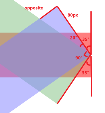
箭头 rotate 35°,厚度 80px,求 opposite 长度。
算式
hypot = 80 / cos(20°) = 85.134...
opposite = sin(20°) * 85.134 = 29.117...
Styles
.arrow {
  --clip-degree: calc(90deg - calc(2 * min(var(--arrow-head-rotate), 45deg)));
  --clip-hypot: calc(var(--arrow-head-thickness) / cos(var(--clip-degree)));
  --clip-opposite: calc(sin(var(--clip-degree)) * var(--clip-hypot));

  &::before {
    clip-path: polygon(0 0, 100% 0, calc(100% - var(--clip-opposite)) 100%, 0 100%);
  }

  &::after {
    clip-path: polygon(0 0, calc(100% - var(--clip-opposite)) 0, 100% 100%, 0 100%);
  }
}
效果
箭头 clip 正确了,但箭身任然过头。
这我们不能用 clip,因为箭头伪元素在箭身里,clip 箭身会导致上下箭头超出箭身的部分也被 clip 掉。
正确的做法是减少箭身的 width 长度。
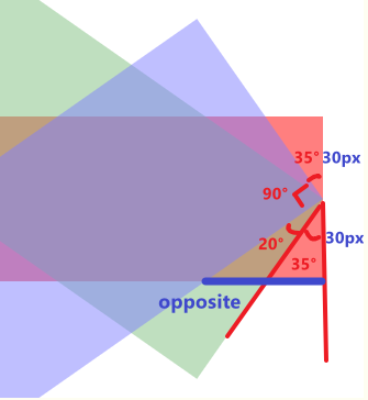
角度是 20° + 35°
adjacent 是箭身一半厚度 30px
求 opposite
.arrow {
  --move-degree: calc(var(--arrow-head-rotate) + (90deg - (2 * var(--arrow-head-rotate))));
  --move-adjacent: calc(var(--arrow-body-thickness) / 2);
  --move-hypot: calc(var(--move-adjacent) / cos(var(--move-degree)));
  --move-opposite: calc(sin(var(--move-degree)) * var(--move-hypot));

  width: calc(var(--arrow-body-length) - var(--move-opposite));
}
效果
箭身短的同时,还得用 translateX 把箭头往前(右)推。
.arrow {
  &::before {
    transform: translateX(var(--move-opposite)) translateY(var(--translate-y)) rotate(var(--arrow-head-rotate));
  }

  &::after {
    transform: translateX(var(--move-opposite)) translateY(calc(-1 * var(--translate-y)))
      rotate(calc(-1 * var(--arrow-head-rotate)));
  }
}
效果
注:箭头 rotate 太小会坏掉,但无所谓,毕竟太小太大在真实项目不太可能出现。
完整代码


* {
  margin: 0;
  padding: 0;
  box-sizing: border-box;

  *:focus {
    outline: none;
  }
}

:root {
  --arrow-body-length: 375px;
  --arrow-body-thickness: 60px;
  --arrow-head-length: 250px;
  --arrow-head-thickness: 80px;
  --arrow-head-rotate: 35deg;
}

.arrow {
  display: flex;
  flex-direction: column;
  justify-content: center;
  align-items: flex-end;

  --move-degree: calc(var(--arrow-head-rotate) + (90deg - (2 * var(--arrow-head-rotate))));
  --move-adjacent: calc(var(--arrow-body-thickness) / 2);
  --move-hypot: calc(var(--move-adjacent) / cos(var(--move-degree)));
  --move-opposite: calc(sin(var(--move-degree)) * var(--move-hypot));

  width: calc(var(--arrow-body-length) - var(--move-opposite));
  height: var(--arrow-body-thickness);

  opacity: 0.5;
  background-color: red;

  &::before,
  &::after {
    flex-shrink: 0;
    content: '';
    display: block;

    width: var(--arrow-head-length);
    height: var(--arrow-head-thickness);

    opacity: 0.5;
  }

  --clip-degree: calc(90deg - calc(2 * min(var(--arrow-head-rotate), 45deg)));
  --clip-hypot: calc(var(--arrow-head-thickness) / cos(var(--clip-degree)));
  --clip-opposite: calc(sin(var(--clip-degree)) * var(--clip-hypot));

  &::before {
    transform-origin: right top;
    background-color: green;
    clip-path: polygon(0 0, 100% 0, calc(100% - var(--clip-opposite)) 100%, 0 100%);
    transform: translateX(var(--move-opposite)) translateY(var(--arrow-head-thickness)) rotate(var(--arrow-head-rotate));
  }

  &::after {
    transform-origin: right bottom;
    background-color: blue;
    clip-path: polygon(0 0, calc(100% - var(--clip-opposite)) 0, 100% 100%, 0 100%);
    transform: translateX(var(--move-opposite)) translateY(calc(-1 * var(--arrow-head-thickness)))
      rotate(calc(-1 * var(--arrow-head-rotate)));
  }
}
第五步:border-radius
箭头尖尖看起来很可怕,我们让它圆润起来。
.arrow {
  border-radius: 999px;

  &::before,
  &::after {
    border-radius: 999px;
  }
}
效果
完全是错的,因为尖角和圆角的做法完全不一样。
我们回到最初的起点,重新看圆角如何处理。
* {
  margin: 0;
  padding: 0;
  box-sizing: border-box;

  *:focus {
    outline: none;
  }
}

body {
  --body-padding-top: 200px;
  --body-padding-left: 240px;
  padding-left: var(--body-padding-left);
  padding-top: var(--body-padding-top);
}

.wall {
  position: fixed;
  top: var(--body-padding-top);
  left: calc(var(--body-padding-left) + var(--arrow-body-length));
  transform: translateY(-50%);
  width: 100px;
  height: 300px;
  background-color: black;
  opacity: 0.5;
}

:root {
  --arrow-body-length: 375px;
  --arrow-body-thickness: 60px;
  --arrow-head-length: 250px;
  --arrow-head-thickness: 80px;
  --arrow-head-rotate: 28deg;
}

.arrow {
  border-radius: 999px;
  display: flex;
  flex-direction: column;
  justify-content: center;
  align-items: flex-end;

  width: var(--arrow-body-length);
  height: var(--arrow-body-thickness);

  opacity: 0.5;
  background-color: red;

  &::before,
  &::after {
    flex-shrink: 0;
    border-radius: 999px;
    content: '';
    display: block;

    width: var(--arrow-head-length);
    height: var(--arrow-head-thickness);

    opacity: 0.5;
  }

  &::before {
    transform-origin: right top;
    background-color: green;
    transform: rotate(var(--arrow-head-rotate));
  }

  &::after {
    transform-origin: right bottom;
    background-color: blue;
    transform: rotate(calc(-1 * var(--arrow-head-rotate)));
  }
}
效果
先用 translateY 把中间的间隔合起来。

那 translate y 具体是多少呢?如何计算?
我们简化它来看

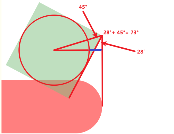
在 rotate 之前,箭头中心和箭身中心的间隔是半个箭头的厚度,这就是 translate y 的距离。
rotate 28° 之后

中心到中心的距离变长了,因此我们需要计算出它变长了多少。

中心到中心的距离 = origin to center 80px - right triangle 的 adjacent
right triangle 的角度是 28°(箭头 rotate) + 45°(hypot 是从左上角到中心,刚好是 90° 的一半 45°)= 73°。
hypot 的长度是 √(40² + 40²) = 56.568...,40 来自箭头厚度 80 的一半。
最后算 adjacent = cos(73°) * 56.568 = 16.539...
translate y = 80 - 16.539 = 63.460...
.arrow {
  --translate-y: calc(
    var(--arrow-head-thickness) -
      (cos(var(--arrow-head-rotate) + 45deg) * hypot(var(--arrow-head-thickness) / 2, var(--arrow-head-thickness) / 2))
  );

  &::before {
    transform: translateY(var(--translate-y)) rotate(var(--arrow-head-rotate));
  }

  &::after {
    transform: translateY(calc(-1 * var(--translate-y))) rotate(calc(-1 * var(--arrow-head-rotate)));
  }
}
效果
下一个要解决的问题是

过头的箭身。
解决方式和处理尖角一样,让箭头往前(右)移。
如何计算呢?
我们简化看看

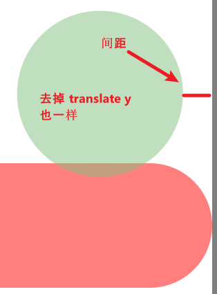
我们的任务是计算出那一段间距。
关键在 right triangle(我们要计算出的距离是那一小段蓝线)
角度是 28°(箭头 rotate) + 45°(hypot 是从左上角到中心,刚好是 90° 的一半 45°)= 73°。
hypot 的长度是 √(40² + 40²) = 56.568...,40 来自箭头厚度 80 的一半。
先算出 opposite,再减去圈的 radius(箭头厚度的一半 40px)就是我们要的间距长度了。
opposite = sin(73°) * 56.568 = 54.096...
gap = opposite - radius → 54.096 - 40 = 14.096
.arrow {
  --translate-y: calc(
    var(--arrow-head-thickness) -
      (cos(var(--arrow-head-rotate) + 45deg) * hypot(var(--arrow-head-thickness) / 2, var(--arrow-head-thickness) / 2))
  );
  --translate-x: calc(
    (sin(var(--arrow-head-rotate) + 45deg) * hypot(var(--arrow-head-thickness) / 2, var(--arrow-head-thickness) / 2)) -
      (var(--arrow-head-thickness) / 2)
  );

  &::before {
    transform: translateX(var(--translate-x)) translateY(var(--translate-y)) rotate(var(--arrow-head-rotate));
  }

  &::after {
    transform: translateX(var(--translate-x)) translateY(calc(-1 * var(--translate-y)))
      rotate(calc(-1 * var(--arrow-head-rotate)));
  }
}
效果
由于箭身也是圆角,因此不需要像处理尖角那样减少箭身长度。
但!如果箭身是尖角呢?
.arrow {
  border-radius: unset;
}
效果

计算出红线的长度,缩短箭身,把箭头再往右移。

这题视乎比较难算,无法用简单的 right triangle 规则算出来,必须使用圆形方程。
圆圈的 radius 是箭头厚度的一半,80 / 2 = 40px。
以圆圈的中心作为几何的中心点,坐标 0, 0。
蓝线是一条横线,它的 y 坐标是箭身厚度的一半 60 / 2 = 30。
求,y 坐标 30 与圆圈的交点(会有两个,我们只需要 positive 的那一个)。
最后拿 radius 减掉交点 x 就是蓝线的长度了。
算式
(x - h)² + (y - k)² = r²
→ (x - h)² = r² - (y - k)²
→ x - h = √(r² - (y - k)²)
→ x = √(r² - (y - k)²) + h
→ √(40² - (30 - 0)²) + 0
→ √(1600 - 900) + 0 = 26.457...
length = 40 - 26.457 = 13.542...
Styles
.arrow {
  --extra-translate-x-due-to-arrow-body-non-radius: calc(
    (var(--arrow-head-thickness) / 2) - sqrt(
        (pow(var(--arrow-head-thickness) / 1px / 2, 2) - pow(var(--arrow-body-thickness) / 1px / 2, 2))
      ) *
      1px
  );

  width: calc(var(--arrow-body-length) - var(--extra-translate-x-due-to-arrow-body-non-radius));

  &::before {
    transform: translateX(calc(var(--translate-x) + var(--extra-translate-x-due-to-arrow-body-non-radius)))
      translateY(var(--translate-y)) rotate(var(--arrow-head-rotate));
  }

  &::after {
    transform: translateX(calc(var(--translate-x) + var(--extra-translate-x-due-to-arrow-body-non-radius)))
      translateY(calc(-1 * var(--translate-y))) rotate(calc(-1 * var(--arrow-head-rotate)));
  }
}
提醒:sqrt 参数必须是 number,不可以带 unit,比如 10px 不行,要 10 才可以。
效果

完整代码
:root {
  --arrow-body-length: 375px;
  --arrow-body-thickness: 60px;
  --arrow-head-length: 250px;
  --arrow-head-thickness: 80px;
  --arrow-head-rotate: 28deg;
}

.arrow {
  display: flex;
  flex-direction: column;
  justify-content: center;
  align-items: flex-end;

  height: var(--arrow-body-thickness);

  opacity: 0.5;
  background-color: red;

  &::before,
  &::after {
    flex-shrink: 0;

    border-radius: 999px;
    content: '';
    display: block;

    width: var(--arrow-head-length);
    height: var(--arrow-head-thickness);

    opacity: 0.5;
  }

  --translate-y: calc(
    var(--arrow-head-thickness) -
      (cos(var(--arrow-head-rotate) + 45deg) * hypot(var(--arrow-head-thickness) / 2, var(--arrow-head-thickness) / 2))
  );
  --extra-translate-x-due-to-arrow-body-non-radius: calc(
    (var(--arrow-head-thickness) / 2) - sqrt(
        (pow(var(--arrow-head-thickness) / 1px / 2, 2) - pow(var(--arrow-body-thickness) / 1px / 2, 2))
      ) *
      1px
  );
  --translate-x: calc(
    (sin(var(--arrow-head-rotate) + 45deg) * hypot(var(--arrow-head-thickness) / 2, var(--arrow-head-thickness) / 2)) -
      (var(--arrow-head-thickness) / 2)
  );

  width: calc(var(--arrow-body-length) - var(--extra-translate-x-due-to-arrow-body-non-radius));

  &::before {
    transform-origin: right top;
    background-color: green;
    transform: translateX(calc(var(--translate-x) + var(--extra-translate-x-due-to-arrow-body-non-radius)))
      translateY(var(--translate-y)) rotate(var(--arrow-head-rotate));
  }

  &::after {
    transform-origin: right bottom;
    background-color: blue;
    transform: translateX(calc(var(--translate-x) + var(--extra-translate-x-due-to-arrow-body-non-radius)))
      translateY(calc(-1 * var(--translate-y))) rotate(calc(-1 * var(--arrow-head-rotate)));
  }
}
总结
本篇讲解如何用纯 HTML + CSS 实现箭头。
手法虽然有点粗糙,但勉强还是能用的。

 浙公网安备 33010602011771号