matplotlab刻度线设置——如何在画布的上下左右四条边框上绘制刻度线
我们平时使用matplotlib绘图时一般默认的刻度只在画布的右侧和下侧出现,但是在网上看到其他人的绘图往往都是上下左右四个边框线均有刻度,这是如何实现的呢,今天就给出一种设置画布上下左右四条边框刻度的方法。
一般默认的matplotlib绘图的刻度见下面链接:
python绘图库matplotlib:刻度线的方向调整, in, out, inout
-----------------------------------------------------------------------------
但是如何设置上下左右边框均有刻度呢?
1. 使用双y轴设置(共享x轴)或双x轴设置(共享y轴),可以保证3条边框有刻度但是不能保证4条边框有刻度,该种方法不是很好,这里只是给出实例代码但不推荐
代码:
import matplotlib.pyplot as plt


plt.rcParams['xtick.direction'] = 'in'  # 将x周的刻度线方向设置向内
plt.rcParams['ytick.direction'] = 'in'  # 将y轴的刻度方向设置向内


x = [0, 0.1, 0.2, 0.3, 0.4, 0.5, 0.6, 0.7, 0.8, 0.9, 1.0]
y = [0, 0.1, 0.2, 0.3, 0.4, 0.5, 0.6, 0.7, 0.8, 0.9, 1.0]


fig, ax1 = plt.subplots()
ax2 = ax1.twinx()  # 做镜像处理


ax1.plot(x, y, "b--")
ax1.plot(x, y[::-1], "g-")


ax1.set_xticks([0, 0.1, 0.2, 0.3, 0.4, 0.5, 0.6, 0.7, 0.8, 0.9, 1.0])
ax1.set_xticklabels([0, 0.1, 0.2, 0.3, 0.4, 0.5, 0.6, 0.7, 0.8, 0.9, 1.0])

ax1.set_yticks([0, 0.1, 0.2, 0.3, 0.4, 0.5, 0.6, 0.7, 0.8, 0.9, 1.0])
ax1.set_yticklabels([0, 0.1, 0.2, 0.3, 0.4, 0.5, 0.6, 0.7, 0.8, 0.9, 1.0])


ax2.set_yticks([0, 0.1, 0.2, 0.3, 0.4, 0.5, 0.6, 0.7, 0.8, 0.9, 1.0])
ax2.set_yticklabels(["", "", "", "", "", "", "", "", "", "", "", ])
# ax2.set_yticklabels([0, 0.1, 0.2, 0.3, 0.4, 0.5, 0.6, 0.7, 0.8, 0.9, 1.0])


ax1.set_xlabel('X data', color="r")  # 设置x轴标题
ax1.set_ylabel('total_count', color='orange')  # 设置Y1轴标题
# ax2.set_ylabel('bad_rate', color='b')  # 设置Y2轴标题


ax1.set_xlim(0, 1)
ax1.set_ylim(0, 1)


plt.grid(axis="both", )

plt.show()
绘图:
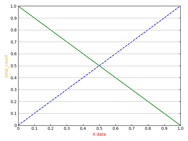
可以看到使用共享轴的方式可以实现三条边框上有刻度,但是如果使用绘制网格grid的时候只能实现绘制横线或竖线但是不能同时绘制横竖线。该种方法有些伪命题的意味,并不是很推荐,再则如果使用grid绘图的话也没有必要实现四条边框绘制刻度的需求了。
去掉gird函数后代码:


import matplotlib.pyplot as plt


plt.rcParams['xtick.direction'] = 'in'  # 将x周的刻度线方向设置向内
plt.rcParams['ytick.direction'] = 'in'  # 将y轴的刻度方向设置向内


x = [0, 0.1, 0.2, 0.3, 0.4, 0.5, 0.6, 0.7, 0.8, 0.9, 1.0]
y = [0, 0.1, 0.2, 0.3, 0.4, 0.5, 0.6, 0.7, 0.8, 0.9, 1.0]


fig, ax1 = plt.subplots()
ax2 = ax1.twinx()  # 做镜像处理


ax1.plot(x, y, "b--")
ax1.plot(x, y[::-1], "g-")


ax1.set_xticks([0, 0.1, 0.2, 0.3, 0.4, 0.5, 0.6, 0.7, 0.8, 0.9, 1.0])
ax1.set_xticklabels([0, 0.1, 0.2, 0.3, 0.4, 0.5, 0.6, 0.7, 0.8, 0.9, 1.0])

ax1.set_yticks([0, 0.1, 0.2, 0.3, 0.4, 0.5, 0.6, 0.7, 0.8, 0.9, 1.0])
ax1.set_yticklabels([0, 0.1, 0.2, 0.3, 0.4, 0.5, 0.6, 0.7, 0.8, 0.9, 1.0])


ax2.set_yticks([0, 0.1, 0.2, 0.3, 0.4, 0.5, 0.6, 0.7, 0.8, 0.9, 1.0])
ax2.set_yticklabels(["", "", "", "", "", "", "", "", "", "", "", ])
# ax2.set_yticklabels([0, 0.1, 0.2, 0.3, 0.4, 0.5, 0.6, 0.7, 0.8, 0.9, 1.0])


ax1.set_xlabel('X data', color="r")  # 设置x轴标题
ax1.set_ylabel('total_count', color='orange')  # 设置Y1轴标题
# ax2.set_ylabel('bad_rate', color='b')  # 设置Y2轴标题


ax1.set_xlim(0, 1)
ax1.set_ylim(0, 1)


# plt.grid(axis="both", )

plt.show()
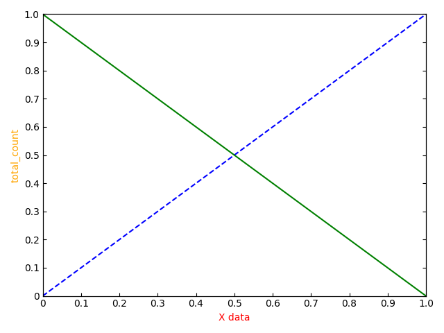
绘图:
============================================
2. 通过设置 tick_params 实现边框刻度
代码:
import matplotlib.pyplot as plt


plt.rcParams['xtick.direction'] = 'in'  # 将x周的刻度线方向设置向内
plt.rcParams['ytick.direction'] = 'in'  # 将y轴的刻度方向设置向内


x = [0, 0.1, 0.2, 0.3, 0.4, 0.5, 0.6, 0.7, 0.8, 0.9, 1.0]
y = [0, 0.1, 0.2, 0.3, 0.4, 0.5, 0.6, 0.7, 0.8, 0.9, 1.0]


fig, ax1 = plt.subplots()


ax1.plot(x, y, "b--")
ax1.plot(x, y[::-1], "g-")


ax1.set_xticks([0, 0.1, 0.2, 0.3, 0.4, 0.5, 0.6, 0.7, 0.8, 0.9, 1.0])
ax1.set_xticklabels([0, 0.1, 0.2, 0.3, 0.4, 0.5, 0.6, 0.7, 0.8, 0.9, 1.0])
ax1.set_yticks([0, 0.1, 0.2, 0.3, 0.4, 0.5, 0.6, 0.7, 0.8, 0.9, 1.0])
ax1.set_yticklabels([0, 0.1, 0.2, 0.3, 0.4, 0.5, 0.6, 0.7, 0.8, 0.9, 1.0])


ax1.tick_params(
                # axis='y', # 只设置y轴刻度
                direction='in', # 刻度线朝内
                # length=6, width=3, # 长度和宽度
                # colors='red', # 颜色
                # labelsize=15, # 标签字体大小
                top=True,
                right=True,
                # labeltop=True,
                # labelright=True
                )


"""
ax1.tick_params(axis='x', # 只设置x轴刻度
direction='in', # 刻度线朝内
length=3, width=3, # 长度和宽度
colors='green', # 颜色
labelsize=15, # 标签字体大小
top=True,
left=True,
labeltop=True,
labelright=True
)

ax1.tick_params(axis='y', # 只设置y轴刻度
direction='in', # 刻度线朝内
length=6, width=3, # 长度和宽度
colors='red', # 颜色
labelsize=15, # 标签字体大小
top=True,
right=True,
labeltop=True,
labelright=True
)
"""


ax1.set_xlabel('X data', color="r")  # 设置x轴标题
ax1.set_ylabel('total_count', color='orange')  # 设置Y1轴标题


ax1.set_xlim(0, 1)
ax1.set_ylim(0, 1)


# plt.grid(axis="both", )

plt.show()
绘图:

------------------------------------
核心实现代码:
ax1.tick_params(
                # axis='y', # 只设置y轴刻度
                direction='in', # 刻度线朝内
                # length=6, width=3, # 长度和宽度
                # colors='red', # 颜色
                # labelsize=15, # 标签字体大小
                top=True,
                right=True,
                # labeltop=True,
                # labelright=True
                )
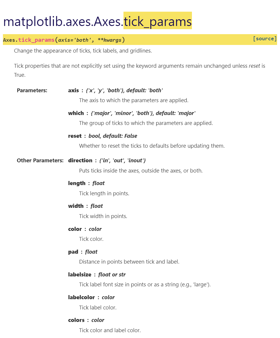
官方给出函数帮助文档:
===========================================
参考:
https://www.cnblogs.com/chenhuabin/p/12393720.html
posted on 2022-06-29 10:23 Angry_Panda 阅读(2346) 评论(0) 编辑 收藏 举报