
python语言绘图:绘制一组正态分布图
代码源自:
https://github.com/PacktPublishing/Bayesian-Analysis-with-Python
===========================================================
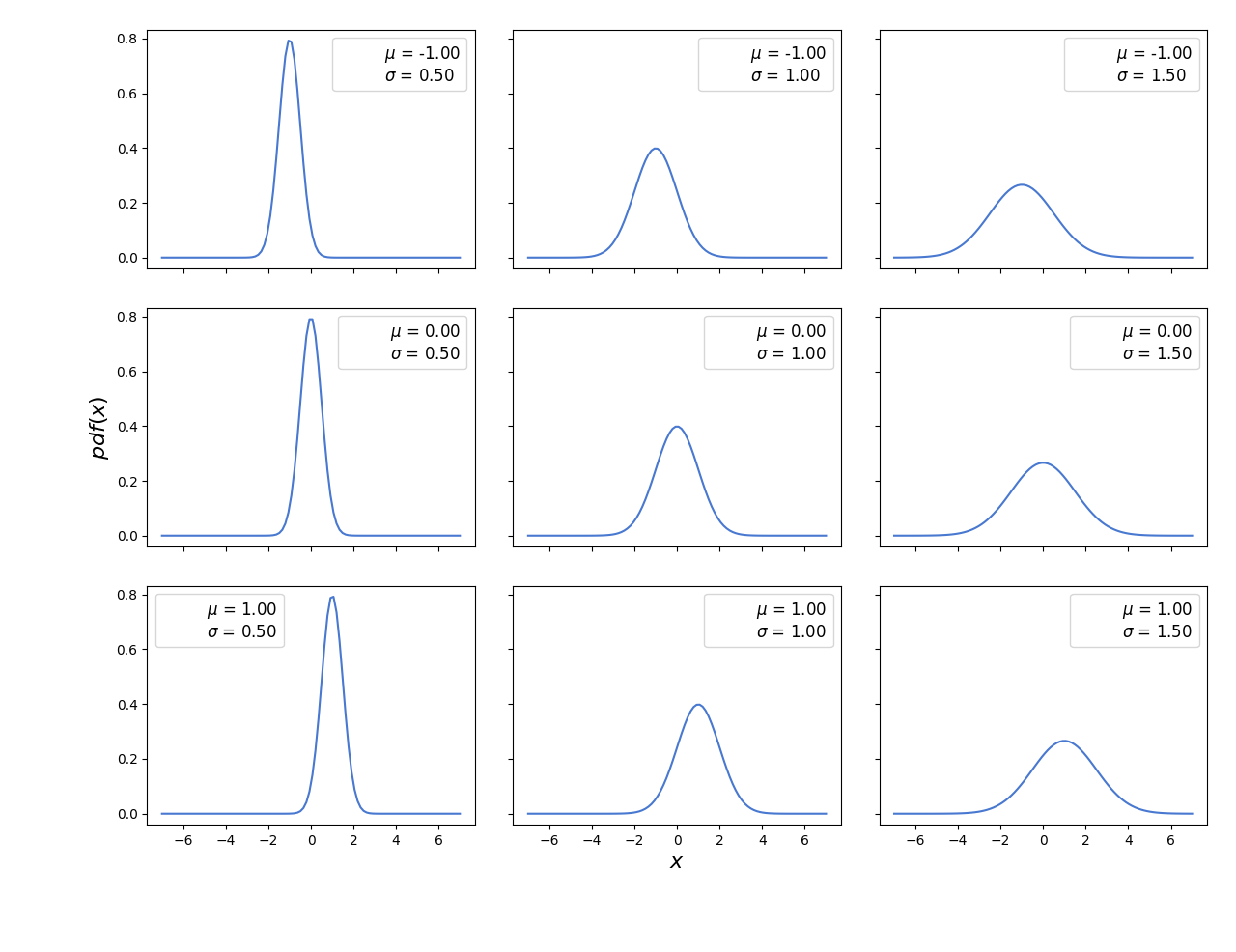
import matplotlib.pyplot as plt
import numpy as np
from scipy import stats
import seaborn as sns
palette = 'muted'
sns.set_palette(palette); sns.set_color_codes(palette)

mu_params = [-1, 0, 1]
sd_params = [0.5, 1, 1.5]
x = np.linspace(-7, 7, 100)
f, ax = plt.subplots(len(mu_params), len(sd_params), sharex=True, sharey=True)
for i in range(3):
    for j in range(3):
        mu = mu_params[i]
        sd = sd_params[j]
        y = stats.norm(mu, sd).pdf(x)
        ax[i,j].plot(x, y)
        ax[i,j].plot(0, 0,
        label="$\\mu$ = {:3.2f}\n$\\sigma$ = {:3.2f}".format(mu, sd), alpha=0)
        ax[i,j].legend(fontsize=12)
ax[2,1].set_xlabel('$x$', fontsize=16)
ax[1,0].set_ylabel('$pdf(x)$', fontsize=16)
plt.tight_layout()
# plt.savefig('B04958_01_01.png', dpi=300, figsize=(5.5, 5.5))
plt.show()
绘图:
==========================================================
本博客是博主个人学习时的一些记录,不保证是为原创,个别文章加入了转载的源地址,还有个别文章是汇总网上多份资料所成,在这之中也必有疏漏未加标注处,如有侵权请与博主联系。
如果未特殊标注则为原创,遵循 CC 4.0 BY-SA 版权协议。
posted on 2022-06-08 19:00 Angry_Panda 阅读(858) 评论(0) 编辑 收藏 举报