Python数据可视化工具 - seaborn 和 missingno
seaborn是一个基于pyplot的数据可视化库,可以比较简单美观地用于展示基于Pandas数据类型的数据
missingno是一个基于pyplot的用于展示数据空值的直观工具,在处理大数据时也非常有用
安装:
pip install seaborn
pip install missingno
使用:
import missingno as msno
import seaborn as sns
Mac上的中文显示
plt.rcParams['font.family'] = ['Heiti TC']
plt.rcParams['axes.unicode_minus'] = False
这两行代码可以用于处理mac上中文不能显示的问题,要注意font.family的内容必须系统中有这个字体,这个命令可以查看字体是不是含有:
import matplotlib.font_manager

# Get All fonts from ttf library
for f in matplotlib.font_manager.fontManager.ttflist:
     print(f.name)
有方法可以通过字体替换,永久解决这个问题,详见:Mac OS系统下实现python matplotlib包绘图显示中文(亲测有效)_Jora0427的博客-CSDN博客_mac matplotlib显示中文
Missingno显示缺失内容
Missingno提供了四种图来显示图片缺失情况,包含:
- 条形图:它显示每一列显示的值的计数,忽略缺失的值
- 矩阵:零度矩阵图可以让我们同时了解整个数据集内的数据在所有列中的分布情况,这可以帮助我们更好地了解数据的分布情况。它还显示sparkline,突出显示数据集中具有最大和最小零值的行。
- Heatmap:该图表显示数据集列之间的零相关性。它让我们了解一个列中缺失的值与其他列中缺失的值之间的关系。
- 树状图:像树状图一样,根据列之间的零度关系将列分组。它把列组合在一起有更多的零关系。
详见:missingno - Visualize Missing Data in Python (coderzcolumn.com)
矩阵图如下,比较直观:
missingno.matrix(starbucks_locations,figsize=(10,5), fontsize=12);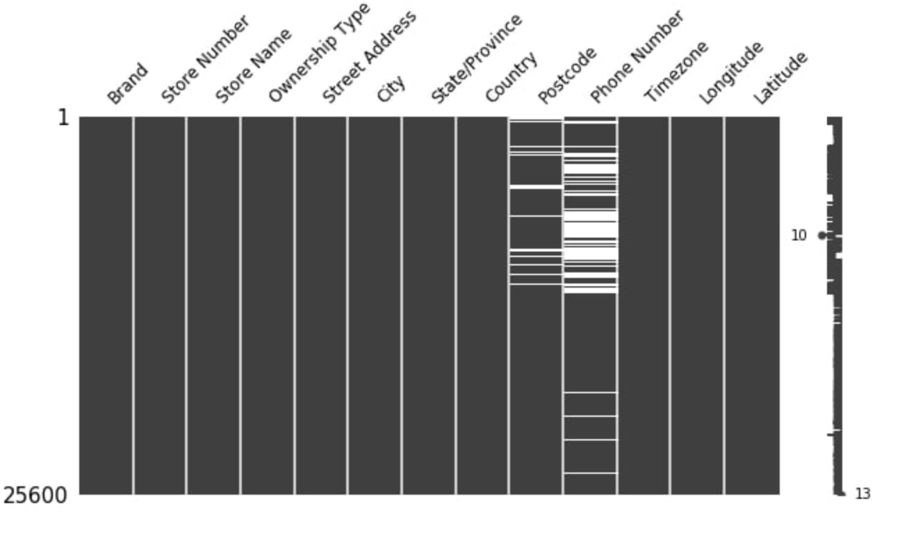
Seaborn
Seaborn基于pyplot,可以用来作各种可视化数据图
- 折线图
# Set the width and height of the figure
plt.figure(figsize=(16,6))

# Line chart showing how FIFA rankings evolved over time
sns.lineplot(data=fifa_data)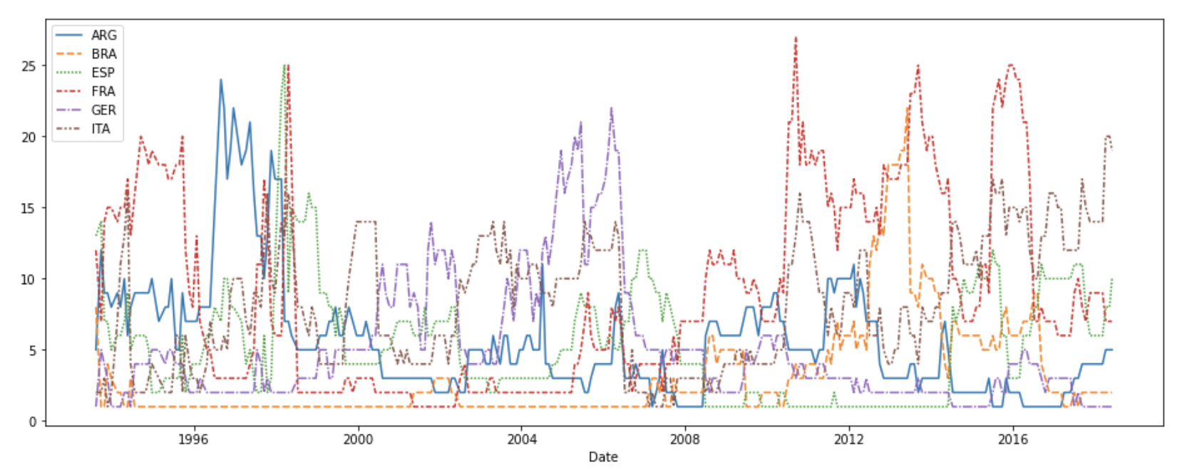
- 条形图
# Set the width and height of the figure
plt.figure(figsize=(10,6))

# Add title
plt.title("Average Arrival Delay for Spirit Airlines Flights, by Month")

# Bar chart showing average arrival delay for Spirit Airlines flights by month
sns.barplot(x=flight_data.index, y=flight_data['NK'])

# Add label for vertical axis
plt.ylabel("Arrival delay (in minutes)")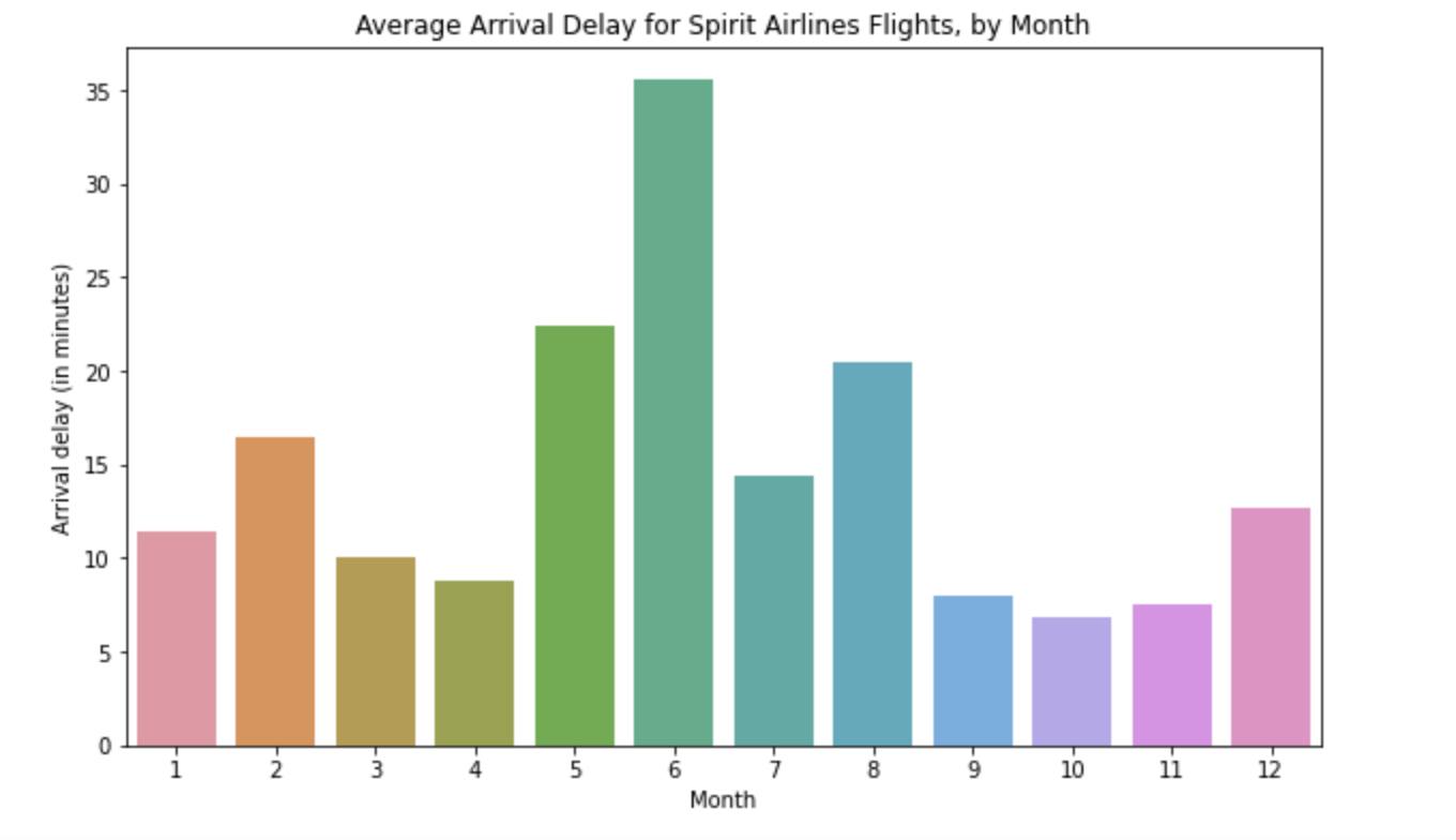
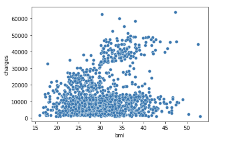
- 散点图
# Path of the file to read
insurance_filepath = "../input/insurance.csv"

# Read the file into a variable insurance_data
insurance_data = pd.read_csv(insurance_filepath)
sns.scatterplot(x=insurance_data['bmi'], y=insurance_data['charges'])
- 热力图
# Set the width and height of the figure
plt.figure(figsize=(14,7))

# Add title
plt.title("Average Arrival Delay for Each Airline, by Month")

# Heatmap showing average arrival delay for each airline by month
sns.heatmap(data=flight_data, annot=True)

# Add label for horizontal axis
plt.xlabel("Airline")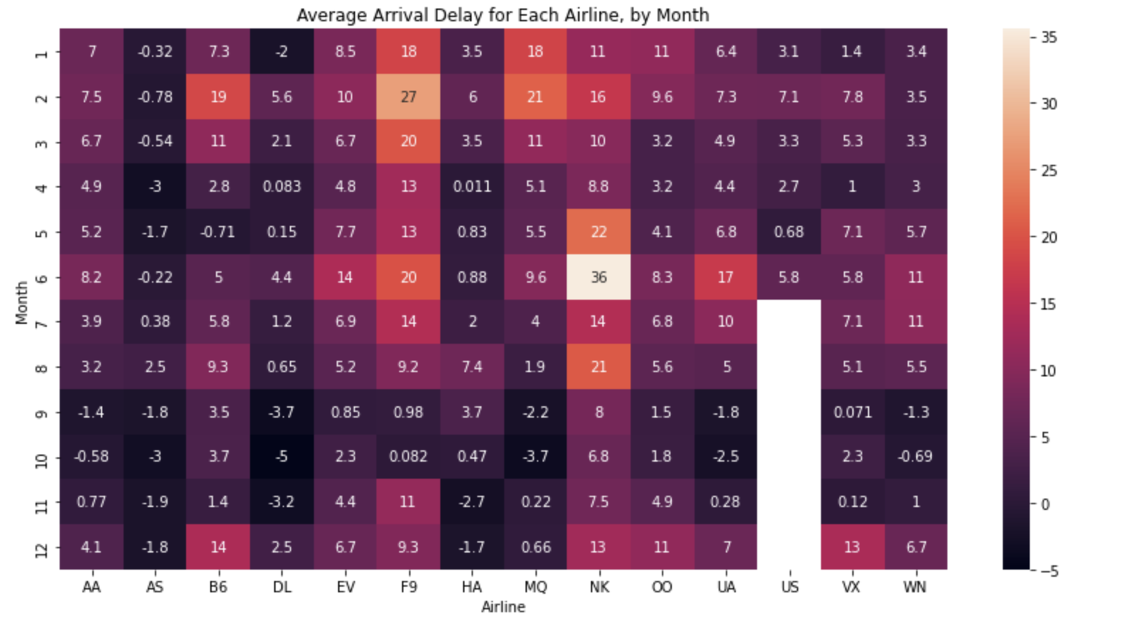

 浙公网安备 33010602011771号