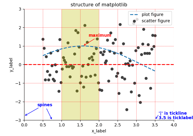
import matplotlib.pyplot as plt
import numpy as np

x = np.linspace(start=0.5, stop=3.5, num=100)
y = np.sin(x)
y1 = np.random.randn(100)

plt.scatter(x, y1, c='0.25', label='scatter figure')
plt.plot(x, y, ls='--', lw=2, label='plot figure')
for spine in plt.gca().spines.keys():
    if spine == 'top' or spine == 'right':
        plt.gca().spines[spine].set_color('none')
plt.gca().xaxis.set_ticks_position('bottom')
plt.gca().yaxis.set_ticks_position('left')
plt.xlim(left=0.0, right=4.0)
plt.ylim(bottom=-3.0, top=3.0)
plt.xlabel('x_label')
plt.ylabel('y_label')
plt.grid(True, ls=':', color='r')
plt.axhline(y=0.0, c='r', ls='--', lw=2)
plt.axvspan(xmin=1.0, xmax=2.0, facecolor='y', alpha=0.3)
plt.annotate('maximum', xy=(np.pi/2, 1.0), xytext=((np.pi/2)+0.15, 1.5), weight='bold', color='r', arrowprops=dict(arrowstyle='->', connectionstyle='arc3', color='r'))
plt.annotate('spines', xy=(0.75, -3), xytext=(0.35, -2.25), weight='bold', color='b', arrowprops=dict(arrowstyle='->', connectionstyle='arc3', color='b'))
plt.annotate('', xy=(0, -2.78), xytext=(0.4, -2.32), arrowprops=dict(arrowstyle='->', connectionstyle='arc3', color='b'))
plt.annotate('', xy=(3.5, -2.98), xytext=(3.6, -2.7), arrowprops=dict(arrowstyle='->', connectionstyle='arc3', color='b'))
plt.text(3.6, -2.7, "'|' is tickline", weight='bold', color='b')
plt.text(3.6, -2.95, '3.5 is ticklabel', weight='bold', color='b')
plt.title('structure of matplotlib')
plt.legend(loc='upper right')
plt.show()


 浙公网安备 33010602011771号