


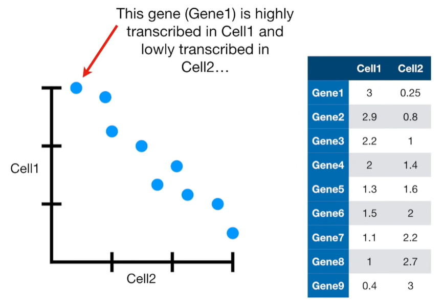

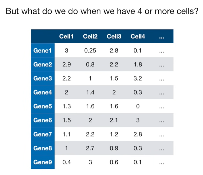


import matplotlib.pyplot as plt
import numpy as np
import pandas as pd
import random as rd

from sklearn import preprocessing
from sklearn.decomposition import PCA
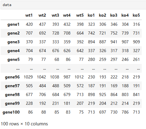
# features
genes = ['gene' + str(i) for i in range (1, 101)]

# samples
wt = ['wt' + str(i) for i in range(1, 6)]  # wild type
ko = ['ko' + str(i) for i in range(1, 6)]  # knock out

data = pd.DataFrame(columns=[*wt, *ko], index=genes)

for gene in data.index:
    data.loc[gene, 'wt1':'wt5'] = np.random.poisson(lam=rd.randrange(10, 1000), size=5)
    data.loc[gene, 'ko1':'ko5'] = np.random.poisson(lam=rd.randrange(10, 1000), size=5)
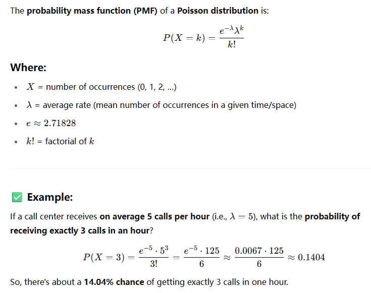 Poisson distribution
Here are some classic examples where the Poisson distribution is used to model the number of events happening in a fixed interval of time or space, assuming the events are rare, independent, and occur at a constant average rate:
📦 1. Call Center (Time-Based)
-
Scenario: A call center receives an average of 10 calls per hour.
-
Question: What's the probability of receiving 7 calls in the next hour?
-
Model:
Let X∼Poisson(λ=10)
🚗 2. Traffic Accidents (Time or Space-Based)
-
Scenario: On average, 3 car accidents happen per day on a specific highway.
-
Question: What's the probability of 0 accidents today?
-
Model:
X∼Poisson(λ=3)
📨 3. Emails Received
-
Scenario: You receive about 5 spam emails per day.
-
Question: What’s the probability of getting exactly 8 spam emails tomorrow?
-
Model:
X∼Poisson(λ=5)
🦠 4. Mutations in DNA (Space-Based)
-
Scenario: A particular stretch of DNA has an average of 2 mutations per 1,000 base pairs.
-
Question: What’s the probability of seeing 4 mutations in a 1,000 base pair segment?
-
Model:
X∼Poisson(λ=2)
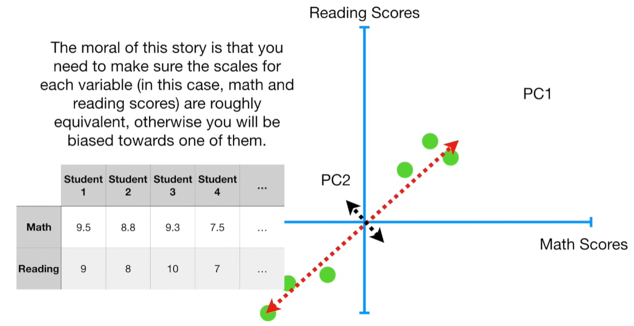
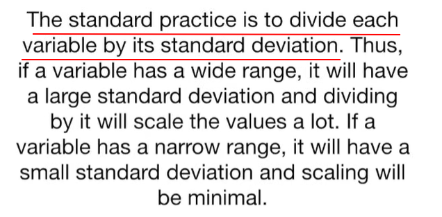
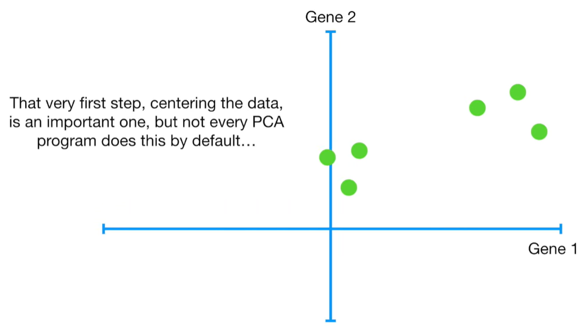
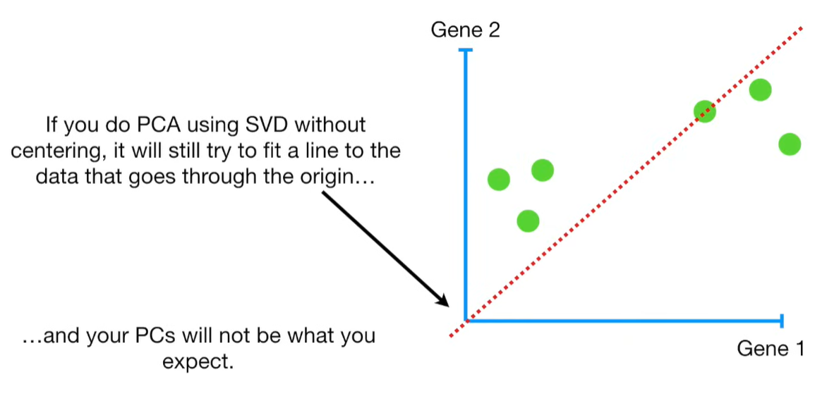
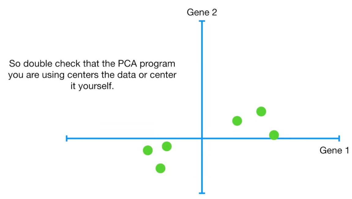
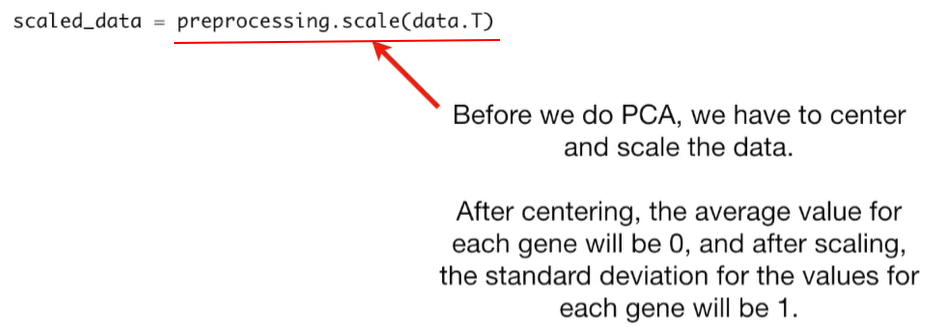
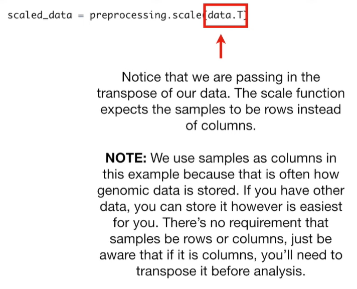
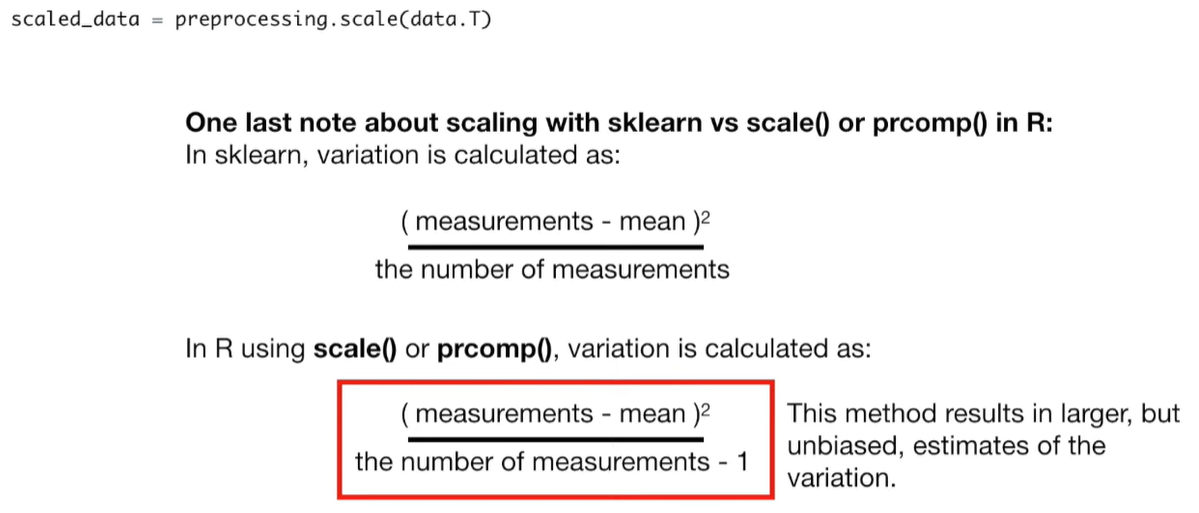
# center and scale the data
scaled_data = preprocessing.scale(data.T)


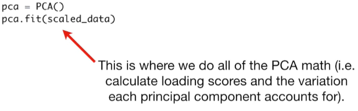
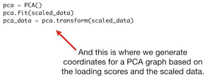
pca = PCA()
pca.fit(scaled_data)
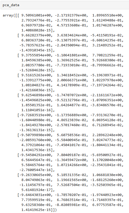
pca_data = pca.transform(scaled_data)
pca_data.shape

# (10, 10)
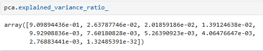
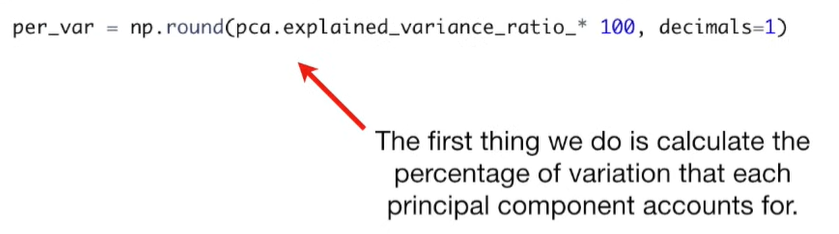
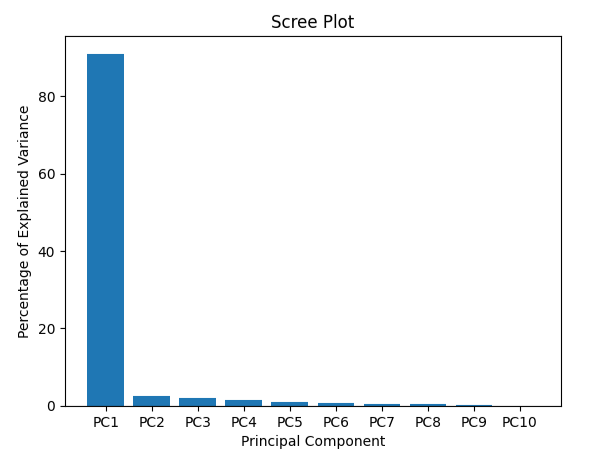
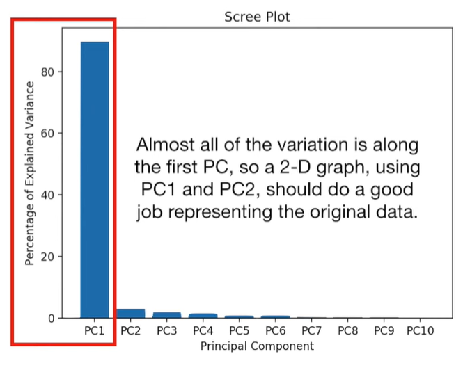
per_var = np.round(pca.explained_variance_ratio_ * 100, decimals=1)
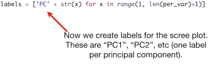
labels = ['PC' + str(i) for i in range(1, len(per_var) + 1)]
plt.bar(x=range(1, len(per_var) + 1), height=per_var, tick_label=labels)
plt.title('Scree Plot')
plt.xlabel('Principal Component')
plt.ylabel('Percentage of Explained Variance')
plt.show()
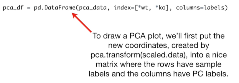
pca_df = pd.DataFrame(pca_data, index=[*wt, *ko], columns=labels)
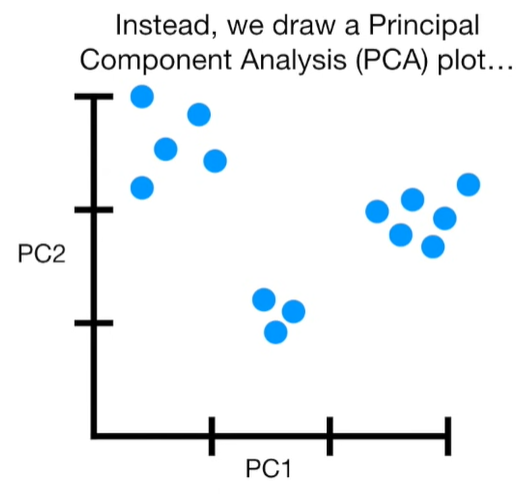
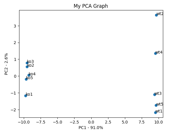
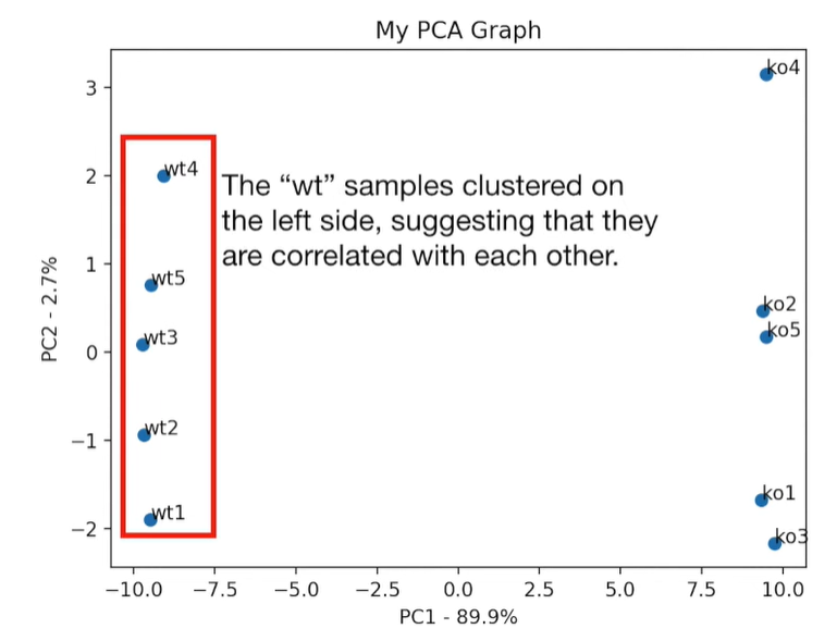
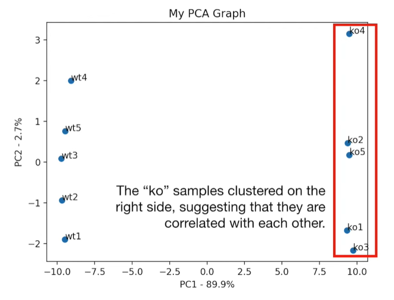
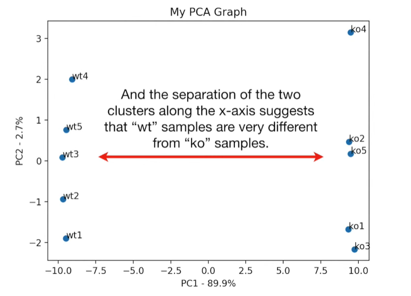
plt.scatter(pca_df.PC1, pca_df.PC2)
plt.title('My PCA Graph')
plt.xlabel('PC1 - {}%'.format(per_var[0]))
plt.ylabel('PC2 - {}%'.format(per_var[1]))

for sample in pca_df.index:
    plt.annotate(sample, (pca_df.PC1.loc[sample], pca_df.PC2.loc[sample]))

plt.show()

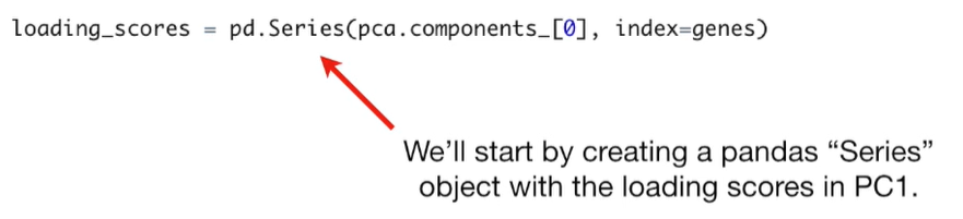
loading_scores = pd.Series(pca.components_[0], index=genes)

sorted_loading_scores = loading_scores.abs().sort_values(ascending=False)

top_10_genes = sorted_loading_scores[:10].index.values

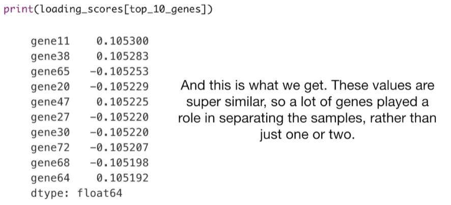
print(loading_scores[top_10_genes])
gene78    0.104774
gene66    0.104751
gene57   -0.104749
gene16   -0.104740
gene69   -0.104737
gene96    0.104724
gene63    0.104712
gene24   -0.104711
gene81   -0.104699
gene95   -0.104689
dtype: float64


 浙公网安备 33010602011771号