CSS——动画
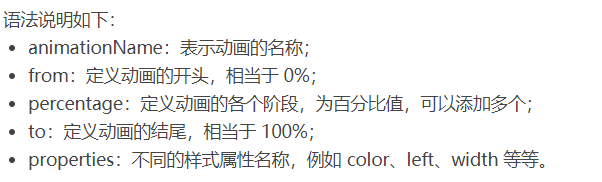
@keyframes 规则
要创建 CSS 动画,您首先需要了解 @keyframes 规则,@keyframes 规则用来定义动画各个阶段的属性值,类似于 flash 动画中的关键帧,语法格式如下:
@keyframes animationName {
    from {
        properties: value;
    }
    percentage {
        properties: value;
    }
    to {
        properties: value;
    }
}
// 或者
@keyframes animationName {
    0% {
        properties: value;
    }
    percentage {
        properties: value;
    }
    100% {
        properties: value;
    }
}
下面我们来看一个简单的 @keyframes 规则示例:
@keyframes ball {
    0% { top: 0px; left: 0px;}
    25% { top: 0px; left: 350px;}
    50% { top: 200px; left: 350px;}
    75% { top: 200px; left: 0px;}
    100% { top: 0px; left: 0px;}
}

下面就来详细介绍一下上述属性的使用:
<!DOCTYPE html>
<html>
<head>
<style>
@keyframes ball {
0% { top: 0px; left: 0px;}
25% { top: 0px; left: 350px;}
50% { top: 200px; left: 350px;}
75% { top: 200px; left: 0px;}
100% { top: 0px; left: 0px;}
}
div {
width: 100px;
height: 100px;
border-radius: 50%;
border: 3px solid black;
position: relative;
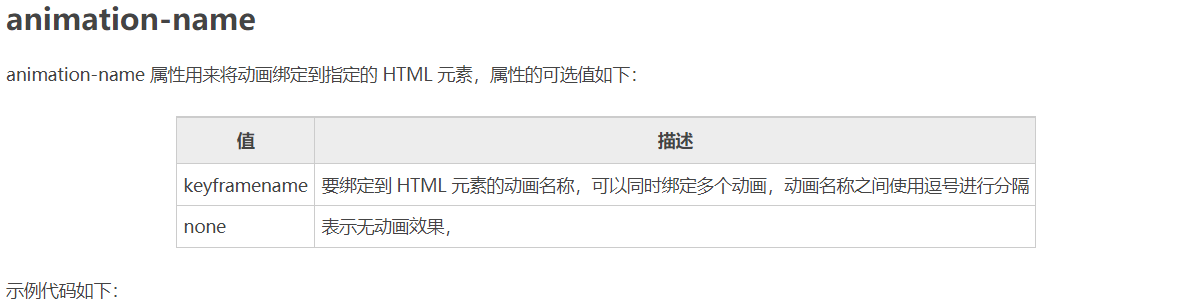
animation-name: ball;
}
</style>
</head>
<body>
<div></div>
</body>
</html>
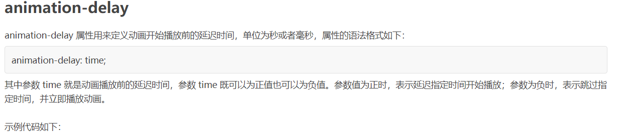
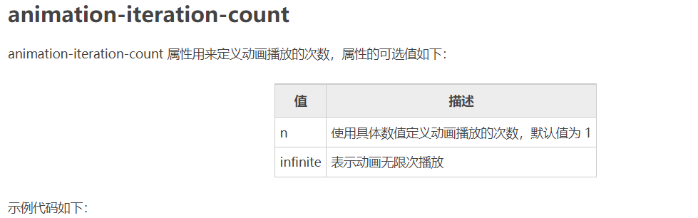
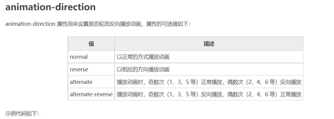
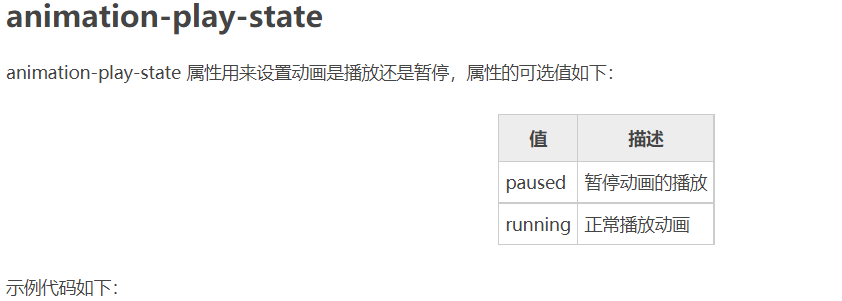
注意:要想让动画成功播放,您还需要定义 animation-duration 属性,否则会因为 animation-duration 属性的默认值为 0,导致动画并不会播放。

<!DOCTYPE html>
<html>
<head>
    <style>
        @keyframes ball {
            0% { top: 0px; left: 0px;}
            25% { top: 0px; left: 350px;}
            50% { top: 200px; left: 350px;}
            75% { top: 200px; left: 0px;}
            100% { top: 0px; left: 0px;}
        }
        div {
            width: 100px;
            height: 100px;
            border-radius: 50%;
            border: 3px solid black;
            position: relative;
            animation-name: ball;
            animation-duration: 2s;
        }
    </style>
</head>
<body>
    <div></div>
</body>
</html>
提示:动画若想成功播放,必须要定义 animation-name 和 animation-duration 属性。
<!DOCTYPE html>
<html>
<head>
<style>
@keyframes ball {
0% {left: 0px;}
50% {left: 350px;}
100% {left: 0px;}
}
div {
width: 100px;
height: 100px;
border-radius: 50%;
border: 3px solid black;
text-align: center;
line-height: 100px;
position: relative;
animation-name: ball;
animation-duration: 2s;
}
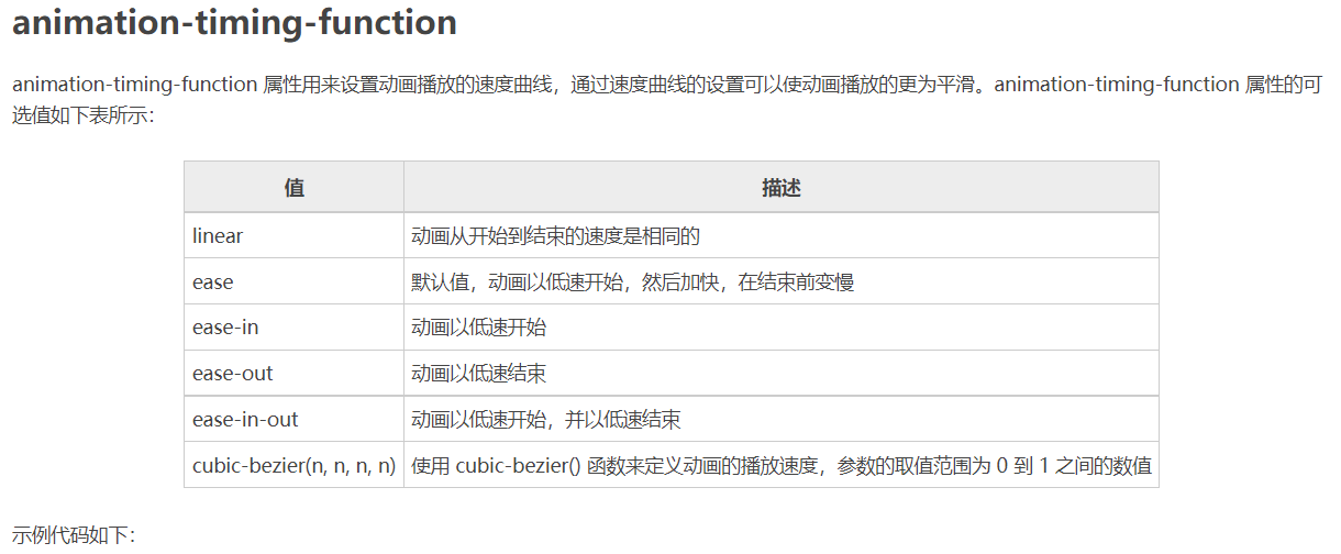
.one {
animation-timing-function: ease;
}
.two {
animation-timing-function: ease-in;
}
.three {
animation-timing-function: ease-out;
}
.four {
animation-timing-function: ease-in-out;
}
</style>
</head>
<body>
<div class="one">ease</div>
<div class="two">ease-in</div>
<div class="three">ease-out</div>
<div class="four">ease-in-out</div>
</body>
</html>
<!DOCTYPE html>
<html>
<head>
<style>
@keyframes box {
0% {transform: rotate(0);}
50% {transform: rotate(0.5turn);}
100% {transform: rotate(1turn);}
}
div {
width: 100px;
height: 100px;
border-radius: 50%;
float: left;
border: 3px solid black;
text-align: center;
line-height: 100px;
position: relative;
animation-name: box;
animation-duration: 2s;
animation-iteration-count: 1;
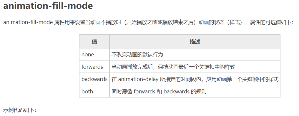
animation-fill-mode: forwards;
}
</style>
</head>
<body>
<div>forwards</div>
</body>
</html>
<!DOCTYPE html>
<html>
<head>
    <style>
        @keyframes ball {
            0% {left: 0px;}
            50% {left: 350px;}
            100% {left: 0px;}
        }
        div {
            width: 100px;
            height: 100px;
            border-radius: 50%;
            border: 3px solid black;
            text-align: center;
            line-height: 100px;
            position: relative;
            animation-name: ball;
            animation-duration: 2s;
        }
        .one {
            animation-delay: 0.5s;
        }
        .two {
            animation-delay: -0.5s;
        }
    </style>
</head>
<body>
    <div class="one">0.5s</div>
    <div class="two">-0.5s</div>
</body>
</html>
<!DOCTYPE html>
<html>
<head>
    <style>
        @keyframes box {
            0% {transform: rotate(0);}
            50% {transform: rotate(0.5turn);}
            100% {transform: rotate(1turn);}
        }
        div {
            width: 100px;
            height: 100px;
            float: left;
            border: 3px solid black;
            text-align: center;
            line-height: 100px;
            position: relative;
            animation-name: box;
            animation-duration: 2s;
        }
        .one {
            animation-iteration-count: 1;
        }
        .two {
            margin-left: 50px;
            animation-iteration-count: infinite;
        }
    </style>
</head>
<body>
    <div class="one">1</div>
    <div class="two">infinite</div>
</body>
</html>
<!DOCTYPE html>
<html>
<head>
    <style>
        @keyframes box {
            0% {transform: rotate(0);}
            50% {transform: rotate(0.5turn);}
            100% {transform: rotate(1turn);}
        }
        div {
            width: 100px;
            height: 100px;
            float: left;
            border: 3px solid black;
            text-align: center;
            line-height: 100px;
            position: relative;
            animation-name: box;
            animation-duration: 2s;
            animation-iteration-count: infinite;
        }
        .one {
            animation-direction: reverse;
        }
        .two {
            margin-left: 50px;
            animation-direction: alternate;
        }
    </style>
</head>
<body>
    <div class="one">reverse</div>
    <div class="two">alternate</div>
</body>
</html>
<!DOCTYPE html>
<html>
<head>
    <style>
        @keyframes box {
            0% {transform: rotate(0);}
            50% {transform: rotate(0.5turn);}
            100% {transform: rotate(1turn);}
        }
        div {
            width: 100px;
            height: 100px;
            float: left;
            border: 3px solid black;
            text-align: center;
            line-height: 100px;
            position: relative;
            animation-name: box;
            animation-duration: 2s;
            animation-iteration-count: infinite;
        }
        .one {
            animation-play-state: running;
        }
        .two {
            margin-left: 50px;
            animation-play-state: paused;
        }
    </style>
</head>
<body>
    <div class="one">running</div>
    <div class="two">paused</div>
</body>
</html>
<!DOCTYPE html>
<html>
<head>
    <style>
        @keyframes box {
            0% {transform: rotate(0);}
            50% {transform: rotate(0.5turn);}
            100% {transform: rotate(1turn);}
        }
        div {
            width: 100px;
            height: 100px;
            border-radius: 50%;
            float: left;
            border: 3px solid black;
            text-align: center;
            line-height: 100px;
            position: relative;
            animation: box 2s linear 0s infinite alternate;
        }
    </style>
</head>
<body>
    <div>animation</div>
</body>
</html>

 浙公网安备 33010602011771号