CSS——渐变色
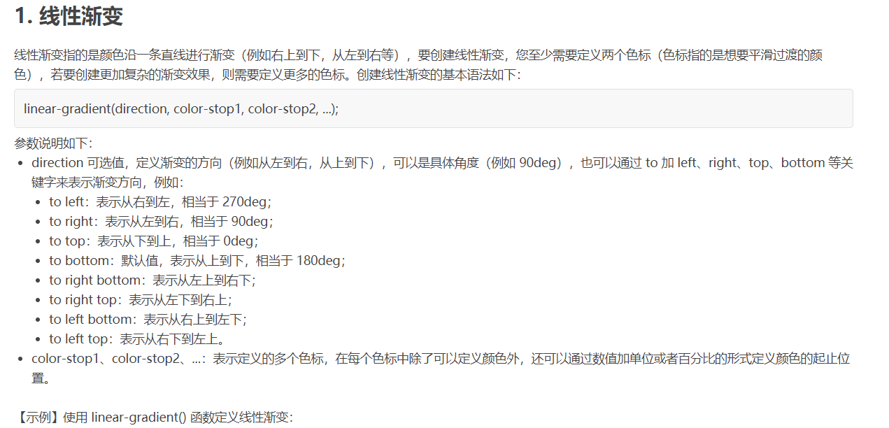
<!DOCTYPE html>
<html>
<head>
    <style>
        div {
            width: 210px;
            height: 50px;
            float: left;
            margin: 10px;
        }
        .one {
            background: linear-gradient(to right bottom, red, blue 70px);
        }
        .two {
            background: linear-gradient(190deg, #000, #FFF);
        }
        .three {
            background: linear-gradient(red, green, blue);
        }
        .four {
            background: linear-gradient(to right, red, orange, yellow, green, blue, indigo, violet);
        }
    </style>
</head>
<body>
    <div class="one"></div>
    <div class="two"></div>
    <div class="three"></div>
    <div class="four"></div>
</body>
</html>
<!DOCTYPE html>
<html>
<head>
<style>
div {
width: 210px;
height: 100px;
float: left;
margin: 10px;
border: 1px solid black;
}
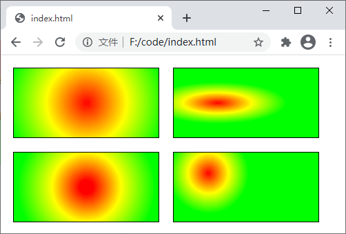
.one {
background: radial-gradient(circle at 50%, red, yellow, lime);
}
.two {
background: radial-gradient(ellipse 100px 30px at 30%, red, yellow, lime);
}
.three {
background: radial-gradient(circle 100px at 50%, red 10%, yellow 50%, lime 100px);
}
.four {
background: radial-gradient(circle closest-corner at 50px 30px, red, yellow, lime);
}
</style>
</head>
<body>
<div class="one"></div>
<div class="two"></div>
<div class="three"></div>
<div class="four"></div>
</body>
</html>
<!DOCTYPE html>
<html>
<head>
<style>
div {
width: 210px;
height: 100px;
float: left;
margin: 10px;
border: 1px solid black;
}
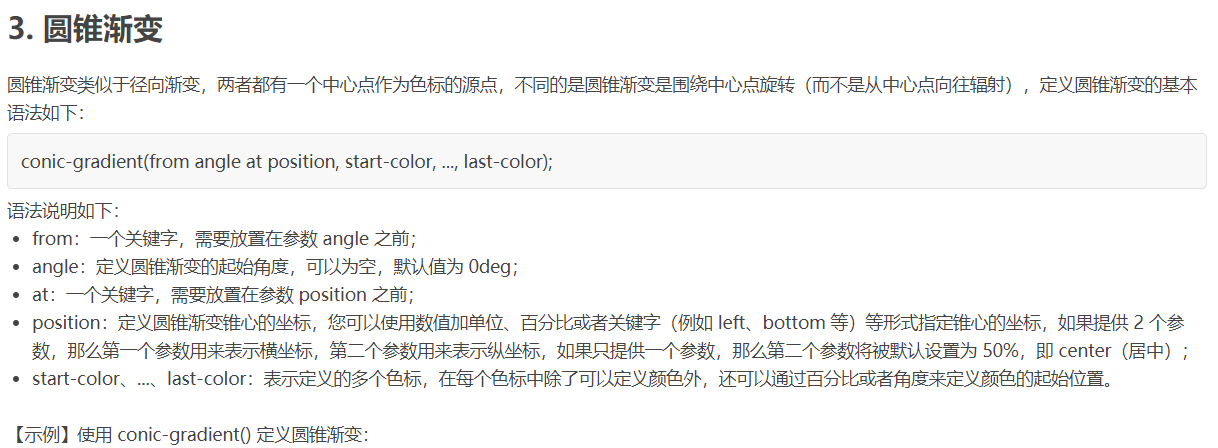
.one {
background: conic-gradient(at 50%, red, orange, yellow, green, blue, indigo, violet, red);
}
.two {
background: conic-gradient(red 0deg 30deg, orange 30deg 50deg, yellow 50deg 200deg, green 200deg 300deg, blue 300deg 360deg);
}
.three {
background: conic-gradient(from 90deg, red 0% 55%, yellow 55% 90%, lime 90% 100%);
}
.four {
background: conic-gradient(#fff 0.25turn, #000 0.25turn 0.5turn, #fff 0.5turn 0.75turn, #000 0.75turn);
}
</style>
</head>
<body>
<div class="one"></div>
<div class="two"></div>
<div class="three"></div>
<div class="four"></div>
</body>
</html>
<!DOCTYPE html>
<html>
<head>
<style>
div {
width: 210px;
height: 100px;
float: left;
margin: 10px;
border: 1px solid black;
}
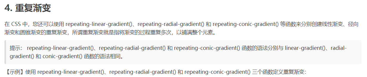
.one {
background: repeating-linear-gradient(190deg, #000 0px 10px, #FFF 10px 20px);
}
.two {
background: repeating-radial-gradient(circle 100px at 50%, red 0% 10%, yellow 10% 30%, lime 30% 40%);
}
.three {
background: repeating-conic-gradient(#69f 0 36deg, #fd44ff 36deg 72deg);
}
.four {
background: conic-gradient(#fff 0.25turn, #000 0.25turn 0.5turn, #fff 0.5turn 0.75turn, #000 0.75turn) top left / 25% 25% repeat;
}
</style>
</head>
<body>
<div class="one"></div>
<div class="two"></div>
<div class="three"></div>
<div class="four"></div>
</body>
</html>


 浙公网安备 33010602011771号