


android:四种基本布局
一个丰富的界面总是要由很多个控件组成的,那我们如何才能让各个控件都有条不紊地 摆放在界面上,而不是乱糟糟的呢?这就需要借助布局来实现了。布局是一种可用于放置很 多控件的容器,它可以按照一定的规律调整内部控件的位置,从而编写出精美的界面。当然, 布局的内部除了放置控件外,也可以放置布局,通过多层布局的嵌套,我们就能够完成一些 比较复杂的界面实现,示意图 3.15 很好地展示了它们之间的关系。
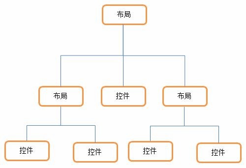
图 3.15
下面我们来详细讲解下 Android 中四种最基本的布局。先做好准备工作,新建一个
UILayoutTest 项目,并让 ADT 自动帮我们创建好活动,活动名和布局名都使用默认值。
3.3.1 LinearLayout
LinearLayout 又称作线性布局,是一种非常常用的布局。正如它名字所描述的一样,这 个布局会将它所包含的控件在线性方向上依次排列。相信你之前也已经注意到了,我们在上 一节中学习控件用法时,所有的控件就都是放在 LinearLayout 布局里的,因此上一节中的控 件也确实是在垂直方向上线性排列的。
既然是线性排列,肯定就不仅只有一个方向,那为什么上一节中的控件都是在垂直方向 排列的呢?这是由于我们通过 android:orientation 属性指定了排列方向是 vertical,如果指定 的是 horizontal ,控件就会在水平方向上排列了。下面我们通过实战来体会一下,修改 activity_main.xml 中的代码,如下所示:
<LinearLayout xmlns:android="http://schemas.android.com/apk/res/android" android:layout_width="match_parent" android:layout_height="match_parent" android:orientation="vertical" >
<Button android:id="@+id/button1" android:layout_width="wrap_content" android:layout_height="wrap_content" android:text="Button 1" />
<Button android:id="@+id/button2" android:layout_width="wrap_content" android:layout_height="wrap_content" android:text="Button 2" />
<Button android:id="@+id/button3" android:layout_width="wrap_content" android:layout_height="wrap_content" android:text="Button 3" />
</LinearLayout>
我们在 LinearLayout 中添加了三个 Button,每个 Button 的长和宽都是 wrap_content,并 指定了排列方向是 vertical。现在运行一下程序,效果如图 3.16 所示。

图 3.16
然后我们修改一下 LinearLayout 的排列方向,如下所示:
<LinearLayout xmlns:android="http://schemas.android.com/apk/res/android" android:layout_width="match_parent" android:layout_height="match_parent"
android:orientation="horizontal" >
……
</LinearLayout>
将 android:orientation 属性的值改成了 horizontal,这就意味着要让 LinearLayout 中的控 件在水平方向上依次排列,当然如果不指定 android:orientation 属性的值,默认的排列方向就 是 horizontal。重新运行一下程序,效果如图 3.17 所示。
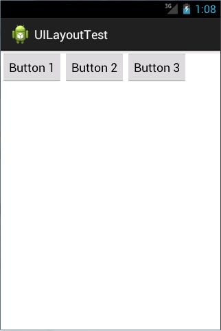
图 3.17
这里需要注意,如果 LinearLayout 的排列方向是 horizontal,内部的控件就绝对不能将 宽度指定为 match_parent,因为这样的话单独一个控件就会将整个水平方向占满,其他的控 件就没有可放置的位置了。同样的道理,如果 LinearLayout 的排列方向是 vertical,内部的控 件就不能将高度指定为 match_parent。
了解了 LinearLayout 的排列规律,我们再来学习一下它的几个关键属性的用法吧。 首先来看 android:layout_gravity 属性,它和我们上一节中学到的 android:gravity 属性看起来有些相似,这两个属性有什么区别呢?其实从名字上就可以看出,android:gravity 是用
于指定文字在控件中的对齐方式,而 android:layout_gravity 是用于指定控件在布局中的对齐 方 式 。 android:layout_gravity 的 可 选 值 和 android:gravity 差 不 多 , 但 是 需 要 注 意 , 当 LinearLayout 的排列方向是 horizontal 时,只有垂直方向上的对齐方式才会生效,因为此时水 平方向上的长度是不固定的,每添加一个控件,水平方向上的长度都会改变,因而无法指定 该方向上的对齐方式。同样的道理,当 LinearLayout 的排列方向是 vertical 时,只有水平方 向上的对齐方式才会生效。修改 activity_main.xml 中的代码,如下所示:
<LinearLayout xmlns:android="http://schemas.android.com/apk/res/android" android:layout_width="match_parent" android:layout_height="match_parent"
android:orientation="horizontal" >
<Button android:id="@+id/button1" android:layout_width="wrap_content" android:layout_height="wrap_content" android:layout_gravity="top" android:text="Button 1" />
<Button android:id="@+id/button2" android:layout_width="wrap_content" android:layout_height="wrap_content" android:layout_gravity="center_vertical" android:text="Button 2" />
<Button android:id="@+id/button3" android:layout_width="wrap_content" android:layout_height="wrap_content" android:layout_gravity="bottom" android:text="Button 3" />
</LinearLayout>
由于目前 LinearLayout 的排列方向是 horizontal,因此我们只能指定垂直方向上的排列方 向,将第一个 Button 的对齐方式指定为 top,第二个 Button 的对齐方式指定为 center_vertical, 第三个 Button 的对齐方式指定为 bottom。重新运行程序,效果如图 3.18 所示。
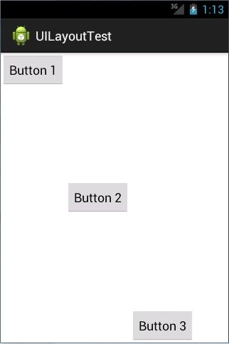
图 3.18
接下来我们学习下 LinearLayout 中的另一个重要属性,android:layout_weight。这个属性 允许我们使用比例的方式来指定控件的大小,它在手机屏幕的适配性方面可以起到非常重要 的作用。比如我们正在编写一个消息发送界面,需要一个文本编辑框和一个发送按钮,修改 activity_main.xml 中的代码,如下所示:
<LinearLayout xmlns:android="http://schemas.android.com/apk/res/android" android:layout_width="match_parent" android:layout_height="match_parent"
android:orientation="horizontal" >
<EditText android:id="@+id/input_message" android:layout_width="0dp" android:layout_height="wrap_content" android:layout_weight="1" android:hint="Type something"/>
<Button android:id="@+id/send" android:layout_width="0dp" android:layout_height="wrap_content" android:layout_weight="1" android:text="Send"/>
</LinearLayout>
你会发现,这里竟然将 EditText 和 Button 的宽度都指定成了 0,这样文本编辑框和按钮 还能显示出来吗?不用担心,由于我们使用了 android:layout_weight 属性,此时控件的宽度 就不应该再由 android:layout_width 来决定,这里指定成 0 是一种比较规范的写法。
然后我们在 EditText 和 Button 里都将 android:layout_weight 属性的值指定为 1,这表示EditText 和 Button 将在水平方向平分宽度,重新运行下程序,你会看到如图 3.19 所示的效果。
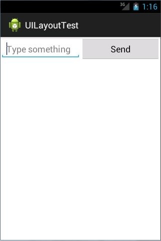
图 3.19
为什么将 android:layout_weight 属性的值同时指定为 1 就会平分屏幕宽度呢?其实原理 也很简单,系统会先把 LinearLayout 下所有控件指定的 layout_weight 值相加,得到一个总值, 然后每个控件所占大小的比例就是用该控件的 layout_weight 值除以刚才算出的总值。因此如 果想让 EditText 占据屏幕宽度的 3/5 ,Button 占据屏幕宽度的 2/5 ,只需要将 EditText 的 layout_weight 改成 3,Button 的 layout_weight 改成 2 就可以了。
我 们 还 可 以 通 过 指 定 部 分 控 件 的 layout_weight 值 , 来 实 现 更 好 的 效 果 。 修 改
activity_main.xml 中的代码,如下所示:
<LinearLayout xmlns:android="http://schemas.android.com/apk/res/android" android:layout_width="match_parent" android:layout_height="match_parent" android:orientation="horizontal" >
<EditText android:id="@+id/input_message" android:layout_width="0dp" android:layout_height="wrap_content" android:layout_weight="1" android:hint="Type something"/>
<Button android:id="@+id/send" android:layout_width="wrap_content" android:layout_height="wrap_content" android:text="Send"/>
</LinearLayout>
这里我们仅指定了 EditText 的 android:layout_weight 属性,并将 Button 的宽度改回 wrap_content。这表示 Button 的宽度仍然按照 wrap_content 来计算,而 EditText 则会占满屏 幕所有的剩余空间。使用这种方式编写的界面,不仅在各种屏幕的适配方面会非常好,而且 看起来也更加舒服,重新运行程序,效果如图 3.20 所示。
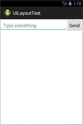
图 3.20
3.3.2 RelativeLayout
RelativeLayout 又称作相对布局,也是一种非常常用的布局。和 LinearLayout 的排列规 则不同,RelativeLayout 显得更加随意一些,它可以通过相对定位的方式让控件出现在布局 的任何位置。也正因为如此,RelativeLayout 中的属性非常多,不过这些属性都是有规律可 循的,其实并不难理解和记忆。我们还是通过实践来体会一下,修改 activity_main.xml 中的 代码,如下所示:
<RelativeLayout xmlns:android="http://schemas.android.com/apk/res/android" android:layout_width="match_parent" android:layout_height="match_parent" >
<Button android:id="@+id/button1" android:layout_width="wrap_content" android:layout_height="wrap_content" android:layout_alignParentLeft="true" android:layout_alignParentTop="true" android:text="Button 1" />
<Button android:id="@+id/button2" android:layout_width="wrap_content" android:layout_height="wrap_content" android:layout_alignParentRight="true" android:layout_alignParentTop="true" android:text="Button 2" />
<Button android:id="@+id/button3" android:layout_width="wrap_content" android:layout_height="wrap_content" android:layout_centerInParent="true" android:text="Button 3" />
<Button android:id="@+id/button4" android:layout_width="wrap_content" android:layout_height="wrap_content" android:layout_alignParentBottom="true"
android:layout_alignParentLeft="true" android:text="Button 4" />
<Button android:id="@+id/button5" android:layout_width="wrap_content" android:layout_height="wrap_content" android:layout_alignParentBottom="true" android:layout_alignParentRight="true" android:text="Button 5" />
</RelativeLayout>
我想以上代码已经不需要我再做过多解释了,因为实在是太好理解了,我们让 Button 1 和父布局的左上角对齐,Button 2 和父布局的右上角对齐,Button 3 居中显示,Button 4 和父 布局的左下角对齐,Button 5 和父布局的右下角对齐。虽然 android:layout_alignParentLeft、 android:layout_alignParentTop、android:layout_alignParentRight、android:layout_alignParentBottom、 android:layout_centerInParent 这几个属性我们之前都没接触过,可是它们的名字已经完全说 明了它们的作用。重新运行程序,效果如图 3.21 所示。

图 3.21
上面例子中的每个控件都是相对于父布局进行定位的,那控件可不可以相对于控件进行
定位呢?当然是可以的,修改 activity_main.xml 中的代码,如下所示:
<RelativeLayout xmlns:android="http://schemas.android.com/apk/res/android" android:layout_width="match_parent" android:layout_height="match_parent" >
<Button android:id="@+id/button3" android:layout_width="wrap_content" android:layout_height="wrap_content" android:layout_centerInParent="true" android:text="Button 3" />
<Button android:id="@+id/button1" android:layout_width="wrap_content" android:layout_height="wrap_content" android:layout_above="@id/button3" android:layout_toLeftOf="@id/button3" android:text="Button 1" />
<Button android:id="@+id/button2" android:layout_width="wrap_content" android:layout_height="wrap_content" android:layout_above="@id/button3" android:layout_toRightOf="@id/button3" android:text="Button 2" />
<Button android:id="@+id/button4" android:layout_width="wrap_content" android:layout_height="wrap_content" android:layout_below="@id/button3" android:layout_toLeftOf="@id/button3" android:text="Button 4" />
<Button android:id="@+id/button5"
android:layout_width="wrap_content" android:layout_height="wrap_content" android:layout_below="@id/button3" android:layout_toRightOf="@id/button3" android:text="Button 5" />
</RelativeLayout>
这次的代码稍微复杂一点,不过仍然是有规律可循的。android:layout_above 属性可以让 一个控件位于另一个控件的上方,需要为这个属性指定相对控件 id 的引用,这里我们填入 了 @id/button3 , 表 示 让 该 控 件 位 于 Button 3 的 上 方 。 其 他 的 属 性 也 都 是 相 似 的 , android:layout_below 表示让一个控件位于另一个控件的下方,android:layout_toLeftOf 表示让 一个控件位于另一个控件的左侧,android:layout_toRightOf 表示让一个控件位于另一个控件 的右侧。注意,当一个控件去引用另一个控件的 id 时,该控件一定要定义在引用控件的后 面,不然会出现找不到 id 的情况。重新运行程序,效果如图 3.22 所示。

图 3.22
RelativeLayout 中还有另外一组相对于控件进行定位的属性,android:layout_alignLeft 表 示让一个控件的左边缘和另一个控件的左边缘对齐,android:layout_alignRight 表示让一个控件的右边缘和另一个控件的右边缘对齐,还有 android:layout_alignTop 和 android:layout_alignBottom,道理都是一样的,我就不再多说,这几个属性就留给你自己去尝试一下了。 好了,正如我前面所说,RelativeLayout 中的属性虽然多,但都是有规律可循的,所以学起来一点都不觉得吃力吧?
3.3.3 FrameLayout
FrameLayout 相比于前面两种布局就简单太多了,因此它的应用场景也少了很多。这种 布局没有任何的定位方式,所有的控件都会摆放在布局的左上角。让我们通过例子来看一看 吧,修改 activity_main.xml 中的代码,如下所示:
<FrameLayout xmlns:android="http://schemas.android.com/apk/res/android" android:layout_width="match_parent" android:layout_height="match_parent"
>
<Button android:id="@+id/button" android:layout_width="wrap_content" android:layout_height="wrap_content" android:text="Button"
/>
<ImageView android:id="@+id/image_view" android:layout_width="wrap_content" android:layout_height="wrap_content" android:src="@drawable/ic_launcher"
/>
</FrameLayout>
FrameLayout 中只是放置了一个按钮和一张图片,重新运行程序,效果如图 3.23 所示。
 图 3.23
可以看到,按钮和图片都是位于布局的左上角。由于图片是在按钮之后添加的,因此图 片压在了按钮的上面。
你可能会觉得,这个布局能有什么作用呢?确实,它的应用场景并不多,不过在下一章 中介绍碎片的时候,我们还是可以用到它的。
3.3.4 TableLayout
TableLayout 允许我们使用表格的方式来排列控件,这种布局也不是很常用,你只需要 了解一下它的基本用法就可以了。既然是表格,那就一定会有行和列,在设计表格时我们 尽量应该让每一行都拥有相同的列数,这样的表格也是最简单的。不过有时候事情并非总会 顺从我们的心意,当表格的某行一定要有不相等的列数时,就需要通过合并单元格的方式来 应对。
比 如 我 们 正 在 设 计 一 个 登 录 界 面 , 允 许 用 户 输 入 账 号 密 码 后 登 录 , 就 可 以 将
activity_main.xml 中的代码改成如下所示:
<TableLayout xmlns:android="http://schemas.android.com/apk/res/android" android:layout_width="match_parent" android:layout_height="match_parent" >
<TableRow>
<TextView android:layout_height="wrap_content" android:text="Account:" />
<EditText android:id="@+id/account" android:layout_height="wrap_content" android:hint="Input your account" />
</TableRow>
<TableRow>
<TextView android:layout_height="wrap_content" android:text="Password:" />
<EditText android:id="@+id/password" android:layout_height="wrap_content" android:inputType="textPassword" />
</TableRow>
<TableRow>
<Button android:id="@+id/login" android:layout_height="wrap_content" android:layout_span="2" android:text="Login" />
</TableRow>
</TableLayout>
在 TableLayout 中每加入一个 TableRow 就表示在表格中添加了一行,然后在 TableRow 中每加入一个控件,就表示在该行中加入了一列,TableRow 中的控件是不能指定宽度的。 这里我们将表格设计成了三行两列的格式,第一行有一个 TextView 和一个用于输入账号的 EditText , 第 二 行 也 有 一 个 TextView 和 一 个 用 于 输 入 密 码 的 EditText , 我 们 通 过 将 android:inputType 属性的值指定为 textPassword,把 EditText 变为密码输入框。可是第三行只有一个用于登录的按钮,前两行都有两列,第三行只有一列,这样的表格就会很难看,而且
结 构 也 非 常 不 合 理 。 这 时 就 需 要 通 过 对 单 元 格 进 行 合 并 来 解 决 这 个 问 题 , 使 用 android:layout_span="2"让登录按钮占据两列的空间,就可以保证表格结构的合理性了。重新 运行程序,效果如图 3.24 所示。
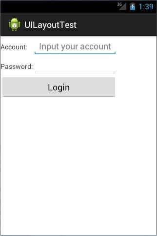
图 3.24
不过从图中可以看出,当前的登录界面并没有充分利用屏幕的宽度,右侧还空出了一块 区 域 , 这 也 难 怪 , 因 为 在 TableRow 中 我 们 无 法 指 定 控 件 的 宽 度 。 这 时 使 用 android:stretchColumns 属性就可以很好地解决这个问题,它允许将 TableLayout 中的某一列 进行拉伸,以达到自动适应屏幕宽度的作用。修改 activity_main.xml 中的代码,如下所示:
<TableLayout xmlns:android="http://schemas.android.com/apk/res/android" android:layout_width="match_parent" android:layout_height="match_parent"
android:stretchColumns="1"
>
……
</TableLayout>
这里将 android:stretchColumns 的值指定为 1,表示如果表格不能完全占满屏幕宽度,就将第二列进行拉伸。没错!指定成 1 就是拉伸第二列,指定成 0 就是拉伸第一列,不要以为
这里我写错了哦。重新运行程序,效果如图 3.25 所示。
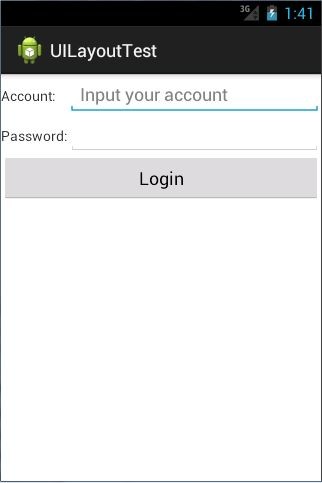
图 3.25

 浙公网安备 33010602011771号