大厂前端推荐纯css实现气泡效果
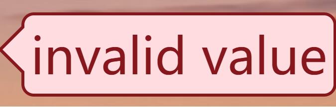
效果图:
主要运用的是1.border 组成的直角三角形。2,before 和 after 伪元素 。3,z-index属性
css代码:
div.bubble{
  position: absolute;
  margin: 0;
  padding: 0;
  color: #86181d;
  background-color: #ffdce0;
  border-color: #cea0a5;
  display:block;
  border:1px solid;
  border-radius: 4px;
  padding: 2px;
}
div.bubble::before{
  content: ' ';
  display: block;
  border-right:7px solid #ffdce0;
  border-left:7px solid  transparent;
  border-top:7px solid  transparent;
  border-bottom: 7px solid transparent;
  width: 0px;
  height: 0px;
  position: absolute;
  top:4px;
  left:-14px;
  z-index: 3;
}
div.bubble::after{
  content: ' ';
  display: block;
  border-right:8px solid #86181d;
  border-left:8px solid  transparent;
  border-top:8px solid  transparent;
  border-bottom: 8px solid transparent;
  width: 0px;
  height: 0px;
  position: absolute;
  top:3px;
  left:-16.5px;
  z-index: 2;
}
字由https://www.wode007.com/sites/73248.html 中国字体设计网https://www.wode007.com/sites/73245.html
1. 将元素的长宽设置为0,并且将border的3条边设置为透明的,就会出现border颜色的直角三角形;
2. 利用伪元素after和before,可以不用另外创建子元素,这可以避免不必要的dom复杂性
3. 用两个border设置的三角形,一大一小,可以模拟边框的效果

 浙公网安备 33010602011771号