
Js 之简单加载动画
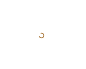
一、效果图

二、示例代码
1、效果一
<!doctype html>
<html lang="en">
<head>
    <meta charset="UTF-8">
    <meta name="viewport" content="width=device-width, user-scalable=no, initial-scale=1.0, maximum-scale=1.0, minimum-scale=1.0">
    <meta http-equiv="X-UA-Compatible" content="ie=edge">
    <title>加载</title>
    <style>
        *{
            margin: 0;
            padding: 0;
        }
        .loading-box{
            width: 100%;
            height: 100%;
            position: fixed;
            left: 0;
            top: 0;
            z-index: 10000;
            background: rgba(255, 255, 255, .4);
        }
        .loading-box .loading{
            color: #AD7D42;
            width: 0.8em;
            height: 0.8em;
            border: .2em solid currentColor;
            border-bottom-color: transparent;
            border-radius: 50%;
            animation: 1s loading linear infinite;
            position: absolute;
            left: 50%;
            top: 50%;
            margin-left: -0.4em;
            margin-top: -60px;
        }

        @keyframes loading{
            0%{
                transform: rotate(0deg);
            }
            100%{
                transform: rotate(360deg);
            }
        }
    </style>
</head>
<body>
<div class="loading-box">
    <div class="loading"></div>
</div>
</body>
</html>
2、效果二
<!doctype html>
<html lang="en">
<head>
    <meta charset="UTF-8">
    <meta name="viewport" content="width=device-width, user-scalable=no, initial-scale=1.0, maximum-scale=1.0, minimum-scale=1.0">
    <meta http-equiv="X-UA-Compatible" content="ie=edge">
    <title>加载</title>
    <style>
        *{
            margin: 0;
            padding: 0;
        }

        .loader:before, .loader:after {
            content: '';
            position: absolute;
            top: 50%;
            left: 50%;
            display: block;
            width: 0.5em;
            height: 0.5em;
            border-radius: 0.25em;
            transform: translate(-50%, -50%);
        }

        .loader:before {
            animation: before 2s infinite;
        }

        .loader:after {
            animation: after 2s infinite;
        }

        .init-loading{
            position: fixed;
            left: 0;
            top: 0;
            width: 100%;
            height: 100%;
            z-index: 99999;
            background: #eee;
        }

        .init-loading.hide {
            opacity: 0;
            pointer-events: none;
            transition: opacity 0.5s;
        }

        .loader {
            position: absolute;
            top: calc(50% - 1.25em);
            left: calc(50% - 1.25em);
            width: 2.5em;
            height: 2.5em;
            transform: rotate(165deg);
        }

        @keyframes before {
            0% {
                width: 0.5em;
                box-shadow: 1em -0.5em rgba(225, 20, 98, 0.75), -1em 0.5em rgba(111, 202, 220, 0.75);
            }
            35% {
                width: 2.5em;
                box-shadow: 0 -0.5em rgba(225, 20, 98, 0.75), 0 0.5em rgba(111, 202, 220, 0.75);
            }
            70% {
                width: 0.5em;
                box-shadow: -1em -0.5em rgba(225, 20, 98, 0.75), 1em 0.5em rgba(111, 202, 220, 0.75);
            }
            100% {
                box-shadow: 1em -0.5em rgba(225, 20, 98, 0.75), -1em 0.5em rgba(111, 202, 220, 0.75);
            }
        }

        @keyframes after {
            0% {
                height: 0.5em;
                box-shadow: 0.5em 1em rgba(61, 184, 143, 0.75), -0.5em -1em rgba(233, 169, 32, 0.75);
            }
            35% {
                height: 2.5em;
                box-shadow: 0.5em 0 rgba(61, 184, 143, 0.75), -0.5em 0 rgba(233, 169, 32, 0.75);
            }
            70% {
                height: 0.5em;
                box-shadow: 0.5em -1em rgba(61, 184, 143, 0.75), -0.5em 1em rgba(233, 169, 32, 0.75);
            }
            100% {
                box-shadow: 0.5em 1em rgba(61, 184, 143, 0.75), -0.5em -1em rgba(233, 169, 32, 0.75);
            }
        }
    </style>
</head>
<body>
<div class="init-loading">
    <div class="loader"></div>
</div>
</body>
</html>

 浙公网安备 33010602011771号