
CSS 绘制同心圆
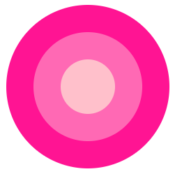
1. 利用三个 div 盒子,以及 margin、border-radius 属性实现同心圆效果:
<style>
    .outer {
      width: 150px;
      height: 150px;
      background-color: deeppink;
      border-radius: 50%;
    }
    .middle {
      width: 100px;
      height: 100px;
      margin-top: -125px;
      margin-left: 25px;
      background-color: hotpink;
      border-radius: 50%;
    }
    .inner {
      width: 50px;
      height: 50px;
      margin-top: -75px;
      margin-left: 50px;
      background-color: pink;
      border-radius: 50%;
    }
  </style>
<body>
  <div class="circle">
    <div class="outer"></div>
    <div class="middle"></div>
    <div class="inner"></div>
  </div>
</body>
效果:
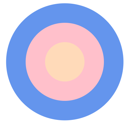
2. 利用一个 div 盒子,以及其 border、box-shadow 属性:
<body>
  <div class="circle-shadow"></div>
</body>
  <style>
    .circle-shadow {
      margin: auto;
      width: 80px;
      height: 80px;
      border-radius: 50%;
      border: 40px solid pink;
      background-color: peachpuff;
      box-shadow: 0 0 0 40px rgba(2, 238, 255, 0.2);
      /*background-clip: padding-box;*/
    }
  </style>
效果:

 浙公网安备 33010602011771号