

Css3 实现锯齿效果整理
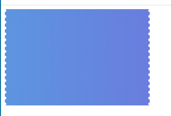
一、Css3 实现锯齿效果 优惠券锯齿效果
<!DOCTYPE html>
<html lang="en">

<head>
    <meta charset="UTF-8">
    <meta name="viewport" content="width=device-width, initial-scale=1.0">
    <meta http-equiv="X-UA-Compatible" content="ie=edge">
    <title>Document</title>
</head>


<style>
    .dotted {
        position: relative;
        background: linear-gradient(to right, #5d95e0, #697dde);
        width: 300px;
        height: 200px;
    }

    .dotted:before {
        content: ' ';
        width: 0;
        height: 100%;
        position: absolute;
        /* 小球形状 */
        border-right: 6px dotted white;
        left: -3px;
        top: 0px;
    }
    .dotted::after {
        content: ' ';
        width: 0;
        height: 100%;
        position: absolute;
        /* 小球形状 */
        border-right: 6px dotted white;
        right: -3px;
        top: 0px;
    }
</style>

<body>
    <div class="dotted"></div>
</body>

</html>
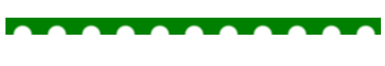
二、Css3 实现锯齿效果 半圆锯齿效果
<!DOCTYPE html>
<html lang="en">

<head>
    <meta charset="UTF-8">
    <meta name="viewport" content="width=device-width, initial-scale=1.0">
    <title>Document</title>
    <style>
        .toothbg {
            width: 100%;
            height: 50px;
            margin: 100px 0px;
            background: white;
            background-image: radial-gradient(15px at 25px 25px, transparent, transparent, transparent, transparent, green);
            background-size: 50px 50px;
            background-repeat: repeat-x;
            background-position: 0px 0px;
        }
    </style>
</head>

<body>
    <div class="toothbg"></div>
</body>

</html>

修改一下高度
        .toothbg {
            width: 100%;
            height: 25px;
            margin: 100px 0px;
            background: white;
            background-image: radial-gradient(15px at 25px 25px, transparent, transparent, transparent, transparent, green);
            background-size: 50px 50px;
            background-repeat: repeat-x;
            background-position: 0px 0px;
        }
更多:

 浙公网安备 33010602011771号