
Css3 实现全圆进度条展示功能
一、Css3 实现全圆进度条展示功能1
<style>
    .block {
        width: 200px;
        height: 200px;
        background: rgb(247, 49, 49);
        position: relative;
        border-radius: 50%;
    }

    .block>.block {
        position: absolute;
    }

    .block2 {
        clip: rect(0, 100px, auto, auto);
        background: #aaa;
    }

    .block3 {
        background: #aaa;
        clip: rect(0, auto, auto, 100px);
        transform: rotate(45deg);
    }
</style>

<div class="block block1">
    <div class="block block2"></div>
    <div class="block block3"></div>
</div>

<script>
    $(function () {
        var percent = 60;
        var baseColor = $('.block').css('background-color');
        if (percent <= 50) {
            $('.block3').css('transform', 'rotate(' + (percent * 3.6) + 'deg)');
        } else {
            $('.block3').css({
                'transform': 'rotate(0deg)',
                'background-color': baseColor
            });
            $('.block2').css('transform', 'rotate(' + ((percent - 50) * 3.6) + 'deg)');
        }
    })
</script>

二、Css3 实现全圆进度条展示功能2
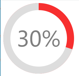
<style>
    /*支持IE9及以上*/
    .circle-bar {
        font-size: 200px;
        width: 1em;
        height: 1em;
        position: relative;
        background-color: rgb(247, 47, 47);
    }

    .circle-bar-left,
    .circle-bar-right {
        width: 1em;
        height: 200px;
        background-color: #ddd;
    }

    /*
    这里采用clip剪切了圆,实现左右两个半圆,右半圆在后面,因此在更上一层,
    clip的用法参考:http://www.w3school.com.cn/cssref/pr_pos_clip.asp
    */
    .circle-bar-right {
        clip: rect(0, auto, auto, 0.5em);
    }

    .circle-bar-left {
        clip: rect(0, 0.5em, auto, 0);
    }

    .mask {
        width: 0.8em;
        height: 0.8em;
        background-color: #fff;
        text-align: center;
        line-height: 0.2em;
        color: rgba(0, 0, 0, 0.5);
    }

    .mask :first-child {
        font-size: 0.3em;
        height: 0.8em;
        line-height: 0.8em;
        display: block;
    }

    /*所有的后代都水平垂直居中,这样就是同心圆了*/
    .circle-bar * {
        position: absolute;
        top: 0;
        right: 0;
        bottom: 0;
        left: 0;
        margin: auto;
    }

    /*自身以及子元素都是圆*/
    .circle-bar,
    .circle-bar>* {
        border-radius: 50%;
    }
</style>
<div class="circle-bar">
    <div class="circle-bar-left"></div>
    <div class="circle-bar-right"></div>
    <!-- 遮罩层,显示百分比 -->
    <div class="mask">
        <span class="percent">30%</span>
    </div>
</div>

<script>
    $(function () {
        var percent = parseInt($('.mask :first-child').text());
        var baseColor = $('.circle-bar').css('background-color');
        if (percent <= 50) {
            $('.circle-bar-right').css('transform', 'rotate(' + (percent * 3.6) + 'deg)');
        } else {
            $('.circle-bar-right').css({
                'transform': 'rotate(0deg)',
                'background-color': baseColor
            });
            $('.circle-bar-left').css('transform', 'rotate(' + ((percent - 50) * 3.6) + 'deg)');
        }
    })
</script>
更多:

 浙公网安备 33010602011771号