

vue使用echarts系列之K线图Candlestick
主要是对配置的一些说明,项目源码githup地址https://github.com/shengbid/echarts-series
看一下option的配置,除去series里面的配置,其他属性都是常见的配置,不多展开
option: {
        title: {
          text: '上证指数',
          left: 0
        },
        tooltip: {
          trigger: 'axis',
          axisPointer: {
              type: 'cross'
          }
        },
        legend: {
          data: ['日K', 'MA5', 'MA10', 'MA20', 'MA30']
        },
        grid: {
          left: '10%',
          right: '10%',
          bottom: '15%'
        },
        xAxis: {
          type: 'category',
          data: [],
          scale: true,
          boundaryGap: false,
          axisLine: {onZero: false},
          splitLine: {show: false},
          splitNumber: 20,
          min: 'dataMin',
          max: 'dataMax'
        },
        yAxis: {
          scale: true,
          splitArea: {
              show: true
          }
        },
        dataZoom: [
          {
              type: 'inside',
              start: 50,
              end: 100
          },
          {
              show: true,
              type: 'slider',
              top: '90%',
              start: 50,
              end: 100
          }
        ],
}
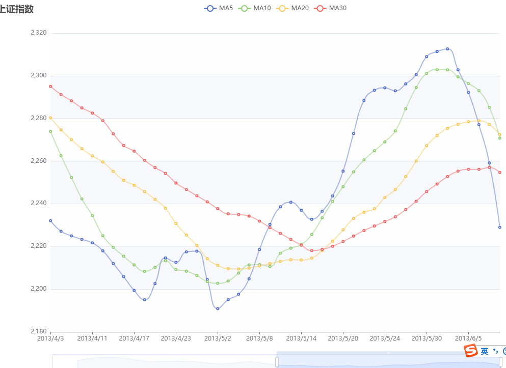
主要看一下series配置里面的K线图,其他4组数据就是普通的折线图,先看一个注释掉K线图的效果,就是简单的多条折线图
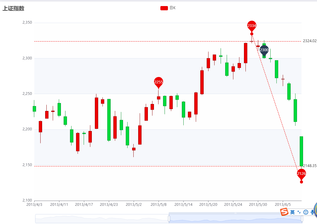
OK,现在把其他4组数据注释,只留下K线图,就是现在这样
然后详细说明一下这里面的配置
data: k线图数据,格式[open, close, lowest, highest] (即:[开盘值, 收盘值, 最低值, 最高值]) 示例: data: [[11, 22, 10, 24], [22, 16, 14, 25]....] 说明一下,如果是红色(赢)收盘大于开盘, 绿色(亏)开盘大于收盘

itemStyle: 单个 K 线图数据的图形样式,默认阳线红色,阴线绿色
itemStyle: {
                color: '#ec0000', // 阳线颜色
                color0: '#00da3c', // 阴线颜色
                borderColor: '#8A0000', // 阳线边框颜色
                borderColor0: '#008F28' // 阴线边框颜色
            },
markPoint: 图表标注,就是图上4个圈圈标注
markPoint: {data: []}
data: [ // 有几组数据就有几个标注
        {
            name: 'XX标点', // 标注名称,可不填,不会展示出来
            coord: ['2013/5/31', 2300], // 标注的坐标X轴, Y轴
            value: 2300, // 标注的数字
            itemStyle: {
                color: 'rgb(41,60,85)' // 标注的颜色
            }
        },
        {
            name: 'highest value',
            // 特殊的标注类型,用于标注最大值最小值等
            // 'min' 最小值。
            // 'max' 最大值。
            // 'average' 平均值
            type: 'max',
            valueDim: 'highest' // K线图的取值维度open, close, lowest, highest
        },
        {
            name: 'lowest value',
            type: 'min',
            valueDim: 'lowest'
        },
        {
            name: 'average value on close',
            type: 'average',
            valueDim: 'close'
        }
    ],

markLine: 图表标线,就是图上三条虚线
markLine: {
      symbol: ['none', 'none'], // 线段两端的图表,默认开始是圆圈,结束是箭头
      data: [
          [ // 数组格式可以有两个值,表示线段的起点和终点
            {
                name: 'from lowest to highest',
                type: 'min',
                valueDim: 'lowest', // K线图的取值维度open, close, lowest, highest
                symbol: 'circle',
                symbolSize: 10,
                label: {
                    show: false
                },
                emphasis: {
                    label: {
                        show: false
                    }
                }
            },
            {
                type: 'max',
                valueDim: 'highest',
                symbol: 'circle',
                symbolSize: 10,
                label: {
                    show: false
                },
                emphasis: {
                    label: {
                        show: false
                    }
                }
              }
          ],
          { // 对象形式为直线
              name: 'min line on close',
              type: 'min',
              valueDim: 'close'
          },
          {
              name: 'max line on close',
              type: 'max',
              valueDim: 'close'
          }
      ]
    }

完整代码,vue
<template>
  <div class="container">
    <div class="chart-container">
      <div id="lineChart" style="width:900px;height:500px"></div>
    </div>
  </div>
</template>

<script>
import data from './chartdata/candlestickdata' // 图表数据

export default {
  name: 'candlestickChart',
  data() {
    return {
      option: {
        title: {
          text: '上证指数',
          left: 0
        },
        tooltip: {
          trigger: 'axis',
          axisPointer: {
              type: 'cross'
          }
        },
        legend: {
          data: ['日K', 'MA5', 'MA10', 'MA20', 'MA30']
        },
        grid: {
          left: '10%',
          right: '10%',
          bottom: '15%'
        },
        xAxis: {
          type: 'category',
          data: [],
          scale: true,
          boundaryGap: false,
          axisLine: {onZero: false},
          splitLine: {show: false},
          splitNumber: 20,
          min: 'dataMin',
          max: 'dataMax'
        },
        yAxis: {
          scale: true,
          splitArea: {
              show: true
          }
        },
        dataZoom: [
          {
              type: 'inside',
              start: 50,
              end: 100
          },
          {
              show: true,
              type: 'slider',
              top: '90%',
              start: 50,
              end: 100
          }
        ],
        series: [
          {
            name: '日K',
            type: 'candlestick',
            data: [],
            itemStyle: {
                color: '#ec0000',
                color0: '#00da3c',
                borderColor: '#8A0000',
                borderColor0: '#008F28'
            },
            markPoint: {
                label: {
                    formatter: function (param) {
                        return param != null ? Math.round(param.value) : '';
                    }
                },
                data: [
                    {
                        name: 'XX标点',
                        coord: ['2013/5/31', 2300],
                        value: 2300,
                        itemStyle: {
                            color: 'rgb(41,60,85)'
                        }
                    },
                    {
                        name: 'highest value',
                        type: 'max',
                        valueDim: 'highest'
                    },
                    {
                        name: 'lowest value',
                        type: 'min',
                        valueDim: 'lowest'
                    },
                    {
                        name: 'average value on close',
                        type: 'average',
                        valueDim: 'close'
                    }
                ],
                tooltip: {
                    formatter: function (param) {
                        return param.name + '<br>' + (param.data.coord || '');
                    }
                }
            },
            markLine: {
              symbol: ['none', 'none'],
              data: [
                  [
                    {
                        name: 'from lowest to highest',
                        type: 'min',
                        valueDim: 'lowest',
                        symbol: 'circle',
                        symbolSize: 10,
                        label: {
                            show: false
                        },
                        emphasis: {
                            label: {
                                show: false
                            }
                        }
                    },
                    {
                        type: 'max',
                        valueDim: 'highest',
                        symbol: 'circle',
                        symbolSize: 10,
                        label: {
                            show: false
                        },
                        emphasis: {
                            label: {
                                show: false
                            }
                        }
                      }
                  ],
                  {
                      name: 'min line on close',
                      type: 'min',
                      valueDim: 'close'
                  },
                  {
                      name: 'max line on close',
                      type: 'max',
                      valueDim: 'close'
                  }
              ]
            }
          },
          {
            name: 'MA5',
            type: 'line',
            data: [],
            smooth: true,
            lineStyle: {
                opacity: 0.5
            }
          },
          {
            name: 'MA10',
            type: 'line',
            data: [],
            smooth: true,
            lineStyle: {
                opacity: 0.5
            }
          },
          {
            name: 'MA20',
            type: 'line',
            data: [],
            smooth: true,
            lineStyle: {
                opacity: 0.5
            }
          },
          {
            name: 'MA30',
            type: 'line',
            data: [],
            smooth: true,
            lineStyle: {
                opacity: 0.5
            }
          },
        ]
      },
      lineChart: null,
      candleData: {
        categoryData: [],
        values: []
      }
    }
  },
  mounted() {
    this.candleData = this.splitData(data)
    console.log(this.candleData)
    this.option.xAxis.data = this.candleData.categoryData
    this.option.series[0].data = this.candleData.values
    this.option.series[1].data = this.calculateMA(5)
    this.option.series[2].data = this.calculateMA(10)
    this.option.series[3].data = this.calculateMA(20)
    this.option.series[4].data = this.calculateMA(30)
    this.getLineChart()
  },
  methods: {
     // 设置折线图
    getLineChart() {
      this.lineChart = this.$echart.init(document.getElementById('lineChart'))
      this.lineChart.setOption(this.option)
    },
    splitData(rawData) {
      var categoryData = [];
      var values = []
      for (var i = 0; i < rawData.length; i++) {
          categoryData.push(rawData[i].splice(0, 1)[0]);
          values.push(rawData[i])
      }
      return {
          categoryData: categoryData,
          values: values
      }
    },
    calculateMA(dayCount) {
      var result = [];
      for (var i = 0, len = this.candleData.values.length; i < len; i++) {
          if (i < dayCount) {
              result.push('-');
              continue;
          }
          var sum = 0;
          for (var j = 0; j < dayCount; j++) {
              sum += this.candleData.values[i - j][1]
          }
          result.push(sum / dayCount)
      }
      return result
    }
  }
}
</script>

<style lang="less">

</style>

 浙公网安备 33010602011771号