TornadoFx学习笔记(1)——常用的代码片段
Tornadofx是基于JavaFx的一个kotlin实现的框架
之后看情况补充..
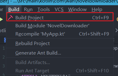
1.读取resources文件夹中的文件
如图
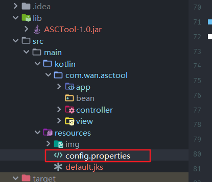
想要读取config.properties文件,有两种方法
在class文件中,可以这样写
//获得输入流
val resourceAsStream = javaClass.classLoader.getResourceAsStream("config.properties")
在MainView.kt文件,可以这样写:
//需要 “/”
val steam = resources.stream("/config.properties")
2.设置窗口的标题、图标、窗口大小
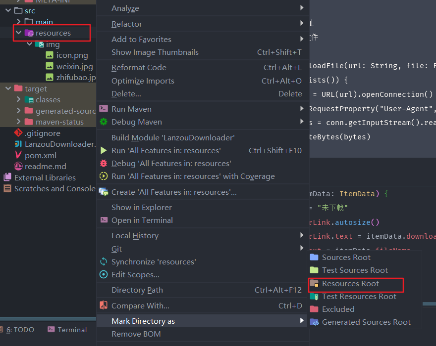
新建一个resources文件夹,将此文件夹设置为resources文件夹
class MainView : View() {
    override val root = vbox {
		//设置标题
        title = "这是标题"
		//设置图标
        addStageIcon(Image("img/file.png"))
		//设置窗口大小
		 setPrefSize(500.0, 400.0)
	}
}
开发者推荐写在init方法里:
class MainView : View() {
	init {
		title = "APK签名验证破解工具 by star-sone"
		setStageIcon(Image("img/file.png"))
	}
    override val root = vbox {
		//设置窗口大小
		 setPrefSize(500.0, 400.0)
	}
}
设置标题还可以这样设置:
class MainView : View("这是标题") {
    override val root = vbox {
		...
	}
}
3.文字与按钮
文字的常用样式设置
text("hello"){
	//设置方向
	alignment = Pos.TOP_CENTER
	style {
		//设置加粗
		fontWeight = FontWeight.BOL
		//字体大小,第二个参数是单位,一个枚举类型
		fontSize = Dimension(18.0, Dimension.LinearUnits.px)
		//设置颜色,c方法是tornadofx中的提取颜色方法
		fill= c("red")
	}
}
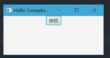
文字按钮
override val root = vbox {
	button("按钮")
}
按钮点击
override val root = vbox {
	button("按钮"){
		//设置最小宽度使用默认,不然会出现省略号
		setMinSize(Button.USE_PREF_SIZE, Button.USE_PREF_SIZE)
		action{
			println("点击按钮")
		}
	}
}
图片按钮
override val root = vbox {
	button(){
		graphic = imageview("img/file.png") {
			//设置大小
			fitHeight = 30.0
			fitWidth = 30.0
                        //设置图片按比例缩放,只设置fitHeight或fitWidth即可有效果
                        isPreserveRatio=true
		}
		setOnAction{
			println("点击按钮")
		}
	}
}
按钮样式
override val root = vbox {
	button("按钮"){
		style {
			//设置背景颜色
			backgroundColor += c("#66bef1")
			//设置按钮文字颜色
			textFill = c("white")
			//粗体
			fontWeight = FontWeight.BOLD
			//字体大小,第二个参数是单位,一个枚举类型
			fontSize = Dimension(20.0, Dimension.LinearUnits.px)
		}
		setOnAction{
			println("点击按钮")
		}
	}
}
按钮设置鼠标滑过阴影
jfxbutton("按钮"){
    setOnMouseEntered { style { backgroundColor += c(0, 0, 0, 0.1)
    //圆形阴影
    //backgroundRadius += box(20.percent)
    } }
    setOnMouseExited { style {} }
}
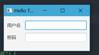
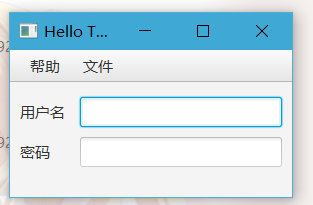
4.表单
登录界面
override val root = vbox {
	form{
		fieldset {
			field("用户名") {
				textfield()
			}
			field("密码") {
				passwordfield()
			}
		}
	}
}
获取输入框的数值
class MainView : View("Hello TornadoFX") {
	//两种写法都可以
    var userTf: TextField by singleAssign()
    var passwordTf by singleAssign<TextField>()

	override val root = vbox {
		form{
			fieldset {
				field("用户名") {
					userTf = textfield()
				}
				field("密码") {
					passwordTf = passwordfield()
				}
				field(){
					button("登录"){
						println(usetTf.text)//用户名
						println(passwordTf.text)//密码

						//登录操作...
					}
				}
			}
		}
}
输入框取消默认选中
JavaFx中,第一个输入框TextField会默认被选中,有时候不希望被选中,可以设置isFocusTraversable = false,如果希望全部输入框不被选中,则全部的输入框都是设置上面的那个属性
class MainView : View("Hello TornadoFX") {
	//两种写法都可以
    var userTf: TextField by singleAssign()
    var passwordTf by singleAssign<TextField>()

	override val root = vbox {
		form{
			fieldset {
				field("用户名") {
					userTf = textfield(){
						//设置此属性
						isFocusTraversable = false
					}
				}
				field("密码") {
					passwordTf = passwordfield()
				}
				field(){
					button("登录"){
						println(usetTf.text)//用户名
						println(passwordTf.text)//密码

						//登录操作...
					}
				}
			}
		}
}
表单验证
//创建验证器
val context = ValidationContext()

//需要验证的控件,一般是对输入框
val input = TextField()

//验证是否符合条件,输入框不能为空
val validator = context.addValidator(input, input.textProperty()) {
	//这里的it就是代表了该输入框的数值
	if(it.isNullOrBlank()){
		//输入框为空,则弹出此信息
		error("输入不能为空")
	}else{
		null
	}
}
//返回是否通过验证的结果,这里可以在button按钮的点击事件触发
val result = context.validtate()
固定大小的文本
有时候需要固定大小的文本,文字超过此宽度,后面的会以省略号来隐藏,这个时候可以使用Label,不过考虑到用户友好度,我们可以加个悬浮窗以便用户可以查看文本的全部内容
label("hello"){
	prefWidth = 100.0
	//鼠标悬浮在上面可以显示提示框
	tooltip = Tooltip(this.text)
}
5.居中
override val root = vbox {
	hbox{
		alignment = Pos.CENTER
		button("按钮")
	}
}
我没有设置hbox大小,所有hbox大小和button高度一样,实现了水平居中
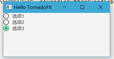
6.单选框
我这里用了Kfoenix,jfxradiobutton是Kfoenix中的控件,jfxradiobutton和radiobutton一样
override val root = vbox {
	togglegroup {
		jfxradiobutton("选项1") {
			isSelected = true
			setOnAction {

			}
		}
		jfxradiobutton("选项2") {
			setOnAction {

			}
		}
		jfxradiobutton("选项3") {
			setOnAction {

			}
		}
	}
}
7.菜单栏
override val root = vbox {
	menubar {
		menu("帮助") {
			item("关于") {
				//设置点击事件
				setOnAction {

				}
			}
		}
		menu("文件"){

		}
	}
	...
}
8.打开新窗口
内部窗口
button("Open editor") {
	action {
		openInternalWindow(Editor::class)
	}
}
新窗口
find(AboutView::class).openModal()
9.View传递数据
10.显示隐藏
比如有一个按钮默认是禁用的,只有当某个单选框被选中的时候,,这个按钮才会启用
val radiobutton = radiobutton(){

}

button{
	disable{
		radiobutton.isSelected
	}
}
11.实时视图
由于是使用kotlin来开发界面,所有,没有像之前那样使用fxml可以直接预览界面,但是,开发提供了一个实时视图,方便我们在debug模式可以快速看到界面,无需重启应用程序
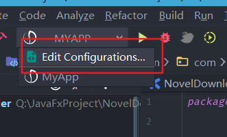
配置
有两种配置方式
1.MyApp中添加如下代码
class MyApp: App(MainView::class,Styles::class){
    init {
        reloadViewsOnFocus()
    }
}
2.在debug配置中添加一个参数--alive-views
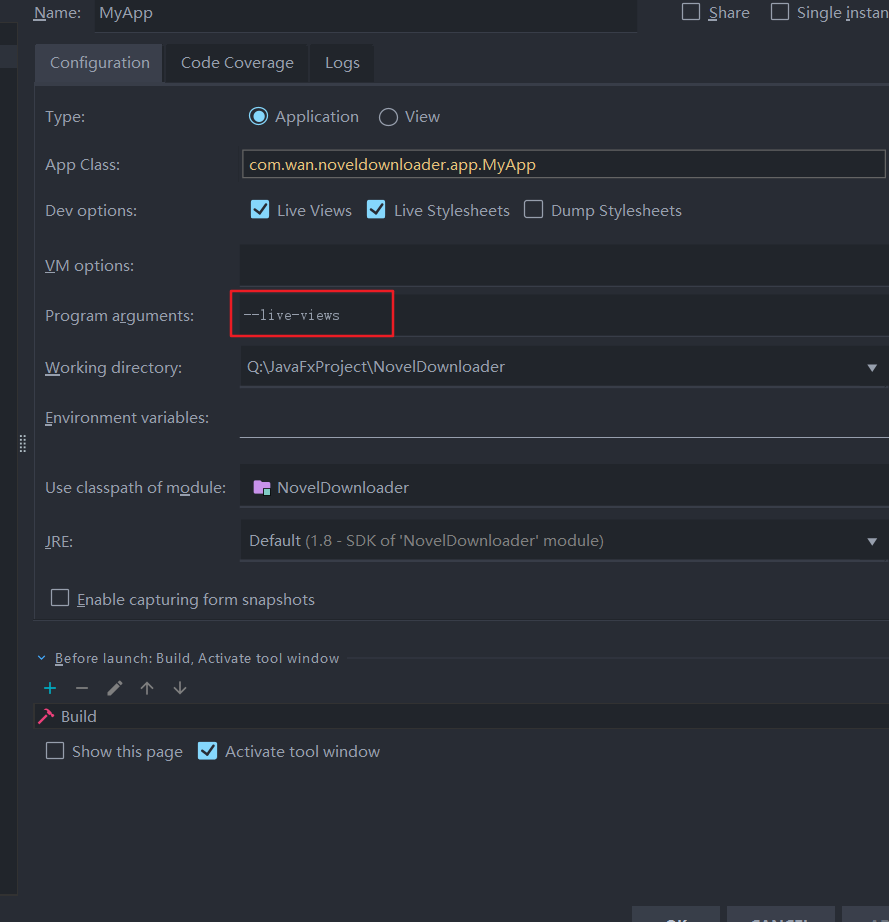
使用
修改View,之后按下Ctrl+F9,等待重载完成,应用的界面就会发生变化
PS:同理还有个--live-stylesheets参数(对应reloadStylesheetsOnFocus方法),用来开启样式的热更新
12.css样式
内联样式
override val root = vbox {
	button{
	   style {
		   backgroundColor += c("blue")
	   }
	}
}
定义css文件
package com.wan.noveldownloader.app

import javafx.scene.text.FontWeight
import tornadofx.*

class Styles : Stylesheet() {
    companion object {
        val MyTab by cssclass()
    }

    init {

        MyTab{
            backgroundColor += c("#64b7ea")
			//伪标签,悬浮
            and(hover){
                backgroundColor+=c("#6495ED")
            }

        }
    }
}
使用addClass方法添加
button{
	addClass(Styles.MyTab)
}
13.单选框 RadioButton
点击按钮输出选中的radioButton的userData数据
PS:userData可以是任意类型
import javafx.scene.control.ToggleGroup
import tornadofx.*

class TestView : View("My View") {
    var toggle by singleAssign<ToggleGroup>()
    override val root = vbox {
        toggle = togglegroup {
            radiobutton("是") {
                userData = 0
            }
            radiobutton("否") {
                isSelected = true
                userData = 1
            }
        }
        button {
            action {
                //输出选中button的userData数据
                println(toggle.selectedToggle.userData)
            }
        }
    }
}


 浙公网安备 33010602011771号