
CSS3动画结合js实现3D轮播
昨天晚上有个同行提出要做一个旋转式的3D轮播图(下面统称banner图)。我就为了帮他看了一下相关的技术贴发现符合要求的很少,所以只能自己去动手写了。看到有人写了CSS3立体旋转动画的博客,我就想把这个动画拆分成几个模块来做一个banner效果可不可以?最后自己动手写了一下还是可以的。不过这个banner效果还是存在一些bug,因为不是急用所以我也没有修复。以后有空我会修复的。
html部分代码
  <div class="container">
        <div class="carouse" id="carouse">
            <div class="pic1">1</div>
            <div class="pic2">2</div>
            <div class="pic3">3</div>
            <div class="pic4">4</div>
            <div class="pic5">5</div>
            <div class="pic6">6</div>
            <div class="pic7">7</div>
            <div class="pic8">8</div>
            <div class="pic9">9</div>
        </div>
    </div>
    <div class="btn-group">
        <button id="prev">上一个</button>
        <button id="next">下一个</button>
    </div>
css代码
*{
            margin:0;
            padding: 0;
        }
        .container{
            width: 210px;
            height:140px;
            position: relative;
            font-size: 32px;
            color: #FFFFFF;
            text-align: center;
            line-height: 90px;
            margin: 200px auto;
            perspective: 1000px;
        }
        .carouse{
            transform-style:preserve-3d;

        }
        .carouse div{
            display: block;
            position: absolute;
            width: 140px;
            height: 90px;
            border: 2px solid black;
        }
        .btn-group{
            display: block;
            margin:100px auto;
            width: 240px;
            height: 30px;
        }
        .btn-group button{
            width: 80px;
            height: 100%;
        }


        .carouse .pic1{
            background:rgba(255,9,15,0.7);
            transform: rotateY(0deg) translateZ(210px);
        }
        .carouse .pic2{
            background:rgba(100,9,100,0.7);
            transform: rotateY(40deg) translateZ(210px);
        }
        .carouse .pic3{
            background:rgba(50,50,15,0.7);
            transform: rotateY(80deg) translateZ(210px);
        }
        .carouse .pic4{
            background:rgba(150,100,200,0.7);
            transform: rotateY(120deg) translateZ(210px);
        }
        .carouse .pic5{
            background:rgba(120,120,120,0.7);
            transform: rotateY(160deg) translateZ(210px);
        }
        .carouse .pic6{
            background:rgba(110,9,250,0.7);
            transform: rotateY(200deg) translateZ(210px);
        }
        .carouse .pic7{
            background:rgba(80,200,15,0.7);
            transform: rotateY(240deg) translateZ(210px);
        }
        .carouse .pic8{
            background:rgba(180,150,100,0.7);
            transform: rotateY(280deg) translateZ(210px);
        }
        .carouse .pic9{
            background:rgba(255,150,0,0.7);
            transform: rotateY(320deg) translateZ(210px);
        }


        /*=== 下一个动画 ===*/
        @keyframes to-scroll1 {
            0%{
                transform: rotateY(0deg);
            }

            100%{
                transform: rotateY(-40deg);

            }

        }
        #carouse1{
            animation: to-scroll1  2s ease both;
            /*animation-fill-mode: both;*/
        }
        @keyframes to-scroll2 {
            0%{
                transform: rotateY(-40deg);
            }

            100%{
                transform: rotateY(-80deg);

            }

        }
        #carouse2{
            animation: to-scroll2  2s ease both;
            /*animation-fill-mode: both;*/
        }
        @keyframes to-scroll3 {
            0%{
                transform: rotateY(-80deg);
            }

            100%{
                transform: rotateY(-120deg);

            }

        }
        #carouse3{
            animation: to-scroll3  2s ease both;
            /*animation-fill-mode: both;*/
        }
        @keyframes to-scroll4 {
            0%{
                transform: rotateY(-120deg);
            }

            100%{
                transform: rotateY(-160deg);

            }

        }
        #carouse4{
            animation: to-scroll4  2s ease both;
            /*animation-fill-mode: both;*/
        }
        @keyframes to-scroll5 {
            0%{
                transform: rotateY(-160deg);
            }

            100%{
                transform: rotateY(-200deg);

            }

        }
        #carouse5{
            animation: to-scroll5  2s ease both;
            /*animation-fill-mode: both;*/
        }
        @keyframes to-scroll6 {
            0%{
                transform: rotateY(-200deg);
            }

            100%{
                transform: rotateY(-240deg);

            }

        }
        #carouse6{
            animation: to-scroll6  2s ease both;
            /*animation-fill-mode: both;*/
        }
        @keyframes to-scroll7 {
            0%{
                transform: rotateY(-240deg);
            }

            100%{
                transform: rotateY(-280deg);

            }

        }
        #carouse7{
            animation: to-scroll7  2s ease both;
            /*animation-fill-mode: both;*/
        }
        @keyframes to-scroll8 {
            0%{
                transform: rotateY(-280deg);
            }

            100%{
                transform: rotateY(-320deg);

            }

        }
        #carouse8{
            animation: to-scroll8  2s ease both;
            /*animation-fill-mode: both;*/
        }
        @keyframes to-scroll9 {
            0%{
                transform: rotateY(-320deg);
            }

            100%{
                transform: rotateY(-360deg);

            }

        }
        #carouse9{
            animation: to-scroll9  2s ease both;
            /*animation-fill-mode: both;*/
        }

       /* @keyframes to-scroll10 {
            0%{
                transform: rotateY(-360deg);
            }

            100%{
                transform: rotateY(-400deg);

            }

        }
        #carouse10{
            animation: to-scroll10  2s ease both;
            /*animation-fill-mode: both;*/
        }*/


        /* === 上一个动画 ===*/

        @keyframes to-scroll21 {
            0%{
                transform: rotateY(-40deg);
            }

            100%{
                transform: rotateY(0deg);

            }

        }
        #carouse21{
            animation: to-scroll21 2s ease both;
            /*animation-fill-mode: both;*/
        }
        @keyframes to-scroll22 {
            0%{
                transform: rotateY(-80deg);
            }

            100%{
                transform: rotateY(-40deg);

            }

        }
        #carouse22{
            animation: to-scroll22  2s ease both;
            /*animation-fill-mode: both;*/
        }
        @keyframes to-scroll23 {
            0%{
                transform: rotateY(-120deg);
            }

            100%{
                transform: rotateY(-80deg);

            }

        }
        #carouse23{
            animation: to-scroll23  2s ease both;
            /*animation-fill-mode: both;*/
        }
        @keyframes to-scroll24 {
            0%{
                transform: rotateY(-160deg);
            }

            100%{
                transform: rotateY(-120deg);

            }

        }
        #carouse24{
            animation: to-scroll24  2s ease both;
            /*animation-fill-mode: both;*/
        }
        @keyframes to-scroll25 {
            0%{
                transform: rotateY(-200deg);
            }

            100%{
                transform: rotateY(-160deg);

            }

        }
        #carouse25{
            animation: to-scroll25  2s ease both;
            /*animation-fill-mode: both;*/
        }
        @keyframes to-scroll26 {
            0%{
                transform: rotateY(-240deg);
            }

            100%{
                transform: rotateY(-200deg);

            }

        }
        #carouse26{
            animation: to-scroll26  2s ease both;
            /*animation-fill-mode: both;*/
        }
        @keyframes to-scroll27 {
            0%{
                transform: rotateY(-280deg);
            }

            100%{
                transform: rotateY(-240deg);

            }

        }
        #carouse27{
            animation: to-scroll27  2s ease both;
            /*animation-fill-mode: both;*/
        }
        @keyframes to-scroll28 {
            0%{
                transform: rotateY(-320deg);
            }

            100%{
                transform: rotateY(-280deg);

            }

        }
        #carouse28{
            animation: to-scroll28  2s ease both;
            /*animation-fill-mode: both;*/
        }
        @keyframes to-scroll29 {
            0%{
                transform: rotateY(-360deg);
            }

            100%{
                transform: rotateY(-320deg);

            }

        }
        #carouse29{
            animation: to-scroll29  2s ease both;
            /*animation-fill-mode: both;*/
        }

        @keyframes to-scroll30 {
            0%{
                transform: rotateY(-400deg);
            }

            100%{
                transform: rotateY(-360deg);

            }

        }
        #carouse30{
            animation: to-scrol30  2s ease both;
            /*animation-fill-mode: both;*/
        }
js代码
var prevBut = document.getElementById("prev");
    var nextBut = document.getElementById("next");
    var carouse = document.getElementsByClassName("carouse")
    var state = 1;  //id的变化状态

    prevBut.addEventListener("click",function() {
        prev();
    }) ;

    nextBut.addEventListener("click",function() {
        next();
    }) ;


    function prev(){
        if( state == 1||state == 21){
            state = 29;
            carouse.item(0).id = 'carouse'+state;
        }else if(state == 2||state == 22){
            state = 21;
            carouse.item(0).id = 'carouse'+state;
        }else if(state == 3 || state == 23){
            state = 22;
            carouse.item(0).id = 'carouse'+state;
        }else if(state == 4 || state == 24){
            state = 23;
            carouse.item(0).id = 'carouse'+state;
        }else if(state == 5||state == 25){
            state = 24;
            carouse.item(0).id = 'carouse'+state;
        }else if(state == 6 || state == 26){
            state = 25;
            carouse.item(0).id = 'carouse'+state;
        }else if(state == 7 || state == 27){
            state = 26;
            carouse.item(0).id = 'carouse'+state;
        }else if(state == 8||state == 28){
            state = 27;
            carouse.item(0).id = 'carouse'+state;
        }else if(state == 9 || state == 29){
            state = 28;
            carouse.item(0).id = 'carouse'+state;
        }else if(state == 10 || state == 30){
            state = 29;
            carouse.item(0).id = 'carouse'+state;
        }
    }

    function next() {
        if( state == 1||state == 21){
            state = 1;
            carouse.item(0).id = 'carouse'+state;
            state++;
        }else if(state == 2||state == 22){
            state = 2;
            carouse.item(0).id = 'carouse'+state;
            state++;
        }else if(state == 3 || state == 23){
            state = 3;
            carouse.item(0).id = 'carouse'+state;
            state++;
        }else if(state == 4 || state == 24){
            state = 4;
            carouse.item(0).id = 'carouse'+state;
            state++;
        }else if(state == 5||state == 25){
            state = 5;
            carouse.item(0).id = 'carouse'+state;
            state++;
        }else if(state == 6 || state == 26){
            state = 6;
            carouse.item(0).id = 'carouse'+state;
            state++;
        }else if(state == 7 || state == 27){
            state = 7;
            carouse.item(0).id = 'carouse'+state;
            state++;
        }else if(state == 8||state == 28){
            state = 8;
            carouse.item(0).id = 'carouse'+state;
            state++;
        }else if(state == 9 || state == 29){
            state = 9;
            carouse.item(0).id = 'carouse'+state;
            state++;
        }else if(state == 10 || state == 30){
            state = 1;
            carouse.item(0).id = 'carouse'+state;
        }
    }
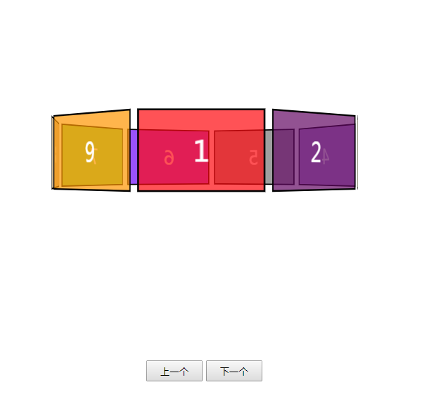
效果图

 浙公网安备 33010602011771号