插件1-图片预览组件v-viewer(vue2)
介绍
v-viewer 是一个基于 viewer.js 的 Vue 图像查看器组件,用于实现图片的预览、缩放、旋转等功能。
安装
npm install v-viewer@1.6.4
全局引入
在 main.js 文件中全局引入并注册 v-viewer 插件:
import VueViewer from 'v-viewer';
import 'viewerjs/dist/viewer.css';
Vue.use(VueViewer);
封装组件
在components文件夹下创建imagePreview目录,并在该目录下创建index.vue,内容如下:
<template>
  <div class=''>
    <viewer :images="newImages" style="height: 800px;">
    </viewer>
  </div>
</template>

<script>

  export default {
    props: {
      img: {
        type: Object,
        default: {}
      },
    },
    name: '',
    data() {
      return {
        newImages: []
      }
    },

    watch: {
      img: function (newData, oldData) {
        this.newImages = newData.urls;
        let imgList = this.splitImg(this.newImages)
        this.newImages = []
        for (let i = 0; i < imgList.length; i++) {
          this.newImages.push({ src: imgList[i] })
        }
        this.$viewerApi({
          images: this.newImages,
        });
      },
    },
    methods: {
      splitImg(img) {
        let imgs = img.split(",")
        var r = imgs.filter(function (s) {
          return s && s.trim();
        });
        return r;
      },
    },
  }
</script>

<style lang='scss' scoped></style>
页面中引入组件
<template>
  <div class="image-main">
    <div class="image-container">
      <div class="imageBox">
        <div class="imageItem" v-for="(item, index) in imageList" :key="index">
          <div class="mainBox">
            <div v-if="item.imgUrl" :class="ckeckImgClass(item.imgUrl)">
              <div
                class="imgBox"
                @click="handlePreviewImg(item.imgUrl)"
                v-if="checkImg(item.imgUrl)"
                v-for="(imgItem, imgIndex) in splitImg(item.imgUrl)"
                v-bind:key="imgIndex"
              >
                <img :key="imgItem" v-lazy="imgItem" alt="" />
              </div>
            </div>
          </div>
        </div>
        <image-preview :img="images"></image-preview>
      </div>
    </div>
  </div>
</template>
<script>
import imagePreview from "@/components/imagePreview";
export default {
  components: {
    imagePreview,
  },
  data() {
    return {
      images: {},
      imageList: [
        {
          id: 1,
          imgUrl:
            " http://localhost:5068/storagefile/img/b2c98efd-fb23-41a8-be79-6360ce1b5ffe.jpg ,http://localhost:5068/storagefile/img/78a3e4d9-759c-494e-9661-e969d452ec39.jpg",
        },
        {
          id: 2,
          imgUrl:
            "http://localhost:5068/storagefile/img/78a3e4d9-759c-494e-9661-e969d452ec39.jpg",
        },
      ],
    };
  },
  created() {},
  methods: {
    //图片预览
    handlePreviewImg(imgs) {
      this.images = {
        urls: imgs,
        time: new Date().getTime(),
      };
    },
    //检查是否有图片数据
    checkImg(img) {
      return this.splitImg(img).length > 0;
    },
    //根据图片数量返回不同样式
    ckeckImgClass(img) {
      let length = this.splitImg(img).length;
      if (length == 1) {
        return "contentImg grid-1";
      } else if (length == 2) {
        return "contentImg grid-2";
      } else {
        return "contentImg grid-3";
      }
    },
    //图片地址格式处理
    splitImg(img) {
      let imgs = img.split(",");
      var r = imgs.filter(function (s) {
        return s && s.trim();
      });
      return r;
    },
  },
};
</script>
<style lang="scss" scoped>
.image-main {
  //响应式布局,针对小屏设备处理
  @media screen and (max-width: 1118px) {
    .image-container {
      width: 100%;
      .imgBox {
        max-height: 200px;
      }

      .grid-1 {
        .imgBox {
          width: 200px;
          height: 200px;
        }
      }

      .grid-2 {
        .imgBox {
          width: 150px;
          height: 150px;
        }
      }

      .grid-3 {
        .imgBox {
          width: 100px;
          height: 100px;
        }
      }
    }
  }
  //响应式布局,针对大屏设备处理
  @media screen and (min-width: 1119px) {
    .image-container {
      width: 60%;

      .imgBox {
        max-height: 250px;
      }
      .grid-1 {
        .imgBox {
          width: 250px;
        }
      }

      .grid-2 {
        .imgBox {
          width: 250px;
        }
      }

      .grid-3 {
        .imgBox {
          width: 250px;
        }
      }
    }
  }
  .image-container {
    padding: 10px;
    margin-top: 80px;

    .imageBox {
      margin-top: 20px;
      width: 100%;
      color: var(--text-color);

      .imageItem {
        padding: 10px;
        display: flex;
        margin-bottom: 10px;
        border-radius: 5px;
        position: relative;
        background-color: var(--background-color);
        overflow: hidden;
      }

      .mainBox {
        padding-left: 10px;
        display: flex;
        flex-direction: column;
        width: 100%;

        .grid-1 {
          grid-template-columns: repeat(1, 0fr);
        }

        .grid-2 {
          grid-template-columns: repeat(2, 0fr);
        }

        .grid-3 {
          grid-template-columns: repeat(3, 0fr);
        }

        .contentImg {
          display: grid;
          margin-top: 10px;

          .imgBox {
            overflow: hidden;
            margin-right: 5px;
            margin-bottom: 10px;
            border-radius: 5px;
          }

          img {
            max-width: 100%;
            min-height: 300px;
            cursor: zoom-in;
            object-fit: cover;
          }
        }
      }
    }
  }
}
</style>
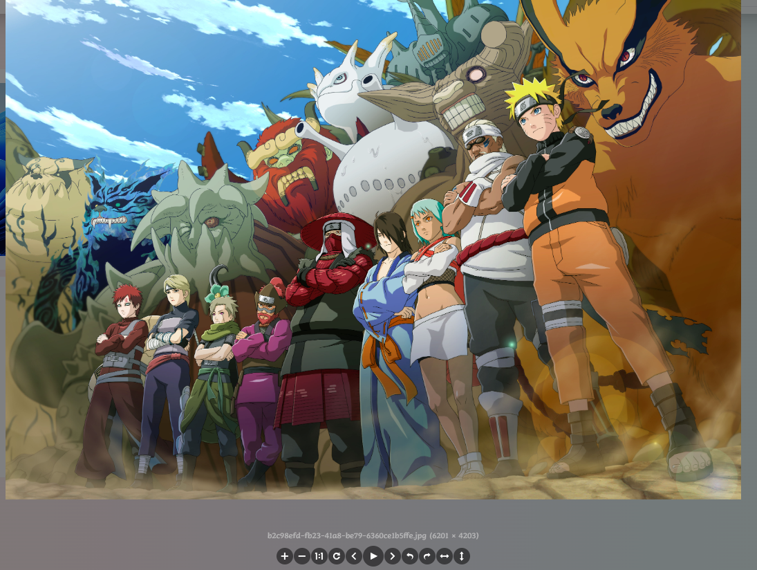
效果图

点击图片,将会弹出图片预览图,并可以根据插件给出的设置项设置上下左右方向、上下图、旋转、放大缩小、原比例图等
人生如逆旅
我亦是行人

 浙公网安备 33010602011771号