
居中
宽度不固定,水平居中

^(* ̄(oo) ̄)^:父节点position: relative;left: 50%;float: left; 子节点:position: relative;left: -50%;
 .condition_parent {
            position: relative;
            left: 50%;
            float: left;
        }
        .condition {
            height: 1.85rem;
            margin: 1rem auto 1rem auto;
            font-size: 0.75rem;
            display: flex;
            flex-wrap: wrap;
            position: relative;
            left: -50%;
        }
绝对定位,水平垂直居中(宽高固定)
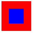
<style>
    .bigbox{
        width: 100px;
        height: 100px;
        background-color: red;
        position: relative;
    }
    .smallbox{
        width: 50px;
        height: 50px;
        background-color: blue;
        position: absolute;
        top:50%;
        left:50%;
        /* transform: translateY(-50%); */
        transform: translate(-50%,-50%);
    }
</style>
<body>
<div class="bigbox">
    <div class="smallbox">
    </div>
</div>
上下左右垂直居中
^(* ̄(oo) ̄)^: margin: auto;
 top: 0;
    left: 0;
    right: 0;
    bottom: 0;
    position: absolute;
    margin: auto;
//居中的容器:position: relative;
文字垂直居中
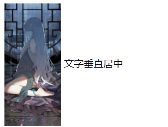
<style>
    img{
        /* vertical-align,它只在 display为 inline 或者 inline-block 的情况下起作用,默认值是 baseline,middle、bottom、text-bottom、text-top */
        vertical-align: middle;
    }
</style>
<body>
<div>
    <img style="height: 200px;" src="https://i.loli.net/2021/06/15/u9GnFQEhYBtwmLf.jpg">
    <span>文字垂直居中</span>

</div>
</body>
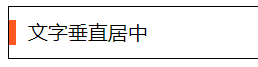
<div>
    <i></i>
    <span>文字垂直居中</span>
</div>
div{
    height: 40px;
    border: 1px solid #000;
    }
    div i{
    display: inline-block;
    width: 5px;
    height: 20px;
    margin-top: 10px;
    margin-bottom: 10px;
    /* margin-top  margin-bottom必须都有 否则会改变基线*/
    background: #FF5722;
    vertical-align: middle;
    margin-right: 5px;
    }
    div span{
    vertical-align: middle;
    }
多行文字垂直居中
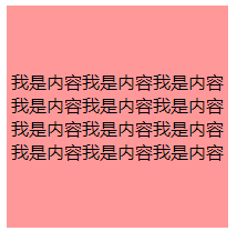
<!DOCTYPE html>
<html lang="en">
<head>
    <meta charset="UTF-8">
    <meta name="viewport" content="width=device-width, initial-scale=1.0">
    <meta http-equiv="X-UA-Compatible" content="ie=edge">
    <title>Document</title>
    <style>
     .wrap{
        display: table;
    }
    #one{
        width: 200px;
        height: 200px;
        display: table-cell;
        background: #FF9999;
        text-align: center;
        vertical-align: middle;
    }
    </style>
</head>

<body>
    <div class="wrap">
        <div id="one">
        我是内容我是内容我是内容我是内容我是内容我是内容我是内容我是内容我是内容我是内容我是内容我是内容
        </div>

</body>

</html>
flex水平等分
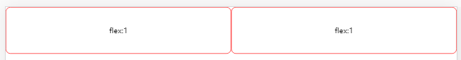
<div class="box0">
    <box class="boxn">flex:1</box>
    <box class="boxn">flex:1</box>
</div>
.box0{
        display: flex;
        margin-bottom: 200px;
    }
    .box0 .boxn{
        flex:1;
        border: 1px solid red;
        border-radius: 10px;
        height: 100px;
        line-height: 100px;
        text-align: center;
    }
flex垂直居中
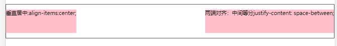
<div class="box1">
    <box class="boxn">垂直居中:align-items:center;</box>
    <box class="boxn">两端对齐:中间等分justify-content: space-between;</box>
</div>
.box1{
        display: flex;
        align-items:center;/* 垂直居中 */
        flex-wrap: wrap; /* 规定灵活的项目在必要的时候拆行或拆列。 */
        justify-content: space-between;
        width: calc(100%-2px);
        height: 100px;
        border: 1px solid black;
        margin-bottom: 20px;
    }
    .box1 .boxn{
        width: auto;
        height: 70px;
        background: pink;
    }

 浙公网安备 33010602011771号