1.水平等分flex:1;
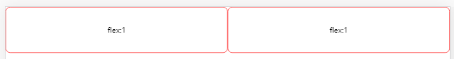
<div class="box0">
    <box class="boxn">flex:1</box>
    <box class="boxn">flex:1</box>
</div>
 .box0{
        display: flex;
        margin-bottom: 200px;
    }
    .box0 .boxn{
        flex:1;
        border: 1px solid red;
        border-radius: 10px;
        height: 100px;
        line-height: 100px;
        text-align: center;
    }
2.justify-content: space-between;
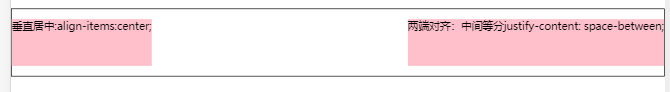
<div class="box1">
    <box class="boxn">垂直居中:align-items:center;</box>
    <box class="boxn">两端对齐:中间等分justify-content: space-between;</box>
</div>
   .box1{
        display: flex;
        align-items:center;/* 垂直居中 */
        flex-wrap: wrap; /* 规定灵活的项目在必要的时候拆行或拆列。 */
        justify-content: space-between;
        width: calc(100%-2px);
        height: 100px;
        border: 1px solid black;
        margin-bottom: 20px;
    }
    .box1 .boxn{
        width: auto;
        height: 70px;
        background: pink;
    }
3.justify-content: space-around;
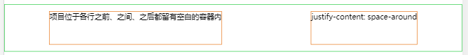
<div class="box2">
    <box class="boxn">项目位于各行之前、之间、之后都留有空白的容器内</box>
    <box class="boxn">justify-content: space-around</box>
</div>
    .box2{
        display: flex;
        justify-content: space-around;
        align-items:center;
        width: calc(100%-2px);
        height: 100px;
        border: 1px solid rgb(36, 202, 64);
        margin-bottom: 10px;
    }
    .box2 .boxn{
        width: auto;
        height: 70px;
        border: 1px solid rgb(231, 116, 22);
    }
4. 垂直居中align-items: center;
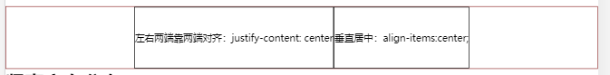
<div class="box4">
    <box class="boxn">左右两端靠两端对齐:justify-content: center</box>
    <box class="boxn">垂直居中:align-items:center;</box>
</div>
    .box4{
        display: flex;
        align-items: center;
        justify-content: center;
        width: calc(100%-2px);
        border: 1px solid rgb(146, 50, 50);
    }
    .box4 .boxn{
        border: 1px solid #000;
        height: 100px;
        line-height: 100px;
    }
5. 竖直排列flex-direction: column;
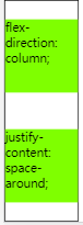
<div class="box3">
    <box class="boxn">flex-direction: column;</box>
    <box class="boxn">justify-content: space-around;</box>
</div>
    .box3{
        display: flex;
        justify-content: space-around;
        flex-direction: column;
        height: 300px;
        border: 1px solid #000;
        width: 100px;
        }
    .box3 .boxn{
        width: 100px;
        height: 100px;
        background-color: chartreuse;
    }


 浙公网安备 33010602011771号