
自定义圆形的ProgressBar
1.自定义圆形的ProgressBar
效果图:
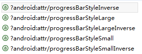
圆形ProgressBar的样式主要有以下几个,我们这里以progressBarStyleLarge为例进行样式的修改,其他的类似。
<ProgressBar
  android:layout_width="wrap_content"
  android:layout_height="wrap_content"
  style="?android:attr/progressBarStyleLarge"/>
首先看一下style="?android:attr/progressBarStyleLarge"的源码,在\frameworks\base\core\res\res\values\styles.xml

<style name="Widget.ProgressBar.Large">
  <item name="android:indeterminateDrawable">@android:drawable/progress_large_white</item>
  <item name="android:minWidth">76dip</item>
  <item name="android:maxWidth">76dip</item>
  <item name="android:minHeight">76dip</item>
  <item name="android:maxHeight">76dip</item>
</style>
看到这一行<item name="android:indeterminateDrawable">@android:drawable/progress_large_white</item>有木有,我们去看一下它的源码,在\frameworks\base\core\res\res\drawable\progress_large_white.xml
<rotate xmlns:android="http://schemas.android.com/apk/res/android"
    android:drawable="@drawable/spinner_white_76"
    android:pivotX="50%"
    android:pivotY="50%"
    android:fromDegrees="0"
    android:toDegrees="360" />
看到这一行 android:drawable="@drawable/spinner_white_76" 我们就明白了,原来它在这里放了一张图片,进行旋转。
接下来我定义自己的ProgressBarStyle:
首先我们先找一张图片加入我们的项目中(如一开始的效果图片),然后在drawable下新建progress_large.xml文件
<?xml version="1.0" encoding="utf-8"?>
<rotate xmlns:android="http://schemas.android.com/apk/res/android"
    android:drawable="@drawable/progress_large"
    android:fromDegrees="0"
    android:pivotX="50%"
    android:pivotY="50%"
    android:toDegrees="360" />
在 \value\style.xml中定义myProgressBarStyleLarge
<style name="myProgressBarStyleLarge" >
  <item name="android:indeterminateDrawable">@drawable/progress_large</item>
  <item name="android:minWidth">76dip</item>
  <item name="android:maxWidth">76dip</item>
  <item name="android:minHeight">76dip</item>
  <item name="android:maxHeight">76dip</item>
</style>
最后在ProgressBar中使用我们自己定义的style,android:indeterminateDuration="700"指定图片旋转的速度,这样我们就可以根据自己的需要来定义ProgressBar的样式。
<ProgressBar
  style="@style/myProgressBarStyleLarge"
  android:layout_width="wrap_content"
  android:layout_height="wrap_content"
  android:indeterminateDuration="700" />
2.上面是通过一张图片填充android:indeterminateDrawable,我们也可以定义一个动画或者自定义颜色来实现,跟图片的用法一样:
定义res/anim/progress_large_loading.xml如下:
<?xml version="1.0" encoding="UTF-8"?>
<animation-list android:oneshot="false"
  xmlns:android="http://schemas.android.com/apk/res/android">
  <item android:duration="100" android:drawable="@drawable/loading_1" />
  <item android:duration="100" android:drawable="@drawable/loading_2" />
  <item android:duration="100" android:drawable="@drawable/loading_3" />
  <item android:duration="100" android:drawable="@drawable/loading_4" />
  <item android:duration="100" android:drawable="@drawable/loading_5" />
  <item android:duration="100" android:drawable="@drawable/loading_6" />
</animation-list>
在我们定义的style中引入<item name="android:indeterminateDrawable">@anim/progress_large_loading</item>
定义res/drawable/progress_large_shape.xml如下:
<?xml version="1.0" encoding="utf-8"?>
<rotate xmlns:android="http://schemas.android.com/apk/res/android"
  android:fromDegrees="0"
  android:pivotX="50%"
  android:pivotY="50%"
  android:toDegrees="360" >
  <shape
    android:innerRadiusRatio="3"
    android:shape="ring"
    android:thicknessRatio="8"
    android:useLevel="false" >
    <gradient
      android:centerColor="#FFFFFF"
      android:centerY="0.50"
      android:endColor="#1E90FF"
      android:startColor="#000000"
      android:type="sweep"
      android:useLevel="false" />
  </shape>
</rotate>
在我们定义的style中引入<item name="android:indeterminateDrawable">@drawable/progress_large_shape</item>

 浙公网安备 33010602011771号