[Python] Numpy:二元函数绘制/三维数据可视化/3D
意义
在机器学习任务中选择计算模型或者学习数学时,可视化有助于研究函数值的变化趋势(观察收敛、分布、几何形状等),带来直观的感受。
源码
# 绘制二元函数
# 参考文献
# + python画二元函数的图像(3D) https://blog.csdn.net/your_answer/article/details/79135076
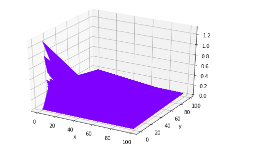
from mpl_toolkits.mplot3d import Axes3D
import numpy as np
from matplotlib import pyplot as plt
fig = plt.figure()
ax = Axes3D(fig)
# x=np.arange(-2*np.pi,2*np.pi,0.1) # np.range(startValue,endValue, stepSize)
# y=np.arange(-2*np.pi,2*np.pi,0.1)
# x = np.random.rand(100) # np.random.rand(4) # 生成一维数组 形如: array([ 0.69804514, 0.48808425, 0.79440667, 0.66959075]);
# y = np.random.rand(100)
# x = np.arange(1,100,1) # np.random.rand(4) # 生成一维数组 形如: array([ 0.69804514, 0.48808425, 0.79440667, 0.66959075]);
# y = np.arange(1,100,1)
x = np.random.randint(100,size=100) # np.random.randint(20,size=10) 形如: array([4, 1, 4, 3, 8, 2, 8, 5, 8, 19])
y = np.random.randint(100,size=100)
X, Y = np.meshgrid(x, y) # [important] 创建网格 np.meshgrid(xnums,ynums)
# Z = np.sin(X)*np.cos(Y) # 创建二元函数关系
Z = 1 / (np.log(X)*np.log(Y));
plt.xlabel('x')
plt.ylabel('y')
ax.plot_surface(X, Y, Z, rstride=1, cstride=1, cmap='rainbow')
plt.show()
绘制曲线图/一元函数
- 示例一
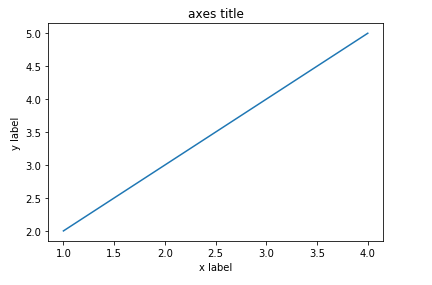
    # 绘制曲线图
import matplotlib.pyplot as plt

def plotLineChart():
    fig  = plt.figure()
    ax = fig.add_subplot(1,1,1) # numrows, numcols, fignum ; fignum标识了该子图的顺序,其范围从1到numrows*numcols
    ax.set_title("axes title");
    ax.set_xlabel("x label")
    ax.set_ylabel("y label")
    ax.plot([1,2,3,4],[2,3,4,5])
    plt.show()
    pass;

plotDemo();
- 示例二(进阶)
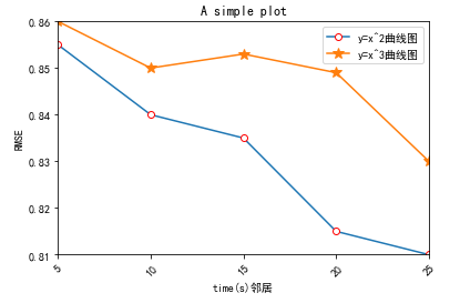
# encoding=utf-8
import matplotlib.pyplot as plt
from pylab import *                                 #支持中文
mpl.rcParams['font.sans-serif'] = ['SimHei']

names = ['5', '10', '15', '20', '25']
x = range(len(names))
y1 = [0.855, 0.84, 0.835, 0.815, 0.81]
y2=[0.86,0.85,0.853,0.849,0.83]
    #plt.plot(x, y1, 'ro-')
    #plt.plot(x, y2, 'bo-')
    #pl.xlim(-1, 11)  # 限定横轴的范围
    #pl.ylim(-1, 110)  # 限定纵轴的范围
plt.plot(x, y1, marker='o', mec='r', mfc='w',label=u'y=x^2曲线图')
plt.plot(x, y2, marker='*', ms=10,label=u'y=x^3曲线图')
plt.legend()  # 让图例生效
plt.xticks(x, names, rotation=45)
plt.margins(0)
plt.subplots_adjust(bottom=0.15)
plt.xlabel(u"time(s)邻居") #X轴标签
plt.ylabel("RMSE") #Y轴标签
plt.title("A simple plot") #标题

plt.show()
参考文献
推荐工具

本文作者:
千千寰宇
本文链接: https://www.cnblogs.com/johnnyzen
关于博文:评论和私信会在第一时间回复,或直接私信我。
版权声明:本博客所有文章除特别声明外,均采用 BY-NC-SA 许可协议。转载请注明出处!
日常交流:大数据与软件开发-QQ交流群: 774386015 【入群二维码】参见左下角。您的支持、鼓励是博主技术写作的重要动力!
本文链接: https://www.cnblogs.com/johnnyzen
关于博文:评论和私信会在第一时间回复,或直接私信我。
版权声明:本博客所有文章除特别声明外,均采用 BY-NC-SA 许可协议。转载请注明出处!
日常交流:大数据与软件开发-QQ交流群: 774386015 【入群二维码】参见左下角。您的支持、鼓励是博主技术写作的重要动力!

 浙公网安备 33010602011771号