CSS特效:clip-path边框
clip-path
clip-path
clip-path:裁剪,新的裁剪,与clip相同,只不过clip是老裁剪,并且要absolute和fixed定位元素才能使用,并且智能裁剪正方形,这里就不多做赘述,我们直接看clip-path就行
clip-path对元素的定位没有要求,而且也能裁剪更多的元素
用法:clip-path: inset(<top> <right> <bottom> <left> [round <border-radius>])
我们来看看裁剪:

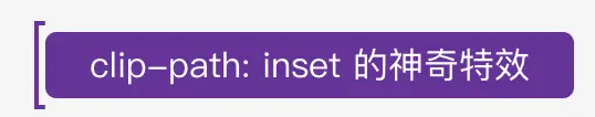
边框线条特效
我们先随便写段文字,添加上背景色,注意,不要对文字限制宽度,可以用padding,这样就能适应文字长度了。像这样

边框
我们现在需要在此处添加一个边框,我们可以利用 after,在通过定位,在通过top等设置边距,如
 1 div{
 2         position: relative;
 3         &::after{
 4             content: "";
 5             border: 2px solid rebeccapurple;
 6             position: absolute;
 7             top: -5px;
 8             left: -5px;
 9             right: -5px;
10             bottom: -5px;
11         }
12     }

clip-path的流动:
经过上面的介绍,我们可以通过 clip-path: inset(<top> <right> <bottom> <left> [round <border-radius>])来设定
我们随变写一个值看看效果: clip-path: inset(0 96% 0 0%)
我们要做成动画,假设从上往下,所以应该是初始值为top => right => bottom => left, 在分别设置 25% 50% 75%三个值,像这样:
 1 div{
 2     &&:after{
 3         animation: clippath 3s infinite linear;
 4     }
 5 }
 6
 7 @keyframes clippath {
 8   0%,
 9   100% {
10       clip-path: inset(0 0 96% 0);
11   }
12   25% {
13       clip-path: inset(0 96% 0 0);
14   }
15   50% {
16       clip-path: inset(96% 0 0 0);
17   }
18   75% {
19       clip-path: inset(0 0 0 96%);
20   }
21 }

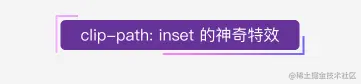
双流动特效
除了 after我们还有个before,同时设置延迟时间,防止重合,就OK了,对了,要想让按钮触碰高亮效果可以用filter: contrast()这个属性,参照大佬的,大佬yyds~
图片
当然我们也可以给图片加入边框,效果变成了这样

详细代码:
 1 <!doctype html>
 2 <html>
 3 <head>
 4     <style type="text/css">
 5         .Index {
 6             display: flex;
 7             justify-content: center;
 8             padding-top: 100px;
 9         }
10         .clipPath {
11             background: rebeccapurple;
12             position: relative;
13             line-height: 30px;
14             padding: 0 20px;
15             color: #fff;
16             border-radius: 5px;
17         }
18             .clipPath:hover {
19                 filter: contrast(1.1);
20             }
21
22             .clipPath:active {
23                 filter: contrast(0.9);
24             }
25
26             .clipPath::before,
27             .clipPath::after {
28                 content: "";
29                 border: 2px solid;
30                 border-image: linear-gradient(45deg, gold, deeppink) 1;
31                 position: absolute;
32                 top: -5px;
33                 left: -5px;
34                 right: -5px;
35                 bottom: -5px;
36                 animation: clippath 3s infinite;
37             }
38
39             .clipPath::before {
40                 animation: clippath 3s infinite -1.5s linear;
41             }
42
43         @keyframes clippath {
44             0%, 100% {
45                 clip-path: inset(0 0 96% 0);
46                 filter: hue-rotate(0deg);
47             }
48
49             25% {
50                 clip-path: inset(0 96% 0 0);
51             }
52
53             50% {
54                 clip-path: inset(96% 0 0 0);
55                 filter: hue-rotate(360deg);
56             }
57
58             75% {
59                 clip-path: inset(0 0 0 96%);
60             }
61         }
62     </style>
63 </head>
64 <body>
65     <div className="Index">
66         <div class="clipPath">clip-path: inset 的神奇特效</div>
67     </div>
68 </body>
69
70 </html>
来源: https://article.juejin.cn/post/7088977301722890277


 浙公网安备 33010602011771号