

matplotlib 中文显示异常的修复方法
这个问题很常见
问题原因
1. 字体缓存污染
matplotlib 在第一次运行时创建字体缓存,如果之前有错误的字体配置或损坏的缓存,会导致后续所有绘图都使用错误的字体设置。
2. 缓存不更新
即使你后来添加了正确的中文字体,matplotlib 可能仍然使用旧的缓存文件,不会自动检测新字体。
3. 环境配置冲突
在 Jupyter/云平台环境中,多个用户或会话可能共享或冲突的缓存配置。
以后注意事项
1. 字体设置最佳实践
import matplotlib.pyplot as plt
import matplotlib.font_manager as fm
import os

def safe_chinese_plot():
    """安全的中文绘图函数"""
    # 方法1:先尝试系统字体
    plt.rcParams['font.sans-serif'] = ['WenQuanYi Micro Hei', 'DejaVu Sans', 'Arial']
    plt.rcParams['axes.unicode_minus'] = False

    # 如果系统字体不行,使用自定义字体
    font_path = './simsun.ttc'
    if os.path.exists(font_path):
        font_prop = fm.FontProperties(fname=font_path)
        # 使用 fontproperties 参数
        plt.title('标题', fontproperties=font_prop)
        plt.xlabel('X轴', fontproperties=font_prop)
    else:
        plt.title('标题')
        plt.xlabel('X轴')
2. 项目初始化脚本
# init_plot.py - 每个项目开始前运行
import matplotlib.pyplot as plt
import matplotlib.font_manager as fm
import os

def init_chinese_font():
    """初始化中文字体设置"""
    # 清除可能的缓存问题
    cache_dir = os.path.join(os.path.expanduser('~'), '.cache', 'matplotlib')
    if os.path.exists(cache_dir):
        import shutil
        shutil.rmtree(cache_dir)
        print("已清除matplotlib缓存")

    # 重新加载字体管理器
    fm._load_fontmanager(try_read_cache=False)

    # 设置字体
    font_path = './simsun.ttc'
    if os.path.exists(font_path):
        # 添加自定义字体
        fe = fm.FontEntry(fname=font_path, name='MySimSun')
        fm.fontManager.ttflist.insert(0, fe)
        plt.rcParams['font.family'] = ['MySimSun', 'WenQuanYi Micro Hei']
    else:
        plt.rcParams['font.sans-serif'] = ['WenQuanYi Micro Hei', 'DejaVu Sans']

    plt.rcParams['axes.unicode_minus'] = False
    print("中文字体初始化完成")

# 在项目开始时调用
init_chinese_font()
3. 环境检查脚本
def check_font_environment():
    """检查字体环境"""
    import matplotlib.font_manager as fm
    import os

    print("=== 字体环境检查 ===")

    # 检查缓存目录
    cache_dir = os.path.join(os.path.expanduser('~'), '.cache', 'matplotlib')
    print(f"缓存目录: {cache_dir}")
    print(f"缓存存在: {os.path.exists(cache_dir)}")

    # 检查可用中文字体
    chinese_fonts = []
    for font in fm.fontManager.ttflist:
        font_name = font.name.lower()
        if any(keyword in font_name for keyword in ['chinese', 'song', 'hei', 'kai', 'micro', 'wenquan']):
            chinese_fonts.append(font.name)

    print(f"可用中文字体: {list(set(chinese_fonts))}")

    # 检查自定义字体
    custom_font = './simsun.ttc'
    print(f"自定义字体存在: {os.path.exists(custom_font)}")

    return len(chinese_fonts) > 0

# 在绘图前运行检查
if check_font_environment():
    print("字体环境正常")
else:
    print("警告: 字体环境可能有问题")
4. 可靠的绘图模板
import matplotlib.pyplot as plt
import matplotlib.font_manager as fm
import os

class ChinesePlot:
    def __init__(self, font_path='./simsun.ttc'):
        self.font_path = font_path
        self.font_prop = None

        if os.path.exists(font_path):
            self.font_prop = fm.FontProperties(fname=font_path)

    def safe_text(self, text, **kwargs):
        """安全地添加中文文本"""
        if self.font_prop:
            kwargs['fontproperties'] = self.font_prop
        return kwargs

    def plot(self):
        """示例绘图方法"""
        plt.figure(figsize=(10, 6))

        # 安全设置标题和标签
        plt.title('中文标题', **self.safe_text('中文标题', fontsize=16))
        plt.xlabel('X轴标签', **self.safe_text('X轴标签', fontsize=14))
        plt.ylabel('Y轴标签', **self.safe_text('Y轴标签', fontsize=14))

        plt.text(0.5, 0.5, '中文文本', **self.safe_text('中文文本', fontsize=12, ha='center'))
        plt.grid(True)
        plt.show()

# 使用
plotter = ChinesePlot()
plotter.plot()
findfont: Font family ['sans-serif'] not found. Falling back to DejaVu Sans.
findfont: Generic family 'sans-serif' not found because none of the following families were found: WenQuanYi Micro Hei
findfont: Font family ['sans-serif'] not found. Falling back to DejaVu Sans.
findfont: Generic family 'sans-serif' not found because none of the following families were found: WenQuanYi Micro Hei
findfont: Font family ['sans-serif'] not found. Falling back to DejaVu Sans.
findfont: Generic family 'sans-serif' not found because none of the following families were found: WenQuanYi Micro Hei
findfont: Font family ['sans-serif'] not found. Falling back to DejaVu Sans.
findfont: Generic family 'sans-serif' not found because none of the following families were found: WenQuanYi Micro Hei
5. 常见预防措施
- 在Docker/云环境中:在容器启动时清除字体缓存
- 在CI/CD中:在流水线中添加字体缓存清理步骤
- 团队项目中:共享字体初始化脚本
- 版本控制:将字体文件和初始化脚本纳入版本管理
6. 快速修复命令
# 当遇到中文乱码时,快速执行这个单元格
import matplotlib.pyplot as plt
import matplotlib.font_manager as fm
import os
import shutil

# 清除缓存
cache_dir = os.path.join(os.path.expanduser('~'), '.cache', 'matplotlib')
if os.path.exists(cache_dir):
    shutil.rmtree(cache_dir)

# 重新加载
fm._load_fontmanager(try_read_cache=False)
plt.rcParams.update({'font.sans-serif': ['WenQuanYi Micro Hei']})
print("字体缓存已重置")
总结:matplotlib 字体缓存是个常见坑点,在云平台、容器等环境中尤其要注意。建议在每个项目开始前都运行字体初始化检查。
英文最可靠
方案1:纯英文绘图(最可靠)
import matplotlib.pyplot as plt
import numpy as np

def english_plot():
    """使用英文绘图 - 100% 可靠"""
    # 创建示例数据
    x = np.linspace(0, 2*np.pi, 100)
    y1 = np.sin(x)
    y2 = np.cos(x)

    # 创建图形
    plt.figure(figsize=(12, 8))

    # 绘制数据
    plt.plot(x, y1, 'b-', linewidth=2, label='Sine Wave')
    plt.plot(x, y2, 'r-', linewidth=2, label='Cosine Wave')

    # 设置标题和标签(英文)
    plt.title('Mathematical Functions Demo', fontsize=16, fontweight='bold')
    plt.xlabel('X Axis - Input Values', fontsize=14)
    plt.ylabel('Y Axis - Output Values', fontsize=14)

    # 添加文本说明
    plt.text(1, 0.8, 'Sine: sin(x)', fontsize=12, color='blue')
    plt.text(1, 0.6, 'Cosine: cos(x)', fontsize=12, color='red')
    plt.text(4, -0.8, 'Period: 2π', fontsize=11, style='italic')

    # 添加图例和网格
    plt.legend(fontsize=12)
    plt.grid(True, alpha=0.3)

    # 设置坐标轴范围
    plt.xlim(0, 2*np.pi)
    plt.ylim(-1.2, 1.2)

    plt.tight_layout()
    plt.show()

# 执行
english_plot()
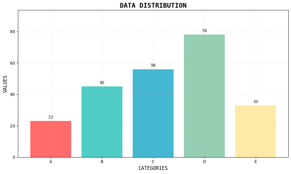
方案2:使用ASCII艺术风格
import matplotlib.pyplot as plt
import numpy as np

def ascii_style_plot():
    """ASCII艺术风格的图表"""
    # 数据
    categories = ['A', 'B', 'C', 'D', 'E']
    values = [23, 45, 56, 78, 33]

    # 创建图表
    fig, ax = plt.subplots(figsize=(10, 6))

    # 绘制柱状图
    bars = ax.bar(categories, values, color=['#FF6B6B', '#4ECDC4', '#45B7D1', '#96CEB4', '#FFEAA7'])

    # 设置标题和标签
    ax.set_title('DATA DISTRIBUTION', fontsize=16, fontweight='bold', family='monospace')
    ax.set_xlabel('CATEGORIES', fontsize=12, family='monospace')
    ax.set_ylabel('VALUES', fontsize=12, family='monospace')

    # 在柱子上显示数值
    for bar, value in zip(bars, values):
        height = bar.get_height()
        ax.text(bar.get_x() + bar.get_width()/2., height + 1,
                f'{value}', ha='center', va='bottom', fontfamily='monospace')

    # 网格线
    ax.grid(True, alpha=0.3, linestyle='--')

    # 设置y轴从0开始
    ax.set_ylim(0, max(values) * 1.2)

    plt.tight_layout()
    plt.show()

# 执行
ascii_style_plot()
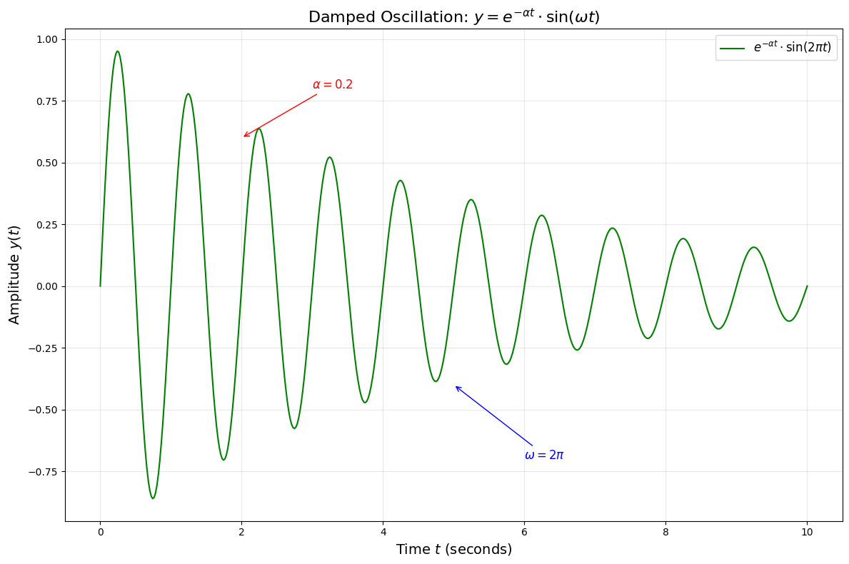
方案3:使用符号和数学表达式
import matplotlib.pyplot as plt
import numpy as np

def math_symbols_plot():
    """使用数学符号和表达式"""
    # 生成数据
    t = np.linspace(0, 10, 500)
    signal = np.exp(-0.2 * t) * np.sin(2 * np.pi * t)

    # 创建图形
    plt.figure(figsize=(12, 8))

    # 绘制信号
    plt.plot(t, signal, 'g-', linewidth=1.5, label=r'$e^{-\alpha t} \cdot \sin(2\pi t)$')

    # 使用LaTeX数学表达式
    plt.title(r'Damped Oscillation: $y = e^{-\alpha t} \cdot \sin(\omega t)$', fontsize=16)
    plt.xlabel(r'Time $t$ (seconds)', fontsize=14)
    plt.ylabel(r'Amplitude $y(t)$', fontsize=14)

    # 添加数学注释
    plt.annotate(r'$\alpha = 0.2$', xy=(2, 0.6), xytext=(3, 0.8),
                arrowprops=dict(arrowstyle='->', color='red'),
                fontsize=12, color='red')

    plt.annotate(r'$\omega = 2\pi$', xy=(5, -0.4), xytext=(6, -0.7),
                arrowprops=dict(arrowstyle='->', color='blue'),
                fontsize=12, color='blue')

    # 图例和网格
    plt.legend(fontsize=12)
    plt.grid(True, alpha=0.3)

    plt.tight_layout()
    plt.show()

# 执行
math_symbols_plot()
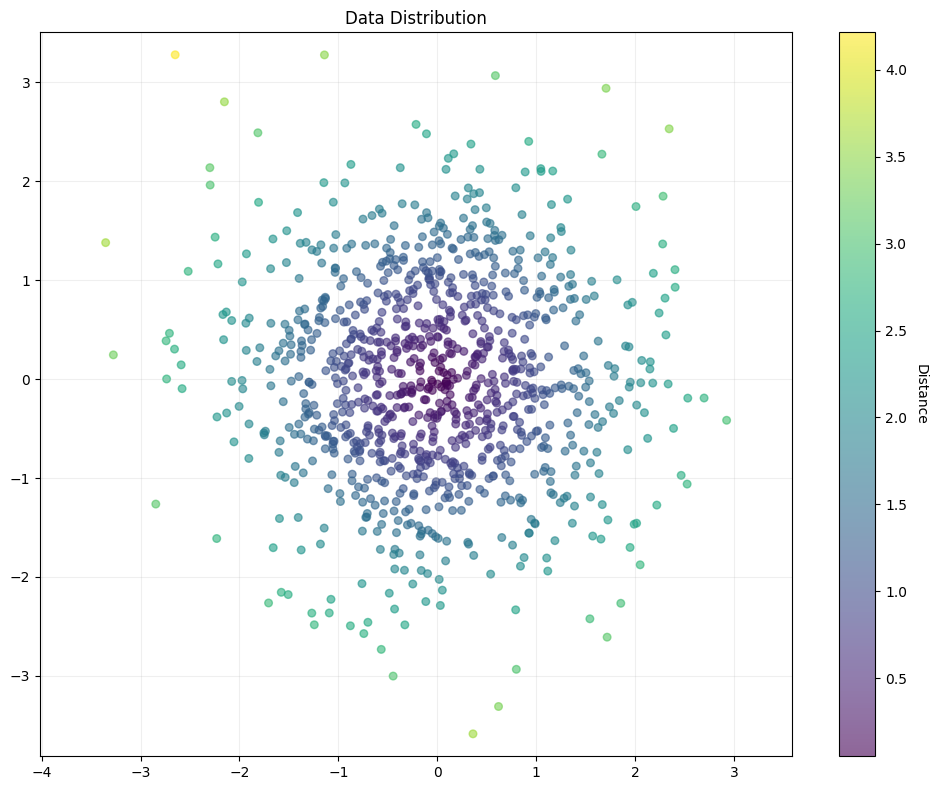
方案4:极简风格图表
import matplotlib.pyplot as plt
import numpy as np

def minimalist_plot():
    """极简风格,最少文本"""
    # 数据
    x = np.random.randn(1000)
    y = np.random.randn(1000)

    # 创建散点图
    plt.figure(figsize=(10, 8))

    # 绘制散点
    scatter = plt.scatter(x, y, c=np.sqrt(x**2 + y**2),
                         cmap='viridis', alpha=0.6, s=30)

    # 颜色条
    cbar = plt.colorbar(scatter)
    cbar.set_label('Distance', rotation=270, labelpad=15)

    # 极简标题
    plt.title('Data Distribution')

    # 网格
    plt.grid(True, alpha=0.2)

    # 等比例
    plt.axis('equal')

    plt.tight_layout()
    plt.show()

# 执行
minimalist_plot()
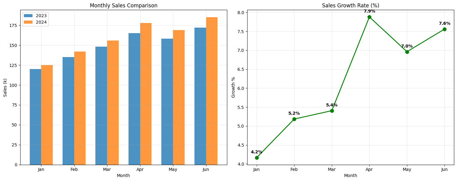
方案5:实用数据分析图表
import matplotlib.pyplot as plt
import numpy as np

def practical_analysis_plot():
    """实用的数据分析图表"""
    # 模拟数据
    months = ['Jan', 'Feb', 'Mar', 'Apr', 'May', 'Jun']
    sales_2023 = [120, 135, 148, 165, 158, 172]
    sales_2024 = [125, 142, 156, 178, 169, 185]

    # 创建图表
    fig, (ax1, ax2) = plt.subplots(1, 2, figsize=(15, 6))

    # 子图1: 柱状图
    x_pos = np.arange(len(months))
    width = 0.35

    ax1.bar(x_pos - width/2, sales_2023, width, label='2023', alpha=0.8)
    ax1.bar(x_pos + width/2, sales_2024, width, label='2024', alpha=0.8)

    ax1.set_title('Monthly Sales Comparison')
    ax1.set_xlabel('Month')
    ax1.set_ylabel('Sales (k)')
    ax1.set_xticks(x_pos)
    ax1.set_xticklabels(months)
    ax1.legend()
    ax1.grid(True, alpha=0.3)

    # 子图2: 增长率
    growth_rate = [(s24 - s23) / s23 * 100 for s23, s24 in zip(sales_2023, sales_2024)]

    ax2.plot(months, growth_rate, 'o-', linewidth=2, markersize=8, color='green')
    ax2.set_title('Sales Growth Rate (%)')
    ax2.set_xlabel('Month')
    ax2.set_ylabel('Growth %')
    ax2.grid(True, alpha=0.3)

    # 在增长率图上添加数值标签
    for i, rate in enumerate(growth_rate):
        ax2.annotate(f'{rate:.1f}%', (i, rate), textcoords="offset points",
                    xytext=(0,10), ha='center', fontweight='bold')

    plt.tight_layout()
    plt.show()

# 执行
practical_analysis_plot()
推荐使用
建议直接使用方案1(纯英文),因为:
- ✅ 100% 可靠 - 不需要任何额外依赖
- ✅ 专业美观 - 英文在学术和工程领域是标准
- ✅ 无兼容性问题 - 在任何环境都能正常工作
- ✅ 国际化 - 便于分享和协作

 浙公网安备 33010602011771号