
CSS里不为人知的秘密(01)之常见属性使用
CSS里不为人知的秘密(01)之常见属性使用
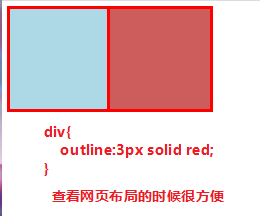
01) border 和 outline 区别
轮廓不占据空间,绘制于元素内容周围。
根据规范,轮廓通常是矩形,但也可以是非矩形的
div{
    outline:3px solid red;/* 查看网页布局的时候很方便 */
}
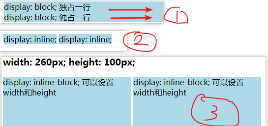
02) css 属性值 display
/* display: block; */ /* 浏览器默认样式 */
/* display: inline; */ /* 设置为行内元素 */
/* display: none; */ /* 隐藏元素不占空间 */
/* display: inline-block; */ /* 可以和行内元素在同一行, 可以设置宽度和高度*/
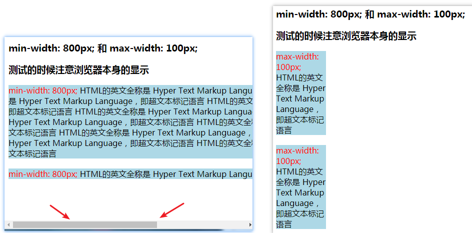
03) css 属性值 min-width 和 max-width
/* width: 100px;*/
/* min-width: 800px; */  /* 内容宽度小于盒子宽度800的时候出现滚动条 */
/* max-width: 100px; */  /*  内容在宽度大于盒子宽度100的时候换行 */
04) margin 和 padding 参数
A) margin 和 padding 参数顺时针方向顺序[ 上右下左]
两个 值时,第一个值被匹配给 上和下, 第二个值被匹配给 左和右.
三个 值时,第一个值被匹配给 上, 第二个值被匹配给 左和右, 第三个值被匹配给 下.
两个值的时候,上和右,没有下和左,下跟随上,左跟随右
三个值的时候,上右下,没有左,左边的值跟随右边的值
B) 折叠(发生在垂直方向),垂直方向上margin折叠计算规则: 2个值进行比较,取较大的值
demo: div1 和 div2 页面上实际效果是20px


<style>
    .div1 {
        background: #add8e6;
        width: 100px;
        height: 100px;
        margin-bottom: 20px;
    }

    .div2 {
        background: #cd5c5c;
        width: 100px;
        height: 100px;
        margin-top: 10px;
    }
</style>
<div class="div1"></div>
<div class="div2"></div>
C) 传递(子元素和父元素基线对齐的时候,子元素传给父元素)
margin-top 传递 demo1: div2_01 中的 margin-top: 30px; 发生了传递
<style>
    .div1 {
        background: #add8e6;
        width: 100px;
        height: 100px;
        margin-bottom: 20px;
    }

    .div2 {
        background: #cd5c5c;
        width: 100px;
        height: 100px;
        margin-top: 10px;
    }

    .div2_01 {
        background: red;
        width: 50px;
        height: 50px;
        margin-top: 30px;
    }
</style>

<div class="div1"></div>
<div class="div2">
    <div class="div2_01"></div>
</div>
margin-bottom 传递 demo2
<style>
    .div1 {
        background: #add8e6;
        width: 100px;
        /*height: 100px;*/
        height: auto;
    }

    .div2 {
        background: #cd5c5c;
        width: 100px;
        height: 100px;
    }

    .div1_01 {
        background: red;
        width: 50px;
        height: 100px;
        margin-bottom: 20px;
    }
</style>
<h3> margin-bottom 传递</h3>
<div class="div1">
    <div class="div1_01"></div>
</div>
<div class="div2"></div>
防止传递方法3种
 C-1) 给父元素设置padding-top 或者 padding-bottom
 C-2) 给父元素设置border
 C-3) 触发BFC: 设置overflow为auto 或者 hidden
D) margin 和 padding 总结
margin一般是用来设置兄弟元素之间的间距
padding一般是用来设置父子元素之间的间距
一个padding的demo: 子元素向下移动20px, 父元素总高度为120px
<style>
    .div1 {
        background: #add8e6;
        width: 100px;
        height: 100px;
        margin-bottom: 20px;
    }

    .div2 {
        background: #cd5c5c;
        width: 100px;
        height: 100px;
        padding-top: 20px;/*  子元素移动20px, 父元素总高度为120px */
    }

    .div2_01 {
        background: red;
        width: 50px;
        height: 50px;
    }
</style>

<div class="div1"></div>
<div class="div2">
    <div class="div2_01"></div>
</div>
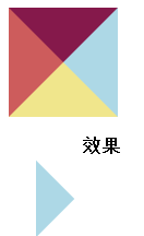
05) 利用 border 制作三角图形
<style>
    .div1 {
        border-top: 50px solid #85194B;
        border-right: 50px solid #add8e6;
        border-bottom: 50px solid #f0e68c;
        border-left: 50px solid #cd5c5c;
        width: 0;
        height: 0;
    }
    .div2 {
        border-top: 50px solid #add8e6;
        border-left: 50px solid rgba(0,0,0,0);
        width: 0;
        height: 0;
        transform: rotate(45deg);
    }
</style>

<div class="div1"></div>
<div class="div2"></div>
06) box-sizing 属性
属性值: box-sizing: border-box  /  content-box [默认值 不盒子是否包括边框 ]

content-box
元素实际占用宽度= 内容的宽度wdith
元素实际占用高度= 内容的宽度height

border-box
元素实际占用宽度= border + padding + 内容的宽度width
元素实际占用高度= border + padding + 内容的高度height
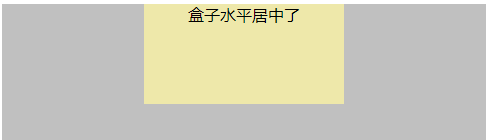
07) 水平居中 text-align 和 marigin
[ text-align:center | marigin: 0,auto ] 2个属性使用
垂直方向的时候 margin 不能实现居中
text-align:center 可以居中的元素
01) 普通文本
02) 行内元素
03) 图片:行内替换元素
04) 行内块级元素

marigin: 0,auto  可以居中的元素
05) 块级元素  [ marigin: 0,auto ]

demo:
<style>
    .box{
        height: 200px;
        background: #c0c0c0;
    }
    .inner{
        width: 200px;
        height: 100px;
        background: #eee8aa;
        margin: 0 auto; /*盒子水平居中了*/
        text-align: center; /*内容水平居中了*/
    }
</style>

<div class="box">
    <div class="inner">盒子水平居中了</div>
</div>
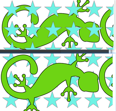
08) background-image 属性
background-image
01) 图片先后顺序,先写谁,谁在上面;
02) 前面图片错误,会显示后面图片
background-image: url("./images/lizard.png"),  /*lizard 图片在上面*/
url("./images/star.png");

background-image: url("./images/star.png"),  /* star 图片在上面 */
url("./images/lizard.png");
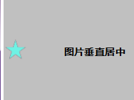
08) 图片垂直居中
不能使用 vertical-align: middle
<style>
    .box {
        background-color: #c0c0c0;
        height: 300px;
    }

    img {
        position: relative;
        top: 50%;
        transform: translate(0, -50%);
        /*vertical-align: middle;*/ /* 不能使用这个居中,基线问题 */
    }
</style>

<div class="box">
    <img src="./images/star.png" alt="">
</div>
09) 图片水平居中+垂直居中
<style>
    .box {
        background-color: #c0c0c0;
        height: 600px;
        /*overflow: hidden;*/
    }

    img {
        position: relative;
        /* 垂直居中*/
        /*top: 50%;*/
        /*transform: translate(0, -50%);*/
        /* 水平居中*/
        /*left: 50%;*/
        /*transform: translate(-50%,0);*/
        /* 水平居中+垂直居中*/
        top: 50%;
        left: 50%;
        transform: translate(-50%, -50%);
    }
</style>
<h3>图片,实现垂直居中和水平居中</h3>
<div class="box">
    <!--<img src="./images/img_center_01.png" alt="这是一张大图">-->
    <img src="./images/star.png" alt="这是一张小图">
</div>
10) 让一个div水平靠右显示
方法01) float
<style>
    .da-fei{
        float: right;
        width: 100px;
        height: 100px;
        background-color: #c0c0c0;
    }
</style>
<div class="da-fei"></div>
方法02) position:absolute
<style>
    .da-fei {
        position: absolute;
        right: 10px;
        top: 20px;
        width: 100px;
        height: 100px;
        background-color: #c0c0c0;
    }
</style>
<div class="da-fei"></div>
其他:
CSS里不为人知的秘密(03)之常见小布局

 浙公网安备 33010602011771号