


效果图,查了下,这类的代码还是满多的!

跟代码的自动完成,是一个作者写的,相关文件如下:
FastColoredTextBox-master.zip(源码)
FastColoredTextBox_Help.zip(帮助文件)
FastColoredTextBoxCF.zip(.net2.0下的使用)
FastColoredTextBoxDemo.zip(样例,你懂的)
作者提供的下载地址,当然我已经全部下载完了,上面第一个:
https://github.com/PavelTorgashov/FastColoredTextBox
怎么下载github的文件:http://www.cnblogs.com/cyangluiqin/archive/2013/03/31/2991758.html
原文还没来的及看,先贴着
Introduction
For one of my projects, I have felt the need of a text editor with syntax highlighting. At first, I used a component inherited from RichTextBox, but while using it for a large amount of text I found out that RichTextBox highlights very slowly a large number of colored fragments (from 200 and more). When such highlighting has to be made in a dynamic way, it causes a serious problem.
Therefore I created my own text component which uses neither Windows TextBox nor RichTextBox.
The rendering of a text was made completely only by the means of GDI+.
The component works fast enough with a large amount of text and also possesses tools to make comfortably dynamic syntax highlighting.
It has such settings as foreground color, font style, background color which can be adjusted for arbitrarily selected text symbols. One can easily gain access to a text with the use of regular expressions. WordWrap, Find/Replace, Code folding and multilevel Undo/Redo are supported as well.
Implementation
For storage of characters of text, structure Char is used:
public struct Char
{
    public char c;
    public StyleIndex style;
}
The structure keeps the symbol (char, 2 bytes) and style index mask (StyleIndex, 2 bytes). Thus, on each character of text consumes 4 bytes of memory. Symbols are grouped into lines, which are implemented usingList<Char>.
StyleIndex is mask of styles indices, applied to this character. Each bit of StyleIndex means that this symbol will be drawn by appropriate style. Because StyleIndex has 16 bits, control supports no more than 16 different styles.
Styles are stored in a separate list:
public readonly Style[] Styles = new Style[sizeof(ushort)*8];
In fact, Style is renderer of chars, backgrounds, borders and other design elements of the text.
Below is a typical implementation of one of the styles for rendering text characters:
public class TextStyle : Style
{
    public Brush ForeBrush { get; set; }
    public Brush BackgroundBrush { get; set; }
    public FontStyle FontStyle { get; set; }

    public override void Draw(Graphics gr, Point position, Range range)
    {
        //draw background
        if (BackgroundBrush != null)
            gr.FillRectangle(BackgroundBrush, position.X, position.Y,
        (range.End.iChar - range.Start.iChar) *
        range.tb.CharWidth, range.tb.CharHeight);
        //draw chars
        Font f = new Font(range.tb.Font, FontStyle);
        Line line = range.tb[range.Start.iLine];
        float dx = range.tb.CharWidth;
        float y = position.Y - 2f;
        float x = position.X - 2f;

        Brush foreBrush = this.ForeBrush ?? new SolidBrush(range.tb.ForeColor);

        for (int i = range.Start.iChar; i < range.End.iChar; i++)
        {
            //draw char
            gr.DrawString(line[i].c.ToString(), f, foreBrush, x, y);
            x += dx;
        }
    }
}
TextStyle contains foreground color, background color and font style of the text. When creating a new style, component checks style on its list, and if there is no style, it creates a new style, with its index.
You can create custom styles, inherited from Style class.
To work with fragments of text, the class Range was used, representing a continuous block of text, given the initial and final positions:
public class Range
{
    Place start;
    Place end;
}
public struct Place
{
    int iLine;
    int iChar;
}
Using the Code
Syntax highlighting
Unlike RichTextBox, the component does not use RTF. The information about the color and type of symbols is kept only in the component. It means that the coloring of the component has to be redone every time when entering text. In this case, the event TextChanged is applied.
A Range object which contains the information about modified text range pass into the event TextChanged. It permits the highlighting of the altered text fragment only.
For the search of fragments of text which need to be colored, it is possible to employ overloaded methodRange.SetStyle() which accepts search pattern (regular expression). For example, the following code can be used for the search and coloring of the comments of C# code (the part of the line starting from two forward slashes):
Style GreenStyle = new TextStyle(Brushes.Green, null, FontStyle.Italic);
...
private void fastColoredTextBox1_TextChanged(object sender, TextChangedEventArgs e)
{
    //clear style of changed range
    e.ChangedRange.ClearStyle(GreenStyle);
    //comment highlighting
    e.ChangedRange.SetStyle(GreenStyle, @"//.*$", RegexOptions.Multiline);
}
Before beginning the coloring call, the method Range.ClearStyle() is used to clean out and delete the previous style.
The method SetStyle() highlights the text fragment corresponding to a regular expression. However, if the expression includes the named group "range", the group with a name "range" is highlighted. The name of the class which comes after the key words "class", "struct" and "enum" was bolded in the following example:
e.ChangedRange.SetStyle(BoldStyle, @"\b(class|struct|enum)\s+(?<range>[\w_]+?)\b");
The event handler TextChanged utilized for coloring C#, VB, HTML and other languages syntax was implemented in demo application.
说是样例里提供了c#,vb,html还有别的,已经提供了。
Apart from the event TextChanged the events TextChanging, VisibleRangeChanged and SelectionChangedmay happen to be useful. The event TextChanging appears before the text starts to be modified. The eventSelectionChanged occurs after the change of the cursor position in the component or while a selected fragment of text is being modified.
Code Folding(代码的折叠)
Control allows to hide blocks of text. To hide the selected text, use method CollapseBlock():
要让代码,请使用CollapseBlock():方法
fastColoredTextBox1.CollapseBlock(fastColoredTextBox1.Selection.Start.iLine,
                fastColoredTextBox1.Selection.End.iLine);
例子很清楚的了,大约有个行号,从哪行开始折叠fastColoredTextBox1.Selection.Start.iLine,到哪行结束fastColoredTextBox1.Selection.End.iLine!
The result is shown in the picture:
图片给出了折叠了效果,还不错,会出现一个红色的小+号:

The component supports automatic search for fragments of collapse (folding area). To set the pattern (Regex) to find the beginning and end of folding block, use method Range.SetFoldingMarkers() in TextChanged handler.
For example, to search of blocks {..} and #region .. #endregion, use next handler:
支持自动查找折叠区,Range.SetFoldingMarkers()要使用自动折叠,要用到前面的方法
另外,这个方法,写在 TextChanged里面
下面是个 #region .. #endregion,还有{}间的折叠的例子:有用的,就写上了,嘿嘿!
private void fastColoredTextBox1_TextChanged(object sender, TextChangedEventArgs e)
{
    //clear folding markers of changed range
    e.ChangedRange.ClearFoldingMarkers();
    //set folding markers
    e.ChangedRange.SetFoldingMarkers("{", "}");
    e.ChangedRange.SetFoldingMarkers(@"#region\b", @"#endregion\b");
}

Folding blocks can be nested into each other.
Collapsed block can be opened by doubleclick on it, or click on marker '+'. Single click on folded area selects hidden block. Also, you can open hidden block programmatically by ExpandBlock() method.-->这个是展开折叠要使用到的方法
Demo application contains sample for collapse all #region...#endregion blocks of the text.-->demo里是region和endregion的
In addition to hiding the text, folding blocks help visually define the boundaries of the block where the caret is located. For this purpose, the left side of the control draws a vertical line (folding indicator). It shows the beginning and end of the current folding block, in which the caret is located.
Delayed Handlers
Many events (TextChanged, SelectionChanged, VisibleRangeChanged) have a pending version of the event. A deferred event is triggered after a certain time after the occurrence of major events.
What does this mean? If the user enters text quickly, then the TextChanged is triggered when you enter each character. And event TextChangedDelayed works only after the user has stopped typing. And only once.
It is useful for lazy highlighting of large text.
Control supports next delayed events: TextChangedDelayed, SelectionChangedDelayed,VisibleRangeChangedDelayed. Properties DelayedEventsInterval and DelayedTextChangedIntervalcontain time of pending.
Export to HTML
Control has property Html. It returns HTML version of colored text. Also you can use ExportToHTML class for more flexibility of export to HTML. You can use export to HTML for printing of the text, or for coloring of the code of your web-site.
Clipboard
Control copies the text in two formats - Plain text and HTML.
If the target application supports inserting HTML (e.g. Microsoft Word) then will be inserted colored text. Otherwise (such as Notepad) will be inserted plain text.
Hotkeys
The control supports following hotkeys:
- Left, Right, Up, Down, Home, End, PageUp, PageDown - moves caret
- Shift+(Left, Right, Up, Down, Home, End, PageUp, PageDown) - moves caret with selection
- Ctrl+F, Ctrl+H - shows Find and Replace dialogs
- F3 - find next
- Ctrl+G - shows GoTo dialog
- Ctrl+(C, V, X) - standard clipboard operations
- Ctrl+A - selects all text
- Ctrl+Z, Alt+Backspace, Ctrl+R - Undo/Redo opertions
- Tab, Shift+Tab - increase/decrease left indent of selected range
- Ctrl+Home, Ctrl+End - go to first/last char of the text
- Shift+Ctrl+Home, Shift+Ctrl+End - go to first/last char of the text with selection
- Ctrl+Left, Ctrl+Right - go word left/right
- Shift+Ctrl+Left, Shift+Ctrl+Right - go word left/right with selection
- Ctrl+-, Shift+Ctrl+- - backward/forward navigation
- Ctrl+U, Shift+Ctrl+U - converts selected text to upper/lower case
- Ctrl+Shift+C - inserts/removes comment prefix in selected lines
- Ins - switches between Insert Mode and Overwrite Mode
- Ctrl+Backspace, Ctrl+Del - remove word left/right
- Alt+Mouse, Alt+Shift+(Up, Down, Right, Left) - enables column selection mode
- Alt+Up, Alt+Down - moves selected lines up/down
- Shift+Del - removes current line
- Ctrl+B, Ctrl+Shift-B, Ctrl+N, Ctrl+Shift+N - add, removes and navigates to bookmark
- Esc - closes all opened tooltips, menus and hints
- Ctrl+Wheel - zooming
- Ctrl+M, Ctrl+E - start/stop macro recording, executing of macro
- Alt+F [char] - finds nearest [char]
- Ctrl+(Up, Down) - scrolls Up/Down
- Ctrl+(NumpadPlus, NumpadMinus, 0) - zoom in, zoom out, no zoom
Note: You can change hotkey mapping. Use Hotkeys property in design mode and HotkeysMapping in runtime.
Brackets Highlighting
Control has built-in brackets highlighting. Simply set properties LeftBracket and RightBracket. If you want to disable brackets highlighting, set it to '\x0'. For adjust color of highlighting, use property BracketsStyle. For adjusting of time of pending of highlighting, change DelayedEventsInterval.
Interactive Styles
You can create own interactive(clickable) styles. To do this, derive your class from the Style, and callAddVisualMarker() from your overridden Draw() method. To handle a click on the marker, use eventsFastColoredTextBox.VisualMarkerClick or Style.VisualMarkerClick or override methodStyle.OnVisualMarkerClick().
Also you can use built-in style ShortcutStyle. This class draws little clickable rectangle under last char of range.
Styles Priority
Each char can contain up to 16 different styles. Therefore, the matter in which order these styles will be drawn. To explicitly specify the order of drawing, use the method FastColoredTextBox.AddStyle():
fastColoredTextBox1.AddStyle(MyUndermostStyle);
fastColoredTextBox1.AddStyle(MyUpperStyle);
fastColoredTextBox1.AddStyle(MyTopmostStyle);
This methods must be called before any calls of Range.SetStyle(). Otherwise, the draw order will be determined by the order of calls of methods Range.SetStyle().
Note: By default, control draws only one TextStyle(or inherited) style - undermost from all. However, you can enable the drawing of the symbol in many TextStyle, using the propertyFastColoredTextBox.AllowSeveralTextStyleDrawing. This applies only to TextStyle(or inherited) styles, other styles(inherited from Style) are drawn in any case.
If char has not any TextStyle, it will drawing by FastColoredTextBox.DefaultStyle. DefaultStyle draws over all other styles.
Call method ClearStyleBuffer() if you need reset order of drawing.
Also, to adjust the look of text, you can apply a semitransparent color in your styles.
Built-in highlighter
FastColoredTextBox has built-in syntax highlighter for languages: C#, VB, HTML, SQL, PHP, JS. 真心没JAVA
Note: You can create own syntax highlighter for any language.
Property HighlightingRangeType specifies which part of the text will be highlighted as you type (by built-in highlighter). Value ChangedRange provides better performance. Values VisibleRange and AllTextRange - provides a more accurate highlighting (including multiline comments), but with the loss of performance.
Multiline Comments Highlighting
If your custom language supports multiline comments or other multiline operators, you may encounter a problem highlighting such operators. Property ChangedRange from TextChanged event contains only changed range of the text. But multiline comments is larger than ChangedRange, from what follows incorrect highlighting. You can solve this problem in the following way: In TextChanged handler use VisibleRange or Range property ofFastColoredTextBox instead of ChangedRange. For example:
private void fastColoredTextBox1_TextChanged(object sender, TextChangedEventArgs e)
{
    //old edition
    //Range range = e.ChangedRange;

    //new edition
    Range range = (sender as FastColoredTextBox).VisibleRange;//or (sender as
                        //FastColoredTextBox).Range

    //clear style of changed range
    range.ClearStyle(GreenStyle);
    //comment highlighting
    range.SetStyle(GreenStyle, @"//.*$", RegexOptions.Multiline);
    range.SetStyle(GreenStyle, @"(/\*.*?\*/)|(/\*.*)", RegexOptions.Singleline);
    range.SetStyle(GreenStyle, @"(/\*.*?\*/)|(.*\*/)", RegexOptions.Singleline |
                RegexOptions.RightToLeft);
}
Note: Using VisibleRange instead of ChangedRange decreases performance of the control.
Note: If you use built-in highlighter, you can adjust property HighlightingRangeType.
Using XML Syntax Descriptors(也是用XML提供的高亮支持,所以大家可以自己扩展)
Component can use the XML file for syntax highlighting. File name specified in the property DescriptionFile.
For highlighting, you need to set the Language property to Custom.
The file may contain information about styles, rules of syntax highlighting, folding parameters and brackets.
Below is a list of valid tags and attributes to them:
<doc>...</doc>- root XML node.<brackets left="..." right="..." left2="..." right2="..." />- sets the brackets for highlighting<style name="..." color="..." backColor="..." fontStyle="..." />- sets the style called name. Tag<style>creates only styles of typeTextStyle.colorandbackColordetermine foreground and background color. Allowed as astringcolor name or hex representation of the form #RGB or #ARGB.fontStyle- enumeration ofFontStyleparameters.
The sequence tags<style>determines the order of rendering these styles.<rule style="..." options="...">regex pattern</rule>- sets rule of highlighting.style- style name described in the tags<style>.options- enumeration ofRegexOptionsparameters. The contents of the tag - regex pattern for highlighting.<folding start="..." finish="..." options="...">- specifies the rules for folding.startandfinishset regular expressions to the beginning and end of the block.options- enumeration ofRegexOptionsparameters.
Below is an example XML file for syntax highlighting HTML:
<doc>
    <brackets left="<" right=">" />
    <style name="Maroon" color="Maroon" fontStyle="Bold,Italic" />
    <style name="Blue" color="Blue"/>
    <style name="Red" color="Red" backColor="#f5f5e5" />
    <rule style="Blue"><|/>|</|></rule>
    <rule style="Maroon"><(?<range>[!\w\d]+)</rule>
    <rule style="Maroon"></(?<range>[\w\d]+)></rule>
    <rule style="Red" options="Multiline">(?<range>\S+?)='[^']*
        '|(?<range>\S+)="[^"]*"|(?<range>\S+)=\S+</rule>
    <folding start="<div" finish="</div>" options="IgnoreCase"/>
</doc>
Backward/Forward Navigation
Control remembers lines in which the user has visited. You can return to the previous location by pressing [Ctrl + -] or call NavigateBackward(). Similarly, [Ctrl + Shift + -] and the method NavigateForward().
You can also use the property Line.LastVisit for information on the last visit to this line. In the examplePowerfulCSharpEditor this property is used for navigation in multitab mode, when you have multiple documents open.
Hieroglyphs and Wide Characters
Control supports input and display hieroglyphs and other wide characters (CJK languages, Arabic and other). Also Input Method Editor (IME) is supported.
To enable this feature to switch the property ImeMode to the state On.
Demo contains a sample of IME features usage.
Note: For a normal display wide characters may require a larger font size.
Note: Enabled IME mode can decrease performance of control.
Autocomplete(代码自动完成部份,我转载了==>)
The library has class AutocompleteMenu to implement autocompleting functionality (like IntelliSense popup menu). AutocompleteMenu contains a list of AutocompleteItem. It supports displaying, filtering and inserting of items.
You can use AutocompleteMenu for code snippets, keywords, methods and properties hints.
Notice to such properties and methods as Fragment, SearchPattern, MinFragmentLength, Items.ImageList,Items.SetAutocompleteItems().
You can override class AutocompleteItem for more flexibility of functionality.
Also, you can use more advanced control AutocompleteMenu[^]. AutocompleteMenu is fully compatible with FastColoredTextBox.
See AutocompleteSample and AutocompleteSample2 for more information.
AutoIndent(代码的自动缩进)
When the user is typing, and enabled AutoIndent, control automatically determines the left indent for the input string.
By default, the indentation made on the markers of Code Folding. But, if you select a specific Language, then padding makes integrated highlighter for appropriate language.
You can set their own rules for indentation.
Use the event AutoIndentNeeded.
The handler must return two values: Shift and ShiftNextLines.
Shift value indicates indention of this line relative to the previous line (in characters, can be negative).ShiftNextLines value indicates a indent will be applied to the subsequent lines after this.
The pictures show some possible variants:

Example of AutoIndentNeeded handler shown in AutoIndentSample.
Note: If you handle AutoIndentNeeded event, built-in highlighter's indention will disabled.
Also, you can manually make AutoIndent of selected text. Simply call DoAutoIndent() method. The below picture shows text before calling:

And this is picture after DoAutoIndent() calling:

Printing
The component has built-in printing functionality. For print all text or selected range, call method Print(). You can specify which dialog boxes to show, by passing the object PrintDialogSettings. By default, the method makes printing of all text, without dialog boxes.
Lazy file loading
To work with files of extremally large size (100k lines and more) can be a useful "lazy" mode. In this mode, the control opens the file and reads its parts, as needed. Unused pieces of text are deleted from memory.
这个模式很有意思,比如你打开很多文件,文件又很大,用他可以把暂时没使用的文件片段,从内存释放,从而达到节约内存的目的。
This mode is supported by three methods:OpenBindingFile() - Opens file for reading (in exclusive mode). CloseBindingFile() - Closes opened file. After call the control returns to simple (non lazy) mode. SaveToFile() - Saves text to the file. After this method, control will be binded to new file. This method can be used in simple (non lazy) mode too.
Split-screen mode
The control has property SourceTextBox of type FastColoredTextBox. If you set this property to another textbox, both the controls will display the same text. This mode can be used to split the screen, where you can edit the same text in different places.
Column selection mode
The component supports column selection mode. When its activated, user can work with vertical fragment of the text:

To enable column selection mode, press Alt key and select area by mouse. Another way - press Alt+Shift and select area by arrow keys. To switch off this mode simply click on the control or press any arrow key.
Column selection mode supports text inputting (include Del and Backspace, but exclude insert or delete lines), clipboard operations, clear selection, undo/redo operations.
Arrow keys(Right, Left, Up, Down, etc) switches off column mode.
Also, if you call methods Text{set;} or AppendText, column mode switches off. Methods InsertText andSelectedText do not change selection mode.
If you want prorgammatically enable/disable selection mode, use property Selection.ColumnSelectionMode.
Wordwrap mode does not support column selection.
Bookmarks
The control has built-in bookmarks. You can use property Bookmarks to get access to bookmarks. Also, user can use hot-keys Ctrl-B, Ctrl-Shift-B, Ctrl-N to add, remove and navigate to bookmark.
Note: Bookmarks are working even for virtual modes (lazy loading mode, custom TextSource, etc)
ToolTips
The component supports tooltips. For this you need to handle event ToolTipNeeded and pass parameters for tooltip. ToolTipNeeded is fired when user moves mouse over text. After the mouse is stopped, afterToolTipDelay ms ToolTipNeeded will be called and will be showed popup tooltip.
Hints
The component supports built-in hints. This is powerful feature allows you to insert hints into text.
The hint can contain simple text or arbitrary control. The hint is linked to range and move with it when user scrolls textbox. If user presses Esc or changes text all hints are removing.

Class Hint has several modes of displaying. Property Dock allows to place hint on whole line. If property Inline is True, hint will be built in the text, otherwise the hint will be located over text.
Also you can adjust colors of background, borders, fonts etc. If user clicks on the hint, event HintClick will be called. To create and show hint use collection Hints. Also the FastColoredTextBox has auxiliary methods to add and remove hints: AddHint() and ClearHints().
Call method Hint.DoVisible() to scroll textbox to the hint.
Macro recording
The FCTB supports recording of macros. When recording is activated, FCTB remembers all pressed keys. Later you can execute recorded sequence.
Macros remember any entered symbols and control keys (include Ctrl-C, Ctrl-V, Home, End, etc). But macros do not support selection by mouse.
The user can start/stop recording pressed Ctrl-M. For executing macro - Ctrl-E.
For more efficiency of macros introduced the function 'char finding'. Press Alt-F and any char. Entered char will be found in the text, and caret will be placed immediatly after found char.
You can get access to the macros infrastructure via property MacrosManager. There you can control macros programmatically.
Layout and colors
Below shown some layout and color properties:

Compact Framework Version
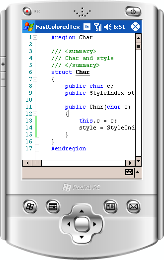 |
The control works under .NET Compact Framework 2.0. This means that you can use it for mobile platforms (PocketPC, Smartphones, PDA etc). CF version supports all features except the following:
The remaining features are presented, only slightly different from the full version.
|

 浙公网安备 33010602011771号