
plt.annotate() 在图中标注文字
plt.annotate()函数用于标注文字
plt.annotate(s,sy,*args,**kwargs)
参数解释:
-
s 为注释文本内容
-
xy 为被注释的坐标点
-
xytext 为注释文字的坐标位置
-
xycoords 参数如下:
- figure points:图左下角的点
- figure pixels:图左下角的像素
- figure fraction:图的左下部分
- axes points:坐标轴左下角的点
- axes pixels:坐标轴左下角的像素
- axes fraction:左下轴的分数
- data:使用被注释对象的坐标系统(默认)
- polar(theta,r):if not native ‘data’ coordinates t
-
weight 设置字体线型
- {‘ultralight’, ‘light’, ‘normal’, ‘regular’, ‘book’, ‘medium’, ‘roman’, ‘semibold’, ‘demibold’, ‘demi’, ‘bold’, ‘heavy’, ‘extra bold’, ‘black’}
-
color 设置字体颜色
- {‘b’, ‘g’, ‘r’, ‘c’, ‘m’, ‘y’, ‘k’, ‘w’}
- ‘black’,'red’等
- [0,1]之间的浮点型数据
- RGB或者RGBA, 如: (0.1, 0.2, 0.5)、(0.1, 0.2, 0.5, 0.3)等
-
arrowprops #箭头参数,参数类型为字典dict
- width:箭头的宽度(以点为单位)
- headwidth:箭头底部以点为单位的宽度
- headlength:箭头的长度(以点为单位)
- shrink:总长度的一部分,从两端“收缩”
- facecolor:箭头颜色
-
bbox给标题增加外框 ,常用参数如下:
- boxstyle:方框外形
- facecolor:(简写fc)背景颜色
- edgecolor:(简写ec)边框线条颜色
- edgewidth:边框线条大小
例子:
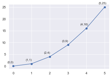
import matplotlib.pyplot as plt
import numpy as np

x = np.arange(0, 6)
y = x * x

plt.plot(x, y, marker='o')
for xy in zip(x, y):
    plt.annotate("(%s,%s)" % xy, xy=xy, xytext=(-20, 10), textcoords='offset points')
plt.show()
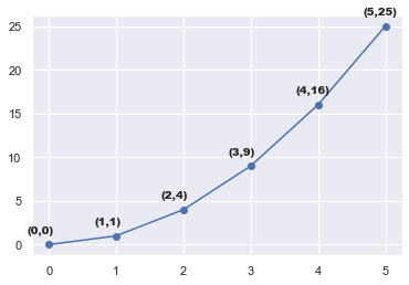
weight参数
plt.plot(x, y, marker='o')
for xy in zip(x, y):
    plt.annotate("(%s,%s)" % xy, xy=xy, xytext=(-20, 10), textcoords='offset points', weight='heavy')
plt.show()
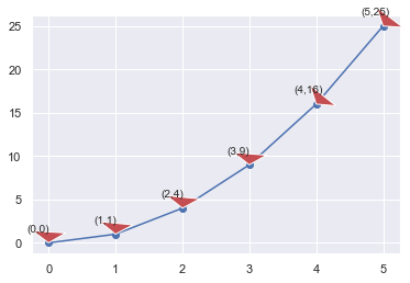
把arrowprops参数改成通过dict传入参数(facecolor = “r”, headlength = 10, headwidth = 30, width = 20)
plt.plot(x, y, marker='o')
for xy in zip(x, y):
    plt.annotate("(%s,%s)" % xy, xy=xy, xytext=(-20, 10), textcoords='offset points',
    arrowprops = dict(facecolor = "r", headlength = 10, headwidth = 30, width = 20))
plt.show()
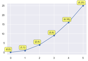
把bbox参数改成通过dict传入参数(boxstyle=‘round,pad=0.5’, fc=‘yellow’, ec=‘k’,lw=1 ,alpha=0.5)
plt.plot(x, y, marker='o')
for xy in zip(x, y):
    plt.annotate("(%s,%s)" % xy, xy=xy, xytext=(-20, 10), textcoords='offset points',
    bbox=dict(boxstyle='round,pad=0.5', fc='yellow', ec='k', lw=1, alpha=0.5))
plt.show()
arrowprops=dict(arrowstyle='-|>',connectionstyle='arc3',color='red')
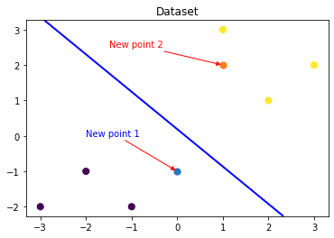
### 可视化预测新样本

plt.figure()
## new point 1
x_fearures_new1 = np.array([[0, -1]])
plt.scatter(x_fearures_new1[:,0],x_fearures_new1[:,1], s=50, cmap='viridis')
plt.annotate(s='New point 1',xy=(0,-1),xytext=(-2,0),color='blue',arrowprops=dict(arrowstyle='-|>',connectionstyle='arc3',color='red'))

## new point 2
x_fearures_new2 = np.array([[1, 2]])
plt.scatter(x_fearures_new2[:,0],x_fearures_new2[:,1], s=50, cmap='viridis')
plt.annotate(s='New point 2',xy=(1,2),xytext=(-1.5,2.5),color='red',arrowprops=dict(arrowstyle='-|>',connectionstyle='arc3',color='red'))

## 训练样本
plt.scatter(x_fearures[:,0],x_fearures[:,1], c=y_label, s=50, cmap='viridis')
plt.title('Dataset')

# 可视化决策边界
plt.contour(x_grid, y_grid, z_proba, [0.5], linewidths=2., colors='blue')

plt.show()

 浙公网安备 33010602011771号