

matplotlib画箭头
matplotlib画箭头
一、总结
一句话总结:
ax.annotate("", xy=(1-0.1, 6), xytext=(1-0.1, 9),arrowprops=dict(arrowstyle="<->"))
arrowstyle="<->" 表示双向箭头
二、matplotlib画箭头
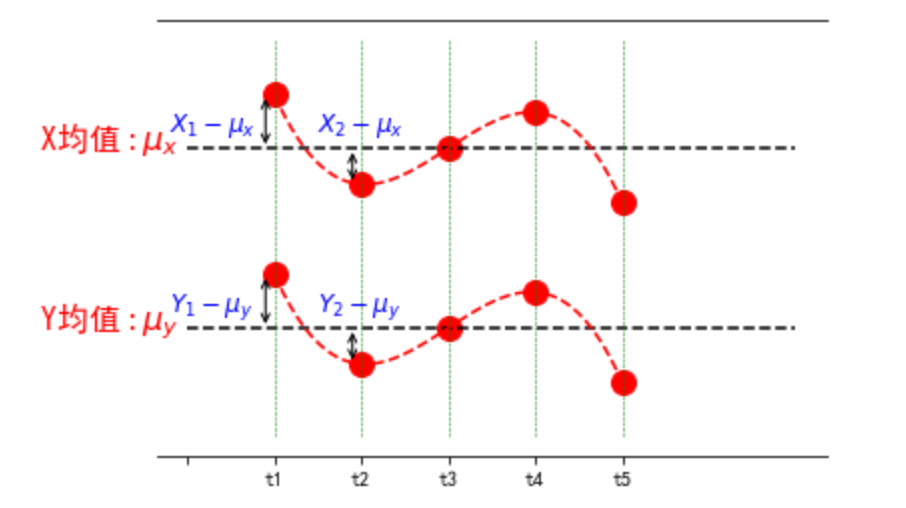
import numpy as np
import matplotlib.pyplot as plt
from scipy.interpolate import make_interp_spline
# 设置matplotlib库字体的非衬线字体为黑体
plt.rcParams["font.sans-serif"]=["SimHei"]
# 设置matplotlib库字体族为非衬线字体
plt.rcParams["font.family"]="sans-serif"

fig, ax = plt.subplots()
# 取消边框
for key, spine in ax.spines.items():
    # 'left', 'right', 'bottom', 'top'
    if key == 'left' or key == 'right':
        spine.set_visible(False)
plt.xticks(np.arange(6), ('','t1', 't2', 't3', 't4', 't5'))
plt.yticks([])

# 上部分图
x_mean=[0,2,3,4,7]
x_list=[1,2,3,4,5]

x=np.array(x_list)
y=np.array([19,14,16,18,13])
y_mean=np.mean(y).repeat(5)
#plt.plot(x,y,'ro')
plt.plot(x,y,color='red', marker='o', linestyle='dashed',linewidth=0, markersize=12)
plt.plot(x_mean,y_mean,'k--')
x_smooth = np.linspace(x.min(),x.max(),300) #300 represents number of points to make between T.min and T.max
y_smooth = make_interp_spline(x, y)(x_smooth)
plt.plot(x_smooth,y_smooth,'r--')
plt.text(-1.7,np.mean(y),r'X均值'+r'$:\mu_x$', fontdict={'size':16,'color':'r'})

# 下部分图
y2=np.array([9,4,6,8,3])
y2_mean=np.mean(y2).repeat(5)
#plt.plot(x,y,'ro')
plt.plot(x,y2,color='red', marker='o', linestyle='dashed',linewidth=0, markersize=12)
plt.plot(x_mean,y2_mean,'k--')
x2_smooth = np.linspace(x.min(),x.max(),300) #300 represents number of points to make between T.min and T.max
y_smooth = make_interp_spline(x, y2)(x2_smooth)
plt.plot(x_smooth,y_smooth,'r--')
plt.text(-1.7,np.mean(y2),r'Y均值'+r'$:\mu_y$', fontdict={'size':16,'color':'r'})

# 画虚线
d_y=np.linspace(0,22,10)
for i in range(len(x_list)):
    d_x=np.array([x_list[i] for j in range(10)])
    plt.plot(d_x,d_y,'g--',linewidth=0.5)

ax.annotate("", xy=(1-0.1, 6), xytext=(1-0.1, 9),arrowprops=dict(arrowstyle="<->"))
plt.text(-0.2,7,r'$Y_1-\mu_y$', fontdict={'size':12,'color':'b'})
ax.annotate("", xy=(1-0.1, 16), xytext=(1-0.1, 19),arrowprops=dict(arrowstyle="<->"))
plt.text(-0.2,17,r'$X_1-\mu_x$', fontdict={'size':12,'color':'b'})
ax.annotate("", xy=(2-0.1, 6), xytext=(2-0.1, 4),arrowprops=dict(arrowstyle="<->"))
plt.text(1.5,7,r'$Y_2-\mu_y$', fontdict={'size':12,'color':'b'})
ax.annotate("", xy=(2-0.1, 16), xytext=(2-0.1, 14),arrowprops=dict(arrowstyle="<->"))
plt.text(1.5,17,r'$X_2-\mu_x$', fontdict={'size':12,'color':'b'})
# t时刻标注
plt.show()
三、matplotlib画箭头
转自或参考:
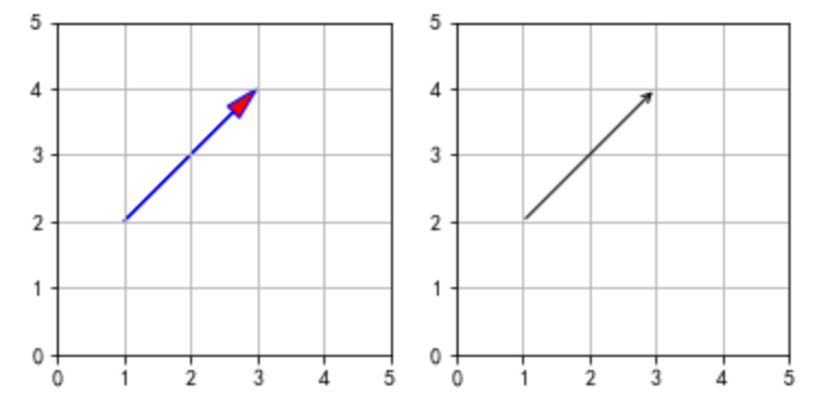
import numpy as np
import matplotlib.pyplot as plt


def drawArrow1(A, B):
    '''
    Draws arrow on specified axis from (x, y) to (x + dx, y + dy).
    Uses FancyArrow patch to construct the arrow.

    The resulting arrow is affected by the axes aspect ratio and limits.
    This may produce an arrow whose head is not square with its stem.
    To create an arrow whose head is square with its stem, use annotate() for example:
    Example:
        ax.annotate("", xy=(0.5, 0.5), xytext=(0, 0),
        arrowprops=dict(arrowstyle="->"))
    '''
    fig = plt.figure()
    ax = fig.add_subplot(121)
    # fc: filling color
    # ec: edge color
    ax.arrow(A[0], A[1], B[0]-A[0], B[1]-A[1],
             length_includes_head=True,# 增加的长度包含箭头部分
             head_width=0.25, head_length=0.5, fc='r', ec='b')
    # 注意: 默认显示范围[0,1][0,1],需要单独设置图形范围,以便显示箭头
    ax.set_xlim(0,5)
    ax.set_ylim(0,5)
    ax.grid()
    ax.set_aspect('equal') #x轴y轴等比例
    # Example:
    ax = fig.add_subplot(122)
    ax.annotate("", xy=(B[0], B[1]), xytext=(A[0], A[1]),arrowprops=dict(arrowstyle="->"))
    ax.set_xlim(0,5)
    ax.set_ylim(0,5)
    ax.grid()
    ax.set_aspect('equal') #x轴y轴等比例
    plt.show()
    plt.tight_layout()
    #保存图片,通过pad_inches控制多余边缘空白
    # plt.savefig('arrow.png', transparent = True, bbox_inches = 'tight', pad_inches = 0.25)

#%%
a = np.array([1,2])
b = np.array([3,4])
drawArrow1(a,b)

 浙公网安备 33010602011771号