红心点赞效果的实现
一、总结
一句话总结:
css的动画效果有时候也蛮好用的,比如红心的闪烁效果
1、css实现红心闪烁效果?
这个用css实现比用原生js实现方便太多了
.heart1{
    ...
    animation: test 1s linear 1;
    filter:drop-shadow(0px 0px 4px rgb(255,20,20));
}
@keyframes test{
    0%{
        transform: scale(0.8,0.8);
        opacity: 1;
    }
    25%{
        transform: scale(1,1);
        opacity: 0.8;
    }
    100%{
        transform: scale(0.8,0.8);
        opacity: 1;
    }
}
2、红心的外溅效果?
filter:drop-shadow(0px 0px 4px rgb(255,20,20));
3、js中addEventListener的使用?
document.getElementById("heart").addEventListener("click", function(){ });
4、原生js中修改css样式?
document.getElementById("heart").style.display = "block";
5、html字符集中还有蛮多的图案,比如红心?
稍微知道下就好:比如<span>♥♥</span>
6、html字符集(比如♥的红心)如何修改大小?
通过font-size属性,因为本身就是字符
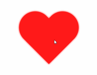
二、css画红心
1、效果图
2、代码
 1 <!DOCTYPE html>
 2 <html lang="en">
 3 <head>
 4     <meta charset="UTF-8">
 5     <title>微信点赞</title>
 6     <style>
 7         *{
 8             padding: 0;
 9             margin: 0;
10         }
11         .heart{
12             position:absolute;
13             left: 50%;
14             top:50%;
15             margin-left: -150px;
16             margin-top: -135px;
17             width: 300px;
18             height:270px;
19             background: transparent;
20             animation: test 1s linear 1;
21             filter:drop-shadow(0px 0px 4px rgb(192,192,192));
22         }
23         .heart1{
24             position:absolute;
25             left: 50%;
26             top:50%;
27             margin-left: -150px;
28             margin-top: -135px;
29             width: 300px;
30             height:270px;
31             background: transparent;
32             animation: test 1s linear 1;
33             filter:drop-shadow(0px 0px 4px rgb(255,20,20));
34         }
35         .heart:before,
36         .heart:after{
37             content: "";
38             position: absolute;
39             left: 150px;
40             width: 150px;
41             height: 240px;
42             background: rgb(192,192,192);
43             border-radius: 150px 150px 0 0;
44             transform:rotate(-45deg);
45             transform-origin: 0 100%;
46         }
47         .heart1:before,.heart1:after{
48             content: "";
49             position: absolute;
50             left: 150px;
51             width: 150px;
52             height: 240px;
53             background: rgb(255,0,0);
54             border-radius: 150px 150px 0 0;
55             transform:rotate(-45deg);
56             transform-origin: 0 100%;
57         }
58         .heart:after,.heart1:after{
59             left: 0;
60             transform:rotate(45deg);
61             transform-origin: 100% 100%;
62         }
63         @keyframes test{
64             0%{
65                 transform: scale(0.8,0.8);
66                 opacity: 1;
67             }
68             25%{
69                 transform: scale(1,1);
70                 opacity: 0.8;
71             }
72             100%{
73                 transform: scale(0.8,0.8);
74                 opacity: 1;
75             }
76         }
77     </style>
78 </head>
79 <body>
80 <div id="heart" class="heart" >
81
82 </div>
83 <div id="heart1" class="heart1" style="display: none;">
84
85 </div>
86 <script>
87     document.getElementById("heart").addEventListener("click", function()
88     {
89         document.getElementById("heart1").style.display = "block";
90         this.style.display = "none";
91     });
92     document.getElementById("heart1").addEventListener("click", function()
93     {
94         document.getElementById("heart").style.display = "block";
95         this.style.display = "none";
96     });
97 </script>
98 </body>
99 </html>
三、html字符集 红心
1、效果图

2、代码
1 <!DOCTYPE html>
2 <html lang="en">
3 <head>
4 <meta charset="UTF-8">
5 <title>Document</title>
6 </head>
7 <style>
8 span{color:#999;}
9 p{color:#D00;}
10 .heart{
11 animation: test 1s linear 1;
12 filter:drop-shadow(0px 0px 4px rgb(192,192,192));
13 }
14 .heart1{
15 animation: test 1s linear 1;
16 filter:drop-shadow(0px 0px 4px rgb(255,20,20));
17 }
18 @keyframes test{
19 0%{
20 transform: scale(0.8,0.8);
21 opacity: 0.8;
22 }
23 100%{
24 transform: scale(1,1);
25 opacity: 1.0;
26 }
27 }
28 </style>
29 <body>
30 <span>
31 ♥♥
32 </span>
33 <p>
34 ♥♥
35 </p>
36
37 <div style="position: relative;width: 500px;height: 500px;">
38 <div id="heart" class="heart" style="width: 500px;height: 500px;font-size: 200px;line-height:200px;color:#999;position: absolute;left: 30px;top: 30px;cursor: pointer;">
39 ♥
40 </div>
41 <div id="heart1" class="heart1" style="width: 500px;height: 500px;font-size: 200px;line-height:200px;color:#D00;position: absolute;left: 30px;top: 30px;display: none;cursor: pointer;">
42 ♥
43 </div>
44 </div>
45
46 <script>
47 document.getElementById("heart").addEventListener("click", function()
48 {
49 document.getElementById("heart1").style.display = "block";
50 this.style.display = "none";
51 });
52 document.getElementById("heart1").addEventListener("click", function()
53 {
54 document.getElementById("heart").style.display = "block";
55 this.style.display = "none";
56 });
57 </script>
58
59
60 </body>
61 </html>


 浙公网安备 33010602011771号