[Python] Scatter Plot for daily return
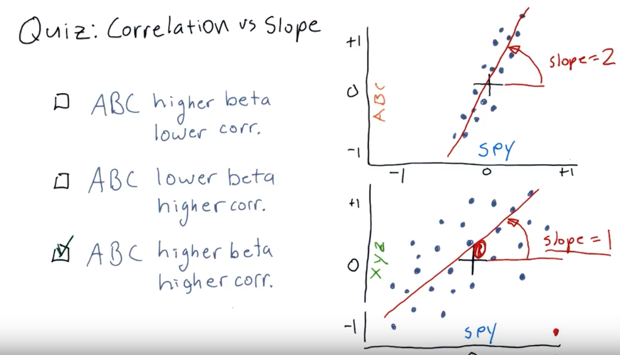
Sploe = 2: means that SPY move up 1, ABC move up 2
Correlation: how close those dots close to the line.
def scatter(df):

    plot_data(df, title="Data frame", yLabel="Time")
    plt.show()

    dr = compute_daily_return(df)
    plot_data(dr, title="Daily returns", yLabel="Daily returns")

    dr['GOOG'].hist(bins=20, label="GOOG")
    dr['SPY'].hist(bins=20, label="SPY")
    plt.legend(loc='upper right')

    # Scatterplot SPY vs GOOG
    dr.plot(kind='scatter', x = 'SPY', y = 'GOOG')
    spy = dr['SPY'][:-1] # remove nan value
    goog = dr['GOOG'][:-1] # remove nan value
    beta_goog, alpha_goog = np.polyfit(spy, goog, 1)
    # beta_goog= 1.23719057977
    # alpha_goog= -0.000283995818653
    plt.plot(dr['SPY'], beta_goog*dr['SPY']+alpha_goog, '-', color='r')
    plt.show()

    print("Correlation", dr.corr(method='pearson'))

    # Get kurtosis
    print("kurtosis=", dr.kurtosis())


if __name__ == '__main__':
    df=test_run()
    scatter(df[['SPY', 'GOOG']])


 浙公网安备 33010602011771号