[Mobile Web] LEVEL 3: ADAPTIVE ADVENTURES -- EX
IPHONE MEDIA QUERY
We want to target a mobile device, specifically an iPhone. Write a media query to target the iPhone's 320px width, using the max-width property.
@media screen and (max-width: 320px){

  }
MEDIA QUERY #2
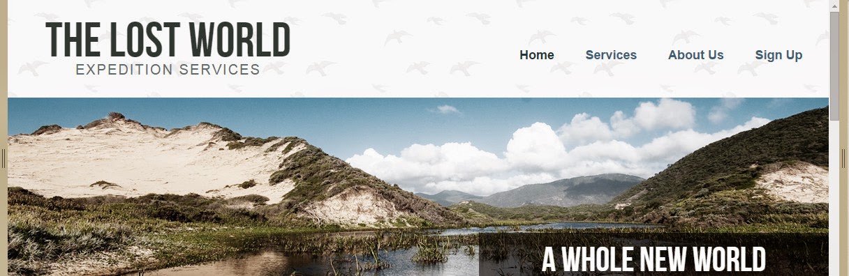
Using the media query you just wrote, stack the .logo and <nav>, rather than floating them to either side. Also, set the width to inherit from the parent and center the text inside the <nav>. Use the Desktop and Mobile buttons below to resize the site.
/* Logo */

.logo {
  float: left;
  width: 36.1702128%; /* 340px/940px */
}

/* Navigation */

nav {
  float: right;
}

Answer:
@media screen and (max-width: 320px) {
  .logo {
    float: none;   /*IMPORTANT to set float to none*/
    width: inherit;  /*IMPORTANT to set width to inherit*/
  }
  nav {
    float: none;
    text-align: center;
    width: inherit;
  }
}

MEDIA SPECIFIC CONTENT
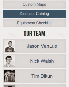
Stack the .content and the .sidebar, making sure their width inherits from the parent container. Use the Desktop and Mobile buttons below to resize the site.
.content {
  float: left;
  width: 64.893617%; /* 610px/940px */
}
.sidebar {
  float: right;
  width: 31.9148936%; /* 300px/940px */
}
Answer:
@media screen and (max-width: 320px) {
  .content {
      float: none;
      width: inherit ;
  }
  .sidebar {
    float: none;
    text-align: center;
    width: inherit ;
  }
}

MEDIA SPECIFIC NAVIGATION
Target the <nav> <ul> <li>'s, giving them a margin-right of 5%, set the text touppercase, and set the font-size, in ems, to a target of 13px, with the context being 16px.

@media screen and (max-width: 320px) {
  nav ul li {
    margin-right: 5%;
    font-size: 0.8125em/*(13px/16px)*/;
    text-transform: uppercase;
  }
}


 浙公网安备 33010602011771号