[CSS] min-content/max-content (尺寸局限)
Brwoser support: https://caniuse.com/?search=width%3Amin-content
https://caniuse.com/?search=width%3Amax-content
<!DOCTYPE html>
<html lang="en">
  <head>
    <meta charset="UTF-8" />
    <meta name="viewport" content="width=device-width, initial-scale=1.0" />
    <title>Document</title>
    <style>
      .box1 {
        width: 200px;
        background-color: red;
        color: white;
      }
      .box2 {
        width: max-content;
        background-color: blue;
        color: white;
      }
      .box3 {
        width: min-content;
        background-color: green;
        color: white;
      }
    </style>
  </head>
  <body>
    <h2>min-content/max-content (尺寸局限)</h2>
    <div class="box1">测试文字</div>
    <div class="box2">测试文字</div>
    <div class="box3">测试文字</div>
  </body>
</html>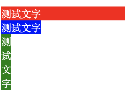
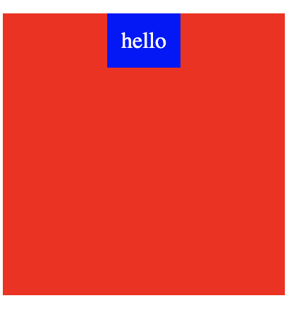
Usecase:
Let say we want to achieve this style:
Normal approach using flex box:
<!DOCTYPE html>
<html lang="en">
  <head>
    <meta charset="UTF-8" />
    <meta name="viewport" content="width=device-width, initial-scale=1.0" />
    <title>Document</title>
    <style>
      .box {
        width: 200px;
        height: 200px;
        background-color: red;
        display: flex;
        justify-content: center;
      }
      .text {
        align-self: flex-start;
        background-color: blue;
        color: white;
        padding: 10px;
        margin-inline: auto;
      }
    </style>
  </head>
  <body>
    <h2>min-content/max-content (尺寸局限)</h2>
    <div class="box">
      <div class="text">hello</div>
    </div>
  </body>
</html>
By using new approach:
<!DOCTYPE html>
<html lang="en">
  <head>
    <meta charset="UTF-8" />
    <meta name="viewport" content="width=device-width, initial-scale=1.0" />
    <title>Document</title>
    <style>
      .box {
        width: 200px;
        height: 200px;
        background-color: red;
      }
      .text {
        width: max-content;
        background-color: blue;
        color: white;
        padding: 10px;
        margin-inline: auto;
      }
    </style>
  </head>
  <body>
    <h2>min-content/max-content (尺寸局限)</h2>
    <div class="box">
      <div class="text">hello</div>
    </div>
  </body>
</html>
As you can see, it is much easier by using width: max-conetent

 浙公网安备 33010602011771号