python 数据可视化 -- 生成可控的随机数据集合
生成可控的随机数据集合 使用 numpy.random 模块
numpy.random.random(size=None) 返回 [0.0, 1.0) 区间的随机 floats, 默认返回一个 float
numpy.random.randint(low, high=None, size=None, dtype='l') 按照均匀分布,返回 [low, high) 区间的随机 integers
numpy.random.uniform(low=0.0, high=1.0, size=None) 按照均匀分布,返回 [low, high) 区间的随机 floats
numpy.random.normal(loc=0.0, scale=1.0, size=None) 按照正态分布,返回随机 floats
numpy.random.triangular(left, mode, right, size=None) 按照三角分布,返回随机 floats
numpy.random.beta(a, b, size=None) 按照 beta 分布,返回随机 floats
numpy.random.exponential(scale=1.0, size=None) 按照指数分布,返回随机 floats
numpy.random.gamma(shape, scale=1.0, size=None) 按照 gamma 分布,返回随机 floats
numpy.random.lognormal(mean=0.0, sigma=1.0, size=None) 按照指数正态分布,返回随机 floats
numpy.random.pareto(a, size=None) 按照 pareto 分布,返回随机 floats
更多分布见 numpy.random 官网教程:https://docs.scipy.org/doc/numpy/reference/routines.random.html?highlight=random#module-numpy.random
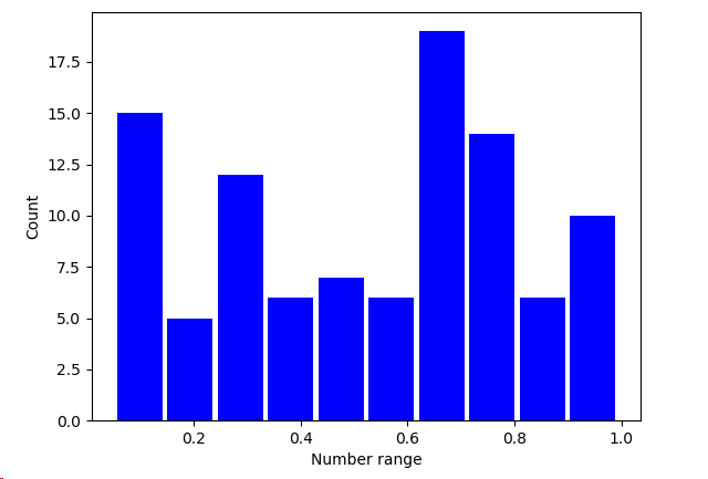
import matplotlib.pyplot as plt
import numpy as np

SAMPLE_SIZE = 100

np.random.seed()
real_rand_vars = [np.random.random() for _ in range(SAMPLE_SIZE)]  # 生成 100 个 [0.0, 1.0) 的随机小数

plt.figure()
plt.hist(x = real_rand_vars, bins=10, rwidth=0.9, color='blue')
plt.xlabel('Number range')
plt.ylabel('Count')
plt.show()
使用相似的方法,可以生成虚拟价格增长数据的时序图,并加上随机噪声
import matplotlib.pyplot as plt
import numpy as np

duration = 100
mean_inc = 0.2
std_dev_inc = 1.2

x = range(duration)
y = []
price_today = 0

for i in x:
    next_delta = np.random.normal(loc=mean_inc, scale=std_dev_inc)  # 按照给定的均值和方差的正态分布返回随机floats
    price_today += next_delta
    y.append(price_today)

plt.figure()
plt.plot(x, y, 'b.-')
plt.xlabel('Time')
plt.ylabel('Value')
plt.show()

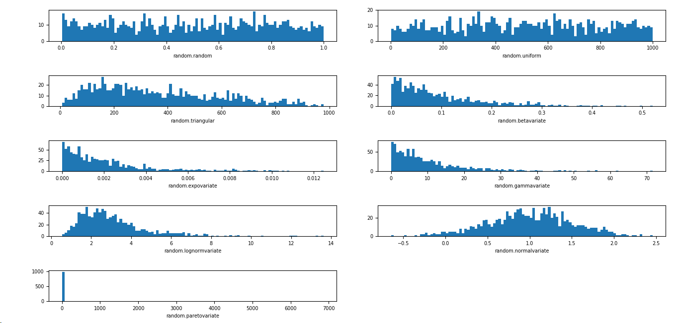
根据不同的需求,可以选择不同的分布
import matplotlib.pyplot as plt
import numpy as np
import matplotlib

SAMPLE_SIZE = 1000
buckets = 100
matplotlib.rcParams.update({'font.size':7})

plt.figure()
# 第一个图是 [0,1) 之间分布的随机变量
plt.subplot(521)
plt.xlabel('random.random')
res = [np.random.random() for _ in range(1, SAMPLE_SIZE)]
plt.hist(x=res, bins=buckets)
# 第二个图是一个均匀分布的随机变量
plt.subplot(522)
plt.xlabel('random.uniform')
a = 1
b = SAMPLE_SIZE
res = [np.random.uniform(a, b) for _ in range(1, SAMPLE_SIZE)]
plt.hist(x=res, bins=buckets)
# 第三个图是一个三角形分布
plt.subplot(523)
plt.xlabel('random.triangular')
low = 1
mode = 100.0
high = SAMPLE_SIZE
res = [np.random.triangular(low, mode, high) for _ in range(1, SAMPLE_SIZE)]
plt.hist(x=res, bins=buckets)
# 第四个图是一个 beta 分布
plt.subplot(524)
plt.xlabel('random.betavariate')
alpha = 1
beta = 10
res = [np.random.beta(alpha, beta) for _ in range(1, SAMPLE_SIZE)]
plt.hist(x=res, bins=buckets)
# 第五个图是一个指数分布
plt.subplot(525)
plt.xlabel('random.expovariate')
lambd = 1.0 / ((SAMPLE_SIZE + 1) / 2.0)
res = [np.random.exponential(lambd) for _ in range(1, SAMPLE_SIZE)]
plt.hist(x=res, bins=buckets)
# 第六个图是一个 gamma 分布
plt.subplot(526)
plt.xlabel('random.gammavariate')
alpha = 1
beta = 10
res = [np.random.gamma(alpha, beta) for _ in range(1, SAMPLE_SIZE)]
plt.hist(x=res, bins=buckets)
# 第七个图是一个 对数正态分布
plt.subplot(527)
plt.xlabel('random.lognormvariate')
mu = 1
sigma = 0.5
res = [np.random.lognormal(mu, sigma) for _ in range(1, SAMPLE_SIZE)]
plt.hist(x=res, bins=buckets)
# 第八个图是一个正态分布
plt.subplot(528)
plt.xlabel('random.normalvariate')
mu = 1
sigma = 0.5
res = [np.random.normal(mu, sigma) for _ in range(1, SAMPLE_SIZE)]
plt.hist(x=res, bins=buckets)
# 第九个图是一个帕累托分布
plt.subplot(529)
plt.xlabel('random.paretovariate')
alpha = 1
res = [np.random.pareto(alpha) for _ in range(1, SAMPLE_SIZE)]
plt.hist(x=res, bins=buckets)

plt.tight_layout()
plt.show()


 浙公网安备 33010602011771号