python 数据可视化(matplotlib)
matpotlib 官网 :https://matplotlib.org/index.html
matplotlib 可视化示例:https://matplotlib.org/gallery/index.html
matplotlib 教程:https://matplotlib.org/tutorials/index.html
matplotlib 的官网教程分为初级(Introductory)、中级(Intermediate)、高级(Advanced)三部分,此外还有专门的章节,如 Colors、Text、Toolkits
一个简单的示例
import matplotlib.pyplot as plt
import numpy as np
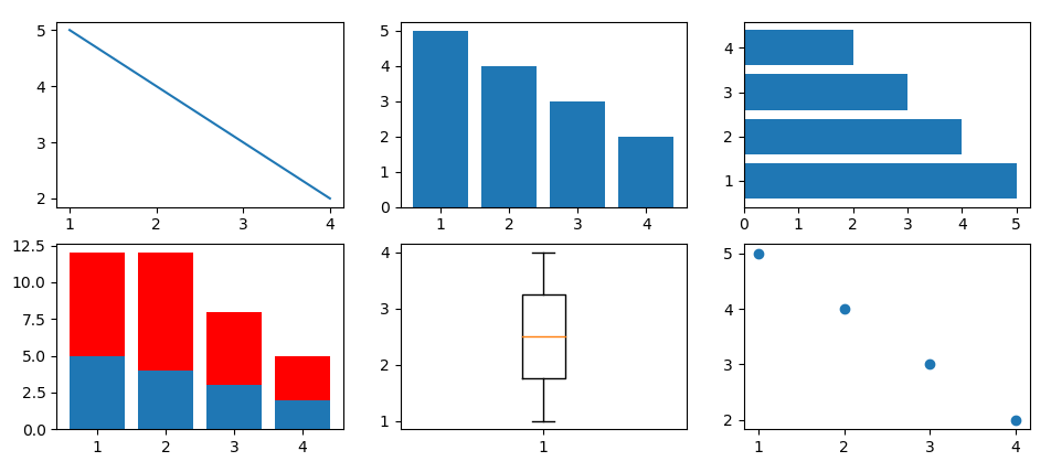
x = [1,2,3,4] y = [5,4,3,2] y1 = [7,8,5,3] plt.figure() # 创建新图表 plt.subplot(231) # 将图表分隔成 2X3 的网格,并在当前图表上添加子图 plt.plot(x, y) plt.subplot(232) plt.bar(x=x, height=y) plt.subplot(233) plt.barh(y=x, width=y) plt.subplot(234) plt.bar(x=x, height=y) plt.bar(x=x, height=y1, bottom=y, color='r') plt.subplot(235) plt.boxplot(x=x) plt.subplot(236) plt.scatter(x=x, y=y) plt.show()
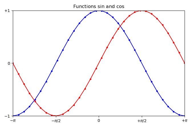
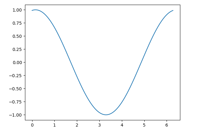
简单的正弦图和余弦图
import matplotlib.pyplot as plt
import numpy as np

x = np.linspace(start=-np.pi, stop=np.pi, num=32, endpoint=True)

y = np.cos(x)
y1 = np.sin(x)

plt.figure()
plt.plot(x, y, 'b.-')
plt.plot(x, y1, 'r.-')
# 设置图标的标题
plt.title(label='Functions $\sin$ and $\cos$')
# 设置x轴和y轴的范围
plt.xlim(left=-3.0, right=3.0)
plt.ylim(bottom=-1.0, top=1.0)
# 设置x轴和y轴的刻度和标记
plt.xticks(ticks=[-np.pi, -np.pi/2, 0, np.pi/2, np.pi], labels=[r'$-\pi$', r'$-\pi/2$', r'$0$', r'$+\pi/2$', r'$+\pi$'])
plt.yticks(ticks=[-1, 0, +1], labels=[r'$-1$', r'$0$', r'$+1$'])

plt.show()
设置坐标轴的长度和范围
matplotlib.pyplot.axis()
如果不使用 axis() 或者其他设置,matplotlib 会自动使用最小值,刚好可以让我们在一个图中看到所有的数据点。
如果设置 axis() 的范围比数据集合中的最大值小,matplotlib 会按照设置执行,这样就无法看到所有的数据点,为避免这一情况可以使用 matplotlib.pyplot.autoscale(enable=True, axis='both', tight=None) 方法,该方法会计算坐标轴的最佳大小以适应数据的显示。
matplotlib.pyplot.axes(arg=None, **kwargs) 向相同图形中添加新的坐标轴。
matplotlib.pyplot.axhline(y=0, xmin=0, xmax=1, **kwargs) 根据y轴添加水平线
matplotlib.pyplot.axvline(x=0, ymin=0, ymax=1, **kwargs) 根据x轴添加垂直线
matplotlib.pyplot.axhspan(ylim, ymax, xmin=0, xmax=1, **kwargs) 生成水平带
matplotlib.pyplot.axvspan(xmin, xmax, ymin=0, ymax=1, **kwargs) 生成垂直带
matplotlib.pyplot.grid(b=None, which='major', axis='both', **kwargs) 显示网格
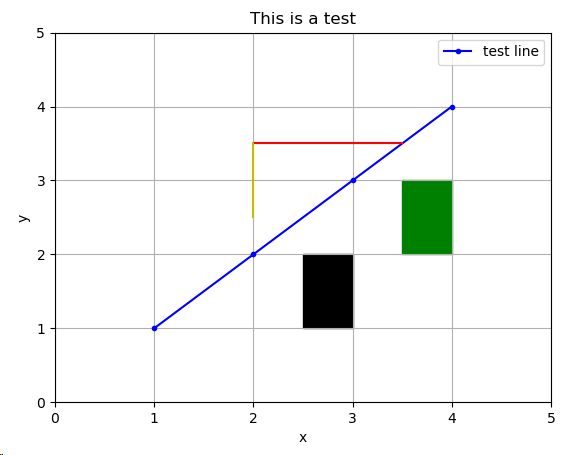
import matplotlib.pyplot as plt

plt.figure()
plt.plot([1,2,3,4], [1,2,3,4], 'b.-')
plt.axis([0,5,0,5])  # 设置坐标轴的范围
plt.axhline(y=3.5, xmin=0.4, xmax=0.7, color='r')
plt.axvline(x=2, ymin=0.5, ymax=0.7, color='y')
plt.axhspan(ymin=1, ymax=2, xmin=0.5, xmax=0.6, color='k')
plt.axvspan(xmin=3.5, xmax=4, ymin=0.4, ymax=0.6, color='g')
plt.grid(b=True, which='major', axis='both')
plt.xlabel('x')
plt.ylabel('y')
plt.title('This is a test')
plt.legend(['test line'])
plt.show()
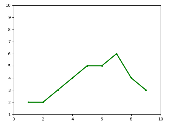
改变线的属性的三种方法
1. 直接在 plot() 函数中社设置线的属性
2. 获取 matplotlib.lines.Line2D 实例对象后,调用该对象的方法进行设置。用来改变线条的所有属性都包含在 matplotlib.lines.Line2D 类中,详见官网说明。
3. 使用 matplotlib.pyplot.setp() 函数进行设置
import matplotlib.pyplot as plt

x = [1,2,3,4,5,6,7,8,9]
y = [2,2,3,4,5,5,6,4,3]
plt.axis([0, 10, 1, 10])
plt.plot(x, y, 'g.-', linewidth=2.5)  # 1.直接在 plot() 函数中设置线条属性
line, = plt.plot(x, y, 'g.-')  # plot() 返回一个线条的实例对象的列表(matplotlib.lines.Line2D),取第一个
line.set_linewidth(2.5)  # 2.调用 Line2D 的相应的set_方法进行设置
plt.setp(line, color='r', linewidth=2.5)  # 3.调用 setp() 函数进行设置
plt.show()
颜色
1.最简单的方法是使用 matplotlib 提供的字母代码,共八个,{'b', 'g', 'r', 'c', 'm', 'y', 'k', 'w'}, color='b'
2. 可以直接使用合法的 HTML 颜色的名字,color=‘chartreuse’
2.使用 HTML 十六进制字符串来指定颜色,color='#eeefff'
3.使用归一化到 [0, 1] 的 RGB 元组,color=(0.3, 0.3, 0.4)
还有其他的指定颜色的方法,官网的 matplotlib.colors 模块中有介绍,不过以上的4种方法完全可以满足需求。
查询颜色编码的网站有很多,推荐取色网站 https://html-color-codes.info/chinese/
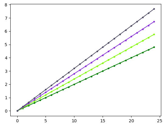
import matplotlib.pyplot as plt
import numpy as np

y = np.arange(0.0, 5.0, 0.2)
plt.plot(y, '.-', linewidth=1.5, color='g')
plt.plot(y*1.2, '.-', linewidth=1.5, color='chartreuse')
plt.plot(y*1.4, '.-', linewidth=1.5, color='#8a2be2')
plt.plot(y*1.6, '.-', linewidth=1.5, color=(0.3, 0.3, 0.4))
plt.show()
坐标轴和刻度
继续学习: https://blog.csdn.net/wuzlun/article/details/80053277
在 matplotlib 中,调用 figure() 会显式的创建一个图形,表示一个图形用户界面窗口。另外,通过调用 plot() 或者类似的方法会隐式的创建图形。
刻度是图形的一部分,有刻度定位器和刻度格式器组成。刻度有主刻度和次刻度,默认不显示次刻度。主刻度和次刻度可以被独立的指定位置和格式化。
刻度定位器指定刻度所在的位置
刻度格式器指定刻度显示的样式。
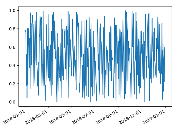
import matplotlib as mpl
import matplotlib.pyplot as plt
import numpy as np
import datetime

fig = plt.figure()  # 返回 matplotlib.figure.Figure 类的对象实例
ax = plt.gca()  # 返回 matplotlib.axes.Axes 类的对象实例
start = datetime.datetime(2018, 1, 1)  # 返回 datetime.datetime 类的对象实例
stop = datetime.datetime(2018, 12, 31)
delta = datetime.timedelta(days = 1)  # 返回 datetime.datedelta 类的对象实例, 用作时间间隔
dates = mpl.dates.drange(dstart=start, dend=stop, delta=delta)  # 返回一个 numpy.array 数组类型
values = np.random.rand(len(dates))  # 返回一个 numpy.array 数组类型
ax.plot_date(x=dates, y=values, linestyle='-', marker='')  # plot date that contains dates
date_format = mpl.dates.DateFormatter('%Y-%m-%d')
ax.xaxis.set_major_formatter(date_format)  # 获取 x 轴,设置格式
fig.autofmt_xdate()  # 主要用于旋转x轴的刻度
plt.show()
移动坐标轴
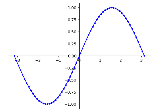
import matplotlib.pyplot as plt
import numpy as np

x = np.linspace(start=-np.pi, stop=np.pi, num=64, endpoint=True)
y = np.sin(x)
plt.plot(x, y, 'b.-')
ax = plt.gca()
ax.spines['right'].set_color('none')  # 去掉右侧坐标轴
ax.spines['top'].set_color('none')  # 去掉上侧坐标轴
ax.spines['bottom'].set_position(('data', 0))  # 移动下侧坐标轴
ax.spines['left'].set_position(('data', 0))  # 移动左侧坐标轴
ax.xaxis.set_ticks_position('bottom')  # 设置x轴刻度的位置
ax.yaxis.set_ticks_position('left')  # 设置y轴刻度的位置
plt.show()
图例和注解
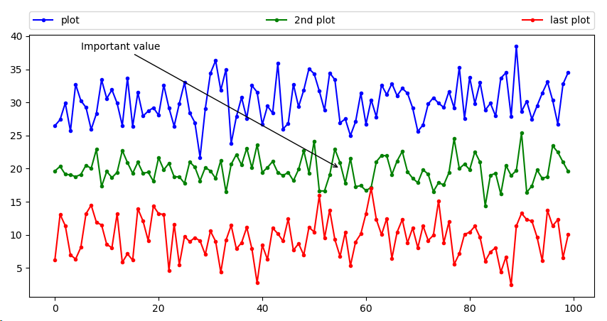
import matplotlib.pyplot as plt
import numpy as np

y1 = np.random.normal(loc=30, scale=3, size=100)
y2 = np.random.normal(loc=20, scale=2, size=100)
y3 = np.random.normal(loc=10, scale=3, size=100)
plt.plot(y1, 'b.-', label='plot')  # label属性为图线设置标签
plt.plot(y2, 'g.-', label='2nd plot')
plt.plot(y3, 'r.-', label='last plot')
plt.legend(bbox_to_anchor=(0.0, 1.02, 1.0, 0.102), loc=3, ncol=3, mode='expand', borderaxespad=0.0)  # 添加并设置图例
plt.annotate(s='Important value', xy=(55.0, 20.0), xycoords='data', xytext=(0, 38), arrowprops=dict(arrowstyle='->'))  # 添加并设置图解
plt.show()
绘制直方图 hist
直方图被用于可视化数据的分布估计。直方图中 bin 表示一定间隔下数据点频率的垂直矩形,bin 以固定的间隔创建,因此直方图的总面积等于数据点的数量。
直方图可以显示数据的相对频率,而不是使用数据的绝对值,此时,总面积就等于1
import matplotlib.pyplot as plt
import numpy as np

mu = 100
sigma = 15
x = np.random.normal(mu, sigma, 10000)  # 根据正态分布随机取值
ax = plt.gca()
ax.hist(x, bins=35, rwidth=0.8, color='r')
ax.set_xlabel('Values')
ax.set_ylabel('Frequency')
ax.set_title(r'$\mathrm{Histogram:}\ \mu=%d, \ \sigma=%d$' % (mu, sigma))
plt.show()

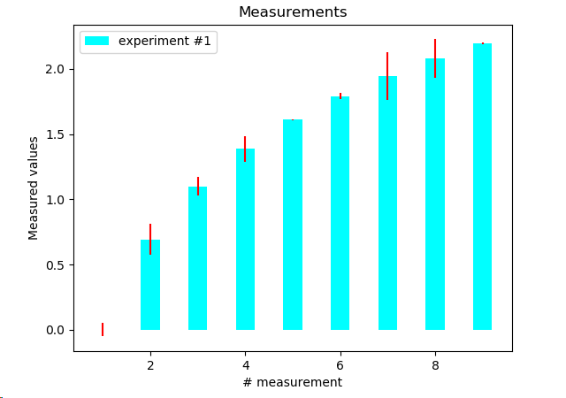
绘制条形误差图
import matplotlib.pyplot as plt
import numpy as np

x = np.arange(1, 10, 1)
y = np.log(x)
xe = 0.1 * np.abs(np.random.randn(len(y)))
plt.bar(x, y, yerr=xe, width=0.4, align='center', ecolor='r', color='cyan', label='experiment #1')
plt.xlabel('# measurement')
plt.ylabel('Measured values')
plt.title('Measurements')
plt.legend(loc='upper left')
plt.show()
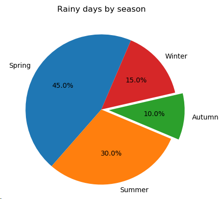
绘制饼图
import matplotlib.pyplot as plt

plt.figure(1, figsize=(5, 5))
x = [45, 30, 10, 15]  # fractions are either x/sum(x) or x if sum(x) <= 1
labels = ['Spring', 'Summer', 'Autumn', 'Winter']
print(type(labels))
explode = (0, 0, 0.1, 0)  # 各部分的间隔,长度与 x 的长度相同
plt.pie(x, explode=explode, labels=labels, autopct='%1.1f%%', startangle=67)
plt.title('Rainy days by season')
plt.show()
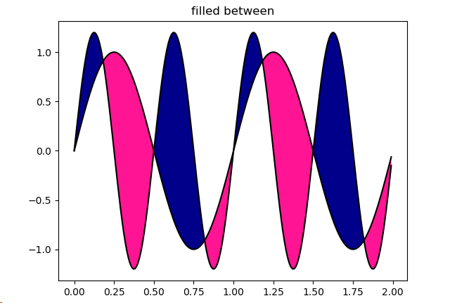
填充区域
import matplotlib.pyplot as plt
import numpy as np

x = np.arange(0.0, 2.0, 0.01)
y1 = np.sin(2*np.pi*x)
y2 = 1.2*np.sin(4*np.pi*x)

fig = plt.figure()
plt.plot(x, y1, x, y2, color='black')
# fill_between()方法使用x为定位点选取y值(y1,y2), where参数指定一个条件来填充曲线。
plt.fill_between(x, y1, y2, where=y2>=y1, facecolor='darkblue', interpolate=True)
plt.fill_between(x, y1, y2, where=y2<=y1, facecolor='deeppink', interpolate=True)
plt.title('filled between')
plt.show()
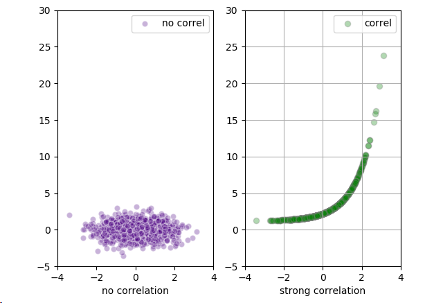
带彩色标记的散点图
import matplotlib.pyplot as plt
import numpy as np

x = np.random.randn(1000)
y1 = np.random.randn(len(x))
y2 = 1.2 + np.exp(x)
plt.subplot(121)
plt.scatter(x, y1, color='indigo', alpha=0.3, edgecolors='white', label='no correl')
plt.xlabel('no correlation')
plt.xlim([-4, 4])
plt.ylim([-5, 30])
plt.legend()

plt.subplot(122)
plt.scatter(x, y2, color='green', alpha=0.3, edgecolors='grey', label='correl')
plt.xlabel('strong correlation')
plt.grid(True)
plt.legend()
plt.xlim([-4, 4])
plt.ylim([-5, 30])
plt.show()
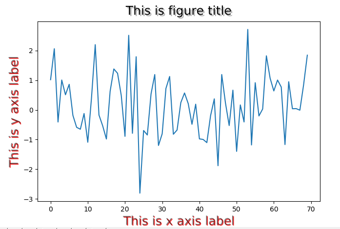
设置坐标轴标签的透明度和大小
import matplotlib.pyplot as plt
import matplotlib.patheffects as pef
import numpy as np

data = np.random.randn(70)
fontsize = 18
title = 'This is figure title'
x_label = 'This is x axis label'
y_label = 'This is y axis label'
offset_xy = (1, -1)
rgbRed = (1.0, 0.0, 0.0)
alpha = 0.8
plt.plot(data)  # 绘图
title_text_obj = plt.title(title, fontsize=fontsize, verticalalignment='bottom')  # 添加标题,返回 Text 实例对象,该类继承自 Artist 类
title_text_obj.set_path_effects([pef.withSimplePatchShadow()])  # 为标题添加阴影效果,默认值offset=(2, -2), shadow_rgbFace=None, alpha=None
xlabel_obj = plt.xlabel(x_label, fontsize=fontsize, alpha=0.5)  # 添加x轴标签,返回一个 Text 实例对象
ylabel_obj = plt.ylabel(y_label, fontsize=fontsize, alpha=0.5)
pe = pef.withSimplePatchShadow(offset=offset_xy, shadow_rgbFace=rgbRed, alpha=alpha)  # 获取一个withSimplePatchShadow类的实例对象
xlabel_obj.set_path_effects([pe])
ylabel_obj.set_path_effects([pe])
plt.show()
向图表线条添加阴影 使用transformation框架
import matplotlib.pyplot as plt
import matplotlib.transforms as transforms
import numpy as np

def setup(layout=None):
    assert layout is not None
    fig = plt.figure()
    ax = fig.add_subplot(layout)
    return fig, ax

def get_signal():
    t = np.arange(0.0, 2.5, 0.01)
    s = np.sin(5*np.pi*t)
    return t, s

def plot_signal(t, s):
    line, = axes.plot(t, s, linewidth=5, color='magenta')  # magenta:洋红色
    return line

def make_shadow(fig, axes, line, t, s):
    delta = 2/72.0
    # xt和 yt 是转换的偏移量,scale_trans 是一个转换可调用对象,在转换时和显示之前对xt和yt进行比例调整
    offset = transforms.ScaledTranslation(xt=delta, yt=-delta, scale_trans=fig.dpi_scale_trans)  # 获取ScaledTranslation实例对象
    offset_transform = axes.transData + offset
    #  阴影实际上是通过将原先的线条进行坐标轴变换后,重现换了一条线,并且通过设置zorder属性值来控制绘制两条线的先后顺序,后划的线会覆盖先划的线
    axes.plot(t, s, linewidth=5, color='black', transform=offset_transform, zorder=0.5*line.get_zorder())  # zorder值小的会先绘制

if __name__ == '__main__':
    fig, axes = setup(111)  # 获取 Figure 和 Axes 实例对象
    t, s = get_signal()  # 获取绘图用的x和y的值,两者都是numpy.ndarray类型
    line = plot_signal(t, s)  # 绘图,返回 LinkedIn2D实例对象
    make_shadow(fig, axes, line, t, s)  # 为线条添加阴影
    axes.set_title('Shadow effect using an offset transform')
    plt.show()

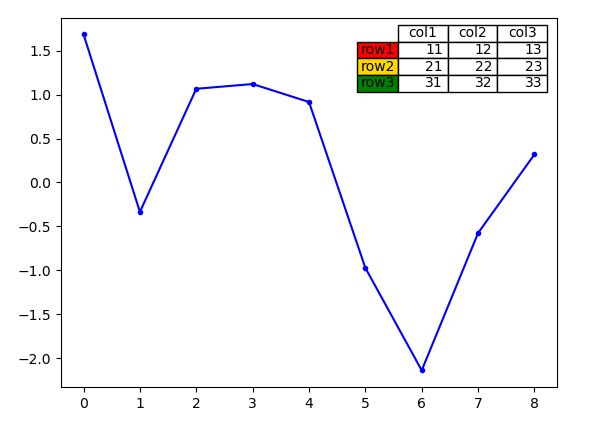
向图表中添加数据表格
import matplotlib.pyplot as plt
import numpy as np

plt.figure()
y = np.random.randn(9)

col_labels = ['col1', 'col2', 'col3']
row_labels = ['row1', 'row2', 'row3']
table_values = [[11, 12, 13], [21, 22, 23], [31, 32, 33]]
row_colors = ['red', 'gold', 'green']
# 使用table()方法创建了一个带单元格的表格,并把它添加到当前坐标轴中,并返回 Table 实例对象
#注意 表格里的数据跟绘图的数据不是关联在一起的,需要手动同时修改两者,使之对应起来
my_table = plt.table(cellText=table_values,
                     colWidths=[0.1]*3,
                     rowLabels=row_labels,
                     colLabels=col_labels,
                     rowColours=row_colors,
                     loc='upper right')
plt.plot(y,'b.-')
plt.show()
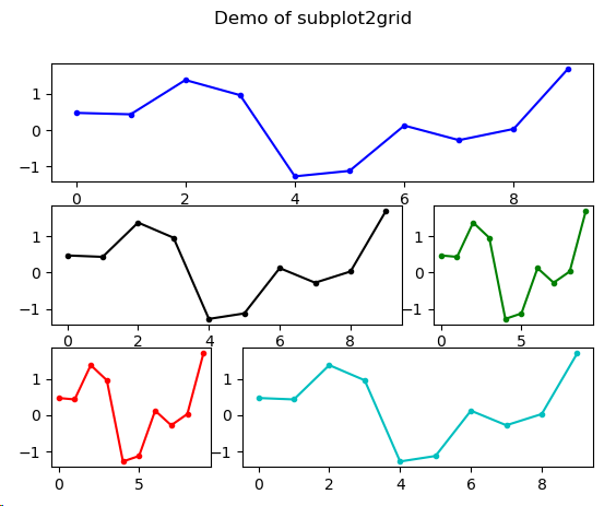
使用subplots(子区)
子区的基类是matplotlib.axes.SubplotBase,子区是matplotlib.axes.Axes的实例,但提供了helper方法来生成和操作图表中的一系列Axes。
matplotlib.pyplot.subplot() 位置从1开始计数,返回一个(fig, ax)元组,其中ax可以是一个坐标轴实例,当创建多个子区时,ax是一个坐标轴实例的数组。
matplotlib.pyplot.subplot2grid() 位置从0开始计数
matplotlib.pyplot.subplots() 位置从1开始计数
matplotlib.pyplot.subplot_tool()
matplotlib.pyplot.subplots_adjust() 调整子区的布局,关键字参数制定了图表中子区的坐标(left, right, bottom, top),其值是归一化的图表大小的值。
import matplotlib.pyplot as plt
import numpy as np

y = np.random.randn(10)
plt.figure()
#subplot()位置是基于1的;subplot2grid()位置是基于0的
axes1 = plt.subplot2grid(shape=(3,3), loc=(0,0), colspan=3)
axes2 = plt.subplot2grid(shape=(3,3), loc=(1,0), colspan=2)
axes3 = plt.subplot2grid(shape=(3,3), loc=(1,2))
axes4 = plt.subplot2grid(shape=(3,3), loc=(2,0))
axes5 = plt.subplot2grid(shape=(3,3), loc=(2,1), colspan=2)
axes1.plot(y, 'b.-')
axes2.plot(y, 'k.-')
axes3.plot(y, 'g.-')
axes4.plot(y, 'r.-')
axes5.plot(y, 'c.-')
all_axes = plt.gcf().axes
for ax in all_axes:
    for ticklabel in ax.get_xticklabels() + ax.get_yticklabels():
        ticklabel.set_fontsize(10)
plt.suptitle('Demo of subplot2grid')
plt.show()
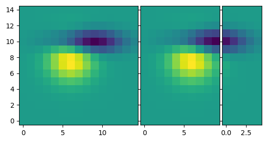
定制化网格
使用matplotlib.pyplot.grid来设置网格的可见度、密度和风格,或者是否显示网格。
import matplotlib.pyplot as plt
from matplotlib.cbook import get_sample_data
import numpy as np
from mpl_toolkits.axes_grid1 import ImageGrid

def get_demo_image():
    # 返回一个数据文件,fname是基于 ..\mpl-data\sample_data 的相对路径。asfileobj为True时返回文件对象,否则返回文件的绝对路径
    f = get_sample_data(fname="axes_grid/bivariate_normal.npy", asfileobj=False)
    #载入文件,返回 ndarray
    z = np.load(f)
    return z

def get_grid(fig=None, layout=None, nrows_ncols=None):
    assert fig is not None
    assert layout is not None
    assert nrows_ncols is not None
    # 获取 ImageGrid 类的实例对象
    grid = ImageGrid(fig, layout, nrows_ncols=nrows_ncols, axes_pad=0.05, add_all=True, label_mode='L')
    return grid

def load_images_to_grid(grid, z, *images):
    min, max = z.min(), z.max()  # 获取最大值和最小值
    for i, image in enumerate(images):
        axes = grid[i]
        axes.imshow(image, origin='lower', vmin=min, vmax=max, interpolation='nearest')

if __name__ == '__main__':
    fig = plt.figure()
    grid = get_grid(fig, 111, (1, 3))
    z = get_demo_image()
    image1 = z
    image2 = z[:, :10]  # 切片,取前10列
    image3 = z[:, 10:]  # 切片,取10列及后面的列
    load_images_to_grid(grid, z, image1, image2, image3)
    plt.show()
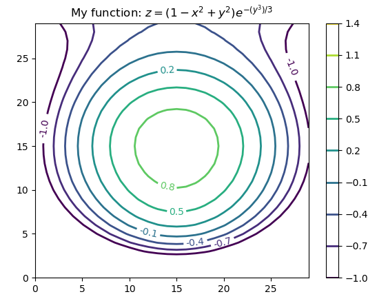
创建等高线图 Contour
使用 matplotlib.pyplot.contour 和 matplotlib.pyplot.contourf 绘制等高线图,前者绘制等高线,后者绘制填充的等高线。
import matplotlib.pyplot as plt
import numpy as np

def process_signals(x, y):
    return (1-(x**2+y**2))*np.exp(-y**3/3)

x = np.arange(-1.5, 1.5, 0.1)
y = np.arange(-1.5, 1.5, 0.1)
X, Y = np.meshgrid(x, y)  # 生成坐标矩阵 根据传入的两个一位数组参数生成两个数组元素的列表。
Z = process_signals(X, Y)
N = np.arange(-1, 1.5, 0.3)
CS = plt.contour(Z, N, linewidths=2)  # 绘制等高线
plt.clabel(CS, inline=True, fmt='%1.1f', fontsize=10)  # 向等值线中添加标签
plt.colorbar(CS)  # 向图表中添加 colorbar
plt.title('My function: $z=(1-x^2+y^2) e^{-(y^3)/3}$')
plt.show()
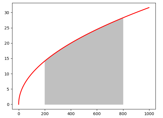
填充图标底层区域
绘制一个填充多边形的基本方式是使用 matplotlib.pyplot.fill()
matplotlib.pyplot.fill_between() 填充 y 轴的值之间的区域
matplotlib.pyplot.fill_betweenx() 填充 x 轴的值之间的区域
import matplotlib.pyplot as plt
from math import sqrt

x = range(1000)
y = [sqrt(i) for i in x]
plt.plot(x, y, color='red', linewidth=2)
# fill_between()填充y轴之间的区域,区域由(x,y1)和(x,y2)确定,x和y1的长度必须相等,y2默认为0
plt.fill_between(x=x[400:800], y1=y[400:800], color='silver')
plt.show()
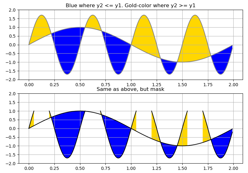
import matplotlib.pyplot as plt
import numpy as np

x = np.arange(0.0, 2.0, 0.01)
y1 = np.sin(np.pi*x)
y2 = 1.7*np.sin(4*np.pi*x)
fig = plt.figure()  # 返回 Figure 实例对象

axes1 = fig.add_subplot(211)  # 向图表中添加 一个 Axes;返回一个Axes实例对象
axes1.plot(x, y1, x, y2, color='grey')
axes1.fill_between(x, y1, y2, where=y2<=y1, facecolor='blue', interpolate=True)
axes1.fill_between(x, y1, y2, where=y2>=y1, facecolor='gold', interpolate=True)
axes1.set_title('Blue where y2 <= y1. Gold-color where y2 >= y1')
axes1.set_ylim(-2,2)
axes1.grid('on')

y2 = np.ma.masked_greater(y2, 1.0)  # 将大于1的值变为--
axes2 = fig.add_subplot(212, sharex=axes1)
axes2.plot(x, y1, x, y2, color='black')
axes2.fill_between(x, y1, y2, where=y2<=y1, facecolor='blue', interpolate=True)
axes2.fill_between(x, y1, y2, where=y2>=y1, facecolor='gold', interpolate=True)
axes2.set_title('Same as above, but mask')
axes2.set_ylim(-2, 2)
axes2.grid('on')
plt.show()
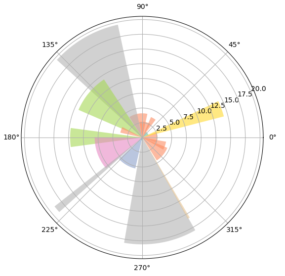
绘制极坐标
import matplotlib.pyplot as plt
import numpy as np
import matplotlib.cm as cm

figsize = 7
colormap = lambda r:cm.Set2(r/20.0)
N = 18
fig = plt.figure(figsize=(figsize, figsize))
ax = fig.add_axes([0.2, 0.2, 0.7, 0.7], polar=True)
theta = np.arange(0.0, 2*np.pi, 2*np.pi/N)
radii = 20*np.random.rand(N)
width = np.pi/4*np.random.rand(N)
bars = ax.bar(theta, radii, width=width, bottom=0.0)
for r, bar in zip(radii, bars):
    bar.set_facecolor(colormap(r))
    bar.set_alpha(0.6)
plt.show()
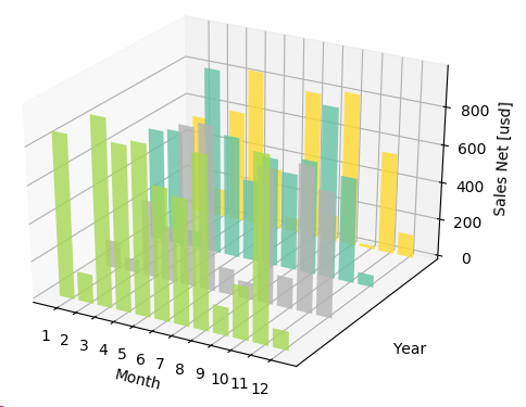
创建 3D 柱状图
import numpy as np
import matplotlib as mpl
import matplotlib.pyplot as pltfrom mpl_toolkits.mplot3d import Axes3D

mpl.rcParams['font.size'] = 10
fig = plt.figure()
ax = fig.add_subplot(111, projection='3d')  # 获取Axes3D实例对象
for z in [2011, 2012, 2013, 2014]:
    xs = range(1, 13)
    ys = 1000 * np.random.rand(12)
    color = plt.cm.Set2(np.random.choice(range(plt.cm.Set2.N)))
    ax.bar(left=xs, height=ys, zs=z, zdir='y', color=color, alpha=0.8)  # 绘制柱状图
ax.xaxis.set_major_locator(mpl.ticker.FixedLocator(xs))
ax.yaxis.set_major_locator(mpl.ticker.FixedLocator(ys))
ax.set_xlabel('Month')
ax.set_ylabel('Year')
ax.set_zlabel('Sales Net [usd]')
plt.show()
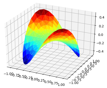
绘制 3D 曲面
import matplotlib.pyplot as plt
import numpy as np
from matplotlib import cm
from mpl_toolkits.mplot3d import Axes3D

n_angles = 36
n_radii = 8
radii = np.linspace(start=0.125, stop=1.0, num=n_radii)
angles = np.linspace(start=0, stop=2*np.pi, num=n_angles, endpoint=False)
angles = np.repeat(a=angles[..., np.newaxis], repeats=n_radii, axis=1)  # 重复array中的元素,axis=1表示在行方向上,axis=0表示在列方向上
x = np.append(arr=0, values=(radii*np.cos(angles)).flatten())
y = np.append(arr=0, values=(radii*np.sin(angles)).flatten())
z = np.sin(-x*y)
fig = plt.figure()
ax = fig.gca(projection='3d')
ax.plot_trisurf(x, y, z, cmap=cm.jet, linewidth=0.2, antialiased=True)  # 绘制三翼面图
plt.show()
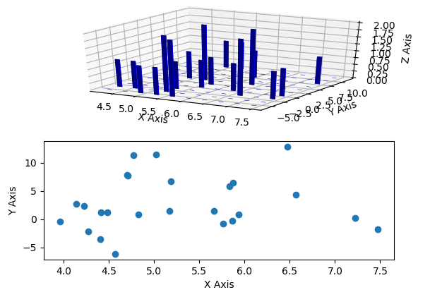
绘制 3D 直方图
import matplotlib.pyplot as plt
import numpy as np
import matplotlib as mpl
from mpl_toolkits.mplot3d import Axes3D

mpl.rcParams['font.size'] = 10
samples = 25
x = np.random.normal(loc=5, scale=1, size=samples)
y = np.random.normal(loc=3, scale=5, size=samples)
fig = plt.figure()
ax = fig.add_subplot(211, projection='3d')  # 获取Axes3D实例对象
hist, xedges, yedges = np.histogram2d(x=x, y=y, bins=10)  # 生成2d的直方图的数据
elements = (len(xedges)-1)*(len(yedges)-1)
xpos, ypos = np.meshgrid(xedges[:-1]+0.25, yedges[:-1]+0.25)
xpos = xpos.flatten()
ypos = ypos.flatten()
zpos = np.zeros(elements)
dx = 0.1*np.ones_like(zpos)
dy = dx.copy()
dz = hist.flatten()
ax.bar3d(x=xpos, y=ypos, z=zpos, dx=dx, dy=dy, dz=dz, color='b', alpha=0.4)  # 绘制直方图
ax.set_xlabel('X Axis')
ax.set_ylabel('Y Axis')
ax.set_zlabel('Z Axis')
ax2 = fig.add_subplot(212)
ax2.scatter(x, y)
ax2.set_xlabel('X Axis')
ax2.set_ylabel('Y Axis')
plt.show()
创建动画
matplotlib.animation.Animation 此类用matplotlib创建动画,仅仅是一个基类,应该被子类化以提供所需的行为
matplotlib.animation.TimedAnimation(Animation) 该动画子类支持基于时间的动画
matplotlib.animation.ArtistAnimation(TimedAnimation)
matplotlib.animation.FuncAnimation(TimedAnimation)
init()函数:通过参数 init_func 传入 matplotlib.animation.FuncAnimation 构造器中,在绘制下一帧前清空当前帧。
animate()函数:通过参数 func 传入 matplotlib.animation.FuncAnimation 构造器中,通过 fig 参数传入想要绘制动画的图形窗口,其内部实际上是将 fig 传入到 matplotlib.animatin.FuncAnimation 构造器中,把要绘制图形的窗口和动画时间关联起来。该函数从 frames 参数中获取参数。
matplotlib.animation.Animation.save()函数:通过绘制每一帧保存一个视频文件。
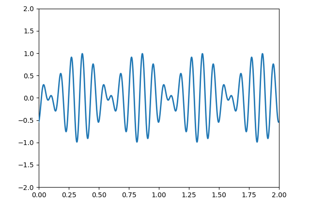
import matplotlib.pyplot as plt
import matplotlib.animation as animation
import numpy as np

fig = plt.figure()
ax = plt.axes(xlim=(0, 2), ylim=(-2, 2))
line, = ax.plot([], [], lw=2)  # 返回Line2D实例对象的列表

def init():
    line.set_data([], [])
    return line,

def animate(i):  # i 的值有frames参数决定
    x = np.linspace(start=0, stop=2, num=1000)
    y = np.sin(2*np.pi*(x-0.01*i))*np.cos(22*np.pi*(x-0.01*i))
    line.set_data(x, y)
    return line,
animator = animation.FuncAnimation(fig=fig, func=animate, init_func=init, frames=200, interval=20, blit=True)
animator.save(filename='basic_animation.html', fps=30, extra_args=['-vcodec', 'libx264'], writer='html')  # 保存动画
plt.show()
import matplotlib.pyplot as plt
import numpy as np
import matplotlib.animation as animation

fig = plt.figure()
ax = fig.add_subplot(111)
x = np.arange(0, 2*np.pi, 0.01)
line, = ax.plot(x, np.sin(x))

def animate(i):
    line.set_ydata(np.sin(x+i/10.0))
    return line,

def init():
    line.set_ydata(np.ma.array(x, mask=True))
    return line,

ani = animation.FuncAnimation(fig=fig, func=animate, frames=np.arange(1, 200), init_func=init, interval=25, blit=True)
plt.show()
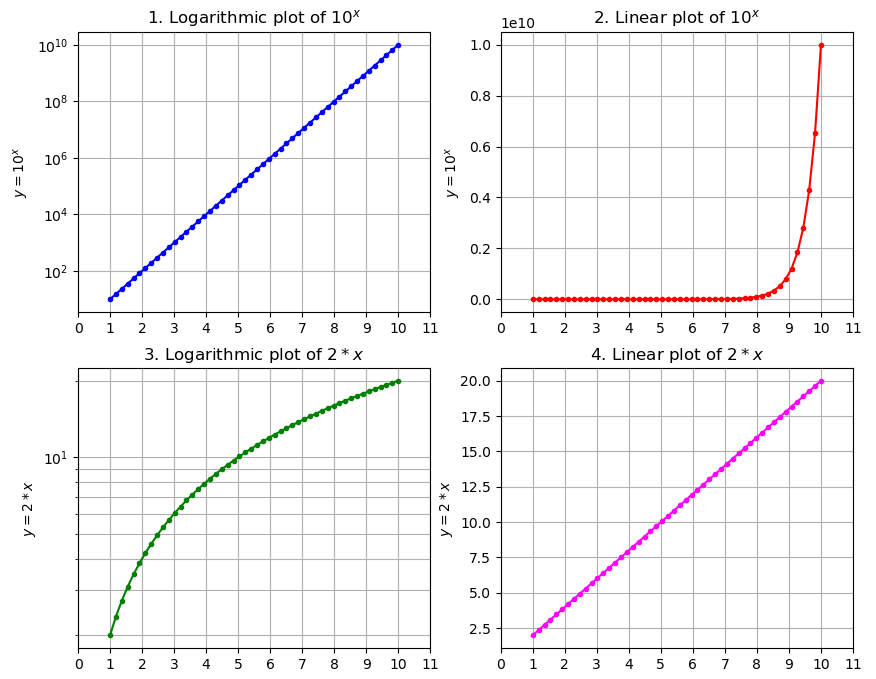
指数图
from matplotlib import pyplot as plt
import numpy as np

x = np.linspace(start=1, stop=10)
y = [10 ** el for el in x]
z = [2 * el for el in x]
fig = plt.figure(figsize=(10, 8))  # 返回一个Figure对象实例

ax1 = fig.add_subplot(2, 2, 1)  # 返回一个SubplotBase对象实例, 该类是Axes的子类
ax1.plot(x, y, marker='.', color='blue')  # Plot y versus x as lines and/or markers
ax1.set_yscale('log')  # Set the y-axis scale
ax1.set_title(r'1. Logarithmic plot of $ {10}^{x} $')  # Set a title for the axes.
ax1.set_xticks(np.linspace(start=0, stop=11, num=12, endpoint=True))  # Set the x ticks with list of ticks
ax1.set_ylabel(r'$ {y} = {10}^{x} $')  # Set the label for the y-axis
ax1.grid(b=True, which='both', axis='both')

ax2 = fig.add_subplot(2, 2, 2)
ax2.plot(x, y, marker='.', color='red')
ax2.set_yscale('linear')
ax2.set_title(r'2. Linear plot of $ {10}^{x} $')
ax2.set_xticks(np.linspace(start=0, stop=11, num=12, endpoint=True))
ax2.set_ylabel(r'$ {y} = {10}^{x} $')
ax2.grid(b=True, which='both', axis='both')
print(ax2.get_xticks())

ax3 = fig.add_subplot(2, 2, 3)
ax3.plot(x, z, marker='.', color='green')
ax3.set_yscale('log')
ax3.set_title(r'3. Logarithmic plot of $ {2}*{x} $')
ax3.set_xticks(np.linspace(start=0, stop=11, num=12, endpoint=True))
ax3.set_ylabel(r'$ {y} = {2}*{x} $')
ax3.grid(b=True, which='both', axis='both')

ax4 = fig.add_subplot(2, 2, 4)
ax4.plot(x, z, marker='.', color='magenta')
ax4.set_yscale('linear')
ax4.set_title(r'4. Linear plot of $ {2}*{x} $')
ax4.set_xticks(np.linspace(start=0, stop=11, num=12, endpoint=True))
ax4.set_ylabel(r'$ {y} = {2}*{x} $')
ax4.grid(b=True, which='both', axis='both')

plt.show()
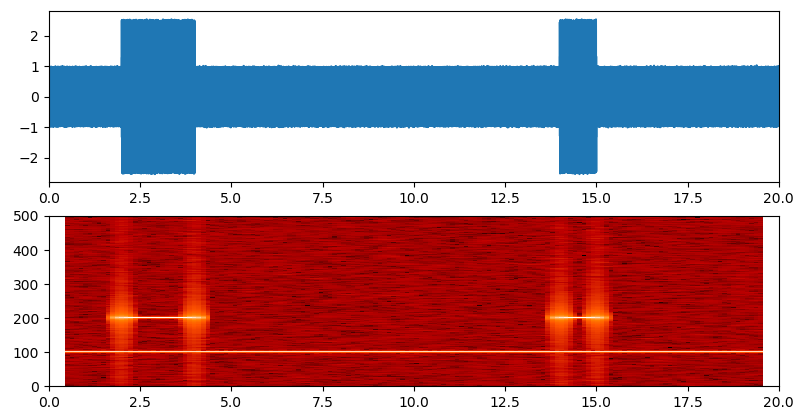
频谱图
频谱图是一个随时间变化的谱表现,它显示了信号的频谱强度随时间的变化。频谱图是把声音或者其他信号的频谱以可视化的方式呈现出来。
通常,频谱图的布局如下:x轴表示时间,y轴表示频率,第三个维度是频率-时间对的幅值,通过颜色表示。
import numpy as np
import matplotlib.pyplot as plt

def _get_mask(t, t1, t2, lvl_pos, lvl_neg):
    if t1 >= t2:
        raise ValueError("t1 must be less than t2")
    return np.where(np.logical_and(t>t1, t<t2), lvl_pos, lvl_neg)

def generate_signal(t):
    sin1 = np.sin(2*np.pi*100*t)
    sin2 = 2*np.sin(2*np.pi*200*t)
    masks = _get_mask(t, 2, 4, 1.0, 0.0) + _get_mask(t, 14, 15, 1.0, 0.0)
    sin2 = sin2*masks
    noise = 0.02*np.random.randn(len(t))
    final_signal = sin1 + sin2 + noise
    return final_signal

if __name__ == '__main__':
    step = 0.001
    sampling_freq = 1000
    t = np.arange(0.0, 20.0, step)
    y = generate_signal(t)
    fig = plt.figure()
    ax211 = fig.add_subplot(211)
    ax211.plot(t, y)
    ax211.set_xlim(left=0, right=20)  # 设置x轴的范围
    ax212 = fig.add_subplot(212)
    ax212.specgram(y, NFFT=1024, noverlap=900, Fs=sampling_freq, cmap=plt.cm.gist_heat)  # 绘制频谱图
    ax212.set_xlim(left=0, right=20)
    plt.show()
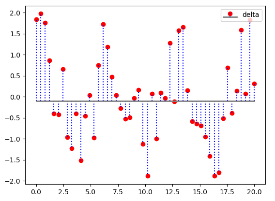
火柴杆图
一个二维的火柴杆图(stem plot)把数据显示为沿x轴的基线延伸的线条。圆圈(默认值)或者其他标记表示每个杆的结束,其y轴表示了数据值。
import matplotlib.pyplot as plt
import numpy as np

x = np.linspace(0, 20, 50)
y = np.sin(x+1)+np.cos(x**2)
bottom = -0.1
label = "delta"
markerline, stemlines, baseline, = plt.stem(x, y, bottom=bottom, label=label)  # 绘制火柴杆图,返回一个元组,包含markerline, stemlines, baseline
plt.setp(markerline, color='red', marker='o')  #   设置markerline的属性
plt.setp(stemlines, color='blue', linestyle=':')  # 设置stemlines的属性
plt.setp(baseline, color='grey', linewidth=2, linestyle='-')  # 设置baseline的属性
plt.legend(loc='upper right')
plt.show()
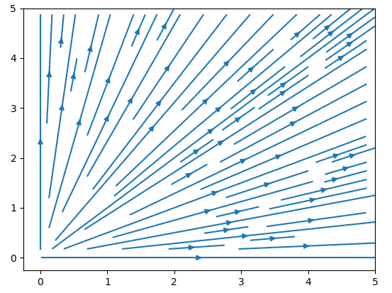
矢量场流线图
import matplotlib.pyplot as plt
import numpy as np

Y, X = np.mgrid[0:5:100j, 0:5:100j]
U = X
V = Y
plt.streamplot(X, Y, U, V)  # 绘制矢量场流线图
plt.show()
多颜色的散点图
import matplotlib.pyplot as plt
import numpy as np

red_yellow_green = ['#d73027', '#f46d43', '#fdae61',
                    '#fee08b', '#ffffbf', '#d9ef8b',
                    '#a6d96a', '#66bd63', '#1a9850']
sample_size = 300
fig = plt.figure(figsize=(8, 5))
ax = fig.gca()
for i in range(9):
    y = np.random.normal(size=sample_size).cumsum()
    x = np.arange(sample_size)
    ax.scatter(x, y, label=str(i), linewidth=0.1, edgecolors='grey', facecolor=red_yellow_green[i])
ax.legend(loc='upper right')
ax.set_xlim(left=-10, right=350)
plt.show()

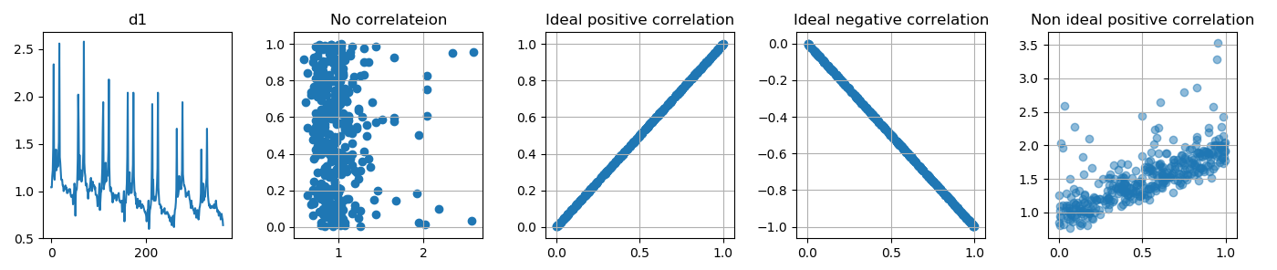
import matplotlib.pyplot as plt
import numpy as np

d = [ 1.04, 1.04, 1.16, 1.22, 1.46, 2.34, 1.16, 1.12, 1.24, 1.30, 1.44, 1.22, 1.26, 1.34, 1.26, 1.40, 1.52, 2.56, 1.36, 1.30, 1.20, 1.12, 1.12, 1.12, 1.06, 1.06,
 1.00, 1.02, 1.04, 1.02, 1.06, 1.02, 1.04, 0.98, 0.98, 0.98, 1.00, 1.02, 1.02, 1.00, 1.02, 0.96, 0.94, 0.94, 0.94, 0.96, 0.86, 0.92, 0.98, 1.08, 1.04, 0.74,
 0.98, 1.02, 1.02, 1.12, 1.34, 2.02, 1.68, 1.12, 1.38, 1.14, 1.16, 1.22, 1.10, 1.14, 1.16, 1.28, 1.44, 2.58, 1.30, 1.20, 1.16, 1.06, 1.06, 1.08, 1.00, 1.00,
 0.92, 1.00, 1.02, 1.00, 1.06, 1.10, 1.14, 1.08, 1.00, 1.04, 1.10, 1.06, 1.06, 1.06, 1.02, 1.04, 0.96, 0.96, 0.96, 0.92, 0.84, 0.88, 0.90, 1.00, 1.08, 0.80,
 0.90, 0.98, 1.00, 1.10, 1.24, 1.66, 1.94, 1.02, 1.06, 1.08, 1.10, 1.30, 1.10, 1.12, 1.20, 1.16, 1.26, 1.42, 2.18, 1.26, 1.06, 1.00, 1.04, 1.00, 0.98, 0.94,
 0.88, 0.98, 0.96, 0.92, 0.94, 0.96, 0.96, 0.94, 0.90, 0.92, 0.96, 0.96, 0.96, 0.98, 0.90, 0.90, 0.88, 0.88, 0.88, 0.90, 0.78, 0.84, 0.86, 0.92, 1.00, 0.68,
 0.82, 0.90, 0.88, 0.98, 1.08, 1.36, 2.04, 0.98, 0.96, 1.02, 1.20, 0.98, 1.00, 1.08, 0.98, 1.02, 1.14, 1.28, 2.04, 1.16, 1.04, 0.96, 0.98, 0.92, 0.86, 0.88,
 0.82, 0.92, 0.90, 0.86, 0.84, 0.86, 0.90, 0.84, 0.82, 0.82, 0.86, 0.86, 0.84, 0.84, 0.82, 0.80, 0.78, 0.78, 0.76, 0.74, 0.68, 0.74, 0.80, 0.80, 0.90, 0.60,
 0.72, 0.80, 0.82, 0.86, 0.94, 1.24, 1.92, 0.92, 1.12, 0.90, 0.90, 0.94, 0.90, 0.90, 0.94, 0.98, 1.08, 1.24, 2.04, 1.04, 0.94, 0.86, 0.86, 0.86, 0.82, 0.84,
 0.76, 0.80, 0.80, 0.80, 0.78, 0.80, 0.82, 0.76, 0.76, 0.76, 0.76, 0.78, 0.78, 0.76, 0.76, 0.72, 0.74, 0.70, 0.68, 0.72, 0.70, 0.64, 0.70, 0.72, 0.74, 0.64,
 0.62, 0.74, 0.80, 0.82, 0.88, 1.02, 1.66, 0.94, 0.94, 0.96, 1.00, 1.16, 1.02, 1.04, 1.06, 1.02, 1.10, 1.22, 1.94, 1.18, 1.12, 1.06, 1.06, 1.04, 1.02, 0.94,
 0.94, 0.98, 0.96, 0.96, 0.98, 1.00, 0.96, 0.92, 0.90, 0.86, 0.82, 0.90, 0.84, 0.84, 0.82, 0.80, 0.80, 0.76, 0.80, 0.82, 0.80, 0.72, 0.72, 0.76, 0.80, 0.76,
 0.70, 0.74, 0.82, 0.84, 0.88, 0.98, 1.44, 0.96, 0.88, 0.92, 1.08, 0.90, 0.92, 0.96, 0.94, 1.04, 1.08, 1.14, 1.66, 1.08, 0.96, 0.90, 0.86, 0.84, 0.86, 0.82,
 0.84, 0.82, 0.84, 0.84, 0.84, 0.84, 0.82, 0.86, 0.82, 0.82, 0.86, 0.90, 0.84, 0.82, 0.78, 0.80, 0.78, 0.74, 0.78, 0.76, 0.76, 0.70, 0.72, 0.76, 0.72, 0.70,
 0.64]
d1 = np.random.random(365)
assert len(d) == len(d1)
fig = plt.figure(figsize=(14, 3))

ax151 = fig.add_subplot(151)
ax151.plot(d)
ax151.set_title("d1")

ax152 = fig.add_subplot(152)
ax152.scatter(d, d1)
ax152.set_title('No correlateion')
ax152.grid(True)

ax153 = fig.add_subplot(153)
ax153.scatter(d1, d1, alpha=1)  # alpha控制透明度, 0是透明,1是不透明
ax153.set_title('Ideal positive correlation')
ax153.grid(True)

ax154 = fig.add_subplot(154)
ax154.scatter(d1, d1*-1, alpha=1)
ax154.set_title('Ideal negative correlation')
ax154.grid(True)

ax155 = fig.add_subplot(155)
ax155.scatter(d1, d1+d, alpha=0.5)
ax155.set_title('Non ideal positive correlation')
ax155.grid(True)

plt.tight_layout()
plt.show()
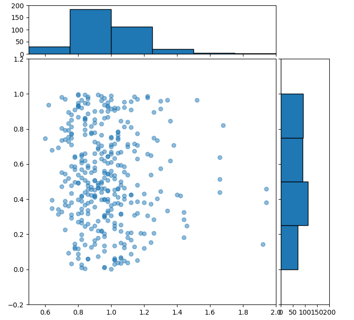
散点图和直方图
import numpy as np
import matplotlib.pyplot as plt
from mpl_toolkits.axes_grid1 import make_axes_locatable

def scatterhist(x, y, figsize=(8, 8)):
    _, scatter_axes = plt.subplots(figsize=figsize)  # Create a figure and a set of subplots. 返回一个Figure对象实例和Axes对象实例。
    scatter_axes.scatter(x, y, alpha=0.5)  # 绘制散点图
    scatter_axes.set_xlim(left=0.5, right=2)
    scatter_axes.set_ylim(bottom=-0.2, top=1.2)
#     scatter_axes.set_aspect(aspect='equal')  # 设置轴刻度的外观
    divider = make_axes_locatable(scatter_axes)  #
    axes_hist_x = divider.append_axes(position="top", sharex=scatter_axes, size=1, pad=0.1)  # create an axes at the given position with the same height (or width) of the main axes.
    axes_hist_y = divider.append_axes(position="right", sharey=scatter_axes, size=1, pad=0.1)  # 返回一个Axes对象实例
    binwidth = 0.25
    xymax = np.max([np.max(np.fabs(x)), np.max(np.fabs(y))])
    bincap = int(xymax/binwidth)*binwidth
    bins = np.arange(-bincap, bincap, binwidth)
    nx, binsx, _ = axes_hist_x.hist(x, bins=bins, edgecolor='black', histtype='bar', orientation='vertical')  # 绘制直方图,
    ny, binsy, _ = axes_hist_y.hist(y, bins=bins, edgecolor='black', histtype='bar', orientation='horizontal')
    tickstep = 50
    ticksmax = np.max([np.max(nx), np.max(ny)])
    xyticks = np.arange(0, ticksmax+tickstep, tickstep)
    for t1 in axes_hist_x.get_xticklabels():
        t1.set_visible(False)
    axes_hist_x.set_yticks(xyticks)
    for t1 in axes_hist_y.get_yticklabels():
        t1.set_visible(False)
    axes_hist_y.set_xticks(xyticks)
    plt.show()

if __name__ == '__main__':
    d = [ 1.04, 1.04, 1.16, 1.22, 1.46, 2.34, 1.16, 1.12, 1.24, 1.30, 1.44, 1.22, 1.26, 1.34, 1.26, 1.40, 1.52, 2.56, 1.36, 1.30, 1.20, 1.12, 1.12, 1.12, 1.06, 1.06,
1.00, 1.02, 1.04, 1.02, 1.06, 1.02, 1.04, 0.98, 0.98, 0.98, 1.00, 1.02, 1.02, 1.00, 1.02, 0.96, 0.94, 0.94, 0.94, 0.96, 0.86, 0.92, 0.98, 1.08, 1.04, 0.74,
0.98, 1.02, 1.02, 1.12, 1.34, 2.02, 1.68, 1.12, 1.38, 1.14, 1.16, 1.22, 1.10, 1.14, 1.16, 1.28, 1.44, 2.58, 1.30, 1.20, 1.16, 1.06, 1.06, 1.08, 1.00, 1.00,
0.92, 1.00, 1.02, 1.00, 1.06, 1.10, 1.14, 1.08, 1.00, 1.04, 1.10, 1.06, 1.06, 1.06, 1.02, 1.04, 0.96, 0.96, 0.96, 0.92, 0.84, 0.88, 0.90, 1.00, 1.08, 0.80,
0.90, 0.98, 1.00, 1.10, 1.24, 1.66, 1.94, 1.02, 1.06, 1.08, 1.10, 1.30, 1.10, 1.12, 1.20, 1.16, 1.26, 1.42, 2.18, 1.26, 1.06, 1.00, 1.04, 1.00, 0.98, 0.94,
0.88, 0.98, 0.96, 0.92, 0.94, 0.96, 0.96, 0.94, 0.90, 0.92, 0.96, 0.96, 0.96, 0.98, 0.90, 0.90, 0.88, 0.88, 0.88, 0.90, 0.78, 0.84, 0.86, 0.92, 1.00, 0.68,
0.82, 0.90, 0.88, 0.98, 1.08, 1.36, 2.04, 0.98, 0.96, 1.02, 1.20, 0.98, 1.00, 1.08, 0.98, 1.02, 1.14, 1.28, 2.04, 1.16, 1.04, 0.96, 0.98, 0.92, 0.86, 0.88,
0.82, 0.92, 0.90, 0.86, 0.84, 0.86, 0.90, 0.84, 0.82, 0.82, 0.86, 0.86, 0.84, 0.84, 0.82, 0.80, 0.78, 0.78, 0.76, 0.74, 0.68, 0.74, 0.80, 0.80, 0.90, 0.60,
0.72, 0.80, 0.82, 0.86, 0.94, 1.24, 1.92, 0.92, 1.12, 0.90, 0.90, 0.94, 0.90, 0.90, 0.94, 0.98, 1.08, 1.24, 2.04, 1.04, 0.94, 0.86, 0.86, 0.86, 0.82, 0.84,
0.76, 0.80, 0.80, 0.80, 0.78, 0.80, 0.82, 0.76, 0.76, 0.76, 0.76, 0.78, 0.78, 0.76, 0.76, 0.72, 0.74, 0.70, 0.68, 0.72, 0.70, 0.64, 0.70, 0.72, 0.74, 0.64,
0.62, 0.74, 0.80, 0.82, 0.88, 1.02, 1.66, 0.94, 0.94, 0.96, 1.00, 1.16, 1.02, 1.04, 1.06, 1.02, 1.10, 1.22, 1.94, 1.18, 1.12, 1.06, 1.06, 1.04, 1.02, 0.94,
0.94, 0.98, 0.96, 0.96, 0.98, 1.00, 0.96, 0.92, 0.90, 0.86, 0.82, 0.90, 0.84, 0.84, 0.82, 0.80, 0.80, 0.76, 0.80, 0.82, 0.80, 0.72, 0.72, 0.76, 0.80, 0.76,
0.70, 0.74, 0.82, 0.84, 0.88, 0.98, 1.44, 0.96, 0.88, 0.92, 1.08, 0.90, 0.92, 0.96, 0.94, 1.04, 1.08, 1.14, 1.66, 1.08, 0.96, 0.90, 0.86, 0.84, 0.86, 0.82,
0.84, 0.82, 0.84, 0.84, 0.84, 0.84, 0.82, 0.86, 0.82, 0.82, 0.86, 0.90, 0.84, 0.82, 0.78, 0.80, 0.78, 0.74, 0.78, 0.76, 0.76, 0.70, 0.72, 0.76, 0.72, 0.70,
0.64]
    d1 = np.random.random(365)
    assert len(d) == len(d1)
    scatterhist(d, d1)
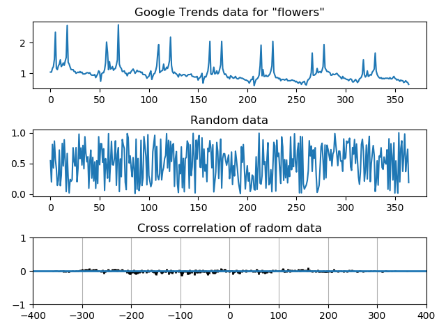
相关性图形
import matplotlib.pyplot as plt
import numpy as np

d = [ 1.04, 1.04, 1.16, 1.22, 1.46, 2.34, 1.16, 1.12, 1.24, 1.30, 1.44, 1.22, 1.26, 1.34, 1.26, 1.40, 1.52, 2.56, 1.36, 1.30, 1.20, 1.12, 1.12, 1.12, 1.06, 1.06,
1.00, 1.02, 1.04, 1.02, 1.06, 1.02, 1.04, 0.98, 0.98, 0.98, 1.00, 1.02, 1.02, 1.00, 1.02, 0.96, 0.94, 0.94, 0.94, 0.96, 0.86, 0.92, 0.98, 1.08, 1.04, 0.74,
0.98, 1.02, 1.02, 1.12, 1.34, 2.02, 1.68, 1.12, 1.38, 1.14, 1.16, 1.22, 1.10, 1.14, 1.16, 1.28, 1.44, 2.58, 1.30, 1.20, 1.16, 1.06, 1.06, 1.08, 1.00, 1.00,
0.92, 1.00, 1.02, 1.00, 1.06, 1.10, 1.14, 1.08, 1.00, 1.04, 1.10, 1.06, 1.06, 1.06, 1.02, 1.04, 0.96, 0.96, 0.96, 0.92, 0.84, 0.88, 0.90, 1.00, 1.08, 0.80,
0.90, 0.98, 1.00, 1.10, 1.24, 1.66, 1.94, 1.02, 1.06, 1.08, 1.10, 1.30, 1.10, 1.12, 1.20, 1.16, 1.26, 1.42, 2.18, 1.26, 1.06, 1.00, 1.04, 1.00, 0.98, 0.94,
0.88, 0.98, 0.96, 0.92, 0.94, 0.96, 0.96, 0.94, 0.90, 0.92, 0.96, 0.96, 0.96, 0.98, 0.90, 0.90, 0.88, 0.88, 0.88, 0.90, 0.78, 0.84, 0.86, 0.92, 1.00, 0.68,
0.82, 0.90, 0.88, 0.98, 1.08, 1.36, 2.04, 0.98, 0.96, 1.02, 1.20, 0.98, 1.00, 1.08, 0.98, 1.02, 1.14, 1.28, 2.04, 1.16, 1.04, 0.96, 0.98, 0.92, 0.86, 0.88,
0.82, 0.92, 0.90, 0.86, 0.84, 0.86, 0.90, 0.84, 0.82, 0.82, 0.86, 0.86, 0.84, 0.84, 0.82, 0.80, 0.78, 0.78, 0.76, 0.74, 0.68, 0.74, 0.80, 0.80, 0.90, 0.60,
0.72, 0.80, 0.82, 0.86, 0.94, 1.24, 1.92, 0.92, 1.12, 0.90, 0.90, 0.94, 0.90, 0.90, 0.94, 0.98, 1.08, 1.24, 2.04, 1.04, 0.94, 0.86, 0.86, 0.86, 0.82, 0.84,
0.76, 0.80, 0.80, 0.80, 0.78, 0.80, 0.82, 0.76, 0.76, 0.76, 0.76, 0.78, 0.78, 0.76, 0.76, 0.72, 0.74, 0.70, 0.68, 0.72, 0.70, 0.64, 0.70, 0.72, 0.74, 0.64,
0.62, 0.74, 0.80, 0.82, 0.88, 1.02, 1.66, 0.94, 0.94, 0.96, 1.00, 1.16, 1.02, 1.04, 1.06, 1.02, 1.10, 1.22, 1.94, 1.18, 1.12, 1.06, 1.06, 1.04, 1.02, 0.94,
0.94, 0.98, 0.96, 0.96, 0.98, 1.00, 0.96, 0.92, 0.90, 0.86, 0.82, 0.90, 0.84, 0.84, 0.82, 0.80, 0.80, 0.76, 0.80, 0.82, 0.80, 0.72, 0.72, 0.76, 0.80, 0.76,
0.70, 0.74, 0.82, 0.84, 0.88, 0.98, 1.44, 0.96, 0.88, 0.92, 1.08, 0.90, 0.92, 0.96, 0.94, 1.04, 1.08, 1.14, 1.66, 1.08, 0.96, 0.90, 0.86, 0.84, 0.86, 0.82,
0.84, 0.82, 0.84, 0.84, 0.84, 0.84, 0.82, 0.86, 0.82, 0.82, 0.86, 0.90, 0.84, 0.82, 0.78, 0.80, 0.78, 0.74, 0.78, 0.76, 0.76, 0.70, 0.72, 0.76, 0.72, 0.70,
0.64]

total = sum(d)  # python3 built-in function
av = total/len(d)
z = [i-av for i in d]
d1 = np.random.random(365)
assert len(d) == len(d1)
total1 = sum(d1)
av1 = total1/len(d1)
z1 = [i-av1 for i in d1]

fig = plt.figure()
ax1 = fig.add_subplot(311)
ax1.plot(d)
ax1.set_title('Google Trends data for "flowers"')

ax2 = fig.add_subplot(312)
ax2.plot(d1)
ax2.set_title('Random data')

ax3 = fig.add_subplot(313)
ax3.xcorr(z, z1, usevlines=True, maxlags=None, normed=True, lw=2)  # The cross correlation is performed with numpy.correlate() with mode = 2.
ax3.set_title('Cross correlation of radom data')
ax3.grid(True)
ax3.set_ylim(bottom=-1, top=1)
plt.tight_layout()
plt.show()
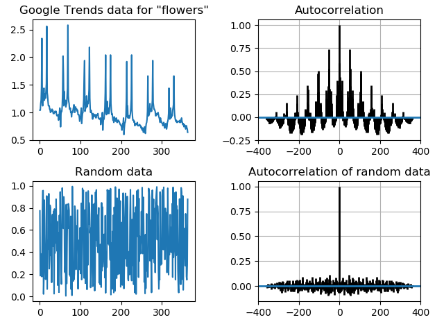
自相关图形
自相关表示在一个给定的时间序列或一个连续的时间间隔上其自身的延迟版本之间的相似度。它发生在一个时间序列研究中,指在一个给定的时间周期内的错误在未来的时间周期上继续存在。
import matplotlib.pyplot as plt
import numpy as np

d = [ 1.04, 1.04, 1.16, 1.22, 1.46, 2.34, 1.16, 1.12, 1.24, 1.30, 1.44, 1.22, 1.26, 1.34, 1.26, 1.40, 1.52, 2.56, 1.36, 1.30, 1.20, 1.12, 1.12, 1.12, 1.06, 1.06,
1.00, 1.02, 1.04, 1.02, 1.06, 1.02, 1.04, 0.98, 0.98, 0.98, 1.00, 1.02, 1.02, 1.00, 1.02, 0.96, 0.94, 0.94, 0.94, 0.96, 0.86, 0.92, 0.98, 1.08, 1.04, 0.74,
0.98, 1.02, 1.02, 1.12, 1.34, 2.02, 1.68, 1.12, 1.38, 1.14, 1.16, 1.22, 1.10, 1.14, 1.16, 1.28, 1.44, 2.58, 1.30, 1.20, 1.16, 1.06, 1.06, 1.08, 1.00, 1.00,
0.92, 1.00, 1.02, 1.00, 1.06, 1.10, 1.14, 1.08, 1.00, 1.04, 1.10, 1.06, 1.06, 1.06, 1.02, 1.04, 0.96, 0.96, 0.96, 0.92, 0.84, 0.88, 0.90, 1.00, 1.08, 0.80,
0.90, 0.98, 1.00, 1.10, 1.24, 1.66, 1.94, 1.02, 1.06, 1.08, 1.10, 1.30, 1.10, 1.12, 1.20, 1.16, 1.26, 1.42, 2.18, 1.26, 1.06, 1.00, 1.04, 1.00, 0.98, 0.94,
0.88, 0.98, 0.96, 0.92, 0.94, 0.96, 0.96, 0.94, 0.90, 0.92, 0.96, 0.96, 0.96, 0.98, 0.90, 0.90, 0.88, 0.88, 0.88, 0.90, 0.78, 0.84, 0.86, 0.92, 1.00, 0.68,
0.82, 0.90, 0.88, 0.98, 1.08, 1.36, 2.04, 0.98, 0.96, 1.02, 1.20, 0.98, 1.00, 1.08, 0.98, 1.02, 1.14, 1.28, 2.04, 1.16, 1.04, 0.96, 0.98, 0.92, 0.86, 0.88,
0.82, 0.92, 0.90, 0.86, 0.84, 0.86, 0.90, 0.84, 0.82, 0.82, 0.86, 0.86, 0.84, 0.84, 0.82, 0.80, 0.78, 0.78, 0.76, 0.74, 0.68, 0.74, 0.80, 0.80, 0.90, 0.60,
0.72, 0.80, 0.82, 0.86, 0.94, 1.24, 1.92, 0.92, 1.12, 0.90, 0.90, 0.94, 0.90, 0.90, 0.94, 0.98, 1.08, 1.24, 2.04, 1.04, 0.94, 0.86, 0.86, 0.86, 0.82, 0.84,
0.76, 0.80, 0.80, 0.80, 0.78, 0.80, 0.82, 0.76, 0.76, 0.76, 0.76, 0.78, 0.78, 0.76, 0.76, 0.72, 0.74, 0.70, 0.68, 0.72, 0.70, 0.64, 0.70, 0.72, 0.74, 0.64,
0.62, 0.74, 0.80, 0.82, 0.88, 1.02, 1.66, 0.94, 0.94, 0.96, 1.00, 1.16, 1.02, 1.04, 1.06, 1.02, 1.10, 1.22, 1.94, 1.18, 1.12, 1.06, 1.06, 1.04, 1.02, 0.94,
0.94, 0.98, 0.96, 0.96, 0.98, 1.00, 0.96, 0.92, 0.90, 0.86, 0.82, 0.90, 0.84, 0.84, 0.82, 0.80, 0.80, 0.76, 0.80, 0.82, 0.80, 0.72, 0.72, 0.76, 0.80, 0.76,
0.70, 0.74, 0.82, 0.84, 0.88, 0.98, 1.44, 0.96, 0.88, 0.92, 1.08, 0.90, 0.92, 0.96, 0.94, 1.04, 1.08, 1.14, 1.66, 1.08, 0.96, 0.90, 0.86, 0.84, 0.86, 0.82,
0.84, 0.82, 0.84, 0.84, 0.84, 0.84, 0.82, 0.86, 0.82, 0.82, 0.86, 0.90, 0.84, 0.82, 0.78, 0.80, 0.78, 0.74, 0.78, 0.76, 0.76, 0.70, 0.72, 0.76, 0.72, 0.70,
0.64]

total = sum(d)
av = total/len(d)
z = [i-av for i in d]

fig = plt.figure()
ax1 = fig.add_subplot(221)
ax1.plot(d)
ax1.set_title('Google Trends data for "flowers"')

ax2 = fig.add_subplot(222)
ax2.acorr(z, usevlines=True, maxlags=None, normed=True, lw=2)  # Plot the autocorrelation of x.
ax2.grid(True)
ax2.set_title('Autocorrelation')

d1 = np.random.random(365)
assert len(d) == len(d1)

total = sum(d1)
av = total/len(d1)
z = [i-av for i in d1]

ax3 = fig.add_subplot(223)
ax3.plot(d1)
ax3.set_title('Random data')

ax4 = fig.add_subplot(224)
ax4.acorr(z, usevlines=True, maxlags=None, normed=True, lw=2)
ax4.set_title('Autocorrelation of random data')
ax4.grid(True)
plt.tight_layout()
plt.show()
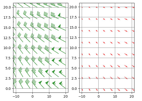
绘制风杆图(barbs)
风杆是风速和风向的一种表现形式,主要由气象学家使用。
import matplotlib.pyplot as plt
import numpy as np

x = np.linspace(-10, 20, 8)
y = np.linspace(0, 20, 8)
X, Y = np.meshgrid(x, y)
U, V = X+25, Y-35
fig = plt.figure()
ax1 = fig.add_subplot(121)
ax1.barbs(X, Y, U, V, flagcolor='green', alpha=0.75)  # Plot a 2-D field of barbs.
ax1.grid(True, color='gray')
ax2 = fig.add_subplot(122)
ax2.quiver(X, Y, U, V, facecolor='red', alpha=0.75)  # Plot a 2-D field of arrows.
ax2.grid(True, color='grey')
plt.show()
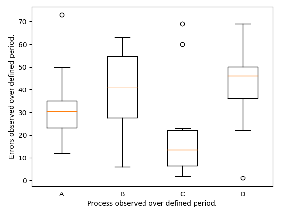
箱线图
import matplotlib.pyplot as plt

PROCESSES = {"A":[12, 15, 23, 24, 30, 31, 33, 36, 50, 73],
             "B":[6, 22, 26, 33, 35, 47, 54, 55, 62, 63],
             "C":[2, 3, 6, 8, 13, 14, 19, 23, 60, 69],
             "D":[1, 22, 36, 37, 45, 47, 48, 51, 52, 69]}

DATA = PROCESSES.values()
LABELS = PROCESSES.keys()

fig = plt.figure()
ax = fig.gca()
ax.boxplot(DATA, notch=False, widths=0.5)  # 绘制箱线图
ax.set_xticklabels(LABELS)
for spine in ax.spines.values():  # 获取四个边框
    spine.set_visible(True)
ax.xaxis.set_ticks_position('none')  # 设置x轴的刻度位置
ax.yaxis.set_ticks_position('left')  # 设置y轴的刻度位置
ax.set_ylabel("Errors observed over defined period.")
ax.set_xlabel("Process observed over defined period.")
plt.show()
import matplotlib.pyplot as plt
from matplotlib.path import Path
import matplotlib.patches as patches

fig = plt.figure()
ax = fig.add_subplot(111)
coords = [(1.0, 0.0),
          (0.0, 1.0),
          (0.0, 2.0),
          (1.0, 3.0),
          (2.0, 3.0),
          (3.0, 2.0),
          (3.0, 1.0),
          (2.0, 0.0),
          (0.0, 0.0),]
line_cmds = [Path.MOVETO,
             Path.LINETO,
             Path.LINETO,
             Path.LINETO,
             Path.LINETO,
             Path.LINETO,
             Path.LINETO,
             Path.LINETO,
             Path.CLOSEPOLY,]
path = Path(coords, line_cmds)
patch = patches.PathPatch(path, lw=1, facecolor='#A1D99B', edgecolor='black')
ax.add_patch(patch)  # Add a Patch p to the list of axes patches
ax.text(x=1.1, y=1.4, s='Python', fontsize=24)
ax.set_xlim(-1, 4)
ax.set_ylim(-1, 4)
plt.show()


 浙公网安备 33010602011771号