

css 绘制 斜纹进度条
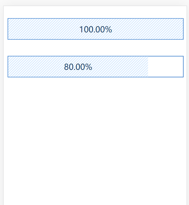
<!DOCTYPE html>
<html>
    <head>
        <meta charset="utf-8">
        <meta name="viewport" content="width=device-width,initial-scale=1,minimum-scale=1,maximum-scale=1,user-scalable=no" />
        <title></title>
        <style type="text/css">
            .progress-bar{
                border: 1px solid #1e6cc6;
                /* width: calc(100% - .7rem); */
                width: 100%;
                display: inline-block;
                height: 40px;
                line-height: 40px;
            }
            .showbar{
                display: inline-block;
                text-align: center;
                height: 100%;
                width:100%;
                background-color: #d5e9ff;
                background-image: linear-gradient(-45deg,#fff 25%,transparent 0,transparent 50%,#fff 0,#fff 75%,transparent 0,transparent);
                position: relative;
                background-size: 5px 5px;
                color: #083262;
            }
        </style>
    </head>
    <body>
        <p class="progress-bar">
            <span  class="showbar" style="display: inline-block; text-align: center; height: 100%; width: 100%;">
                <label style="width: 100%;">100.00%</label>
            </span>
        </p>
        <p class="progress-bar">
            <span  class="showbar" style="display: inline-block; text-align: center; height: 100%; width: 80%;">
                <label style="width: 100%;">80.00%</label>
            </span>
        </p>
    </body>
</html>
效果图如下:

 浙公网安备 33010602011771号