数据大屏解决适配方案
1.vw和vh
缺点:(1)需要计算100px=?vw(2)文字没有vw,vh所以无法自适应
1920px/100vh=1个vh相当于19.2px
100px/19.2px=5.2个vh
2.css3中transfrom和scale放大缩小(推荐)
-
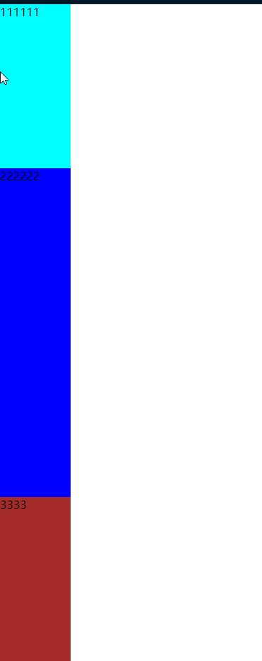
父容器display:flex;如果父容器有 3 个子元素,分别设置
flex: 1、flex: 2、flex: 1,则剩余空间会按 1:2:1 分配。 - 时间插件Moment.js
- background-size:100% 100%;
-
Flexbox 实现右对齐
.container {
display: flex; justify-content: flex-end; /* 子元素靠右 */ }
或者float:right
<!DOCTYPE html>
<html lang="en">
  <head>
    <meta charset="UTF-8" />
    <meta name="viewport" content="width=device-width, initial-scale=1.0" />
    <title>Document</title>
  </head>
  <body>
    <!-- 背景容器 -->
    <div class="container">
      <!-- 数据 -->
      <div class="box">
        <div class="top">我是一个老</div>
        <div class="bottom">花骨朵</div>
      </div>
    </div>
  </body>
  <style>
    * {
      margin: 0;
      padding: 0;
    }
    .container {
      height: 100vh;
      width: 100vw;
      background-image: radial-gradient(circle, #6c2ce3, #1f8165, #16227b);
    }
    .box {
      background-color: red;
      position: fixed;
      left: 50%;
      top: 50%;
      height: 1080px;
      width: 1920px;
      transform-origin: left top;
    }
    .top,
    .bottom {
      width: 100px;
      height: 100px;
      background-color: aqua;
      margin-left: 50px;
    }
    .bottom {
      background-color: rebeccapurple;
      margin-top: 50px;
    }
  </style>
  <script>
    let box = document.querySelector('.box')
    box.style.transform = `scale(${getSize()}) translate(-50%, -50%)`
    function getSize(w = 1080, h = 1920) {
      const ww = window.innerWidth / h
      const hh = window.innerHeight / w
      return ww > hh ? hh : ww
    }
    window.onresize = () => {
      box.style.transform = `scale(${getSize()}) translate(-50%, -50%)`
    }
  </script>
</html>
flex份数范例:flex:1
<!DOCTYPE html>
<html lang="en">
  <head>
    <meta charset="UTF-8" />
    <meta name="viewport" content="width=device-width, initial-scale=1.0" />
    <title>Document</title>
  </head>
  <body>
    <div class="box">
      <div class="one">111111</div>
      <div class="two">222222</div>
      <div class="three">3333</div>
    </div>
  </body>
  <style>
    * {
      margin: 0;
      padding: 0;
    }
    .box {
      height: 100vh;
      width: 100px;
      background-color: red;
      display: flex;
      flex-direction: column;
    }
    .one,
    .two,
    .three {
      background-color: aqua;
      flex: 1;
    }
    .two {
      background-color: blue;
      flex: 2;
    }
    .three {
      background-color: brown;
      flex: 1;
    }
  </style>
</html>

 浙公网安备 33010602011771号