
css3 转场动画实现
- 思路
转场动画一般由两个动画组成,入场动画和出场动画,并且这两个动画处理逻辑正好相反就行
- 关键语法
- 定义一个动画规则:
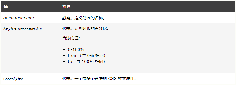
@keyframes animationname {keyframes-selector {css-styles;}}
- 定义一个动画规则:
-
-
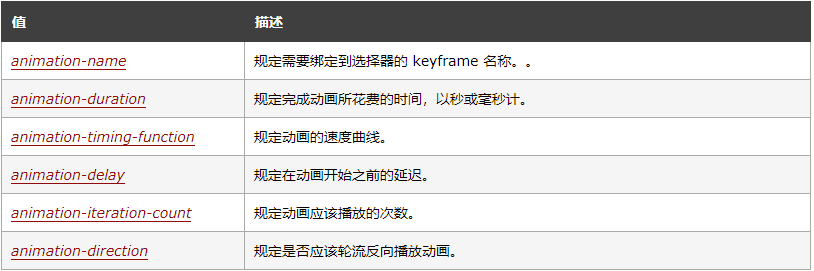
定义一个样式来调用动画
-
animation: namedurationtiming-functiondelayiteration-countdirection;
-
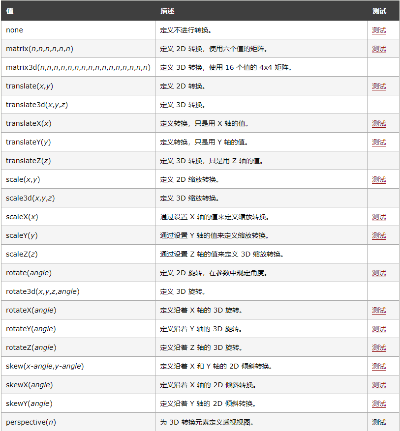
- transform 转换
transform: none|transform-functions;
- 例子
- 入场动画
.fullscreen-chart-open{
    animation: fullscreenOpen 1.5s  forwards;
    -moz-animation: fullscreenOpen 1.5s  forwards;
    /* Firefox */
    -webkit-animation: fullscreenOpen 1.5s  forwards;
    /* Safari and Chrome */
    -o-animation: fullscreenOpen 1.5s forwards;
}
@keyframes fullscreenOpen {
    0% {
        transform: rotateY(180deg) scale(0);
        opacity: 0;
    }
    100% {
        transform: rotateY(0deg) scale(1);
        opacity: 1;
    }
}
-
- 退出动画
.fullscreen-chart-close{
    animation: fullscreenclose 1.5s  forwards;
    -moz-animation: fullscreenclose 1.5s  forwards;
    /* Firefox */
    -webkit-animation: fullscreenclose 1.5s  forwards;
    /* Safari and Chrome */
    -o-animation: fullscreenclose 1.5s forwards;
}
@keyframes fullscreenclose {
    0% {
        transform: rotateY(0deg) scale(1);
        opacity: 1;
    }
    100% {
        transform: rotateY(180deg) scale(0);
        opacity: 0;
    }
}

 浙公网安备 33010602011771号