为何不用Echarts
- 相比Echarts及F2的复杂的设置,本插件几乎等于傻瓜式的配置。
- Echarts在跨端使用更复杂,本插件只需要简单的两个
<canvas>标签轻松区别搞定,代码整洁易维护。 - Echarts在IOS端图表显示错位,只能引用网页解决。
- 本插件打包后的体积相比Echarts小很多很多,所以性能更好。
- 如果您是uni-app初学者,那么强烈建议您使用uCharts,并且目前可以跨全端通用,减少工作量,增强一致性体验。
- 图表样式均可自定义,懂js的都可以读懂插件源码,直接修改u-charts.js源码即可。
- 本插件经过大量测试,反复论证并加以改造而成,请各位放心使用。
扫码体验:

以下代码参考官方示例:/pages/basic/line/curve.vue,下载地址:https://ext.dcloud.net.cn/plugin?id=271
以曲线图为例介绍使用步骤:
1、将u-charts.js拷贝到components目录下
2、引入组件
import uCharts from '@/components/u-charts/u-charts.js';
3、模板写法:
<view class="qiun-charts" >
            <!--#ifdef MP-ALIPAY -->
            <canvas canvas-id="canvasLineA" id="canvasLineA" class="charts" :width="cWidth*pixelRatio" :height="cHeight*pixelRatio"
          :style="{'width':cWidth+'px','height':cHeight+'px'}" @touchstart="touchLineA"></canvas>
            <!--#endif-->
            <!--#ifndef MP-ALIPAY -->
            <canvas canvas-id="canvasLineA" id="canvasLineA" class="charts" @touchstart="touchLineA"></canvas>
            <!--#endif-->
        </view>
如果是支付宝小程序用上面那种,即
<view class="qiun-charts" >
            <!--#ifdef MP-ALIPAY -->
            <canvas canvas-id="canvasLineA" id="canvasLineA" class="charts" :width="cWidth*pixelRatio" :height="cHeight*pixelRatio"
          :style="{'width':cWidth+'px','height':cHeight+'px'}" @touchstart="touchLineA"></canvas>
            <!--#endif-->
        </view>
支付宝以外用下面那种,即
<view class="qiun-charts" >
            <!--#ifndef MP-ALIPAY -->
            <canvas canvas-id="canvasLineA" id="canvasLineA" class="charts" @touchstart="touchLineA"></canvas>
            <!--#endif-->
        </view>
4、样式写法
.qiun-charts{
        width: 750upx;
        height:500upx;
        background-color: #FFFFFF;
        }
    .charts{
        width: 750upx;
        height:500upx;
        background-color: #FFFFFF;
        }
5、实例化方法
showLineA(canvasId,chartData){
                canvaLineA=new uCharts({
                    $this:_self,
                    canvasId: canvasId,
                    type: 'line',
                    fontSize:11,
                    padding:[15,20,0,15],
                    legend:{
                        show:true,
                        padding:5,
                        lineHeight:11, // 控制标题的行高
                        margin:0, // 控制标题的margin
                    },
                    dataLabel:true,
                    dataPointShape:true,
                    background:'#FFFFFF',
                    pixelRatio:_self.pixelRatio,
                    categories: chartData.categories,
                    series: chartData.series,
                    animation: true,
                    xAxis: {
                        type:'grid',
                        gridColor:'#CCCCCC',
                        gridType:'dash',
                        dashLength:8,
            boundaryGap:'justify'
                    },
                    yAxis: {
                        gridType:'dash',
                        gridColor:'#CCCCCC',
                        dashLength:8,
                        splitNumber:5,
                        format:(val)=>{return val.toFixed(0)+'元'}
                    },
                    width: _self.cWidth*_self.pixelRatio,
                    height: _self.cHeight*_self.pixelRatio,
                    extra: {
                        line:{
                            type: 'curve'
                        }
                    }
                });
                //下面是默认选中索引
                let cindex=3;
                //下面是自定义文案
                let textList=[{text:'我是一个标题',color:null},{text:'自定义1:值1',color:'#2fc25b'},{text:'自定义2:值2',color:'#facc14'},
                  {text:'自定义3:值3',color:'#f04864'}];
                //下面是event的模拟,tooltip的Y坐标值通过这个mp.changedTouches[0].y控制
                let tmpevent={mp:{changedTouches:[{x: 0, y: 80}]}};
                setTimeout(()=>{
                    canvaLineA.showToolTip( tmpevent , {
                        index:cindex,
                        textList:textList
                    });
                },200)
            },
            touchLineA(e) {
                canvaLineA.touchLegend(e);
                canvaLineA.showToolTip(e, {
                    format: function (item, category) {
                        return category + ' ' + item.name + ':' + item.data
                    }
                });
            },
数据模型中拷贝以下参数
data() {
            return {
                cWidth:'',
                cHeight:'',
                pixelRatio:1,
                textarea:''
            }
        },
6、在实际项目中,我们是从后台获取数据存入chartData中,并调用实例化方法。这里我们先在数据模型中给出chartData的默认值,并在onLoad中调用实例化方法
onLoad(options) {
            this.showLineA("canvasLineA",this.chartData)
        },
chartData数据示例:
{
    "categories":["2012","2013","2014","2015","2016","2017"],
    "series":[
        {"name":"成交量A","data":[35,8,25,37,4,20]}
    ]
}
7、在onLoad生命周期函数中初始化cWidth和cHeight,来控制图标的宽和高
this.cWidth=uni.upx2px(750);
            this.cHeight=uni.upx2px(500);
8、定义canvaLineA
var canvaLineA=null;
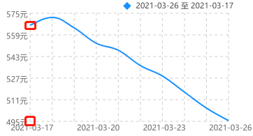
效果如下图所示

完整代码如下:
<template>
    <view class="container">
        <view class="qiun-charts" >
            <!--#ifndef MP-ALIPAY -->
            <canvas canvas-id="canvasLineA" id="canvasLineA" class="charts" @touchstart="touchLineA"></canvas>
            <!--#endif-->
        </view>
    </view>
</template>

<script>
    import uCharts from '@/components/u-charts/u-charts.js';
  var canvaLineA=null;
    export default {
        data(){
            return {
                cWidth:'',
                cHeight:'',
                pixelRatio:1,
                textarea:'',
                chartData:{
                    "categories":["2012","2013","2014","2015","2016","2017"],
                    "series":[
                        {"name":"成交量A","data":[35,8,25,37,4,20]}
                    ]
                }
            }
        },
        onLoad(options) {
            console.log(options)this.cWidth = uni.upx2px(720);
            this.cHeight = uni.upx2px(420);
            this.showLineA("canvasLineA",this.chartData)
        },
        methods:{
            showLineA(canvasId,chartData){
                canvaLineA=new uCharts({
                    $this:this,
                    canvasId: canvasId,
                    type: 'line',
                    fontSize:11,
                    padding:[15,20,0,15],
                    legend:{
                        show:true,
                        padding:5,
                        lineHeight:11,
                        margin:0,
                    },
                    dataLabel:true,
                    dataPointShape:true,
                    background:'#FFFFFF',
                    pixelRatio:this.pixelRatio,
                    categories: chartData.categories,
                    series: chartData.series,
                    animation: true,
                    xAxis: {
                        type:'grid',
                        gridColor:'#CCCCCC',
                        gridType:'dash',
                        dashLength:8,
            boundaryGap:'justify'
                    },
                    yAxis: {
                        gridType:'dash',
                        gridColor:'#CCCCCC',
                        dashLength:8,
                        splitNumber:5,
                        format:(val)=>{return val.toFixed(0)+'元'}
                    },
                    width: this.cWidth*this.pixelRatio,
                    height: this.cHeight*this.pixelRatio,
                    extra: {
                        line:{
                            type: 'curve'
                        }
                    }
                });
                //下面是默认选中索引
                let cindex=3;
                //下面是自定义文案
                let textList=[{text:'我是一个标题',color:null},{text:'自定义1:值1',color:'#2fc25b'},{text:'自定义2:值2',color:'#facc14'},
                  {text:'自定义3:值3',color:'#f04864'}];
                //下面是event的模拟,tooltip的Y坐标值通过这个mp.changedTouches[0].y控制
                let tmpevent={mp:{changedTouches:[{x: 0, y: 80}]}};
                setTimeout(()=>{
                    canvaLineA.showToolTip( tmpevent , {
                        index:cindex,
                        textList:textList
                    });
                },200)
            },
            touchLineA(e) {
                canvaLineA.touchLegend(e);
                canvaLineA.showToolTip(e, {
                    format: function (item, category) {
                        return category + ' ' + item.name + ':' + item.data
                    }
                });
            },
        }
    }
</script>

<style lang="scss" scoped>
    .qiun-charts{
        width: 750upx;
        height:500upx;
        background-color: #FFFFFF;
        }
    .charts{
        width: 750upx;
        height:500upx;
        background-color: #FFFFFF;
        }
</style>
touchLegend(e) 图例点击交互事件
showToolTip(e) 图表中展示数据详细内容
legend中的两个属性position和float来修改标题的位置:
legend:{
                        show:true,
                        padding:5,
                        lineHeight:11,
                        margin:0,
                        position: 'top',
                        float: 'right'
                    },
dataLabel属性用来修改曲线上是否显示数组,值为true表示显示数据,值为false表示隐藏数据
dataPointShape属性用来控制曲线上是否显示点。值为true表示显示点,值为false表示隐藏点
xAxis.labelCount:默认series.data.length,X轴可见区域标签数量(即X轴数刻度标签单屏幕限制显示的数量)
boundaryGap:折线图、区域图起画点结束点方法:center为单元格中间起画,justify为0点起画即两端对齐
当值为justify时是这样的:
当值为justify时是这样的:

toFixed() 方法可把 Number 四舍五入为指定小数位数的数字。toFixed(0)表示小数位数为0.

 浙公网安备 33010602011771号