
CSS3
1、什么是CSS
如何学习
- CSS是什么
- CSS怎么用
- CSS选择器(重点+难点)
- 美化网页(文字,阴影,超链接,列表,渐变.....)
- 盒子模型
- 浮动
- 定位
- 网页动画(特效)
1.1、什么是CSS
Cascading Style Sheet层叠级联样式表
CSS:表现(美化网页)
字体、颜色、边距、高度、宽度、背景图片、网页定位、网页浮动....
1.2、发展史
CSS1.0
CSS2.0 DIV+CSS,HTML与CSS结构分离的思想,网页变得简单,SEO
CSS2.1 浮动,定位
CSS3.0 圆角,阴影,动画.... 浏览器兼容性
1.3、快速入门
style
基本入门
<!DOCTYPE html>
<html lang="en">
<head>
    <meta charset="UTF-8">
    <title>Title</title>

<!--规范,<style>可以编写css的代码,每一个声明最好使用分号结尾
语法:
    选择器{
        声明1;
        声明2;
        声明3;
    }
-->

    <style>
        h1{
            color: red;
        }
    </style>


</head>
<body>


<h1>我是标题</h1>

</body>
</html>
建议使用这种规范
CSS的优势:
1、内容和表现分离
2、网页结构表现统一,可以实现复用
3、样式十分的丰富
4、建议使用独立于html的css文件
5、利用SEO,容易被搜索引擎收录!
1.4、CSS的3种导入方式
<!DOCTYPE html>
<html lang="en">
<head>
    <meta charset="UTF-8">
    <title>Title</title>

    <!-- 内部样式-->
    <style>
        h1{
            color: green;
        }
    </style>

    <!--外部样式-->
    <link rel="stylesheet" href="css/style.css">

</head>
<body>

<!--优先级:就近原则-->

<!--行内样式,在标签元素中,编写一个style属性,编写样式即可-->
<h1 style="color:red;">我是标题 </h1>

</body>
</html>
拓展:外部样式两种写法
- 链接式
    <!--外部样式-->
    <link rel="stylesheet" href="css/style.css">
- 导入式
 <!--导入式-->
<style>
    @import url("css/style.css");
  </style>
2、选择器
作用:选择页面上的某一个或者某一类元素
2.1、基本选择器
1、标签选择器 :选择一类标签
<html lang="en">
<head>
    <meta charset="UTF-8">
    <title>Title</title>

  <style>
      /*标签选择器,会选择到页面上所有的这个标签的元素*/
      h1{
        color: beige;
        background: aquamarine;
        border-radius: 24px;
      }
      p{
        font-size: 80px;
      }
  </style>


</head>
<body>

<h1>学java</h1>
<h1>学java</h1>
<p>听狂神说</p>

</body>
</html>
2、类选择器 class : 选择所有class属性一致的标签,跨标签 .类名{}
<html lang="en">
<head>
    <meta charset="UTF-8">
    <title>Title</title>

  <style>
    /*类选择器的格式  .class的名称{}
    好处,可以多个标签归类,是同一个class,可以复用
    */
    .shaobai{
        color: #dc1231;
    }
    .shaoqin{
        color: #a818e7;
    }


  </style>

</head>
<body>

<h1 class="shaobai">标题1</h1>
<h1 class="shaoqin">标题2</h1>
<h1 class="shaobai">标题3</h1>


</body>
</html>
3、Id选择器
<html lang="en">
<head>
    <meta charset="UTF-8">
    <title>Title</title>

  <style>
      /*id选择器  : id必须保证全局唯一!
         #id名称{}
         优先级:
         不遵循就近原则,固定的
         id 选择器> class 选择器 >标签选择器
      */
      #shaobai{
        color: #29efd1;
      }
      .style1{
        color: #dc1231;
      }
      h1{
          color: blue;
      }

  </style>
</head>
<body>

<h1 class="style1" id="shaobai">标题1</h1>
<h1 class="style1">标题2</h1>
<h1 class="style1">标题3</h1>
<h1>标题4</h1>
<h1>标题5</h1>

</body>
</html>
优先级 : id > class >标签
2.2、层次选择器
1、后代选择器:在某个元素的后面 祖爷爷 爷爷 爸爸 你
/*后代选择器*/
body p{
    background: red;
}
2、子选择器,一代 ,儿子
/*子选择器*/
body>p{
    background: #29efd1;
}
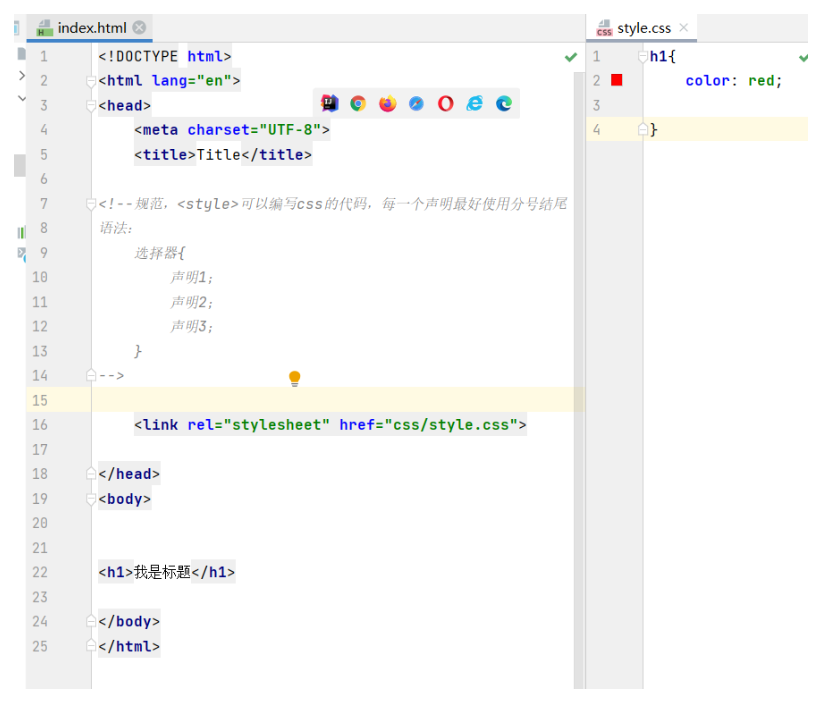
3、相邻兄弟选择器 同辈
 /*相邻兄弟选择器:只有一个,相邻(向下)*/
    .active +p{
        background: #d24949;
    }


<body>

    <p>p0</p>
    <p class="active">p1</p>
    <p>p2</p>
    <p>p3</p>
    <ul>
      <li>
        <p>p4</p>
      </li>
      <li>
        <p>p5</p>
      </li>
      <li>
        <p>p6</p>
      </li>
    </ul>

</body>
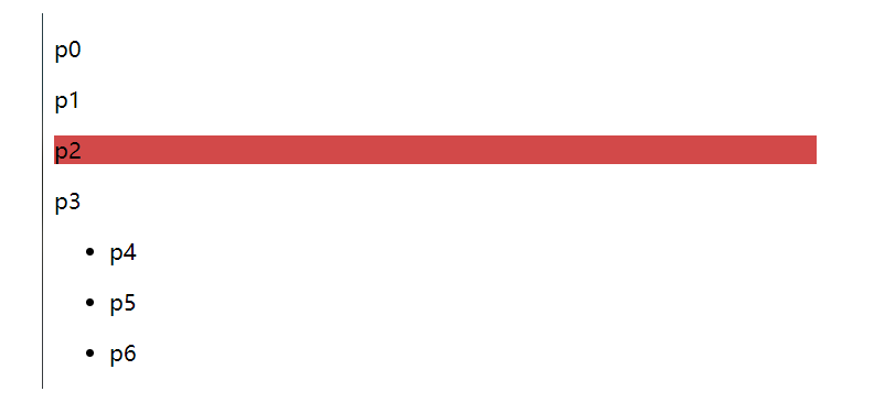
4、通用选择器
/*通用兄弟选择器,当前选中元素的向下的所有兄弟元素*/
.active~p{
    background: #5ee389;
}
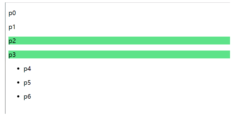
2.3、结构伪类选择器
伪类:条件
<html lang="en">
<head>
    <meta charset="UTF-8">
    <title>Title</title>

<!--  避免使用,class,id选择器-->
  <style>
     /*ul的第一个子元素*/
     ul li:first-child{
       background: #dc1231;
     }
     /*ul的最后一子元素*/
     ul li:last-child{
       background: #a818e7;
     }

     /*选中p1 :定位到父元素,选择当前的第一个元素
     选择当前p元素的父级元素,选中父级元素的第一个,并且是当前元素才生效!*/

     p:nth-child(1){
       background: #d24949;
     }
    /*选中父元素下的p元素的第二个类型*/
     p:nth-of-type(2){
       background: yellow;
     }
  </style>


</head>
<body>
<!--    <h1>h1</h1>-->
    <p>p1</p>
    <p>p2</p>
    <p>p3</p>
    <ul>
        <li>li1</li>
        <li>li2</li>
        <li>li3</li>

    </ul>


</body>
</html>
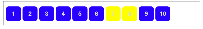
2.4、属性选择器(常用)
id+class结合
<html lang="en">
<head>
    <meta charset="UTF-8">
    <title>Title</title>

  <style>
    .demo a{
        float: left;
      display: block;
      height: 50px;
      width: 50px;
      border-radius: 10px;
      background: #2700ff;
      text-align: center;
      color: gainsboro;
      text-decoration: none;
      margin-right: 5px;
      font:bold 20px/50px Arial;
    }
    /*属性名, 属性名= 属性值(正则)
    = 绝对等于
    *= 包含这个元素
    ^= 以这个开头
    $= 以这个结尾
    */
    /*!*存在id属性的元素  a[]{}*!*/
    /*a[id]{*/
    /*  background: yellow;*/
    /*}*/
    /*id=first的元素*/
    /*a[id=first]{*/
    /*  background: #5ee389;*/
    /*}*/

  /*  class中有links的元素*/
  /*  a[class*="links"]{*/
  /*    background: yellow;*/
  /*  }*/

  /*  选中href中以http开头的元素*/
  /*  a[href^=http]{*/
  /*    background: yellow;*/
  /*  }*/

    a[href$=pdf]{
      background: yellow;
    }

  </style>
</head>
<body>


<p class="demo">
       <a href="https://www.baidu.com" class="links item first" id="first">1</a>
       <a href="https://" class="links item active" target="_blank" title="test">2</a>
       <a href="images/123.html" class="links item ">3</a>
       <a href="images/123.png" class="links item ">4</a>
       <a href="images/123.jpg" class="links item ">5</a>
       <a href="abc"class="links item" >6</a>
       <a href="/a.pdf" class="links item ">7</a>
       <a href="/abc.pdf" class="links item ">8</a>
       <a href="abc.doc" class="links item ">9</a>
       <a href="abcd.doc" class="links item last">10</a>

</p>

</body>
</html>
 	= 绝对等于
    *= 包含这个元素
    ^= 以这个开头
    $= 以这个结尾
3、美化网页元素
3.1、为什么要美化网页
1、有效的传递页面信息
2、美化网页,页面漂亮,才能吸引用户
3、凸显页面的主题
4、提高用户的体验
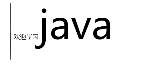
span标签:重点要突出的字,使用span套起来
<html lang="en">
<head>
    <meta charset="UTF-8">
    <title>Title</title>

  <style>
      #title1{
        font-size: 100px;
      }

  </style>

</head>
<body>


欢迎学习<span id ="title1">java</span>

</body>
</html>
3.2字体样式
<!--
font-family :字体
font-size  :  字体大小
font-weight : 字体粗细
color  :字体颜色
-->
  <style>
       body{
         font-family: 楷体;
         color: #a13d30;
       }
       h1{
         font-size: 50px;
       }
       .p1{
         font-weight: bold;
       }
  </style>
3.3、文本样式
1、颜色 color rgb rgba
2、文本对齐的方式 text-align=center
3、首行缩进 text-indent:2em;
4、行高 line-height: 单行文字上下居中
5、装饰 text-decoration:
6、文本图片水平对齐:vertical-align: middle
<html lang="en">
<head>
    <meta charset="UTF-8">
    <title>Title</title>

<!--  颜色:
         单词
         RGB  0~F
         RGBA   A:0~1
   text-align :排版,居中
   text-indent: 2em; 段落首行缩进
   height: 300px;
   line-height: 30px;
   行高,和块的高度一致,就可以上下居中
   -->
  <style>
    h1{
      color:rgba(0,255,255,0.9);
      text-align: center;
    }
    .p1{
        text-indent: 2em;
    }
    .p3{
        background: #2700ff;
        height: 300px;
        line-height: 30px;
    }
    /*下划线*/
    .l1{
      text-decoration: underline;
    }
    /*中华线*/
    .l2{
      text-decoration: line-through;
    }
    /*上划线*/
    .l3{
      text-decoration: overline;
    }
    /*超链接去下划线*/
    a {
      text-decoration: none;
    }

    /*<!--*/
    /*水平对齐~参照物 a,b*/
    /*-->*/

     img,span{
       vertical-align: middle;


     }
  </style>


</head>
<body>

<a href="">123</a>

<p class="l1">121212</p>
<p class="l2">121212</p>
<p class="l3">121212</p>


<h1>故事简介</h1>
<p class="p1">
  这个世界名为元泱境界,脉(本质为振动)是构成万物的基础。每隔333年,会有一个神秘而强大的异常生物重生,它就是魁拔!魁拔的每一次出现,都会给元泱境界带来巨大的灾难!即便是天界的神族,也在劫难逃。在天地两界各种力量的全力打击下,魁拔一次次被消灭,但又总是按333年的周期重新出现。魁拔纪元1664年,天神经过精确测算后,在魁拔苏醒前一刻对其进行毁灭性打击。但谁都没有想到,由于一个差错导致新一代魁拔成功地逃脱了致命一击。很快,天界魁拔司和地界神圣联盟均探测到了魁拔依然生还的迹象。因此,找到魁拔,彻底消灭魁拔,再一次成了各地热血勇士的终极目标。
</p>

<p>
  在偏远的兽国窝窝乡,蛮大人和蛮吉每天为取得象征成功和光荣的妖侠纹耀而刻苦修炼,却把他们生活的村庄搅得鸡犬不宁。村民们绞尽脑汁把他们赶走。一天,消灭魁拔的征兵令突然传到窝窝乡,村长趁机怂恿蛮大人和蛮吉从军参战。然而,在这个一切都凭纹耀说话的世界,仅凭蛮大人现有的一块冒牌纹耀,不要说参军,就连住店的资格都没有。受尽歧视的蛮吉和蛮大人决定,混上那艘即将启程去消灭魁拔的巨型战舰,直接挑战魁拔,用热血换取至高的荣誉。
</p>

<p class="p3">  When I wake up in the morning,
    You are all I see;
    When I think about you,
    And how happy you make me。
    You're everything I wanted;
    You're everything I need;
    I look at you and know;
    That you are all to me。
    Barry Fitzpatrick
</p>


<p>
  <img src="images/img.png" alt="">
  <span>孔子好帅</span>
</p>


</body>
</html>
3.4、阴影
/*text-shadow: 阴影颜色,水平偏移,垂直偏移,阴影半径*/
#price{
    text-shadow: #3cc7f5 10px 10px 10px;
}
3.5、超链接伪类
正常情况下,a, a:hover
  /*默认的颜色*/
a{
  text-decoration: none;
    color: #000000;
}
 /*鼠标悬浮的状态*/
   a:hover{
       color: red;
       font-size : 50px;
   }
3.6、列表
/*ul li*/
/*
list-style :
none  去掉原点
circle  空心圆
decimal  数字
square 正方形
*/
/*ul{*/
/*    background: #a0a0a0;*/
/*}*/
ul li{
    height: 30px;
    list-style: none;
    text-indent: 1em;
}
3.7、背景
背景颜色
背景图片
<style>
  div{
    width:1000px;
    height: 700px;
    border:1px solid red;
    background-image: url("images/img.png");
  /*  默认是全部平铺的*/
  }
  .div1{
    background-repeat: repeat-x;
  }
  .div2{
    background-repeat: repeat-y;
  }
  .div3{
    background-repeat: no-repeat;
  }
</style>
3.8、渐变(https://www.grabient.com/
background-color :#FFFFFF;
background-image : linear-gradient(115deg,#FFFFFF 0%,#6284FF 50%,#FF0000 100%)
4、盒子模型
4.1、什么是盒子模型
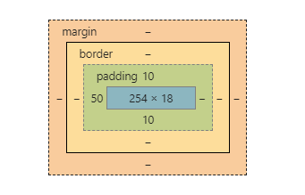
margin:外边距
padding: 内边距
border : 边框
4.2、边框
1、边框的粗细
2、边框的样式
3、边框的颜色
<style>
    /*body{*/
    /*    !*body总有一个默认的外边距margin:0*!*/
    /*    margin: 0;*/
    /*    padding: 0;*/
    /*    text-decoration: none;*/
    /*}*/
    /*border:粗细,样式,颜色*/
    #box{
        width:300px;
        border: 1px  solid  red ;

    }

    h2{
        font-size: 16px;
        background-color: #3cbda6;
        line-height: 30px;
    }

    form{
        background: #3cbda6;
    }
    div:nth-of-type(1){
        border: 3px solid black;
    }
    div:nth-of-type(2){
        border: 3px dashed #5770d0;
    }
    div:nth-of-type(3){
        border: 3px dashed #29f313;
    }

</style>
4.3、内外边距
<html lang="en">
<head>
    <meta charset="UTF-8">
    <title>Title</title>

<!--    外边距的妙用 居中元素-->
    <style>

        #box{
            width: 300px;
            border: 1px solid red;
            margin: 0 auto;
        }

        /*  margin:0
            margin:0  1px
            margin:0  1px  2px  3px
        */
        h2{
            font-size: 16px;
            background-color: #3cbda6;
            line-height: 30px;
            color: white;
            margin:0 1px;
        }

        form{
            background: #3cbda6;
        }
        input{
            border: 1px solid black;
        }

        div:nth-of-type(1){
            padding:10px  2px;
        }

    </style>
</head>
<body>


<div id="box">
  <h2>会员登录</h2>
  <form action="#">
     <div>
       <span>用户名:</span>
       <input type="text">
     </div>
      <div>
          <span>密码:</span>
          <input type="text">
      </div>
      <div>
          <span>邮箱:</span>
          <input type="text">
      </div>
  </form>
</div>
4.4、圆角边框
<!--
左上   右上    右下   左下,顺时针方向
-->

<!--
      圆圈: 圆角 = 半径-->

  <style>
    div{
      width:100px;
      height: 100px;
      border :10px solid red;
      border-radius: 50px 20px;
    }

  </style>
4.5、盒子阴影
<html lang="en">
<head>
    <meta charset="UTF-8">
    <title>Title</title>

<!--margin: 0 auto;  居中
  要求; 块元素,块元素有固定的宽度
-->
  <style>
    img{
      margin: 0 auto;
      border-radius: 50px;
      box-shadow: 10px 10px 1px #151513;
    }
  </style>


</head>
<body>

<div style="width:500px;display: block;text-align: center;">
    <div style="margin: 0 auto">
<img src="images/img.png" alt="">
    </div>
</div>

</body>
</html>
5、浮动
5.1、标准文档流
块级元素: 独占一行
h1~h8 p div 列表。。。
行内元素 : 不独占一行
span a img strong
行内元素 可以被包含在块级元素中,反之,则不可以~
5.2、display
<!--
block,块元素
inline  行内元素
inline-block 是块元素,但是可以内联,在一行
-->
  <style>
    div{
      width:100px;
      height:100px;
      border:1px solid red;
      display : inline;
    }
    span{
      width: 100px;
      height:100px;
      border:1px solid red;
      display: inline-block;
    }

  </style>
1、这个是一种实现行内元素排列的方式,但是我们很多情况都是用float
5.3、float
1、左右浮动
div{
    margin :10px;
    padding :5px;
}
#father{
    border : 1px  #000  solid;
}
.layer01{
    border:1px #F00  dashed;
	display: inline-block;
    float : right;
}
.layer02{
    border:1px #00F  dashed;
	display: inline-block;
    float : right;
}
.layer03{
    border:1px #060  dashed;
	display: inline-block;
    float : right;
}
.layer04{
    border:1px #666  dashed;
	font-size :12px;
	line-height:23px;
	display: inline-block;
    float : right;
}
5.4、父级边框塌陷的问题
clear
/*
clear: right; 右侧不允许有浮动元素
clear: left; 左侧不允许有浮动元素
clear: both; 两侧不允许有浮动元素
clear: none;
*/
解决方案:
1、增加父级元素的高度
#father{
     border:1px  #000  solid;
     height: 800px;
}
2、增加一个空的div标签,清除浮动
<div class="class"></div>

.clear{
    clear:both;
    margin: 0;
    padding: 0;
}
3、overflow
在父级元素中增加一个 overflow:hidden
4、父类添加一个伪类:after
#father:after{
    content:'';
    display:block;
    clear:both;
}
小结:
- 浮动元素后面增加空div
简单,代码中尽量避免空div
2、设置父元素的高度
简单,元素假设有了固定的高度,就会被限制
3、overflow
简单,下拉的一些场景避免使用
4、父类添加一个伪类:after(推荐)
写法稍微复杂一点,但是没有副作用,推荐使用
5.5、对比
- display
方向不可以控制
-
float
浮动起来的话会脱离标准文档流,所以要解决父级边框塌陷的问题
6、定位
6.1、相对定位
<!--  相对定位
相对于自己原来的位置进行偏移-->
  <style>
    body{
      padding: 20px;
    }
    div{
      margin: 10px;
      padding:5px;
      font-size: 12px;
      line-height: 25px;
    }
    #father{
      border:1px solid #666;
      padding:0;
    }
    #first{
      background-color: #a13d30;
      border:1px dashed #b27530;
      position: relative;   /* 相对定位*/
      top:-20px;
      left:20px;
    }
    #second{
      background-color: #c2ea2d;
      border:1px dashed #c3f147;
    }
    #third{
      background-color: #173cf1;
      border:1px dashed #1457e0;
      position: relative;
      bottom:10px;
      right: 20px;
    }

  </style>


</head>
<body>

<div id="father">
  <div id="first">第一个盒子</div>
  <div id="second">第二个盒子</div>
  <div id="third">第三个盒子</div>
</div>

</body>
</html>
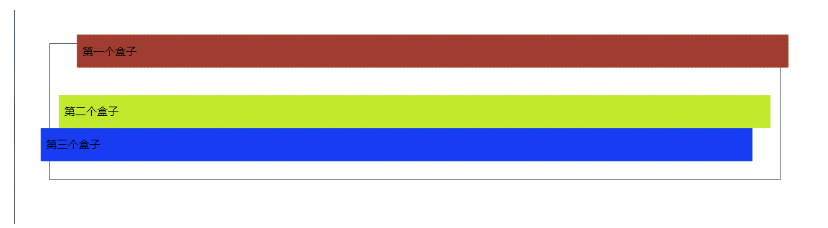
相对定位: position:relative;
相对于原来的位置:进行指定的偏移,相对定位的话,它仍然在标准文档流中,原来的位置会被保留
top:-20px;
left:20px;
bottom:-10px;
right:20px;
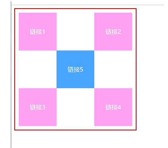
练习题:链接卡
<!DOCTYPE html>
<html lang="en">
<head>
    <meta charset="UTF-8">
    <title>Title</title>
  <style>
    #box{
      width:300px;
      height: 300px;
      padding: 10px;
      border: 2px  solid  red;
    }
    a{
      width: 100px;
      height: 100px;
      text-decoration: none;
      background: #ffa1f2;
      line-height: 100px;
      text-align: center;
      color: white;
      display: block;
    }
    a:hover{
      background: #47a4ff;
    }
    .a2,.a4{
      position: relative;
      left:200px;
      top:-100px;
    }
    .a5{
      position: relative;
      left:100px;
      top:-300px;
    }
  </style>

</head>
<body>


<div id="box">
   <a class="a1" href="#">链接1</a>
  <a class="a2" href="#">链接2</a>
  <a class="a3" href="#">链接3</a>
  <a class="a4" href="#">链接4</a>
  <a class="a5" href="#">链接5</a>
</div>
</body>
</html>
6.2、绝对定位
定位:基于xxx定位,上下左右~
1、没有父级元素定位的前提下,相对于浏览器定位
2、假设父级元素存在定位,我们通常会相对于父级元素进行偏移~
3、在父级元素范围内移动
相对于父级或浏览器的位置:进行指定的偏移,绝对定位的话,它不在标准文档流中,原来的位置不会被保留
<html lang="en">
<head>
    <meta charset="UTF-8">
    <title>Title</title>

  <style>
    div{
      margin: 10px;
      padding:5px;
      font-size: 12px;
      line-height: 25px;
    }
    #father{
          border:1px solid #666;
          padding: 0;
          position: relative;
    }
    #first{
          background-color: #a13d30;
          border:1px dashed #b27530;
    }
    #second{
          background-color: #c2ea2d;
          border:1px dashed #c3f147;
          position: absolute;
          right:30px;

    }
    #third{
          background-color: #173cf1;
          border:1px dashed #1457e0;
    }

  </style>


</head>
<body>

<div id="father">
  <div id="first">第一个盒子</div>
  <div id="second">第二个盒子</div>
  <div id="third">第三个盒子</div>
</div>

</body>
</html>
6.3、固定定位fixed
<html lang="en">
<head>
    <meta charset="UTF-8">
    <title>Title</title>

  <style>
      body{
          height: 1000px;
      }
      div:nth-of-type(1){/*绝对定位:相对于浏览器*/
          width:100px;
          height: 100px;
          background: red;
          position: absolute;
          right: 0;
          bottom: 0;

      }
      div:nth-of-type(2){/*fixed.固定定位*/
          width:50px;
          height: 50px;
          background: yellow;
          position: fixed;
          right: 0;
          bottom: 0;

      }

  </style>


</head>
<body>


  <div>div1</div>
  <div>div2</div>


</body>
</html>
6.4、z-index
图层~
z-index:默认是0,最高无限~999
<!DOCTYPE html>
<html lang="en">
<head>
    <meta charset="UTF-8">
    <title>Title</title>
    <link rel="stylesheet" href="css/style.css">
</head>
<body>

<div id="content">
  <ul>
    <li><img src="images/img.png" alt=""></li>
    <li class="tipText">学习微服务,找狂神 </li>
   <li class="tipBg"></li>
    <li>时间:2099-01-01</li>
    <li>地点:月球一号基地</li>
  </ul>
</div>

</body>
</html>
opacity:0.5;背景透明度
#content{
    padding: 0px;
    margin: 0px;
    overflow: hidden;
    font-size:25px;
    line-height: 25px;
    border: 1px #000 solid;
}
ul,li{
    padding: 0px;
    margin:0px;
    list-style: none;
}
/*父级元素相对定位*/
#content ul{
    position: relative;
}
.tipText,.tipBg{
    position: absolute;
    width: 380px;
    top:25px;
    top:216px;
}
.tipText{
    color: white;
   /*    z-index:0*/
}
.tipBg{
    background: #000;
    opacity: 0.5;  /*背景透明度*/
    filter:Alpha(opacity=50);
}

 浙公网安备 33010602011771号