
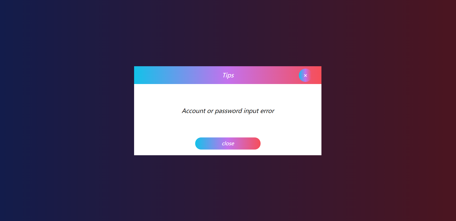
效果图:

代码:
<!DOCTYPE html>
<html lang="en">
<head>
    <meta charset="UTF-8">
    <title>Title</title>
    <style>
        body,html{
            background: #FC466B;  /* fallback for old browsers */
            background: -webkit-linear-gradient(to right, #3F5EFB, #FC466B);  /* Chrome 10-25, Safari 5.1-6 */
            background: linear-gradient(to right, #3F5EFB, #FC466B); /* W3C, IE 10+/ Edge, Firefox 16+, Chrome 26+, Opera 12+, Safari 7+ */
            height: 100%;
            width: 100%;
            margin: 0;
            padding: 0;
        }
        .div_box{
            padding: 0 15px 0 15px;
            position: absolute;
            top: 0;
            line-height: 300px;
            left: 0;
            text-align: center;
            bottom: 0;
            background-color: rgb(255,255,255,.2);
            font-size: 14px;
            right: 0;
            margin:  auto;
            width: 600px;
            height: 300px;
        }
        .btn_bgc{
            background: #FC466B;  /* fallback for old browsers */
            background: -webkit-linear-gradient(to right, #3F5EFB, #FC466B);  /* Chrome 10-25, Safari 5.1-6 */
            background: linear-gradient(to right, #3F5EFB, #FC466B); /* W3C, IE 10+/ Edge, Firefox 16+, Chrome 26+, Opera 12+, Safari 7+ */
            opacity:0.9;
            color: #fff;
            border: none;
            outline: none;
            font-size: 18px;
            width: 200px;
            font-family: "Lucida Sans";
            font-style: italic;
            height: 40px;
            line-height: 40px;
        }
        .btn_bgc:hover{
            background: #12c2e9;  /* fallback for old browsers */
            background: -webkit-linear-gradient(to left, #f64f59, #c471ed, #12c2e9);  /* Chrome 10-25, Safari 5.1-6 */
            background: linear-gradient(to left, #f64f59, #c471ed, #12c2e9); /* W3C, IE 10+/ Edge, Firefox 16+, Chrome 26+, Opera 12+, Safari 7+ */
        }
        .btn_bgc:active{
            background: #b92b27;  /* fallback for old browsers */
            background: -webkit-linear-gradient(to right, #1565C0, #b92b27);  /* Chrome 10-25, Safari 5.1-6 */
            background: linear-gradient(to right, #1565C0, #b92b27); /* W3C, IE 10+/ Edge, Firefox 16+, Chrome 26+, Opera 12+, Safari 7+ */
        }
        .model_hidden{
            position: absolute;
            display: none;
            top: 0;
            line-height: 300px;
            left: 0;
            text-align: center;
            bottom: 0;
            background-color: rgb(255,255,255);
            font-size: 14px;
            right: 0;
            margin:  auto;
            width: 630px;
            height: 300px;
        }
        .bgc_hidden{
            background-color: rgb(0,0,0,0.7);
            display: none;
            height: 100%;
            width: 100%;
        }
        .title_hidden_box{
            height: 60px;
            background: #12c2e9;  /* fallback for old browsers */
            background: -webkit-linear-gradient(to left, #f64f59, #c471ed, #12c2e9);  /* Chrome 10-25, Safari 5.1-6 */
            background: linear-gradient(to left, #f64f59, #c471ed, #12c2e9); /* W3C, IE 10+/ Edge, Firefox 16+, Chrome 26+, Opera 12+, Safari 7+ */
            text-align: center;
            line-height: 60px;
            font-family: "Lucida Sans";
            font-style: italic;
            font-size: 20px;
            color: white;
        }
        p{
            height: 140px;
            line-height: 140px;
            font-size: 20px;
            font-family: "Lucida Sans";
            font-style: italic;
        }
        .btn_hidden{
            width: 220px;
            font-size: 17px;
            height: 41px;
            border-radius: 20px;
            line-height: 41px;
            margin: 0 auto;
            font-family: "Lucida Sans";
            font-style: italic;
            color: #fff;
            background: linear-gradient(to left, #f64f59, #c471ed, #12c2e9);
        }
        .btn_hidden:hover{
            background: linear-gradient(to right, #3F5EFB, #FC466B);
        }
        .btn_hidden:active{
            background: linear-gradient(to right, #1565C0, #b92b27);
        }
        .close_box{
            position: relative;
            left: 554px;
            top: -62px;
            font-style: normal;
            margin-right: 20px;
            width: 45px;
            height: 45px;
            line-height: 45px;
            border-radius: 150px;
            background: linear-gradient(to left, #f64f59, #c471ed, #12c2e9);
            margin-top: 10px;
        }
        .to_hideen{
            position: relative;
            top: 100px;
            transition: 1s;
        }
    </style>
    <script src="../js/jquery/jquery-3.6.0.js"></script>
</head>
<body>

    <div class="div_box">
        <button class="btn_bgc" id="submit">submit</button>
    </div>
    <div class="bgc_hidden" id="btn_hidden_box">
        <div class="model_hidden" id="model_hidden">
            <div class="title_hidden_box">Tips
                <div class="close_box" id="close_box">×</div>
            </div>
            <p>Account or password input error</p>
            <div class="btn_hidden" id="close">close</div>
        </div>
    </div>
    <script>
            $(document).ready(function(){
                $("#submit").click(function (){
                    $("#btn_hidden_box").css("display","block");
                    $("#model_hidden").slideToggle();
                })
                $("#close").click(function (){
                    $("#btn_hidden_box").css("display","none");
                    $("#model_hidden").slideToggle();
                })
                $("#close_box").click(function (){
                    $("#model_hidden").slideToggle();
                    setTimeout(function(){
                        $("#btn_hidden_box").css("display","none");
                    },500);
                })
            });
    </script>
</body>
</html>
本文来自博客园,作者:最帅爸爸,转载请注明原文链接:https://www.cnblogs.com/zsbb

 浙公网安备 33010602011771号