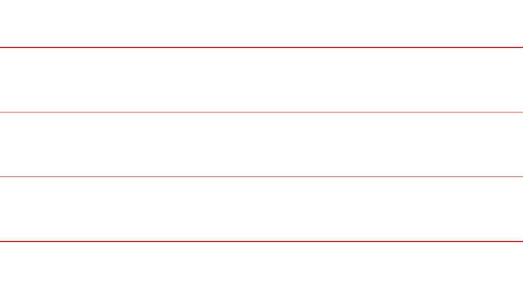
关于不同retina的布局
不同retina,显示高度不一样,很显然最细的线条最美
<!DOCTYPE html>
<html lang="en">
<head>
    <meta charset="UTF-8">
    <meta name="viewport" content="width=device-width, initial-scale=1.0">
    <meta http-equiv="X-UA-Compatible" content="ie=edge">
    <title>Document</title>
    <style>
        *{
            padding:0;
            margin:0;
            box-sizing: border-box;
        }
        .box{
            width:100%;
            height: 1px;
            background: red;
            margin-top: 50px;
        }

        @media (-webkit-min-device-pixel-ratio: 2){
            .box2{
                transform: scaleY(.5)
            }
        }
        @media (-webkit-min-device-pixel-ratio: 3){
            .box3{
                transform: scaleY(.333)
            }
        }
        @media (-webkit-min-device-pixel-ratio: 4){
            .box4{
                transform: scaleY(.1)
            }
        }
    </style>
</head>
<body>
    <div class="box"></div>
    <div class="box box2"></div>
    <div class="box box3"></div>
    <div class="box box4"></div>
</body>
</html>

 浙公网安备 33010602011771号