

优惠券排版
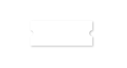
一、优惠券
.coupon{
      width: 200px;
      height: 80px;
      background: radial-gradient(circle at right bottom, transparent 10px, #ffffff 0) top right / 50% 40px no-repeat,
        radial-gradient(circle at left bottom, transparent 10px, #ffffff 0) top left / 50% 40px no-repeat,
        radial-gradient(circle at right top, transparent 10px, #ffffff 0) bottom right / 50% 40px no-repeat,
        radial-gradient(circle at left top, transparent 10px, #ffffff 0) bottom left / 50% 40px no-repeat;
      filter: drop-shadow(3px 3px 3px #c5c5c5);
 }
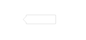
二、气泡框
<style>
.bubble-tip {
  width: 100px;
  height: 30px;
  line-height: 30px;
  margin-left: 10px;
  border: 1px solid #c5c5c5;
  border-radius: 4px;
  position: relative;
  background-color: #fff;
}
.bubble-tip::before {
  content: "";
  width: 0;
  height: 0;
  border-style: solid;
  border-width: 10px 10px 10px 0;
  border-color: transparent #ffffff transparent transparent;
  position: absolute;
  top: 5px;
  left: -10px;
  z-index: 2;
}
.bubble-tip::after {
  content: "";
  width: 0;
  height: 0;
  border-style: solid;
  border-width: 10px 10px 10px 0;
  border-color: transparent #c5c5c5 transparent transparent;
  position: absolute;
  top: 5px;
  left: -11px;
  z-index: 1;
}
</style>
<div class="bubble-tip"></div>
三、三角形
<style>
.triangle {
  width: 0;
  height: 0;
  border-style: solid;
  box-sizing: border-box;
  border-width: 0 10px 10px;
  border-color: transparent transparent #c5c5c5 transparent;
}
</style>
<div class="triangle"></div>

<style>
.left-top-triangle {
  width: 0;
  height: 0;
  border-style: solid;
  box-sizing: border-box;
  border-width: 10px;
  border-color: #c5c5c5 transparent transparent #c5c5c5;
}
</style>
<div class="left-top-triangle"></div>

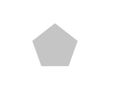
四、五边形
<style>
.pentagon {
  width: 54px;
  position: relative;
  border-width: 50px 18px 0;
  border-style: solid;
  border-color: #c5c5c5 transparent;
}

.pentagon::before {
  content: "";
  position: absolute;
  width: 0;
  height: 0;
  top: -85px;
  left: -18px;
  border-width: 0 45px 35px;
  border-style: solid;
  border-color: transparent transparent #c5c5c5;
}
</style>
<div class="pentagon"></div>

 浙公网安备 33010602011771号