


text-shadow(文字阴影)
text-shadow是css3中的属性中的文字阴影效果
相关语法:
text-shadow: length | length  | length | color;
text-shadow: X轴长度 | Y轴长度 | 阴影模糊半径 | 颜色;
X轴长度和Y轴长度可以为负值,如果不需要设置阴影模糊半径的话,可以省略
下面的写法都是可以的:
text-shadow: -1px 2px 3px #ffb69a;
text-shadow: -1px 2px #ffb69a;
text-shadow: -1px 3px 3px #ffb69a,1px 1px 5px #922e09;
注意:一个text-shadow里可以写多个属性,中间用”,”分开即可
下面分享几个具体的例子
<style type=text/css>
* {margin:0;padding:0;}
body {
font-family:"微软雅黑","宋体",Geneva, sans-serif;
font-size:35px;
font-weight:bold;
background:#ebebeb;
}
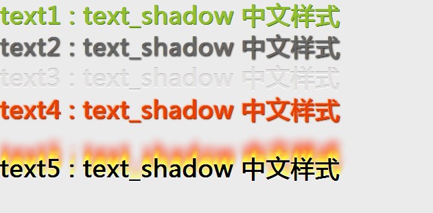
#test1 {
text-shadow: 1px 1px #40730e;
color:#92bf30;
}
#test2 {
text-shadow: 1px 1px 3px #000;
color:#676767;
}
#test3 {
text-shadow: 0px -1px #bbb,0 1px #fff;
color:#e3e1e1;
}
#test4 {
text-shadow: -1px -1px 3px #ffb69a,1px 1px 3px #922e09,-1px -1px #ffb69a,1px 1px #922e09;
color:#e73f00;
}
#test5 {
margin-top:40px;
text-shadow:0 0 4px white, 0 -5px 4px #FFFF33, 2px -10px 6px #FFDD33, 2px -15px 11px #FF8800, 2px -25px 18px #FF2200;
color:#000;
}
</style>
<div id="test1">text1 : text_shadow 中文样式</div>
<div id="test2">text2 : text_shadow 中文样式</div>
<div id="test3">text3 : text_shadow 中文样式</div>
<div id="test4">text4 : text_shadow 中文样式</div>
<div id="test5">text5 : text_shadow 中文样式</div>

 浙公网安备 33010602011771号