用css画箭头
在CSS中,可以使用伪元素 ::before 或 ::after 结合 border 属性来创建箭头。以下是一个简单的示例代码:
```html
<div class="arrow"></div>
```
```css
.arrow {
position: relative;
width: 0;
height: 0;
border-top: 10px solid transparent;
border-bottom: 10px solid transparent;
border-right: 10px solid black;
}
.arrow::before {
content: "";
position: absolute;
top: -10px;
left: -10px;
width: 0;
height: 0;
border-top: 10px solid transparent;
border-bottom: 10px solid transparent;
border-right: 10px solid black;
}
```
在这个示例中,我们定义了一个 `div` 元素并应用了 `arrow` 类。然后我们在 `arrow` 类中设置 `border` 属性,将 `top` 和 `bottom` 的箭头部分设为透明,将 `right` 的箭头部分设为黑色。接着,我们使用 `::before` 伪元素来创建一个相同的箭头,并将其设置在原始箭头的左上角,从而产生箭头的完整形状。可以通过调整 `width`、`height` 和 `border` 属性来自定义箭头的大小和样式。
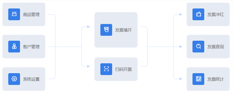
例子
<template lang="pug">
.gongneng-list-container
    .card.left
        .item
            span.icon
                b-icon(type="v4-shangpin" size="18")
            span.name 商品管理
        .item
            span.icon
                b-icon(type="yonghu-kehu" size="18")
            span.name 客户管理
        .item
            span.icon
                b-icon(type="xitongguanli" size="18")
            span.name 系统设置
    .line-box
        .lineA
        .lineB
        .lineC
            .arrow.top
            .arrow.bottom
    .card.middle
        .item(style="padding: 40px 20px;")
            span.icon
                b-icon(type="v4-piaowujiancha" size="18")
            span.name 发票填开
        .item
            span.icon
                b-icon(type="v4-saoma" size="18")
            span.name 扫码开票
    .line-box.to3
        .lineA
        .lineB
        .lineC
            .arrow.top
            .arrow.center
            .arrow.bottom
    .card.right
        .item
            span.icon
                b-icon(type="v4-menpiao1" size="18")
            span.name 发票冲红
        .item
            span.icon
                b-icon(type="v4-sousuo" size="18")
            span.name 发票查询
        .item
            span.icon
                b-icon(type="v4-shujutoushibiao" size="18")
            span.name 发票统计
</template>

<script>
export default {

}
</script>

<style lang="scss" scoped>
.gongneng-list-container {
    display: flex;

    .line-box {
        color: #BDD7FF;
        display: flex;
        align-items: center;
        margin-left: 10px;
        margin-right: 20px;

        .arrow {
            width: 0;
            height: 0;
            border-top: 5px solid transparent;
            border-bottom: 5px solid transparent;
            border-left: 10px solid;

            &.top {
                position: absolute;
                top: -5px;
                right: -5px;
            }

            &.center {
                position: absolute;
                top: calc(50% - 5px);
                right: -5px;
            }

            &.bottom {
                position: absolute;
                bottom: -5px;
                right: -5px;
            }
        }

        &.to3 {
            .lineA {
                width: 24px;
                height: 136px;
            }

            .lineB {
                width: 113px;
                margin-left: -0;
                margin-right: -24px;
            }

            .lineC {
                width: 24px;
                height: 220px;
            }
        }

        .lineA {
            width: 24px;
            height: 220px;
            border: 1px solid;
            border-left: none;
            border-top-right-radius: 8px;
            border-bottom-right-radius: 8px;
        }

        .lineB {
            width: 113px;
            margin-left: -24px;
            border-top: 1px solid;
        }

        .lineC {
            width: 24px;
            height: 136px;
            border: 1px solid;
            border-right: none;
            border-top-left-radius: 8px;
            border-bottom-left-radius: 8px;
            position: relative;
        }

    }

    .card {
        // border: 1px solid red;
        height: 300px;
        display: flex;
        flex-direction: column;
        justify-content: space-between;
        &.middle {
            justify-content: space-evenly;
        }
        .item {
            // height: 112px;
            background-color: #E6EBF3;
            border-radius: 8px;
            padding: 20px;
            span.icon {
                background-color: #367EE8;
                display: inline-block;
                width: 40px;
                height: 40px;
                border-radius: 4px;
                color: white;
                line-height: 40px;
                text-align: center;
            }
            span.name {
                margin-left: 10px;
            }
        }
    }
}
</style>
实现效果:
生活不易,请继续努力,在未来的路上,愿你步伐坚定且内心温柔。——ziChin

 浙公网安备 33010602011771号