

大数据分析-世界死亡和原因
一、选题的背景
查看世界死亡人数具体死亡原因
分析具体的死亡病因以及患病人数
病因死亡导致社会人数下滑,以数据来看随着时间推移,人类患病率越来越高,死亡人数也越来越多。
二、大数据分析设计方案
1.本数据集的数据内容与数据特征分析
人类死亡的原因有,艾滋病,阿兹海默,脑膜炎,帕金森,疟疾,营养缺失等病症。用数据列表以及画图分析患病的人数
2. 数据分析的课程设计方案概述(包括实现思路与技术难点
首先提取数据集,分析数据,确保数据没有流失,然后输出数据集的内容,在以列表画图的方式,输出出来。只能分段输出具体数据
三、数据分析步骤
1.数据源
在laggle采用的数据集
2.数据清洗
输出这段代码,确保数据没有流失df.isnull().sum()
3.大数据分析过程及采用的算法
●常规的统计方法
Pandas,seaborn,numpy,matplotlib.pyplot
统计分析,把各个国家的患病具体人数统计,结合在一起
3. 数据可视化
充分显示全世界帕金森每年死亡人数以及各种病例死亡人数显示


单独显示每个城市帕金森每年死亡人数
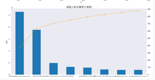
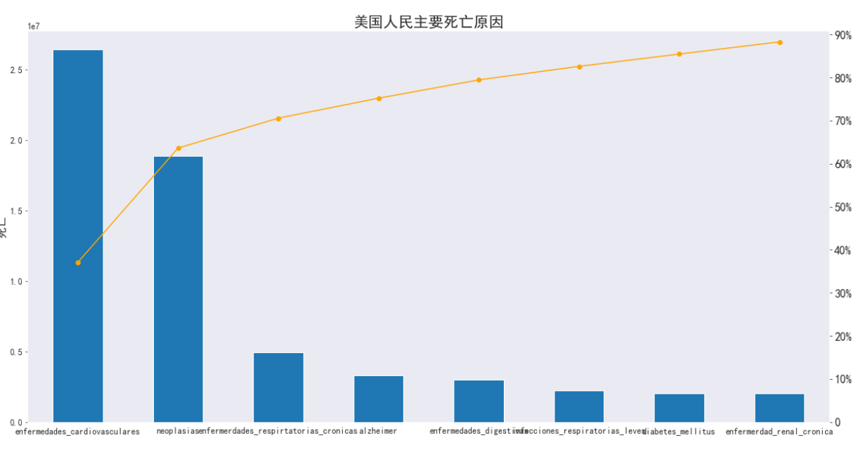
单独统计美国患病原因和死亡人数
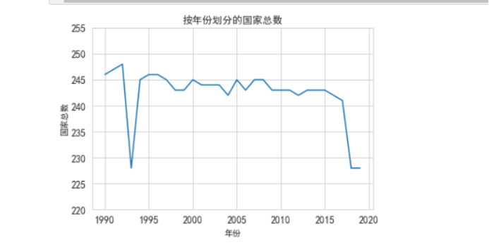
每年分析多少个国家,一个国家患病类型=一个国家统计 ,一个国家大概10-29种病例
5. 附完整程序源代码(以及输出结果)
import pandas as pd
import matplotlib.pyplot as plt
import numpy as np
import seaborn as sns
import os
df = pd.read_csv("annual_deaths_by_causes.csv")
#所有数据
df.info()
#每年各种病状的得病人数
df.head(1990-2020)
#划分1990到2020
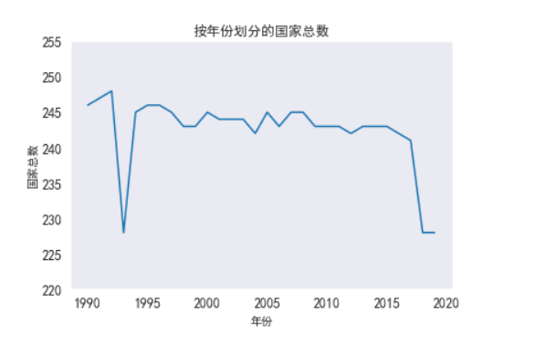
plt.plot(df[["country", "year"]].groupby("year").count().reset_index().year, df[["country", "year"]].groupby("year").count().reset_index().country)
plt.title("按年份划分的国家总数")
plt.ylabel("国家总数")
plt.xlabel("年份")
plt.yticks(np.arange(220, 260, 5))
plt.rcParams['font.sans-serif'] = ['SimHei'] # 指定默认字体
plt.show()
#死亡原因
colmuns_name = ['country', 'code', 'year', 'meningitis', 'alzheimer', 'parkinson',
'deficiencia_nutricional', 'malaria', 'ahogo',
'violencia_interpersonal', 'trastornos_maternos', 'vih_sida',
'uso_drogas', 'tuberculosis', 'enfermedades_cardiovasculares',
'infecciones_respiratorias_leves', 'trastornos_neonatales',
'uso_alcohol', 'autolesiones', 'fuerzas_de_la_naturaleza',
'enfermedades__diarreicas', 'exposicion_al_calor_o_frio', 'neoplasias',
'guerras_terrorismo', 'diabetes_mellitus', 'enfermerdad_renal_cronica',
'envenenamiento', 'desnutricion', 'terrorismo',
'accidentes_de_transito', 'enfermerdades_respirtatorias_cronicas',
'enfermedades_linfaticas_cronicas', 'enfermedades_digestivas',
'sustancias_de_calor_fuego', 'hepatitis_aguda']
#死因
df_causas_death = df
df_causas_death.columns = colmuns_name
df_causas_death.head(1990-2020)
# df_causas_death.describe()
#总共死亡原因
df_data_malaria = df_causas_death[['country', 'code', 'year', 'meningitis', 'alzheimer', 'parkinson',
'deficiencia_nutricional', 'malaria', 'ahogo',
'violencia_interpersonal', 'trastornos_maternos', 'vih_sida',
'uso_drogas', 'tuberculosis', 'enfermedades_cardiovasculares',
'infecciones_respiratorias_leves', 'trastornos_neonatales',
'uso_alcohol', 'autolesiones', 'fuerzas_de_la_naturaleza',
'enfermedades__diarreicas', 'exposicion_al_calor_o_frio', 'neoplasias',
'guerras_terrorismo', 'diabetes_mellitus', 'enfermerdad_renal_cronica',
'envenenamiento', 'desnutricion', 'terrorismo',
'accidentes_de_transito', 'enfermerdades_respirtatorias_cronicas',
'enfermedades_linfaticas_cronicas', 'enfermedades_digestivas',
'sustancias_de_calor_fuego', 'hepatitis_aguda']]
df_data_malaria.head()
df_data_malaria.info()
#脑膜炎人数
df_meningitis_country = df_data_malaria[['country',
'year',
'meningitis']]
df_death_meningitis_x_year = df_meningitis_country.groupby(['year'])[['meningitis']].sum().reset_index()
df_death_meningitis_x_year.head(10)
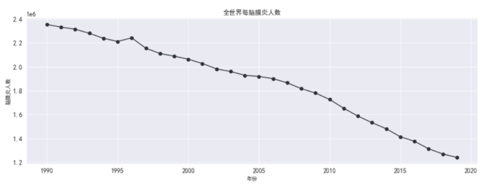
#全世界每年脑膜炎死亡的人数
plt.figure(figsize=(15,5))
plt.plot(df_death_meningitis_x_year['year'],
df_death_meningitis_x_year['meningitis'],
marker='o',
color = '#2d3436')
plt.xlabel('年份')
plt.ylabel('脑膜炎人数')
plt.grid()
plt.title('全世界每脑膜炎人数')
plt.rcParams['font.sans-serif'] = ['SimHei'] # 指定默认字体
plt.show()
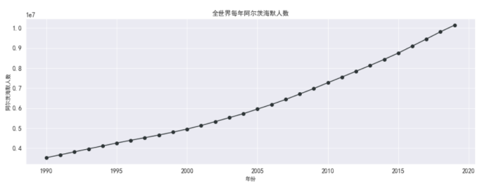
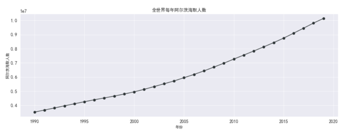
#阿兹海默人数
df_alzheimer_country = df_data_malaria[['country',
'year',
'alzheimer']]
df_death_alzheimer_x_year = df_alzheimer_country.groupby(['year'])[['alzheimer']].sum().reset_index()
df_death_alzheimer_x_year.head(10)
#画图 全世界阿兹海默死亡人数
plt.figure(figsize=(15,5))
plt.plot(df_death_alzheimer_x_year['year'],
df_death_alzheimer_x_year['alzheimer'],
marker='o',
color = '#2d3436')
plt.xlabel('年份')
plt.ylabel('阿尔茨海默人数')
plt.grid()
plt.title('全世界每年阿尔茨海默人数')
plt.rcParams['font.sans-serif'] = ['SimHei'] # 指定默认字体
plt.show()
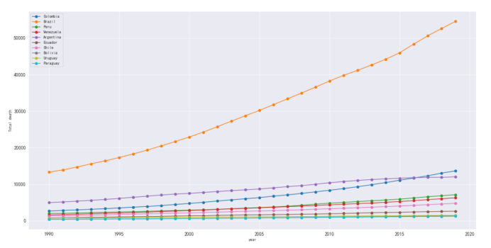
#地区阿兹海默数据
df_alzheimer_x_region = df_alzheimer_country[df_alzheimer_country['country'].isin(['North America (WB)',
'East Asia & Pacific (WB)',
'European Region (WHO)',
'Europe & Central Asia (WB)',
'South-East Asia Region (WHO)',
'South Asia (WB)',
'Middle East & North Africa (WB)',
'Latin America & Caribbean (WB)',
'African Region (WHO)',
'Sub-Saharan Africa (WB)'])]
df_death_alzheimer_x_country = df_alzheimer_country.groupby(['country'])[['alzheimer']].sum().reset_index()\
.sort_values('alzheimer', ascending=False)
df_parkinson_x_region.head()
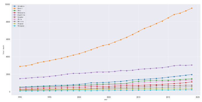
#统计艾兹海默数据的城市
df_death_alzheimer = df_alzheimer_country[df_alzheimer_country['country'].isin(['Colombia',
'Venezuela',
'Ecuador',
'Peru',
'Bolivia',
'Chile',
'Argentina',
'Brazil',
'Uruguay',
'Paraguay'])]
df_death_parkinson
#艾兹海默各个地区死亡人数
plt.figure(figsize=(20,10))
plt.xlabel('year')
plt.ylabel('Total death')
plt.grid()
plt.plot(df_death_alzheimer[df_death_alzheimer['country'] == 'Colombia']['year'],
df_death_alzheimer[df_death_alzheimer['country'] == 'Colombia']['alzheimer'],
marker='o',
label='Colombia')
plt.plot(df_death_alzheimer[df_death_alzheimer['country'] == 'Brazil']['year'],
df_death_alzheimer[df_death_alzheimer['country'] == 'Brazil']['alzheimer'],
marker='o',
label='Brazil')
plt.plot(df_death_alzheimer[df_death_alzheimer['country'] == 'Peru']['year'],
df_death_alzheimer[df_death_alzheimer['country'] == 'Peru']['alzheimer'],
marker='o',
label='Peru')
plt.plot(df_death_alzheimer[df_death_alzheimer['country'] == 'Venezuela']['year'],
df_death_alzheimer[df_death_alzheimer['country'] == 'Venezuela']['alzheimer'],
marker='o',
label='Venezuela')
plt.plot(df_death_alzheimer[df_death_alzheimer['country'] == 'Argentina']['year'],
df_death_alzheimer[df_death_alzheimer['country'] == 'Argentina']['alzheimer'],
marker='o',
label='Argentina')
plt.plot(df_death_alzheimer[df_death_alzheimer['country'] == 'Ecuador']['year'],
df_death_alzheimer[df_death_alzheimer['country'] == 'Ecuador']['alzheimer'],
marker='o',
label='Ecuador')
plt.plot(df_death_alzheimer[df_death_alzheimer['country'] == 'Chile']['year'],
df_death_alzheimer[df_death_alzheimer['country'] == 'Chile']['alzheimer'],
marker='o',
label='Chile')
plt.plot(df_death_alzheimer[df_death_alzheimer['country'] == 'Bolivia']['year'],
df_death_alzheimer[df_death_alzheimer['country'] == 'Bolivia']['alzheimer'],
marker='o',
label='Bolivia')
plt.plot(df_death_alzheimer[df_death_alzheimer['country'] == 'Uruguay']['year'],
df_death_alzheimer[df_death_alzheimer['country'] == 'Uruguay']['alzheimer'],
marker='o',
label='Uruguay')
plt.plot(df_death_alzheimer[df_death_alzheimer['country'] == 'Paraguay']['year'],
df_death_alzheimer[df_death_alzheimer['country'] == 'Paraguay']['alzheimer'],
marker='o',
label='Paraguay')
plt.legend()
#帕金森
df_parkinson_country = df_data_malaria[['country',
'year',
'parkinson']]
df_death_parkinson_x_year = df_parkinson_country.groupby(['year'])[['parkinson']].sum().reset_index()
df_death_parkinson_x_year.head(10)
#帕金森全世界死亡人数
plt.figure(figsize=(15,5))
plt.plot(df_death_parkinson_x_year['year'],
df_death_parkinson_x_year['parkinson'],
marker='o',
color = '#2d3436')
plt.xlabel('年份')
plt.ylabel('帕金森人数')
plt.grid()
plt.title('全世界每年帕金森人数')
plt.rcParams['font.sans-serif'] = ['SimHei'] # 指定默认字体
plt.show()
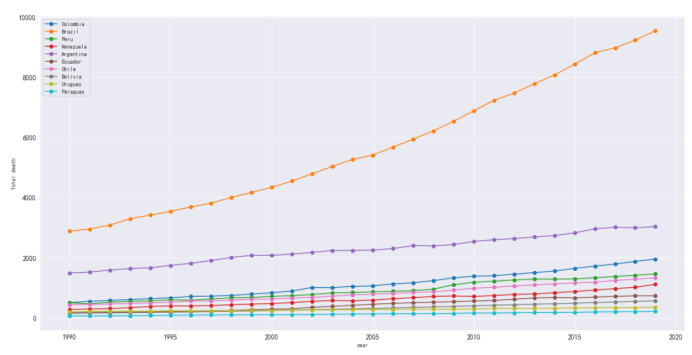
#地区帕金森数据
df_parkinson_x_region = df_parkinson_country[df_parkinson_country['country'].isin(['North America (WB)',
'East Asia & Pacific (WB)',
'European Region (WHO)',
'Europe & Central Asia (WB)',
'South-East Asia Region (WHO)',
'South Asia (WB)',
'Middle East & North Africa (WB)',
'Latin America & Caribbean (WB)',
'African Region (WHO)',
'Sub-Saharan Africa (WB)'])]
df_death_parkinson_x_country = df_parkinson_country.groupby(['country'])[['parkinson']].sum().reset_index()\
.sort_values('parkinson', ascending=False)
df_parkinson_x_region.head()
#统计帕金森数据的城市
df_death_parkinson = df_parkinson_country[df_parkinson_country['country'].isin(['Colombia',
'Venezuela',
'Ecuador',
'Peru',
'Bolivia',
'Chile',
'Argentina',
'Brazil',
'Uruguay',
'Paraguay'])]
df_death_parkinson
#以上城市帕金森死亡人数
plt.figure(figsize=(20,10))
plt.xlabel('year')
plt.ylabel('Total death')
plt.grid()
plt.plot(df_death_parkinson[df_death_parkinson['country'] == 'Colombia']['year'],
df_death_parkinson[df_death_parkinson['country'] == 'Colombia']['parkinson'],
marker='o',
label='Colombia')
plt.plot(df_death_parkinson[df_death_parkinson['country'] == 'Brazil']['year'],
df_death_parkinson[df_death_parkinson['country'] == 'Brazil']['parkinson'],
marker='o',
label='Brazil')
plt.plot(df_death_parkinson[df_death_parkinson['country'] == 'Peru']['year'],
df_death_parkinson[df_death_parkinson['country'] == 'Peru']['parkinson'],
marker='o',
label='Peru')
plt.plot(df_death_parkinson[df_death_parkinson['country'] == 'Venezuela']['year'],
df_death_parkinson[df_death_parkinson['country'] == 'Venezuela']['parkinson'],
marker='o',
label='Venezuela')
plt.plot(df_death_parkinson[df_death_parkinson['country'] == 'Argentina']['year'],
df_death_parkinson[df_death_parkinson['country'] == 'Argentina']['parkinson'],
marker='o',
label='Argentina')
plt.plot(df_death_parkinson[df_death_parkinson['country'] == 'Ecuador']['year'],
df_death_parkinson[df_death_parkinson['country'] == 'Ecuador']['parkinson'],
marker='o',
label='Ecuador')
plt.plot(df_death_parkinson[df_death_parkinson['country'] == 'Chile']['year'],
df_death_parkinson[df_death_parkinson['country'] == 'Chile']['parkinson'],
marker='o',
label='Chile')
plt.plot(df_death_parkinson[df_death_parkinson['country'] == 'Bolivia']['year'],
df_death_parkinson[df_death_parkinson['country'] == 'Bolivia']['parkinson'],
marker='o',
label='Bolivia')
plt.plot(df_death_parkinson[df_death_parkinson['country'] == 'Uruguay']['year'],
df_death_parkinson[df_death_parkinson['country'] == 'Uruguay']['parkinson'],
marker='o',
label='Uruguay')
plt.plot(df_death_parkinson[df_death_parkinson['country'] == 'Paraguay']['year'],
df_death_parkinson[df_death_parkinson['country'] == 'Paraguay']['parkinson'],
marker='o',
label='Paraguay')
plt.legend()
#查询美国死亡和原因
usa = df[df['country'] == 'United States']
usa = usa.drop(columns = ['country'])
usa.set_index('year')
mapper = {'code':'causes'}
usa.rename(columns = mapper,inplace = True)
pd.options.display.float_format = '{:,.2%}'.format
usa_total = usa.groupby(['causes']).sum().transpose().sort_values('USA', ascending = False)
usa_total['relativeFrequency'] = usa_total['USA'] / usa_total['USA'].sum()
usa_total['USA'] = usa_total['USA'].map('{:.0f}'.format)
col_mapper = {'USA':'deaths'}
usa_total.rename(columns = col_mapper,inplace = True)
usa_total.drop(index = 'year', inplace = True)
usa_total['cumulativeFrequency'] = usa_total['relativeFrequency'].cumsum()
usa_total
#画图
sns.set_style('dark')
plt.figure(figsize = (20,10))
usa_total['deaths']= pd.to_numeric(usa_total['deaths'])
usa_total['deaths'].head(8).plot(kind = 'bar')
plt.ylabel('死亡',fontsize = 16)
usa_total['cumulativeFrequency'].head(8).plot(secondary_y = True, kind = 'line', color = 'orange',marker = 'o')
plt.title('美国人民主要死亡原因', fontsize = 21)
plt.yticks([0,.1,.2,.3,.4,.5,.6,.7,.8,.9],labels = ['0','10%','20%','30%','40%', '50%','60%','70%', '80%','90%'],fontsize = 16)
plt.rcParams['font.sans-serif'] = ['SimHei'] # 指定默认字体
四、总结
1、通过数据分析,了解到全世界导致这么人死亡的原因,预期目标:就是分析各个国家死亡原因以及人数,达到预期目标
2、在此设计过程中,收获了很多逐渐掌握如何用画图来分析数据,看到了逐渐的不足和需要改进的地方,从很多网上学习得到了很多经验。虽然这次没有完全实现,也还存在一些问题,在解决一个又一个问题之后,我自己也对python这门语言有了更深的理解,也越发觉得有趣。希望自己下次在绘图上可以做的更好。

 浙公网安备 33010602011771号