


1 import pandas as pd
2 import numpy as np
3 import matplotlib.pyplot as plt
4
5 %matplotlib notebook
1 # 查看预先给定的风格
2 plt.style.available
['seaborn-darkgrid',
 'bmh',
 'fivethirtyeight',
 'dark_background',
 'ggplot',
 'grayscale',
 'seaborn-ticks',
 'seaborn-white',
 'seaborn-poster',
 'seaborn-dark',
 'seaborn-pastel',
 'seaborn',
 'seaborn-deep',
 'seaborn-talk',
 'seaborn-paper',
 'seaborn-whitegrid',
 'seaborn-muted',
 'seaborn-notebook',
 'seaborn-bright',
 'seaborn-dark-palette',
 'classic',
 'seaborn-colorblind']
1 # use the 'seaborn-colorblind' style
2 plt.style.use('seaborn-colorblind')
DataFrame.plot
1 np.random.seed(123)
2
3 df = pd.DataFrame({'A': np.random.randn(365).cumsum(0),
4                    'B': np.random.randn(365).cumsum(0) + 20,
5                    'C': np.random.randn(365).cumsum(0) - 20},
6                   index=pd.date_range('1/1/2017', periods=365))
7 df.head()

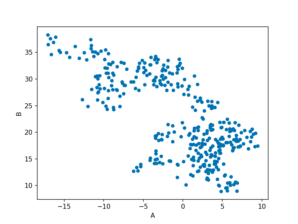
1 df.plot(); # DataFrame画线

我们可以设置plot函数中的kind来决定我们想画什么
1 df.plot('A','B', kind = 'scatter');
下面列举kind的的可选值
kind :
'line': 直线(默认)'bar': 垂直条形图'barh': 水平条形图'hist': 直方图'box': 箱型图'kde': 核密度估计图'density': same as 'kde''area': area plot'pie': 饼图'scatter': 点状图'hexbin': hexbin plot
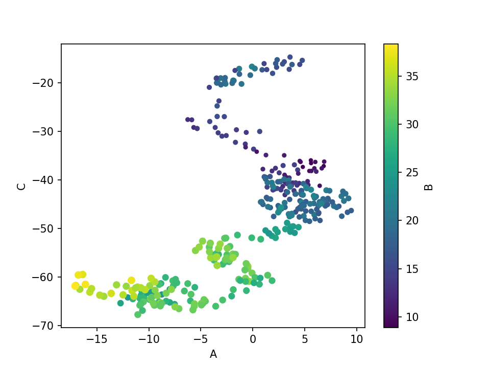
1 # 以A,C为坐标轴,以B值大小('c')来改变颜色深浅,以B的数量('s')来定义点的数量,'colormap'为左边的颜色标注
2 df.plot.scatter('A', 'C', c='B', s=df['B'], colormap='viridis')
1 ax = df.plot.scatter('A', 'C', c='B', s=df['B'], colormap='viridis')
2 ax.set_aspect('equal')

1 df.plot.box();

#绘制直方图,'alpha'为颜色透明度
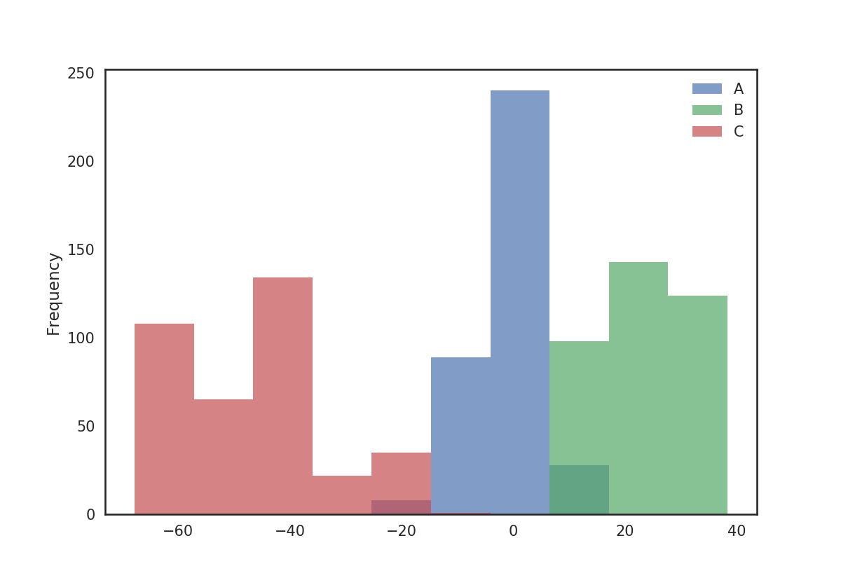
1 df.plot.hist(alpha=0.7);
核密度估计图可用于从给定样本推导平滑连续函数。
绘制核密度估计图
1 df.plot.kde();

pandas.tools.plotting
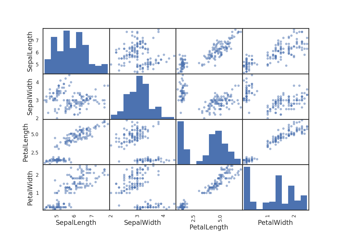
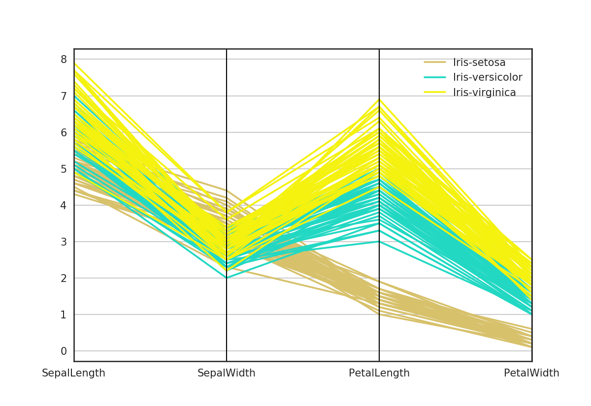
1 #加载iris花的数据集
2 iris = pd.read_csv('iris.csv')
3 iris.head()

1 pd.tools.plotting.scatter_matrix(iris);
1 plt.figure()
2 pd.tools.plotting.parallel_coordinates(iris, 'Name');

 浙公网安备 33010602011771号